
Most vintage kitchens fail on the fifth decision, not the first. Choosing cream cabinets and a checkerboard floor is the easy part; what sinks the room is the brass that never tarnishes, the refrigerator that belongs to a different decade than the house, and the grid of downlights nobody thought to question. The eight decisions below are the ones that separate a kitchen reading as period from one reading as themed, roughly in the order you will have to make them.
1. Pick one decade, and let the house pick it for you
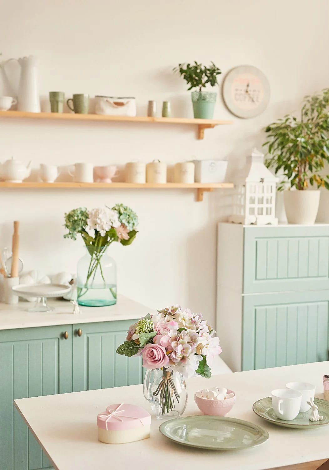
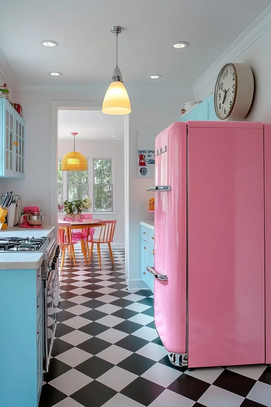
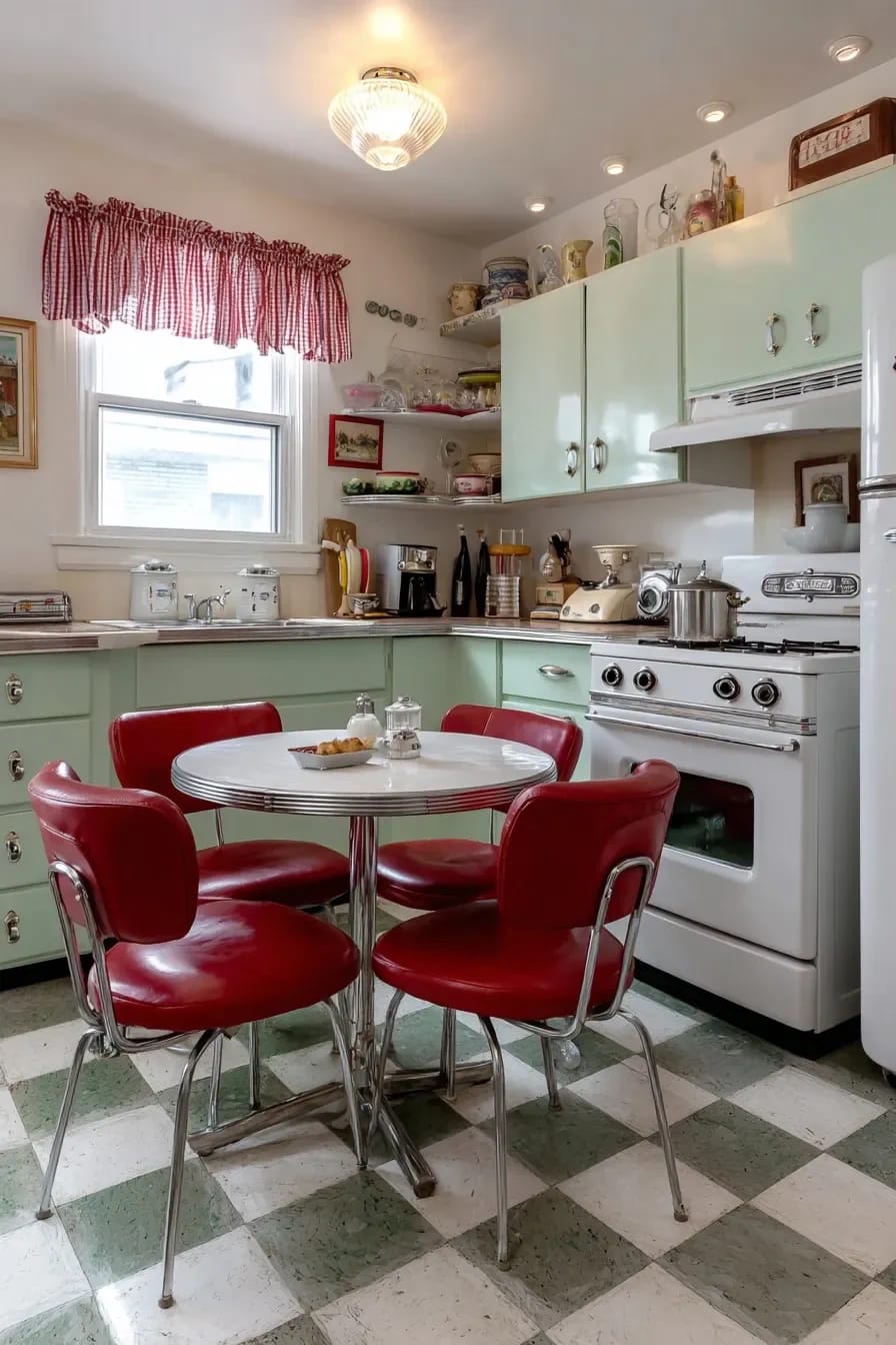
The strongest predictor of whether a vintage kitchen reads right is whether it agrees with the rest of the building. A 1928 bungalow carries a 1930s kitchen without argument; the same kitchen dropped into a 1978 ranch reads as a set; and the four-decade smoothie, a pastel fridge plus a farmhouse sink plus a 70s swag lamp plus Shaker doors, reads as nothing at all. Pick the decade the house was built in, or the decade of its first serious remodel, and stay there.
Reading the house for its date
Trim profiles and door hardware date a house faster than the deed does. Wide flat casing with a backband, plus mortise locks with a rim knob, puts you before roughly 1930. Narrow casing and tubular latches put you after the war. If the original kitchen was gutted long before you arrived, the bathroom usually survived, and its tile will tell you more than the listing photos did.
| Decade | Cabinetry | Palette | Floor | The giveaway detail |
|---|---|---|---|---|
| 1920s to 1930s | Freestanding furniture, Hoosier cabinets, open shelving on brackets | Cream with jade or fern green | Sheet linoleum, small hex tile | A flour bin or pull-out enamel work surface |
| 1940s | Painted inset doors, some steel cabinets, chrome pulls | Butter yellow with brick red or powder blue | Linoleum tile, often checkered | The one-piece drainboard sink |
| 1950s | Steel cabinets, slab and shallow-profile doors | Mint, pink, turquoise against white | Vinyl tile, boomerang laminate on counters | Aluminium edge trim on every counter run |
| 1970s | Cathedral-arch oak, dark stained slab fronts | Harvest gold, avocado, burnt orange | Sheet vinyl, cork, terracotta | Brown appliance fronts and a swag lamp |
Then break it once, deliberately
One anachronism keeps the room from reading as a period display, and it should be a functional one rather than a decorative one: a panelled dishwasher, a wide undermount sink, a single modern task light over the prep run. The mistake is letting the anachronism be the loudest object in the room, which is precisely what a candy-coloured reproduction refrigerator does.
 15 Unique Mid Century Modern Kitchen Ideas Fifteen rooms that show what the 1950s looks like when it is played straight rather than as pastiche.
2. Buy the old thing, not the new thing that looks old
Original hardware usually costs less than the reproduction and always looks better, because the reproduction is a casting of a casting. A box of forty-eight 1930s bin pulls off a salvage shelf runs about the same as a dozen new ones from a catalogue, and the plating on the old ones has already done the thing that new plating spends ten years failing to do.
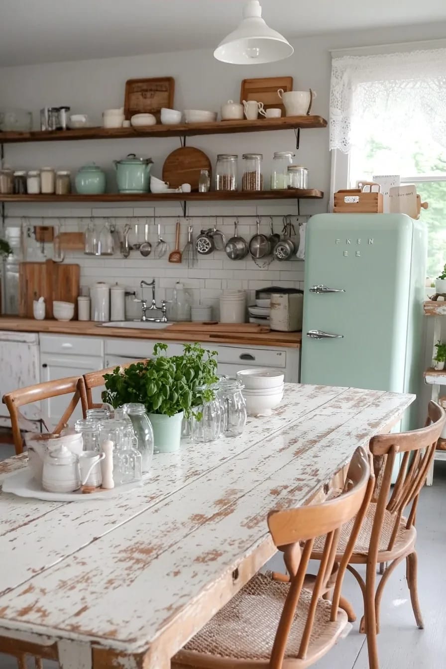
Where the good salvage actually sits
Habitat for Humanity ReStore locations are where whole kitchens go when someone rips one out, and they are priced to move rather than priced by a dealer who knows what a Hoosier is worth. Architectural salvage yards are the opposite: better stock, dealer pricing, and worth it for the one or two items you cannot fake. eBay is where the small metal lives, latches, hinges, icebox catches, escutcheons, usually sold in job lots by people clearing an estate.
Three things repay the hunt more than anything else: a one-piece enamel drainboard sink, original cabinet latches, and a solid wood door with its old hardware still on it. Everything else can be built new and painted.
The two purchases worth a specialist
Restored ranges are the exception to the bargain-hunting logic, and they are not cheap. Shops that publish their inventory list partly restored midcentury units in the high four figures and fully restored showpieces well past that; I could not find consistent pricing across the trade, so treat any quote as a starting point rather than a market rate. What is not optional is the gas work. Retro Stove and Gas Works is blunt that a vintage range without a regulator and a modern flexible supply line needs both fitted before it is used, and that a unit serviced within the last five years is a different proposition from one dragged out of a barn.
Worth reading against your own enthusiasm: The Gold Hive's review of living with a mid-1950s O'Keefe and Merritt lands on no, they would not buy another, partly because the stove does not actually match their 1915 house. That last point is the one people skip. Old is not the same as correct.
3. Checkerboard floors live or die on tile size and the second colour
Twelve inch squares, and the second colour is almost never white. Eight inch squares in a room over about 120 square feet produce a visual buzz that fights everything you put on top of it, while sixteen inch squares in a galley leave you with three tiles across and a floor that reads as a grid rather than a pattern. Twelve is the size that works in most real kitchens.
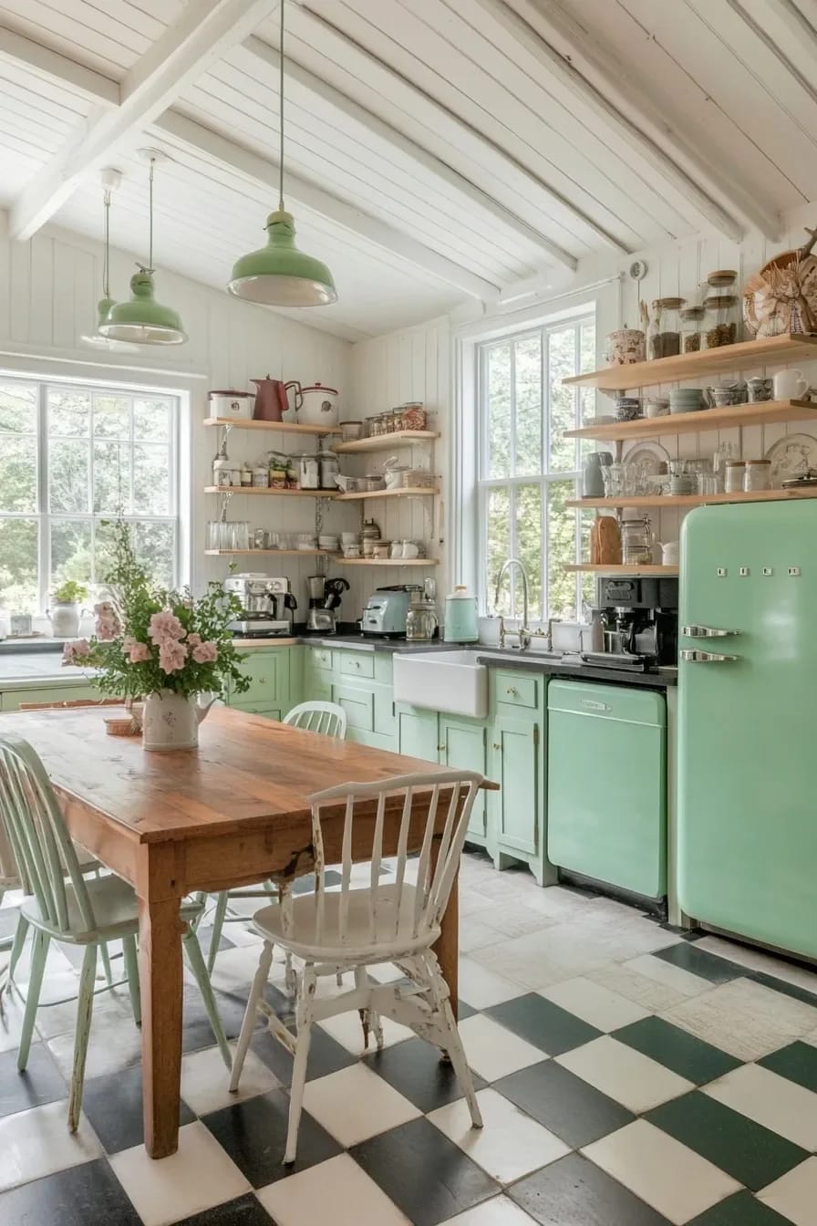
The second colour does the aging
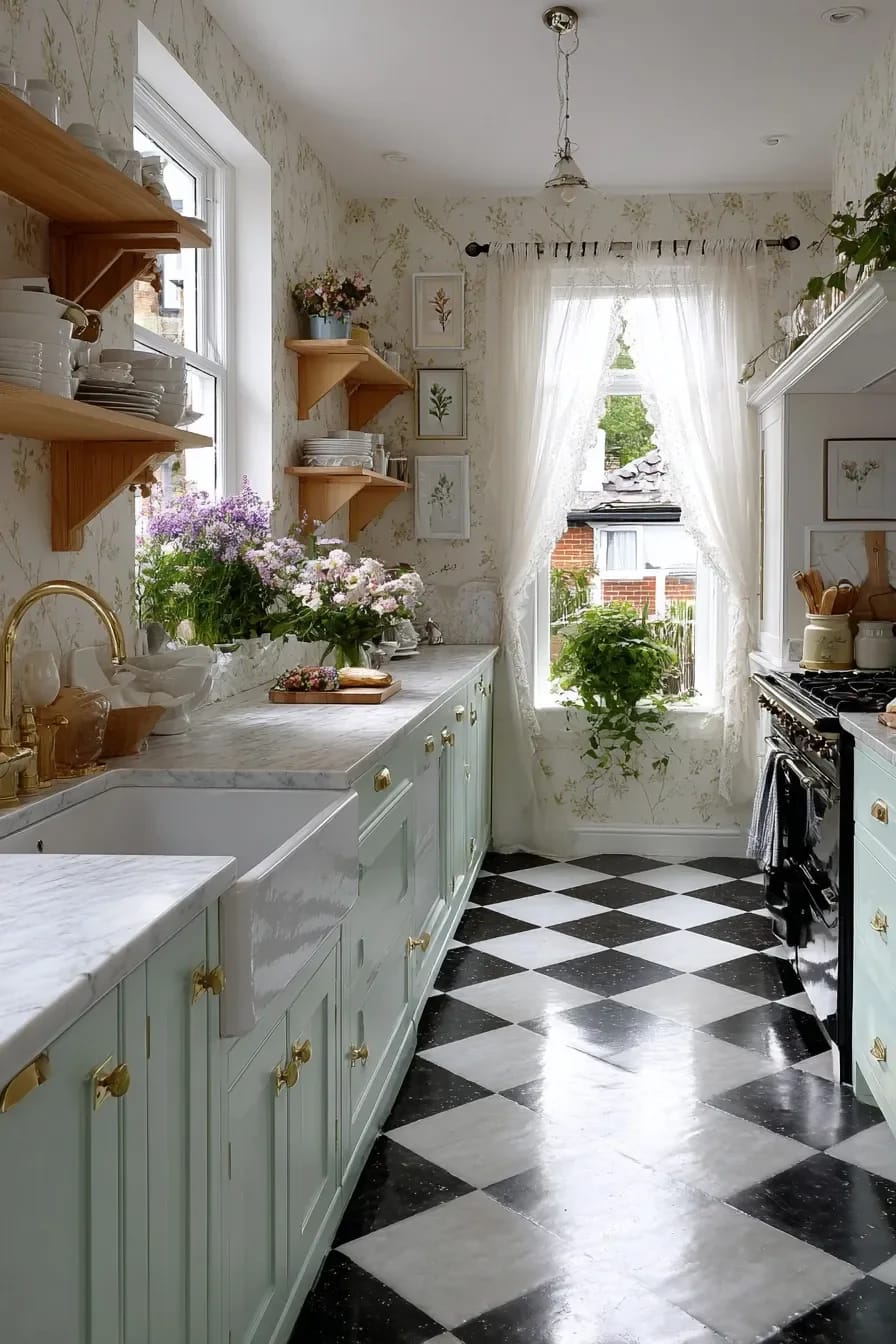
Stark white against black is a 1980s diner reference, not a period one. Older floors ran cream against oxblood, buff against charcoal, pale grey against a deep green, and those pairings sit under warm cabinet colours without shouting. Honed finishes over polished ones, too: polished porcelain near a sink is a fall waiting to happen, and it flashes the overhead light straight back at you.
Do this
- Set the pattern to the sightline from the main doorway, not to the geometric centre of the room. The centre is where the island usually ends up anyway.
- Twelve inch squares as the default.
- Check subfloor deflection before committing to stone; an old joist bay that flexes will crack a marble floor within a season.
- Honed, not polished.
Avoid
- Peel-and-stick vinyl checkerboard. It photographs acceptably and looks like exactly what it is from four feet away.
- Pure white as the light square.
- Running the diagonal in a narrow galley, where it makes the room read shorter.
The wall behind the range is a separate argument and worth settling before the floor goes down, since tile choices tend to drag each other around; there is a fuller run at what to put on the wall behind the range if that decision is still open.
4. The refrigerator is where vintage kitchens usually overspend
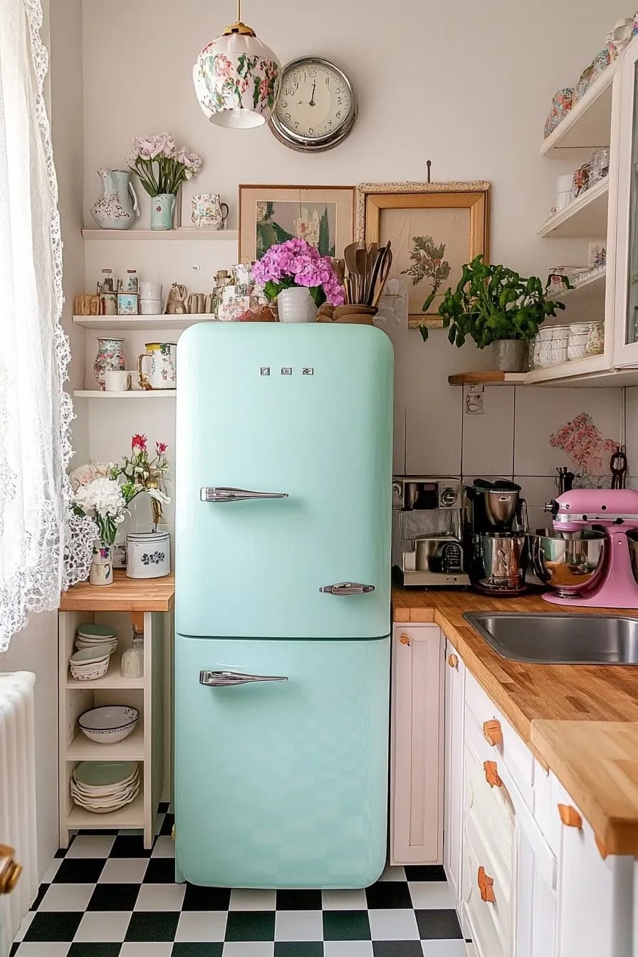
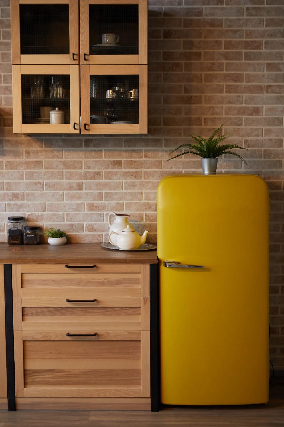
Buy the plain one. This is the call most people dispute, and it holds anyway: a reproduction retro refrigerator is the single most expensive way to make a kitchen look less convincing, because it is a large glossy object with modern proportions wearing a costume, and the eye reads the proportions before it reads the chrome.
What the reproductions cost
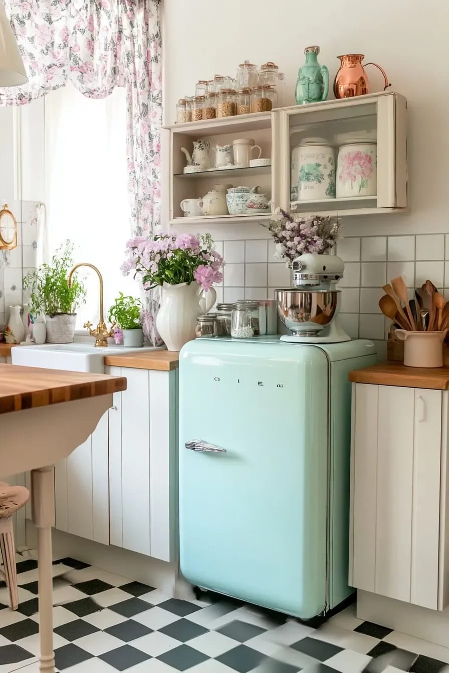
Smeg's FAB28 is the entry point and street pricing has hovered somewhere between roughly $1,700 and $2,700 depending on colour and season, for 24 inches wide and under ten cubic feet total. Big Chill sits higher: its Original Retro model starts around $4,700 and the Classic around $6,400, with $199 to $399 of shipping on top and a warranty of one year on parts and labour, which is short for the money. The Original is Energy Star rated at roughly 436 kWh a year, so running cost is not the objection. Service network is. Both brands have thin repair coverage in most of the country, and a fridge you cannot get a technician for is a fridge you replace.
The unglamorous option that reads older
A plain white top-freezer with a rounded door and no dispenser reads more 1940s than any pastel reproduction, costs a fifth as much, and can be fitted with a period-appropriate handle. Panel-ready is the other route if the budget is there, because a refrigerator hidden behind cabinet fronts removes the anachronism entirely. Worth remembering that pastel appliances are a 1950s phenomenon in the first place; a mint green fridge in a 1930s kitchen is a decade out of place, which is the same error as the four-way mix in the first section. If you want to pressure-test the choice, the argument about which kitchen decisions still look right in ten years applies almost directly here.
5. Unlacquered brass is the correct metal and the wrong purchase for some people
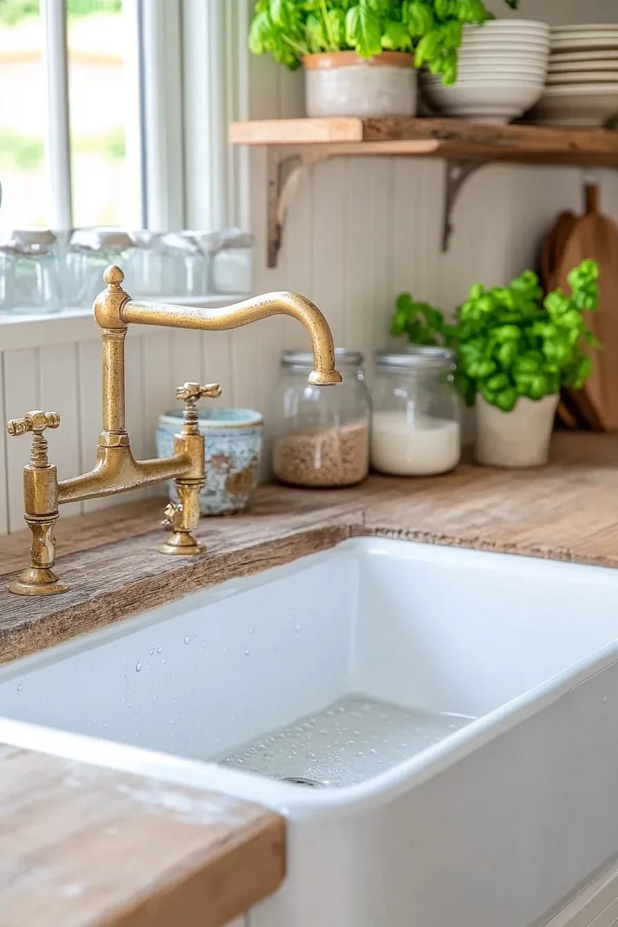
Unlacquered brass is the only common kitchen metal that changes on its own, which is exactly why it belongs in a vintage kitchen and exactly why some people hate owning it. Within a year the faucet will be bright where hands touch it and brown where they do not, and that map of use is the whole point. If you intend to polish it back to uniform gold every month, buy polished nickel instead and save yourself the argument. The broader move from cool metals to warm ones is covered in more detail in the shift from grey and chrome toward warmer neutrals, and vintage kitchens got there first.
Most hardware sold as “antique brass”, “aged brass” or “champagne bronze” is a lacquered or PVD-coated finish, which means it is a colour, not a metal. It will look identical in year ten as in week one, and it will not develop the uneven tone that makes real brass read old. Ask specifically for unlacquered or living finish. Also worth knowing before you commit: in a hard-water house, unlacquered brass around the spout base collects a pale mineral crust that needs wiping rather than polishing, and heavy polishing will strip the patina you paid for.
6. The top third of the room does more period work than the cabinets
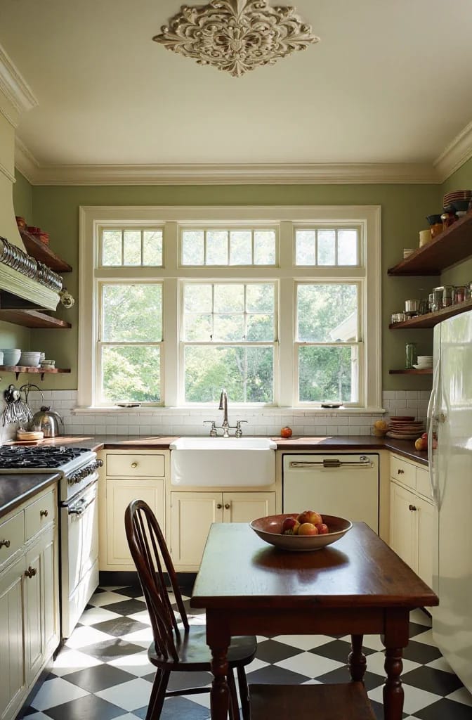
Ceilings and the wall above eye level are where vintage kitchens are won, and almost nobody spends money there. Modern kitchens treat the ceiling as white by default and the upper wall as somewhere to hang cabinets; older kitchens treated both as surfaces, with beadboard overhead, a picture rail at door head height, and colour or paper carrying the top of the room.
Colour above the rail
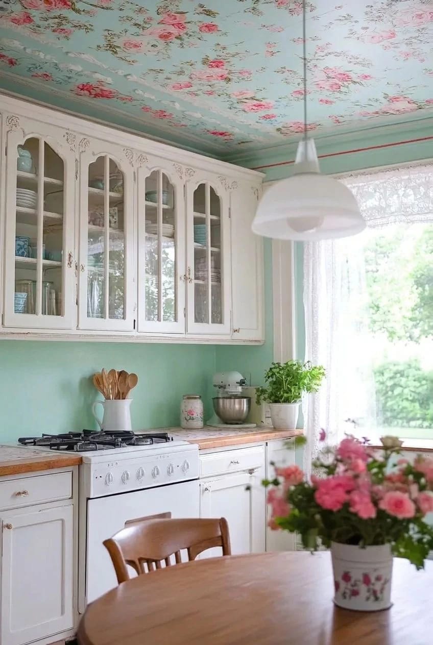
Painting the ceiling a pale version of the wall colour, or a soft butter yellow over cream walls, is the cheapest period move available and it changes how the whole room lights. Two cautions. A dark ceiling in a kitchen under nine feet will close the room; and any colour you choose should be checked for its light reflectance value rather than picked off a chip, since a warm neutral at LRV 58 behaves nothing like the same hue at 38. There is a worked example of that arithmetic in the light reflectance numbers behind the beiges people actually paint.
Put the paper where the grease is not
Floral wallpaper in a kitchen fails when it goes behind the range and succeeds when it goes above the rail, on a breakfast wall, or inside a pantry. Steam and cooking grease will yellow paper within a couple of years in the splash zone, and no sealer really fixes it. Small-scale repeating prints, roses, sprigs, ticking stripes, hold up better at close range than large botanicals, which need distance the average kitchen does not have.
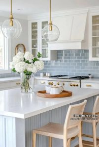 20 Coastal Cottage Kitchens With Worn-In Beach House Feel Twenty rooms where a pale palette and natural texture do the aging instead of the cabinetry.
7. Schoolhouse globes and a sconce over the sink, not a grid of downlights
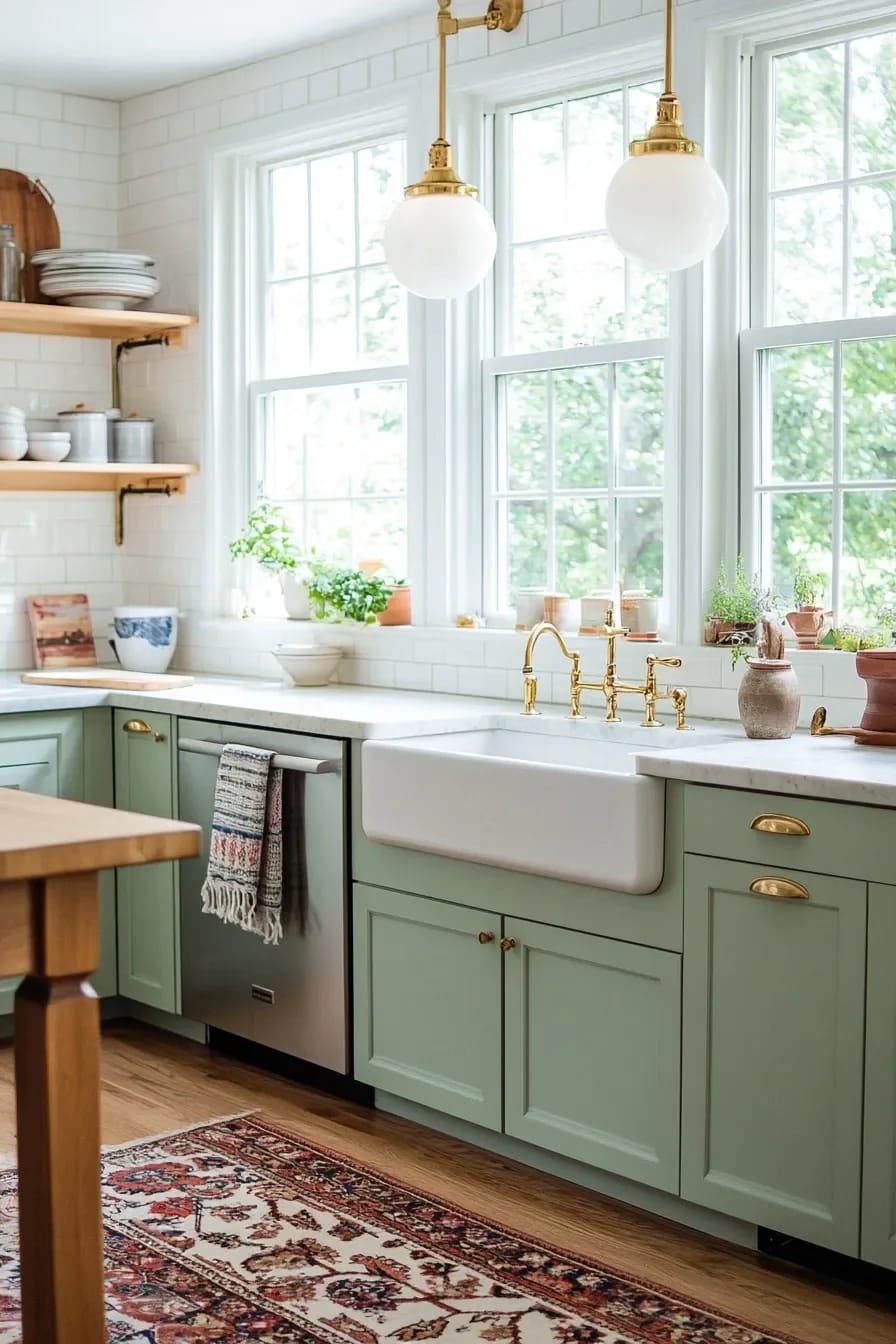
Take out the ceiling grid. Eight recessed cans in a two-metre pattern is the single most modern thing in most attempted vintage kitchens, and it flattens the room in a way that nothing else on this list can undo. Older kitchens lit from three or four discrete points: a central fixture, a sconce or a wall bracket over the sink, sometimes a shaded lamp on a work surface. Reproducing that gives shadow back to the room, which is the quality the downlights removed.
Opal glass schoolhouse shades are the workhorse, in 8, 10 or 12 inch diameters depending on ceiling height. Rejuvenation and Schoolhouse both make genuinely good ones and price them accordingly; the $40 versions on the large marketplaces use thin pressed glass that goes grey-blue when lit, which shows up in photographs immediately. Run everything at 2200K to 2700K and put it all on dimmers, because a period fixture with a 4000K bulb in it reads as a garage.
Relighting a 9 by 12 ft kitchen without touching the ceiling grid
One existing central box, one sink window, 8 ft ceiling, no attic access
The central box takes a 12 inch opal schoolhouse fixture, roughly $180 to $350 from a specialist or $60 to $90 for a decent hardware-store version with a glass swap. A single wall bracket goes above the sink window, wired off the existing switch leg, $120 to $250 plus about two hours of an electrician’s time. Under-cabinet strips at 2700K handle the prep counter, $60 to $140 for the run, and they hide behind a small applied fillet so no diode is visible from a standing position. Total lands somewhere near $500 to $900 including the labour, against the $1,500 and up you would spend cutting six new can housings into a plaster ceiling and patching afterwards. Dimmers on all three circuits are the part people skip and then regret.
8. Glass-front cabinets only earn their keep if the dishes are worth looking at
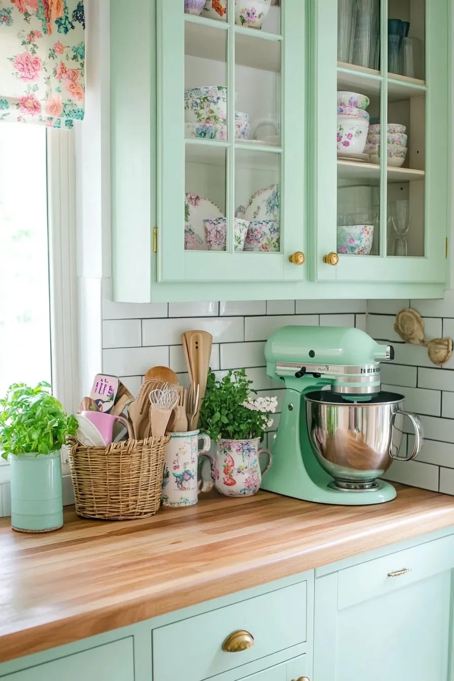
Glazed upper doors are a period-correct detail that turns into a liability the moment they are filled with a matched set of new white plates from a big-box store, because a matched set is the one thing a real old kitchen never contained. What worked historically was accumulation: ironstone in three slightly different whites, a stack of jadeite mugs, patterned transferware inherited from someone and not entirely to your taste. The unevenness is what makes the cupboard look lived in.
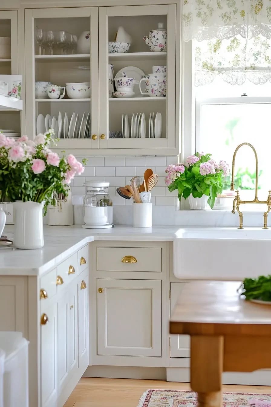
What to collect, and what to leave
Ironstone is the safest starting point, still cheap at estate sales because it is heavy and unfashionable to ship, and the tonal variation between makers does most of the work for you. Jadeite has been collected hard for two decades and priced accordingly, so buy it a piece at a time rather than a set. Pyrex in the printed patterns is fun and very reproduced, so check the backstamp. Leave the commemorative plates, leave anything crazed enough to hold stains, and leave the reproduction enamelware with the deliberately chipped rim, which fools nobody at arm's length.
Only glaze two or three doors, not a whole run. A wall of glass fronts turns every cupboard into a display case and forces you to keep the cereal boxes somewhere else, which is how people end up with a pantry problem they did not have before. If you are still choosing door styles, the wider run through cabinet styles from modern through to classic covers where glazing sits against inset and beadboard fronts. One practical note that decides it for some people: glazed doors want interior lighting to work at night, and a small warm strip inside the cabinet at 2700K costs about $30 a run.
Related Posts
- Modern Kitchen Ideas That Age Well (and the One Already Dating)
- Neutral Kitchen Ideas That Read Warm, Not Builder-Grade
- Timeless Kitchen Ideas That Still Look Right in a Decade
- Retro 1950s Christmas Decorations That Look Collected, Not Costumed
- 45 Timeless Kitchen Design Ideas for Everlasting Style
- 43 Aesthetic Kitchen Ideas to Transform Your Space