
Red and green is the one Christmas palette almost everyone reaches for and almost everyone gets slightly wrong, usually by splitting the two colors down the middle until a room reads like a candy cane. What follows is a room-by-room plan for the whole house, front door to guest bath, that keeps the pairing looking grown-up instead of primary-school.
The order matters more than the pieces. Decide the two exact shades once, in the entryway, then carry them through the house at different volumes so no single room shouts. Everything below assumes real furniture you already own and a budget that does not stretch to repainting a door.

1. Start Red and Green at the Front Door, Not Inside
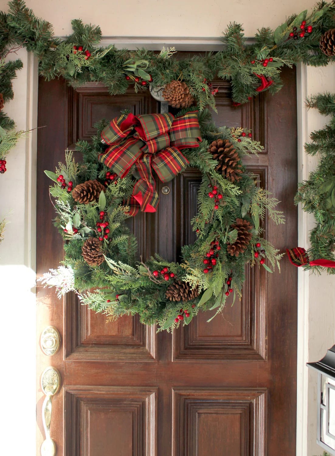
The entry is the one place the pairing can run at full strength, because a guest reads it for ten seconds on the way in and never studies it. Hang a wreath with real depth on the door: mixed noble fir and boxwood for two greens instead of one flat plastic ring, a wide red velvet bow with tails long enough to move in the wind, a few clusters of red winterberry. Flank the step with a pair of dwarf Alberta spruces if you have the cold-hardy space, or galvanized buckets of cut greens if you do not.
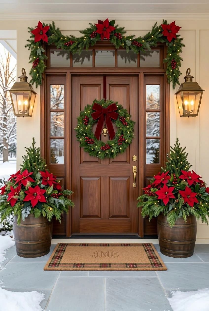
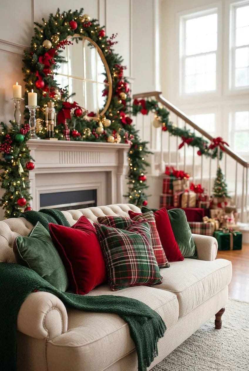
The real trap out here is a door that is already painted red, or a warm brick surround. Piling true red on warm red turns the whole entry muddy and you will not be able to say why the photo looks off. Drop to a single deep green garland and let a brass lantern with a warm bulb carry the heat instead. If you are running strings along the roofline too, the front reads best when the door and the lights share one color temperature rather than competing, which is its own longer question about coordinating the exterior light display zone by zone.
 Traditional Red Front Door Christmas Decorations That Actually Work With the Red If your door is already red, this is the fix for keeping the reds from fighting each other.
2. Let the Entryway Decide Your Whole-House Palette
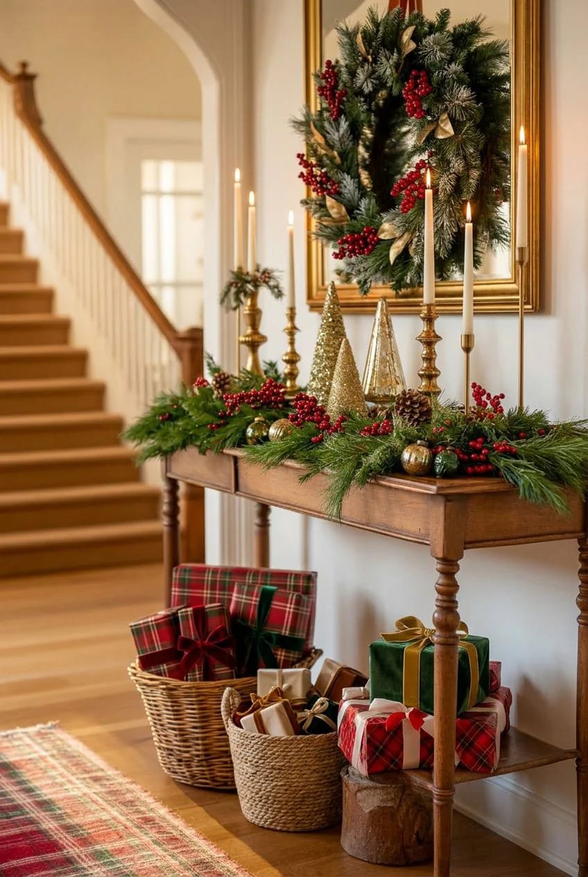
The palette is a decision you make once, at the console table or the bottom of the stairs, and then stop revisiting. Lock the two exact shades here and every later room becomes a matter of turning them up or down.
In any single room, let one of the two colors carry roughly two-thirds of the saturated weight and the other play support, against a mostly neutral backdrop. A living room can lean green through the tree and a wreath while red shows up in only a few cushions; the dining room can flip it. An even fifty-fifty in every room is what reads juvenile.
Pick the green before you pick the red
Choose the green first, because it is the harder color to move once the tree is standing. A deep forest or pine green is the safest anchor for a classic look; it makes almost any red beside it look deliberate. Bright kelly green is the shade that tips into cartoon fastest, so if you love it, keep it to ribbon and small doses. Here is roughly how the greens pair.
| Green | Red to pair with it | What the pairing reads as |
|---|---|---|
| Deep forest / pine | Cranberry, oxblood, or a deep true red | Traditional and grown-up; the safe default for a classic house |
| Emerald | Scarlet with a little gold | Formal, jewel-box; suits a dining room |
| Sage / muted green | Brick, terracotta, dusty red | Soft and farmhouse-leaning, quieter on the eye |
| Kelly / bright green | True red, in small amounts only | Energetic, but tips primary-school fast, so ration it |
None of this is new, incidentally. The pairing predates the Coca-Cola Santa by centuries: the Cambridge conservator Spike Bucklow traced our red-and-green Christmas back to the painted rood screens of medieval churches, which the Victorians rediscovered during restorations and folded into the season. You are decorating inside a very old palette, which is part of why it still feels settled rather than trendy.
There is a whole school of thought that says the opposite, that a house is more interesting when each room runs its own scheme instead of one repeated everywhere. If that sounds more like you, the case for letting every room go its own way is worth reading before you commit to a single palette.
Wrap the banister in one continuous line
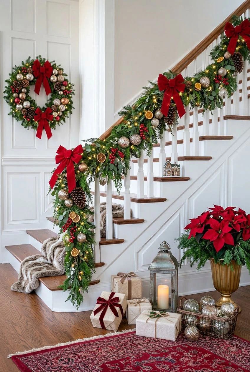
Wind the stair garland as one unbroken line down the banister rather than in cut sections, and thread wide wired ribbon through it in loose loops rather than laying it on top. The wire lets you crush and reopen the loops until they hold a shape; satin ribbon without a wire edge goes limp by the second week. Anchor the whole run at the newel post with the largest bow in the house, then leave it alone.
3. Build the Tree on Three Reds, Not One
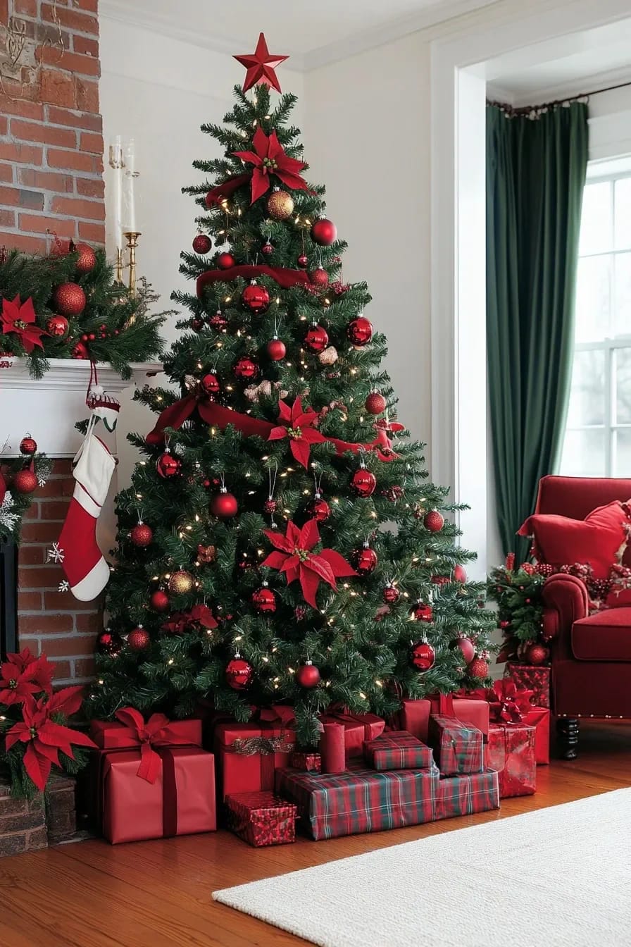
A red-and-green tree looks cheap for one reason above all others: a single primary-red bauble, evenly spaced, over a green tree. The fix is to stop treating red as one color.
Layer three reds so it reads collected
Use three reds of different finish and let them cluster. A matte cranberry, a glossy scarlet, and a brushed or antiqued red read as a collection gathered over years rather than a boxed set bought yesterday. Group them in odd clusters of three and five, tucked at different depths, so the eye picks up texture instead of polka dots.
Do this
- Pick two or three reds in different finishes (matte, gloss, velvet) and cluster them at varied depths.
- Let deep green show between the clusters. The negative space is what makes it read designer.
- Add gold in small amounts as the warm third note.
Avoid
- A single primary-red bauble spaced evenly over the whole tree.
- Tinsel garland. It flattens everything it touches.
- An even split of red and green, which is the candy-cane effect you are trying to dodge.
Ribbon does the work tinsel used to
Wired ribbon, run in vertical cascades from the crown, gives movement without the plastic shimmer. Cut lengths of two to three feet, pinch one end into the branches near the top, and let the tail spill down and outward. Velvet has the nap to catch light; grosgrain is flatter and cheaper and honestly fine on a full tree. If red and green is not the only theme you are weighing this year, there are other ways to build a tree that leave the traditional pairing behind entirely.
Where gold and white earn a place
Gold and white both earn a place, in that order. A little warm gold on a few baubles or the topper keeps the whole thing from going flat, and the Pinterest crowd is right that red, green, and gold is the more forgiving trio. White is riskier: too much and you have drifted into a red-white-and-green flag. Keep it to the odd frosted pick, never a third of the branches.
4. The Mantel Is One Long Line Against a Vertical Anchor
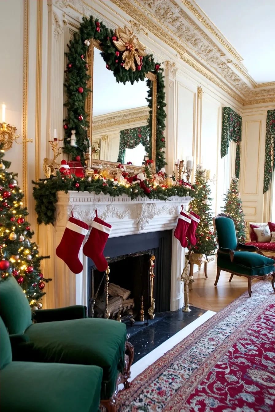
Treat the mantel as one horizontal line you are layering against a vertical anchor (a mirror, a wreath, a piece of art) and most mantel mistakes disappear. The rest is quantity and physics, not taste.
Layer the garland so it has depth
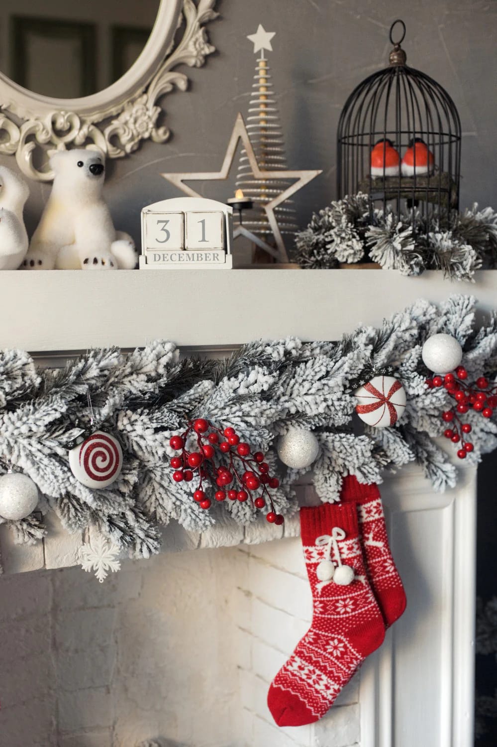
Build the garland in two or three passes rather than one. Lay a base of pine or cedar first, then a second layer of a broader leaf (magnolia, or eucalyptus for a silver-green contrast), then tuck red in last: winterberry, a few matte ornaments wired on, a run of velvet ribbon. A single thin store strand laid flat across the shelf is the tell of a mantel nobody bothered to layer.
A 5-foot mantel, one 9-foot garland
5 ft shelf, 9 ft garland, 3 stockings, candles at three heights
Buy the garland longer than the shelf, not equal to it. A nine-foot garland on a five-foot mantel gives you enough to mound along the top and still drop two tails of eight to ten inches off each end, and that drape is the whole difference between a shelf and a rope. Cluster candles at three heights off-center rather than symmetrically (a pair of tapers, a pillar, a squat votive), space three red stockings along the front, and stop there. The empty stretch to one side is doing as much work as the greenery.
Hang the stockings with real weight
Stockings need weight to hang right; empty velvet ones on thin brass hooks curl and droop within a day. Use heavy holders, or a hidden rod, and stuff the toes with tissue so they hold their line all season. Three or four read intentional. Six crammed edge to edge read like a mudroom. The full breakdown of draping garland so it looks designer rather than draped-on goes further into the layering than there is room for here.
5. Carry Red and Green Into the Living Room With Textiles, Not More Ornaments
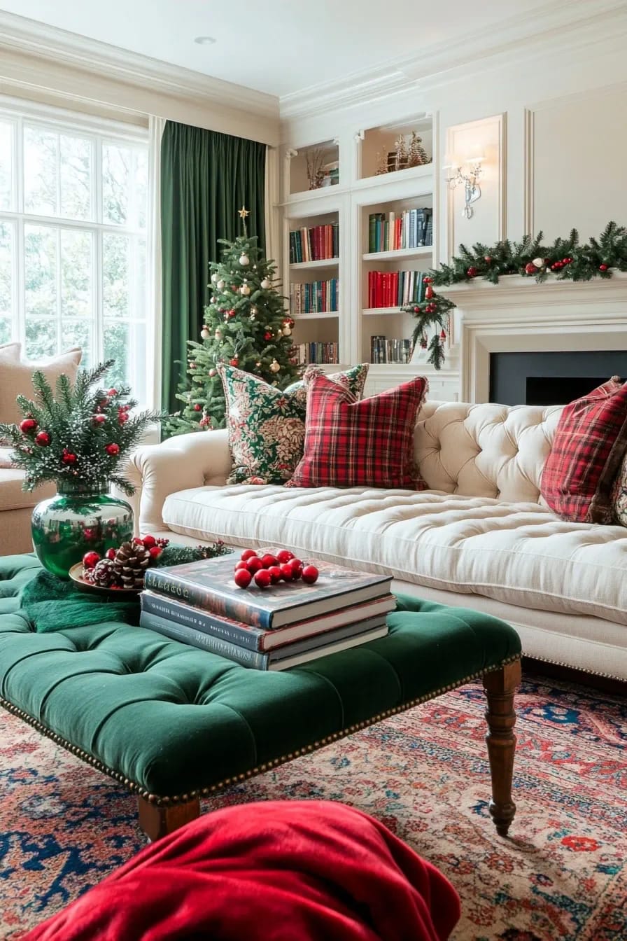
Once the tree is in the room, the living room is mostly decorated, and what is left is textiles rather than more objects. The temptation is to keep adding, and the room goes busy fast. One patterned textile per seat, a solid to break it up, and a lot of restraint. Swapping in a few tartan pillow covers and a velvet cushion is also the single cheapest way to shift a whole room, which is the logic behind most high-impact budget swaps.
Keep the surfaces almost bare against all that pattern: a bowl of red baubles you already own, one candle, done. A tartan runner on the ottoman on top of everything else is usually the one piece too many, so leave it in the box.
6. Set the Dining Table Around One Red-and-Green Anchor
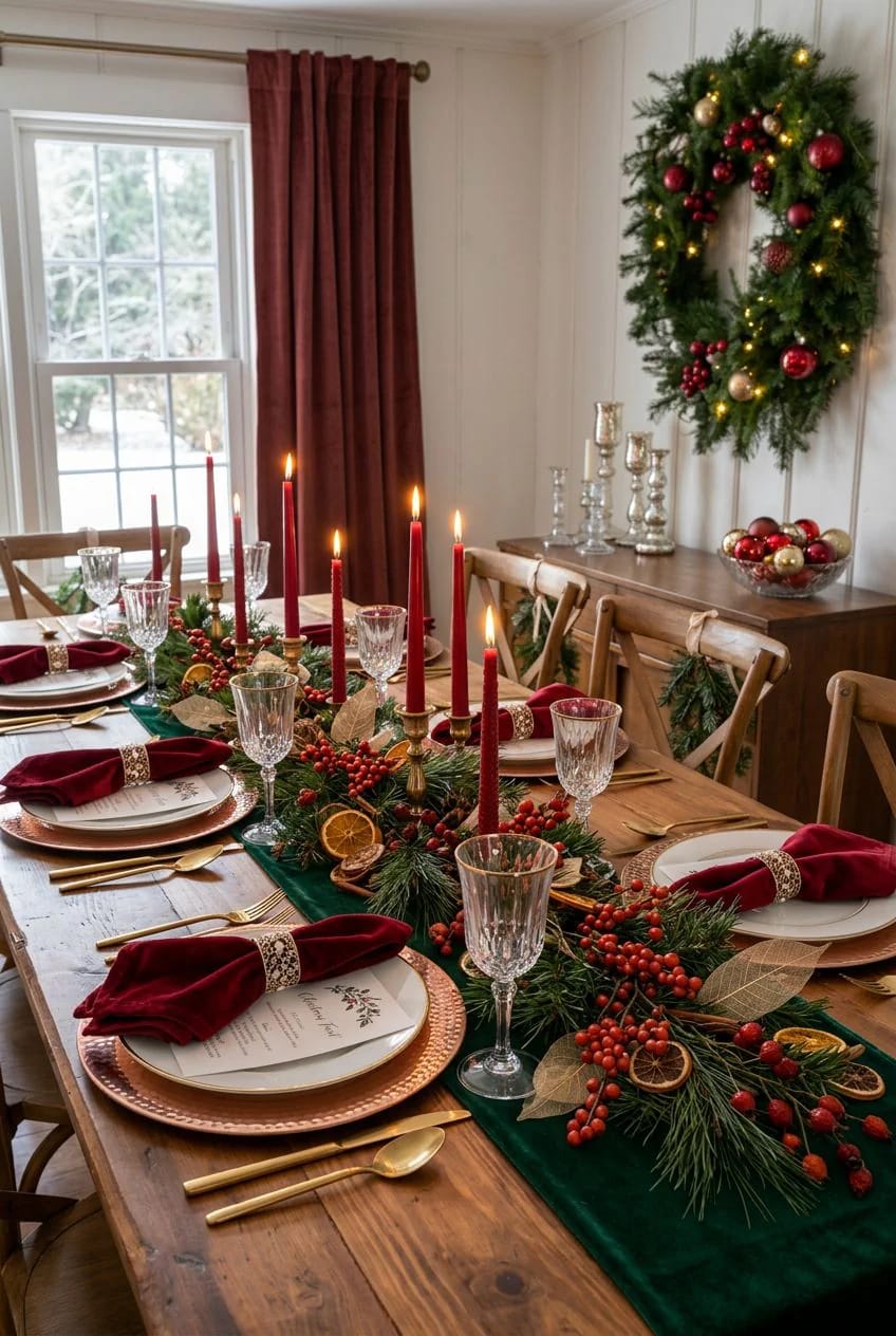
A dining table wants one anchor down the center and almost nothing else, because you are about to cover it with food and elbows. A running line of greenery with red woven through beats a scatter of small props every time. Cloth napkins in red are the cheapest saturated color you can add to a table and the easiest to change out; a stack of ten runs less than a single centerpiece. Skip the trail of mini ornaments down the middle. They end up in the gravy.
7. Kitchen: Small Red-and-Green Touches, Nothing You Have to Store
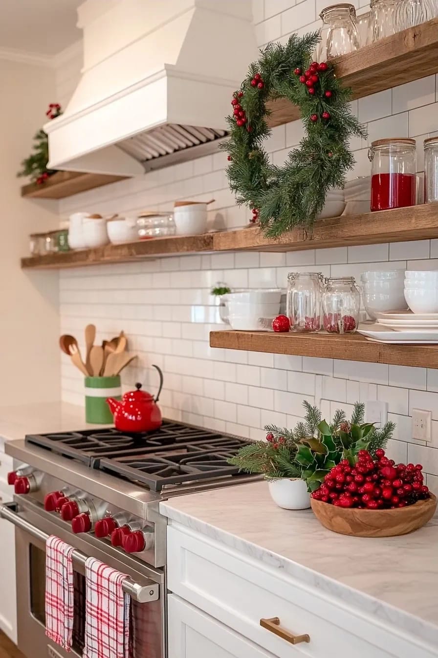
The kitchen takes the least, because it is a working room and anything permanent gets in the way. Two red-and-green tea towels and a short garland over the window is the whole assignment. Add a white bowl of red baubles you already own and a pot of rosemary for a live green if you want, but keep it off the counters you actually cook on. Everything else is in the way by the second time you make dinner.
8. Keep the Bedrooms and Powder Room Quiet
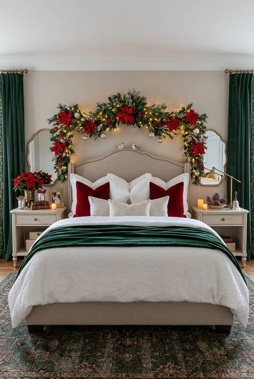
The rooms you sleep in want the least red and green in the house, one small note each, because saturated color reads loud in a small quiet space. A single tartan throw folded at the foot of the bed and one small wreath over the nightstand is plenty; a fully decorated bedroom fights the point of the room.
The powder room is even simpler: swap the hand towels for red or tartan ones and set one short candle on the vanity. Guests are in there for ninety seconds, and that is exactly how much decorating it needs.
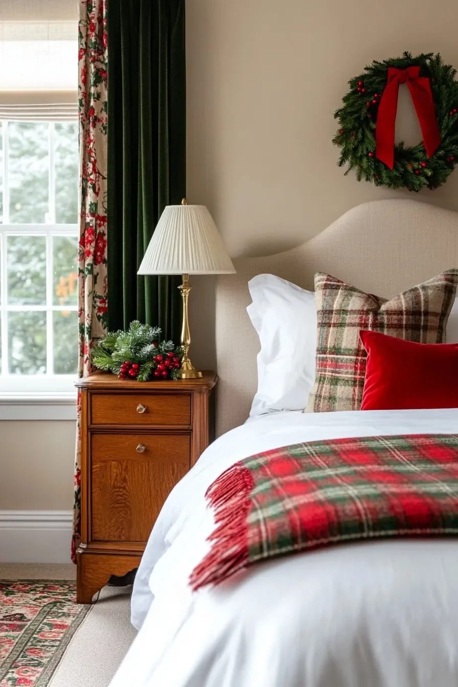
Done in order, the entryway palette decision is the only genuinely hard part; once the forest green and the cranberry are locked, the tree, the mantel, and the living room are the same pair at different volumes, and the kitchen and bedrooms are nearly afterthoughts. The one thing I would not rush is the tree, so save it for last, on a clear evening after the small rooms are already handled and you are not yet tired of clustering ornaments.
Related Posts
- Outdoor Christmas Light Display Ideas for the Whole House
- 21 Best Red and White Christmas Decor Ideas 2024
- 12 Whimsical Christmas Decor Ideas to Run Through the Whole House
- Traditional Red Front Door Christmas Decorations That Actually Work With the Red
- Farmhouse Christmas Decor: 12 Ideas That Skip the Red-and-Green Cliché
- 21 Budget Christmas Decor Ideas to Elevate Your Holiday Home