
Walk into a kitchen remodeled in 2016 and the neutral you find is grey: greige over charcoal, cool marble, brushed nickel. Walk into one finished this year and it is warm instead, white oak and cream and putty, with brass doing the work the chrome used to do. That swing from cool to warm is the whole story of the current neutral kitchen, and it is the reason a room that was supposed to be safe forever started looking dated in under a decade. The thirteen moves below are how the warm version is being built now, from the cabinet color down to the one dark thing you add on purpose so the whole scheme does not go flat.
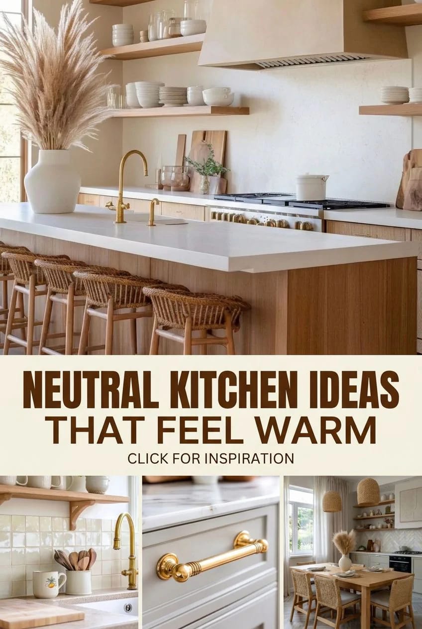
Skip the all-white kitchen and layer three warm neutrals

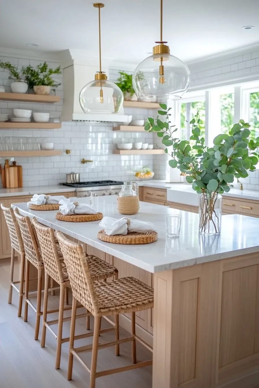
A neutral kitchen needs at least three tones or it flattens into one beige blur. Think cream on the perimeter cabinets, a warmer greige on the island, and natural oak on the floor or the shelves, so the eye reads layers instead of a paint-by-numbers scheme. The all-white kitchen is the version everybody defaults to, and it photographs well, but in person a single value bouncing off every surface feels more like a rental than a room somebody designed.
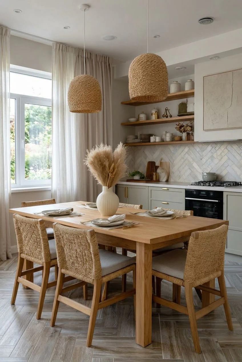
The trick is to keep the tones close. These are neighbors on the warm side of the fan deck, not a high-contrast palette. If you want the reasoning on why plain beige so often lands as builder-grade and how to dodge it, that argument sits at the center of these beige kitchen ideas that avoid the builder-grade look, and it applies to any warm neutral you pick.
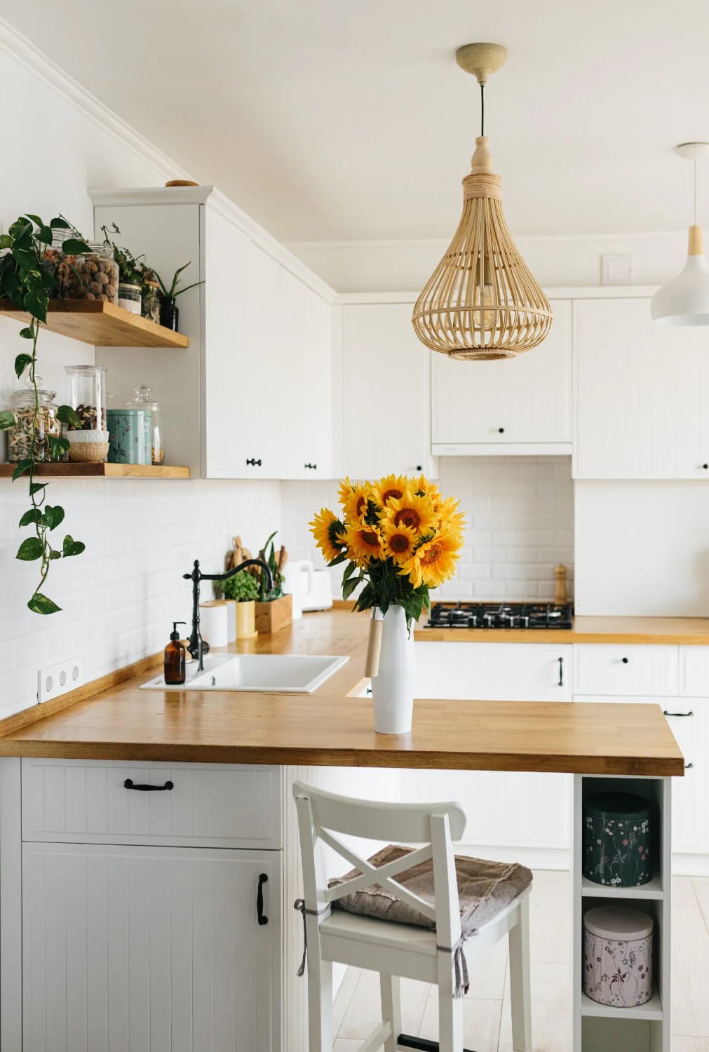
Choose warm white oak over grey-washed cabinets
White oak is the wood carrying the whole warm-neutral moment, and rift-sawn is the cut to ask for because its straight, quiet grain reads calm rather than busy. Grey-washed and limed oak were the 2015 answer to the same question, and they aged into that cold, driftwood look nobody wants to commit to again. Natural oak with a matte, almost raw finish does the opposite: it warms as the light warms.

One caution on cost: real rift-sawn oak doors run well above painted MDF, sometimes double, so if the budget is tight, put the oak where hands and eyes land (the island, a bank of drawers, open shelving) and paint the rest. If your instinct is actually pulling toward a browner, richer wood, that reads more mid-century than warm-neutral, and it lives in these mid-century modern kitchen ideas instead.

Put fluted oak on the island or the range hood

Fluting is how you get texture into a neutral kitchen without adding a single new color. Those vertical reeded grooves on an island front or a hood surround throw a fine rhythm of light and shadow, so a plain oak box stops reading as flat cabinetry and starts reading as a made object. It is the detail doing the most work for the least money in the current crop of kitchens.

Keep it to one element. Fluted island, fluted hood, or a fluted lower band, but not all three at once, or the room starts to look like a speaker grille.
Cream cabinets read softer than stark white
Cream and warm off-white are quietly replacing bright white on cabinets, and the difference is most obvious at the trim line, where a true white next to natural wood can look slightly clinical. A warm off-white like Sherwin-Williams Shoji White (SW 7042), which sits around an LRV of 74, has enough depth and a faint grey-green undertone that it reads as a considered color rather than a default. On cabinets it looks like linen; a stark white can look like appliance enamel.

 45 Timeless Kitchen Design Ideas for Everlasting Style The cabinet, counter and layout choices that still look considered a decade later.
Color-drench the room in one warm neutral
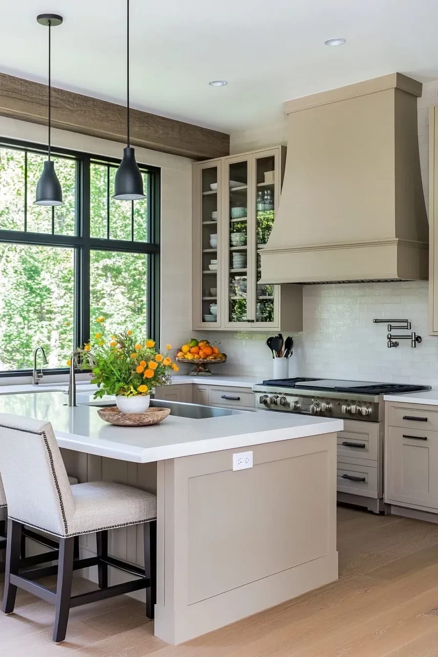
Color-drenching means taking one warm neutral and running it across the walls, cabinets, trim, and ceiling so the room reads as a single enveloping shade with no hard breaks. It sounds like it should feel oppressive. It does the reverse: with no trim contrast chopping the walls into pieces, a small kitchen reads calmer and, oddly, larger. Benjamin Moore White Dove (OC-17, LRV about 85) is the color people reach for here precisely because its warm cream undertone holds up on cabinets, trim, and ceiling without going yellow in any one spot.
Granted, this only works if you shift the sheen. Matte or eggshell on the walls, satin on the cabinets, semi-gloss on the trim, same color throughout. The finishes do the delineating your eye expects, so nothing looks like a mistake, and the range hood or a plaster niche can stay the same tone and simply catch light differently. Where I would stop is the floor. Drenching the floor in the wall color too tips the whole thing from designed into padded cell.
Honed stone counters beat polished in a neutral kitchen
Go honed, not polished, if you want the counter to read warm. A polished slab throws back hard highlights and a slightly cool glare; a honed or leathered finish absorbs light, so the same marble or quartzite looks soft and matte, which is the entire point of a warm neutral scheme. The catch worth knowing up front: honed marble shows etching from anything acidic (lemon, wine, vinegar) more readily than polished, because there is no reflective sheen to hide the dull mark.

If a lived-in patina is not your thing, a honed quartzite (Taj Mahal and Mont Blanc are the usual warm, creamy ones) gives you the same soft look with far more stain resistance than marble. Skip honed pure-white quartz, though. Some brands leave it faintly porous and it grabs coffee rings in a way polished never does.
Break up the calm with a handmade zellige backsplash

Zellige is the handmade Moroccan tile whose whole appeal is imperfection: each little square is glazed and fired by hand, so the color pools and shifts and the surface ripples, catching light no flat machine tile can. In a warm neutral kitchen where everything else is smooth and quiet, that irregular glazed surface is the one place the eye gets to rest on something alive. A warm off-white or soft putty zellige keeps it in the neutral family while still reading as texture.
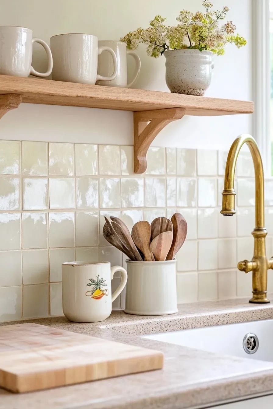
Know what you are buying, though. True zellige is uneven by nature, lippage and variation come standard, and a tile setter who wants everything laser-flat will either fight you or talk you into a machine-made lookalike that misses the point entirely. Budget version: ceramic tiles sold as zellige-style cost a fraction and read fine from a step back, they just lose the depth up close.
Warm metals over chrome, and skip the lacquer
Brass, aged bronze, and warm nickel have pushed chrome and cool stainless out of the neutral kitchen, and the reason is simple: a warm metal reinforces a warm palette, while chrome fights it with a blue-grey glint. The move most people miss is to skip the shiny lacquered brass and go unlacquered (living finish), which starts bright and slowly darkens where hands touch it. Yes, it patinas unevenly. That is the feature you are paying for.
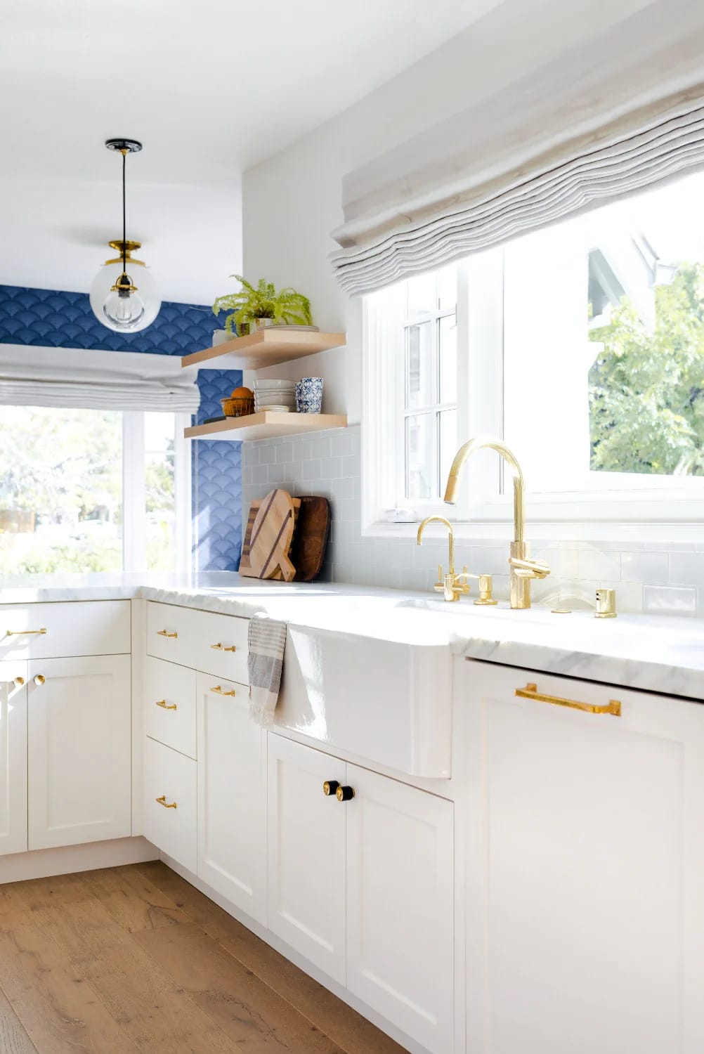
If a darkening, changing finish makes you nervous, buy one unlacquered pull and live with it for a month before you order twenty. Mixing metals is fine, warm with warm, but two is the ceiling. Brass hardware and an aged-bronze faucet reads collected; brass, bronze, nickel, and black together reads like you could not decide.
A limewash or plaster hood adds texture without color

A plastered or limewashed range hood is how you build a focal point out of texture instead of color. Limewash and Roman clay leave a soft, cloudy, matte surface with faint brush movement, so a simple tapered hood becomes the most tactile thing in the room while staying dead neutral. It is the antidote to the stainless chimney hood, which always reads as an appliance rather than architecture.
The finish is DIY-friendly (limewash is a brush job over primer), but the hood form underneath still needs building, so this is a carpentry cost, not just a paint one. West-facing kitchens are where it shines, because low evening sun rakes across the texture and lights up every ripple.
 15 Organic Modern Kitchen Inspiration You’ll Love Where warm neutrals meet clean lines, earthy stone and a little more sculptural shape.
Arched cabinets and plaster niches soften the hard lines
An arch is the fastest way to take the boxiness out of a neutral kitchen. Arched glass upper cabinets, a curved plaster niche over the range, or a softly radiused end panel introduces one continuous curve into a room that is otherwise all right angles, and the eye reads it as calmer even when nothing else changed. Arched glass fronts also let you show off stacked cream dishware, which keeps the palette going up the wall.

Use it once. A single arched moment lands; arched cabinets plus an arched niche plus an arched doorway plus an arched window starts to feel like a theme park.
Run a stone slab backsplash to the ceiling

Carry the counter stone straight up the wall to the ceiling and you get the single most expensive-looking move in a neutral kitchen for, weirdly, not always the most money. One continuous slab of veined marble or quartzite behind the range, no grout lines to interrupt it, turns the backsplash into the whole show, and the veining doubles as the room's only pattern. Skip the upper cabinets on that wall so the slab reads floor to ceiling.

The cost lives in fabrication and the size of the slab, not the surface area alone, so an unusually tall wall or a book-matched seam is where the number climbs. On a budget, a large-format porcelain that mimics the stone gets you most of the effect with far fewer seams.
Light the kitchen with warm bulbs, not daylight LEDs
Put 2700K bulbs in and half the battle is won before you touch a single finish. Color temperature is the thing that quietly wrecks neutral kitchens: a warm oak-and-cream scheme lit by 4000K or 5000K daylight LEDs goes cold and grey the second the sun drops, undoing every warm choice you made. Stick to 2700K (some go to 3000K) across every source and the palette holds its warmth after dark.

Then layer it: a couple of pendants over the island, under-cabinet strips on the counter, maybe a small lamp at the end of the run, all dimmable, so the kitchen has an evening setting and not just a floodlit work mode. A single 4000K can light blasting from the ceiling is the fastest way to make a warm kitchen look like a break room, so this is worth getting right alongside the rest of the kitchen decor and styling details.
| Room exposure | Undertone that holds up | Warm neutral to sample | What to watch |
|---|---|---|---|
| North-facing | Warm greige or cream, nothing grey-based | Benjamin Moore White Dove (OC-17, LRV about 85) | Grey-heavy neutrals turn flat and cold |
| South-facing | A softer off-white can take the strong light | Sherwin-Williams Shoji White (SW 7042, LRV about 74) | Very bright whites glare at midday |
| East-facing | Balanced greige that shifts gracefully | Sherwin-Williams Agreeable Gray (SW 7029) | Reads cooler by evening |
| West-facing | Mid-tone greige, watch the yellow | Benjamin Moore Revere Pewter (HC-172) | Evening sun pushes it amber |
The scheme collapses when every element is matched to the same flat mid-beige: beige cabinets, beige counter, beige floor, beige backsplash, all at one value. With nothing lighter or darker to push against, the room reads as a showroom nobody chose, which is the exact builder-grade look people are trying to leave. Vary the value, not just the hue. Keep the cabinets a step off the walls, let the counter go lighter or the floor go deeper, and the same palette has depth.
One dark anchor keeps a neutral kitchen from going flat
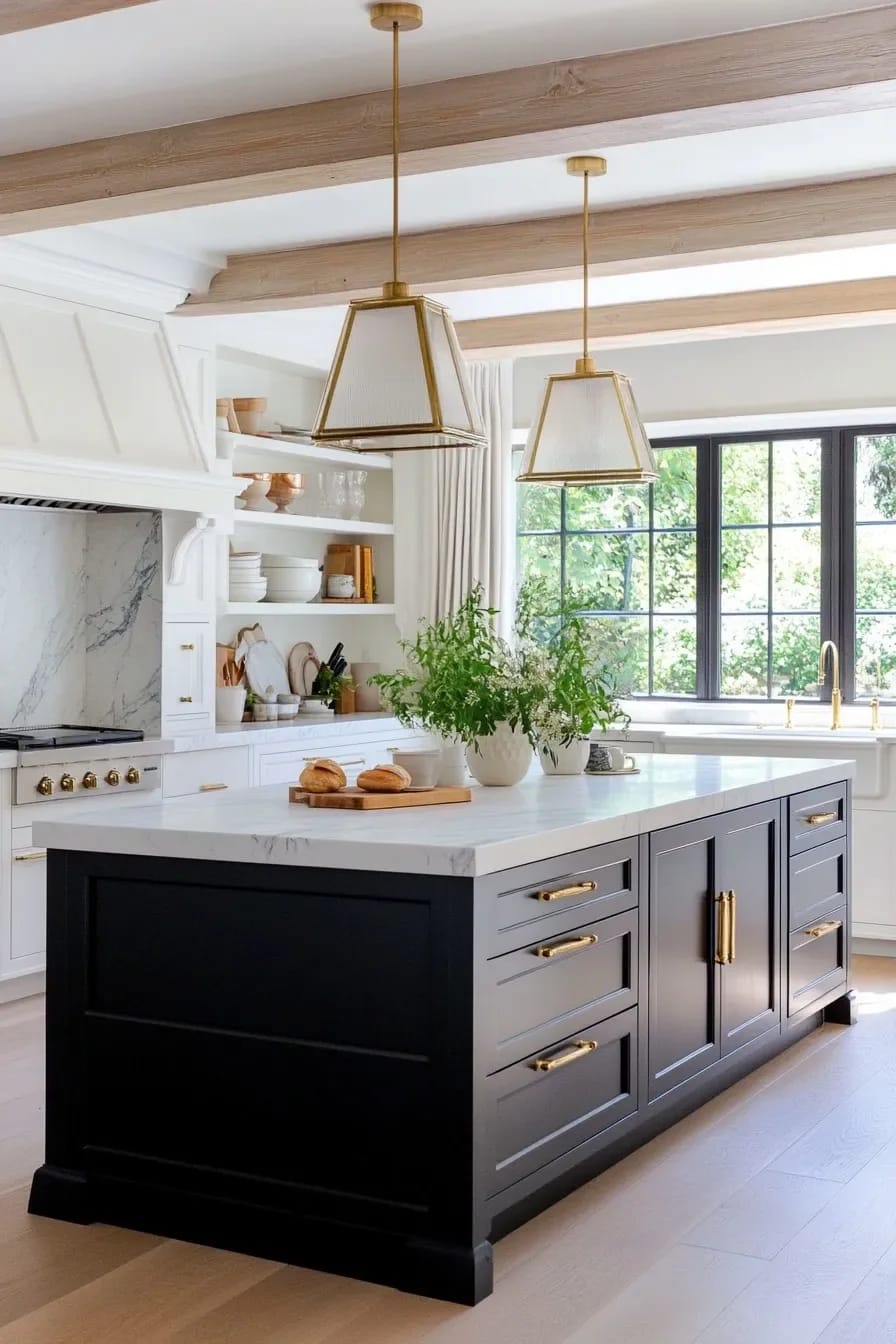
Give a neutral kitchen one dark thing on purpose and the whole pale scheme snaps into focus. Without a single deeper note, warm neutrals blur together and the room reads soft to the point of shapeless; add one anchor and suddenly the eye has somewhere to land and the light tones have something to be light against. The trick is restraint, one anchor, not a scattering of black accents.
The usual candidates: matte black steel window frames over the sink, a single aged-oak beam, soapstone on one counter run, or a near-black island against cream perimeter cabinets. A black backsplash is another way to do it if the rest of the room stays pale, and there are quieter and louder versions of that in these black backsplash ideas. What does not work is peppering black hardware, black faucet, black pendants, black stools, and black frames all around the room, which just drags the whole thing grey again and undoes the warmth you built.
Do this
- Sample paint on the actual cabinet doors, then look at it at night under your own bulbs.
- Let one material lead (oak, marble, or plaster) and keep the rest quiet.
- Commit to one warm metal across the room.
- Leave a little contrast so the eye has somewhere to land.
Avoid
- Matching the backsplash, counter, and cabinets to one identical tone.
- Trusting a paint chip under showroom lighting.
- Three different wood tones, hoping they read as layered. They read as mismatched.
- Going fully monochrome and calling it minimal.
If you are doing this in order, settle the palette and the counter first. Everything after, the backsplash, the metals, the hood, keys off those two, and it is far cheaper to move a paint sample around the room for a week than to recut a slab you have already installed.
The one place I would not economize is the counter and the oak, because those are the surfaces reading as warm or cool from clear across the room. A brass pull you regret is a twenty-minute swap. A greige quartzite you chose under fluorescent showroom light, and only saw properly at home in the evening, is not.
Related Posts
- 11 Beige Kitchen Ideas That Don’t Read Builder-Grade
- Japandi Kitchen Ideas: 10 Design Decisions That Keep It Warm, Not Clinical
- 43 Aesthetic Kitchen Ideas to Transform Your Space
- 11 Cozy Neutral Christmas Living Room Decor Ideas That Stay Warm Without the Red and Green
- 39 Trendy Blue Kitchen Cabinet Ideas: with Cool, Sophisticated Vibes
- 33 Modern Farmhouse Kitchen Ideas: Blending Rustic Charm with Contemporary Design