
Most advice on elegant kitchens reads like a shopping list: marble, a big island, brass everywhere, a range that costs as much as a car. That is a description of an expensive kitchen, not an elegant one. The kitchens that hold up are the ones where fewer materials are asked to do more work and where the joins between them are actually resolved, which is a design problem before it is a budget problem.
Eleven decisions follow, some of them cheap. Two of them are arguments against things you have probably already pinned.
1. Run the stone up the wall: the full-height slab backsplash
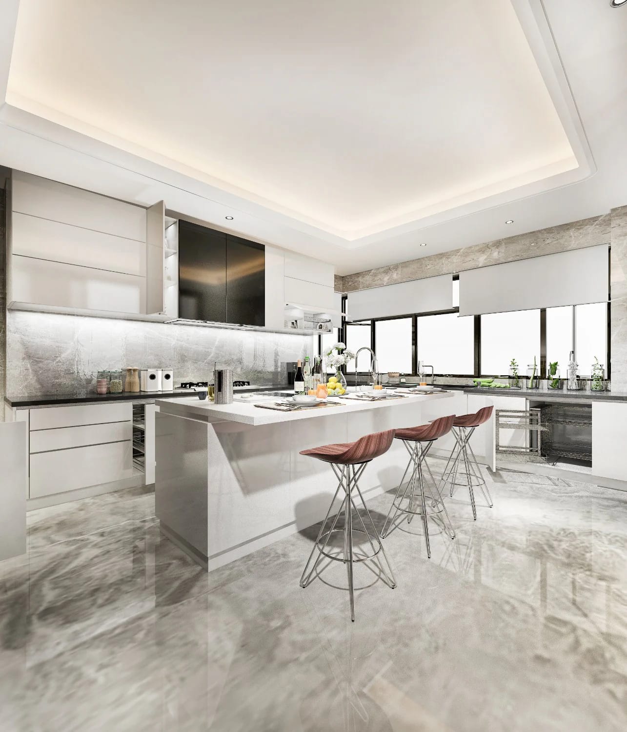
If you can only afford one gesture, make it this one. Continuing the countertop material up the wall removes twenty feet of grout line, removes the horizontal band of tile that dates a kitchen faster than anything else, and turns the run behind the range into the single thing your eye lands on. It has stopped being a niche move: the 2026 U.S. Houzz Kitchen Trends Study puts slab backsplashes at 28% of backsplashes in renovated kitchens, which is a lot of company for something that was custom-only a decade ago.
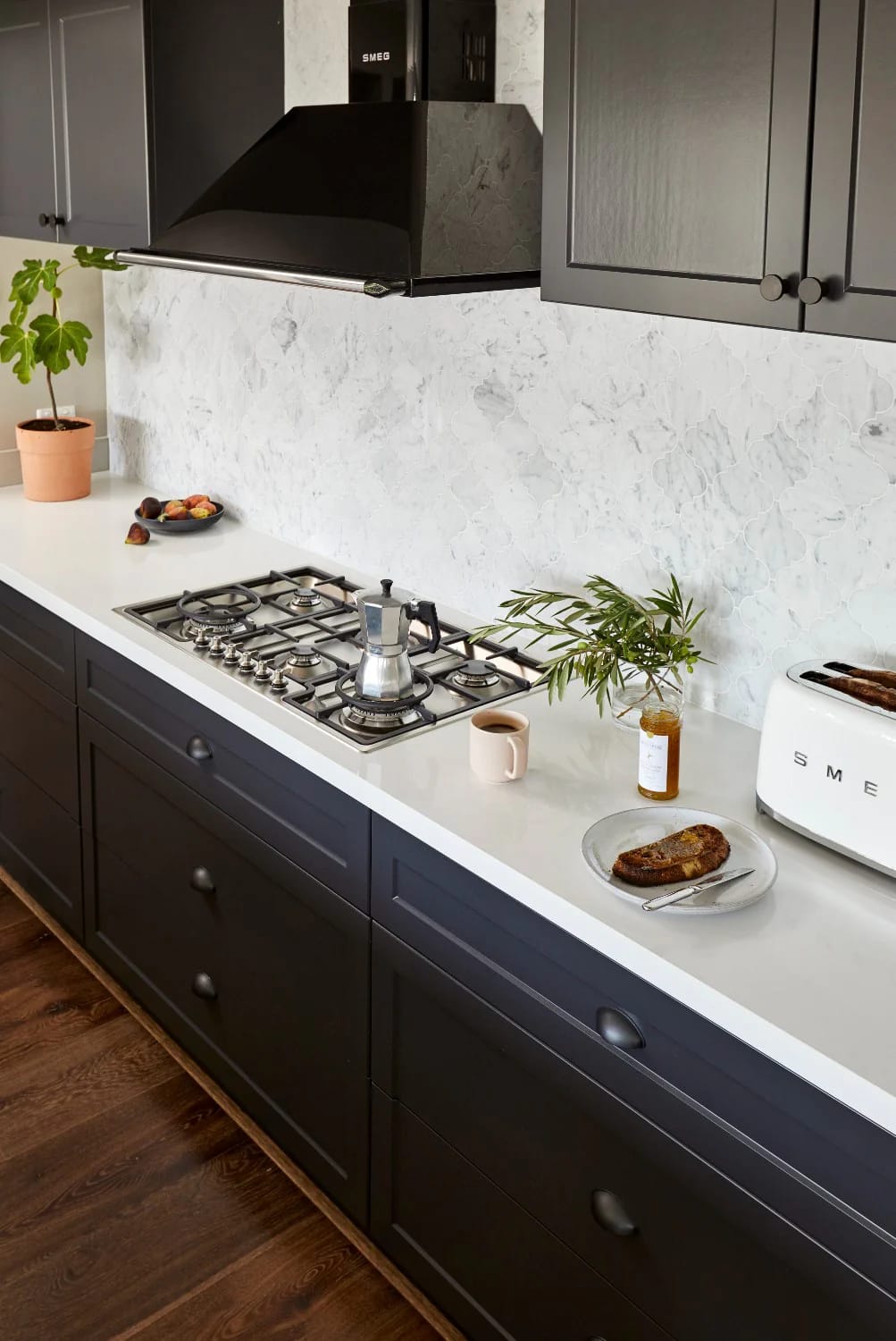
The catch is that the second slab is a second slab. Budget for the stone bill to roughly double if you go full height behind the range and the sink, and ask the fabricator to dry-lay the pieces in the shop so you can see where the vein lands before anything is cut. Book-matching the seam directly behind the burners is the detail that separates a slab backsplash from a big piece of stone stuck to a wall; if the fabricator will not commit to it, choose a quieter stone. Quartzite is the usual compromise for anyone who cooks with lemon and wine, and it is worth reading the case for veined quartzite as a working countertop rather than a display one before you fall for a soft Italian marble in a showroom.
| Material | Acid etching | Behind a working range | Relative cost |
|---|---|---|---|
| Marble | Etches from lemon, wine, tomato | Fine with heat, marks with use | Mid to high |
| Quartzite | Does not etch | Very hard, harder to fabricate | High |
| Engineered quartz | Does not etch | Resin can discolor near sustained heat | Mid |
| Porcelain slab | Does not etch | Heat and stain resistant, thin edge profile | Mid to high |
2. Unlacquered brass, and the patina you have to agree to in advance
Unlacquered brass is the warm metal worth specifying, and it is also the one people return. It has no protective coating, so it darkens unevenly wherever hands land: the faucet lever goes chocolate within months while the spout stays bright, and the pull on the trash pullout ages three times faster than the one on the plate cabinet. That unevenness is the finish doing what it does. If you want a metal that looks identical in year five, buy polished nickel and stop reading this section.
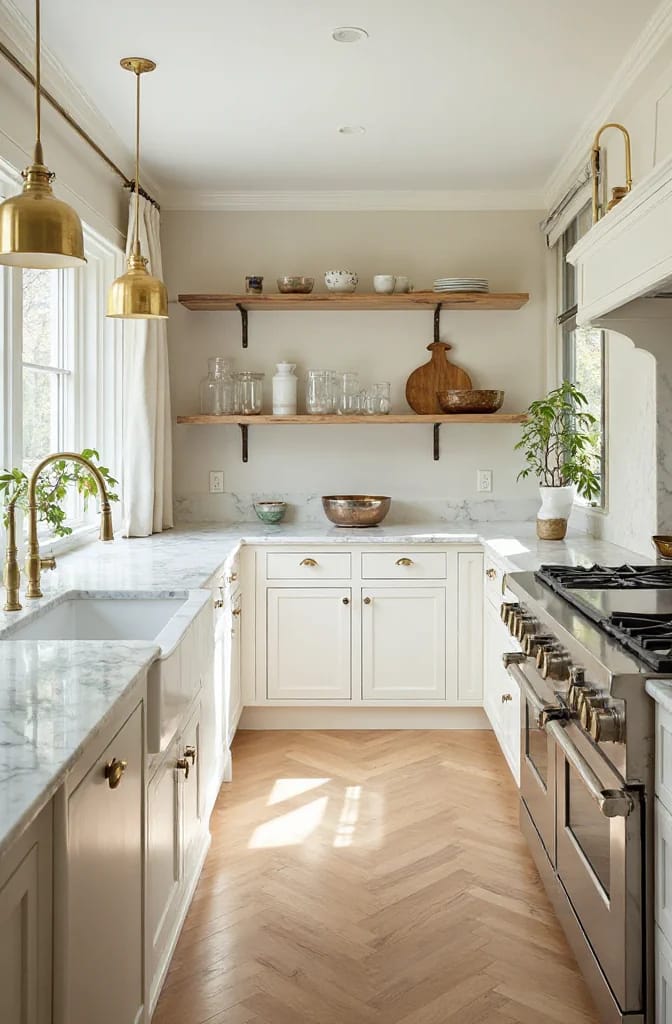
Two practical rules. Never mix unlacquered and lacquered brass in the same sightline, because they start identical and diverge within a year, at which point one of them looks dirty. And buy solid, not plated: a plated pull wears through at the thumb and shows white metal underneath, which no amount of patina explains away. Expect roughly $15 to $40 per pull for solid unlacquered stock and considerably more for a faucet. Meanwhile matte black, which has been the default for most of a decade, is the finish designers now name when asked what feels outdated, with polished nickel and satin or unlacquered brass suggested in its place.
3. Putty and bone beat bright white on elegant kitchen cabinets
Bright white cabinetry is the reason so many recent kitchens read cold in person and fine in photos. Camera sensors flatter it; north light does not. Move one step off pure white into bone, chalk, putty or mushroom and the room warms without becoming a color decision, and the stone stops looking blue by comparison.
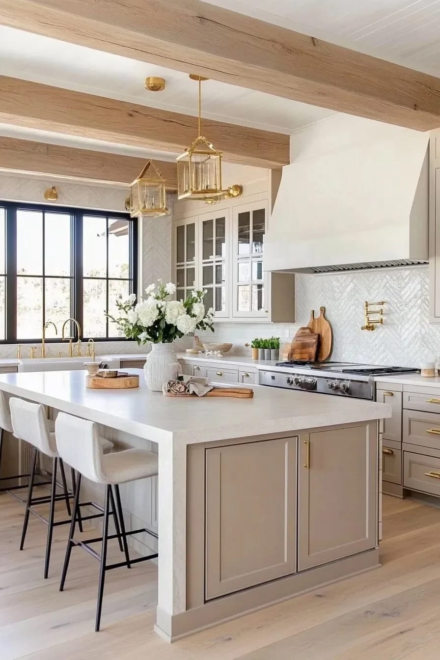
Benjamin Moore White Dove and Farrow & Ball Shaded White are the two most-used versions of this for a reason, and both look nothing like the chip once they are sprayed onto a large door and hung in a room with a green lawn outside. Get a door sample sprayed in the real finish, stand it up against the cabinet run at four in the afternoon, and look at it next to your stone rather than next to the wall. If you want the warm-neutral version pushed further, the case for a genuinely beige kitchen, and how to keep it off builder-grade covers where that palette breaks down.
4. The waterfall island is the new granite bullnose
I would talk most people out of it. A mitred waterfall works only when the vein runs continuously around the corner and down the leg, which requires a fabricator who will cut the two pieces from adjacent parts of one slab and a designer who checked before the template was cut. When that does not happen, and it usually does not, you get a dramatic vein that stops dead at the top corner and a plain grey panel below it, which is a large and permanent way to announce that the stone was chosen from a photograph.
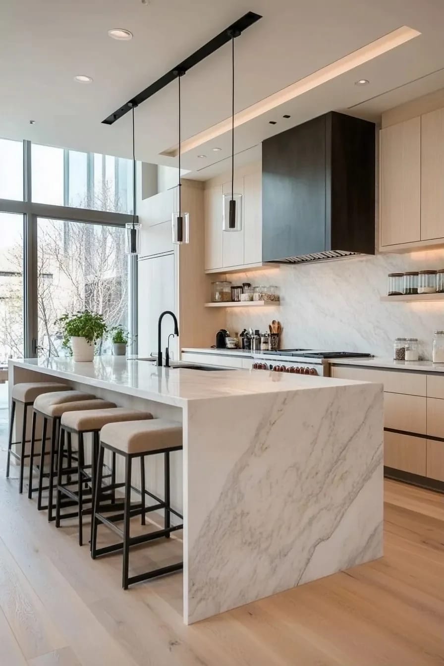
The alternatives cost less and age better. A built-up edge of about three inches gives the island visual weight without wrapping the ends; a thin slab with a shadow-line reveal underneath does the opposite and reads modern; a wood island with a stone top acknowledges that the island is furniture. Any of the three survives being a table that people sit at. Islands are where most of the real decisions in a kitchen get made, which is why they deserve the longer conversation about what actually stays in style rather than a single trend call.
A mitred waterfall corner is two pieces of stone glued at 45 degrees, and the resulting arris is thin. Bar stool feet, vacuum cleaners and one dropped cast iron pan all find it. Chips at a mitre cannot be repaired invisibly because the fill sits across the glue line. If you go ahead anyway, specify a small eased radius on that corner and keep the stools clear of it by six inches.
5. Panel the fridge and the dishwasher before you upgrade the range
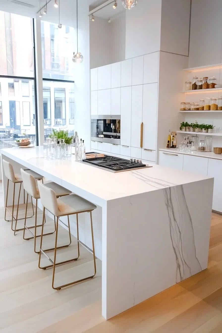
Hiding the two appliances nobody wants to look at does more for a kitchen than a more expensive version of the one appliance people do. A panelled fridge turns a stainless slab into cabinetry and lets the run of doors read as one piece of joinery; a panelled dishwasher removes the second-most visible break in the base run.
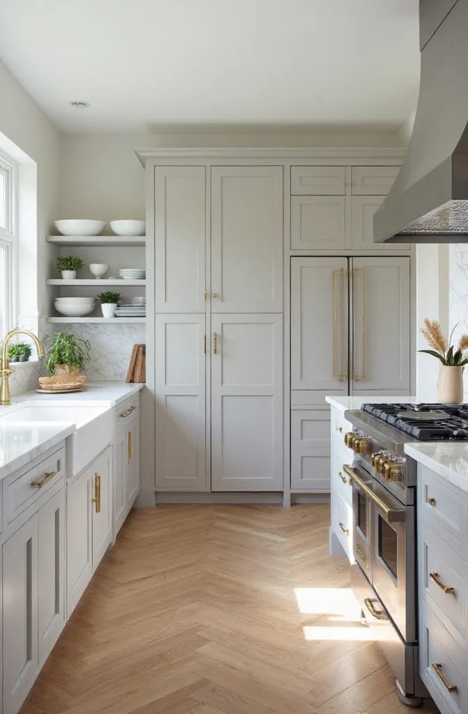
Panel-ready refrigeration is genuinely expensive, so here is the cheap version of the same idea: panel the dishwasher only. A panel-ready dishwasher costs a modest premium over the stainless model and the custom door front is one more cabinet door on the order, which means the base run reads unbroken for a few hundred dollars rather than several thousand. Leave the range in metal. A kitchen with exactly one visible appliance looks deliberate; a kitchen with none looks like a display suite. If you are still working out door styles and how they meet appliances, the range of cabinet approaches from flat modern to inset classic is the place to start.
6. A plastered hood, not a stainless chimney
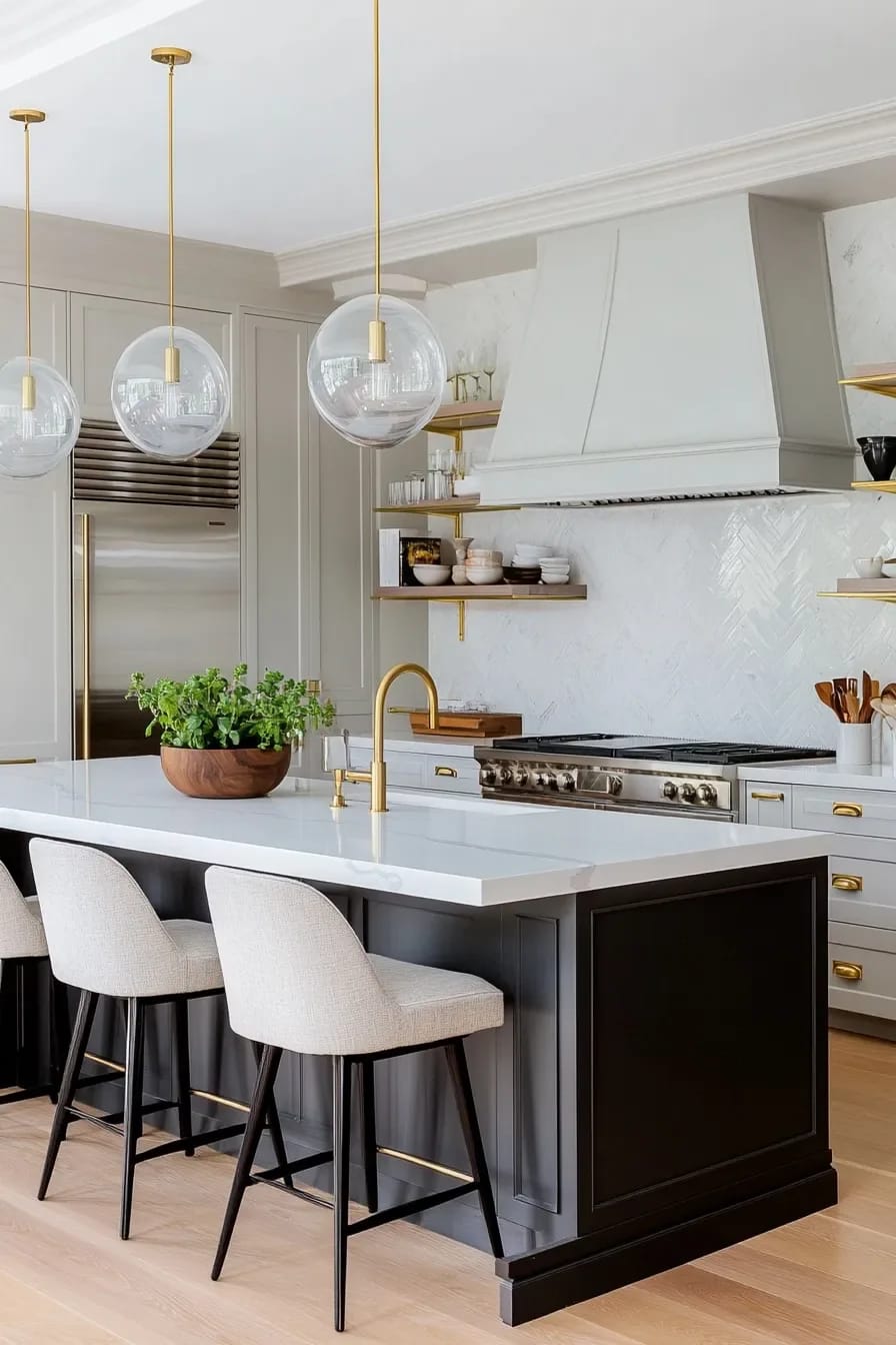
Build the hood out of the wall instead of hanging an object on it. A framed box, skimmed in plaster or limewash and taken to the ceiling, reads as architecture rather than equipment, and it costs less than the sculptural metal hoods it replaces because the expensive part is only the insert and the liner. Designers currently making the same recommendation reach for a curved plaster hood, or one finished in the same material as the surrounding walls, for a softer and more integrated look.
Ventilation is the part that gets skipped. Specify the insert by burner output rather than by hood width, and check the make-up air threshold with your inspector before you order, because residential code in many jurisdictions requires a make-up air path once the exhaust rate passes 400 CFM. Retrofitting that duct after the plaster is up is not a small job.
7. Two oversized pendants, never three small ones
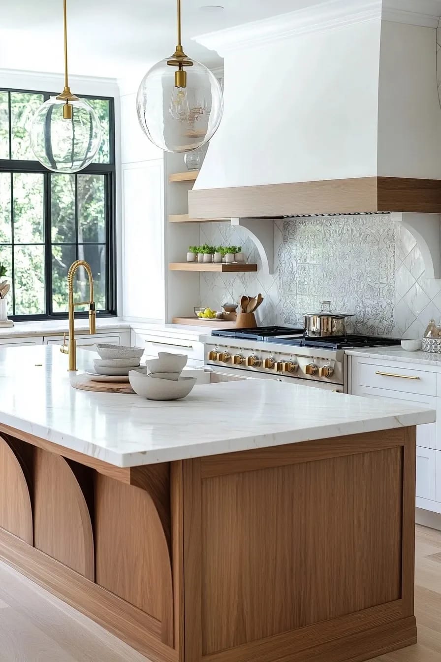
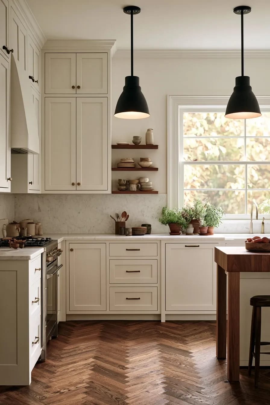
Three little pendants in a row is the single most common lighting mistake in this style of kitchen, and it is a scale problem, not a taste problem. Two fixtures of real size read as objects and leave air between them; three small ones read as a fitting, and they chop a seven-foot island into thirds. If the island is longer than ten feet, use two large pendants and one linear fixture, or just two very large ones.
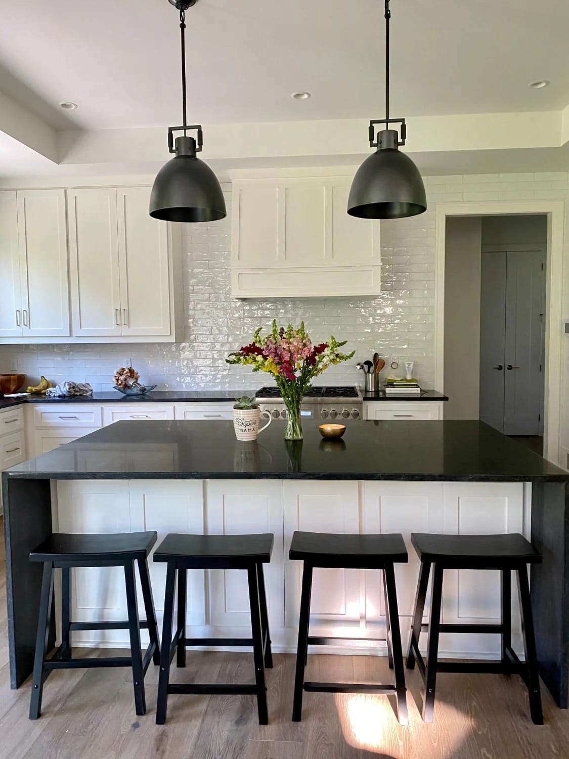
- Hang the bottom of the shade 30 to 36 inches above the counter, then sit on a stool and check you can see the person opposite.
- One color temperature everywhere, 2700K. Mixed temperatures are why a kitchen looks green in one corner.
- Under-cabinet strips at the front edge of the cabinet, not the back, so the light lands on the work surface instead of the backsplash.
- Dimmers on everything. This is the whole of the ambient lighting argument and it costs almost nothing.
8. Fluted oak on exactly one element
Reeded and fluted timber is having a long moment and it is being used four times per kitchen, which cancels it. Pick one element and let it carry the texture: the island front, or the hood, or a single tall bank of doors. Everything else stays flat. Reeding is convex, fluting is concave, and at kitchen scale the convex version catches more light and shows less dust in the grooves.
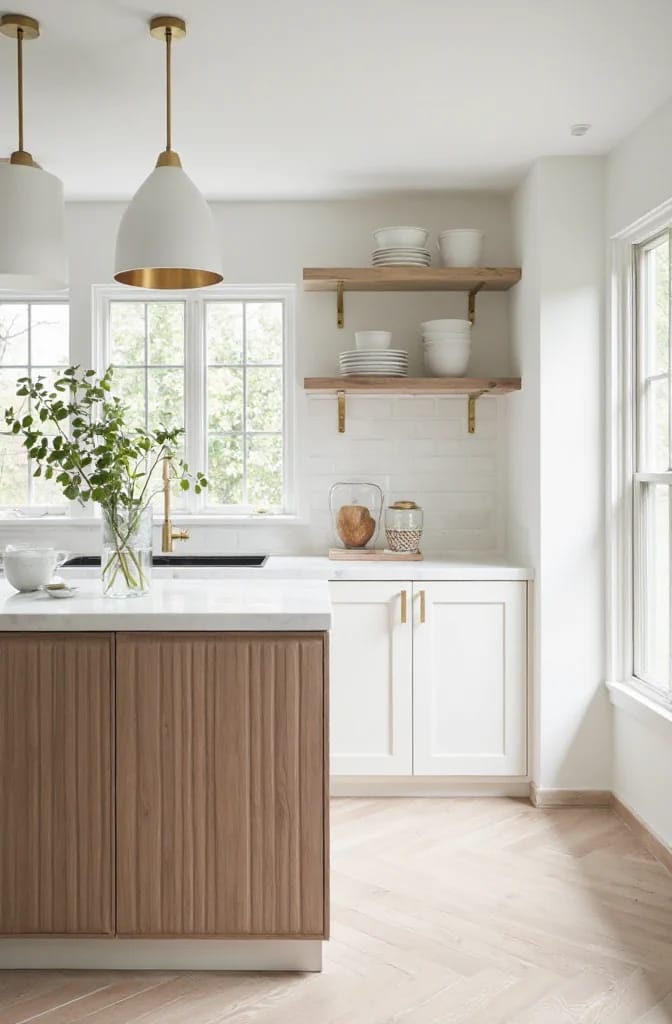
Specify white oak, rift sawn if the budget allows, and ask for the flutes to die into a solid rail at top and bottom rather than running off the edge of the panel. That single detail is the difference between joinery and applied trim. Skip it entirely in a kitchen where someone cooks with a lot of oil, since the grooves next to a range collect a film that a cloth does not reach.
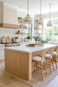 Neutral Kitchen Ideas That Read Warm, Not Builder-Grade Where the grey-to-warm swing actually landed, and which neutrals still fall flat.
9. Olive lowers under a pale stone top
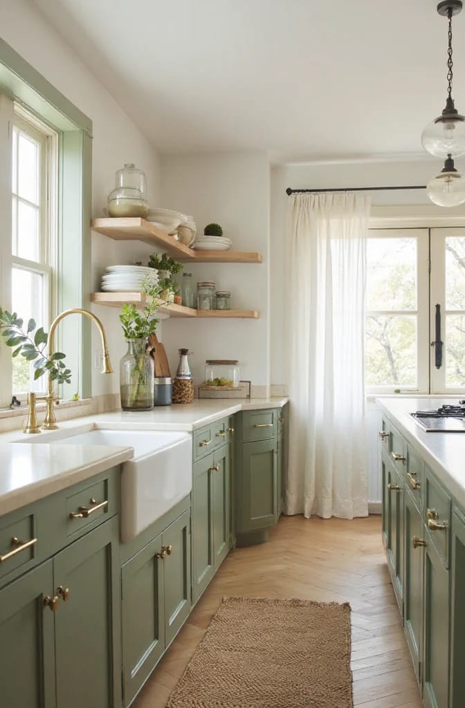
Colour belongs on the base cabinets, not the uppers. Olive on the lowers and the island, with pale doors above and a light stone top, keeps the room bright at eye level and gives it weight at floor level, which is the arrangement that survives repainting a wall later. Sage reads coastal cottage; olive and bay read European, and the two are not interchangeable no matter what the fan deck suggests.
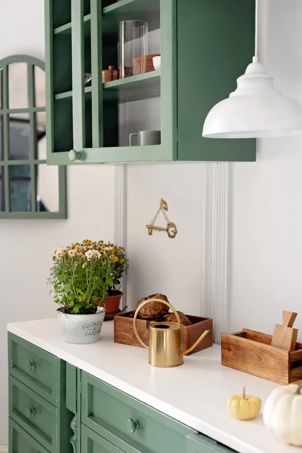
Farrow & Ball Bancha is the reference point most people are actually picturing when they say olive, and it goes almost black in a north-facing room, so test it on the cabinet run rather than a board propped by the window. Keep the metal warm against it. Chrome next to olive drains both. The broader version of this palette, earth tones with visible timber and stone, is worked through in the organic modern approach to kitchens if you want the whole-room logic rather than one colour call.
10. An arch over the sink window, or over the way in
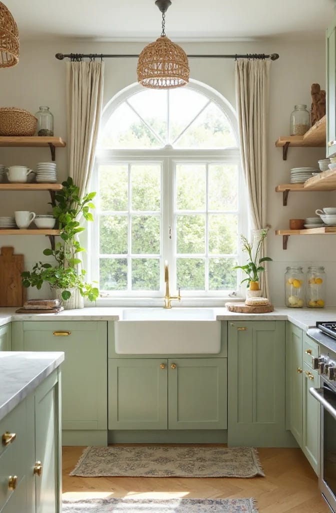
An arch is the cheapest architectural upgrade available to a kitchen that has none. Curving the head of the cased opening between the kitchen and the hall costs framing lumber, a flexible track and a plasterer's afternoon, and it changes how the room is entered. Arched windows over a sink do the same job with more money and a structural conversation, so start with the opening.
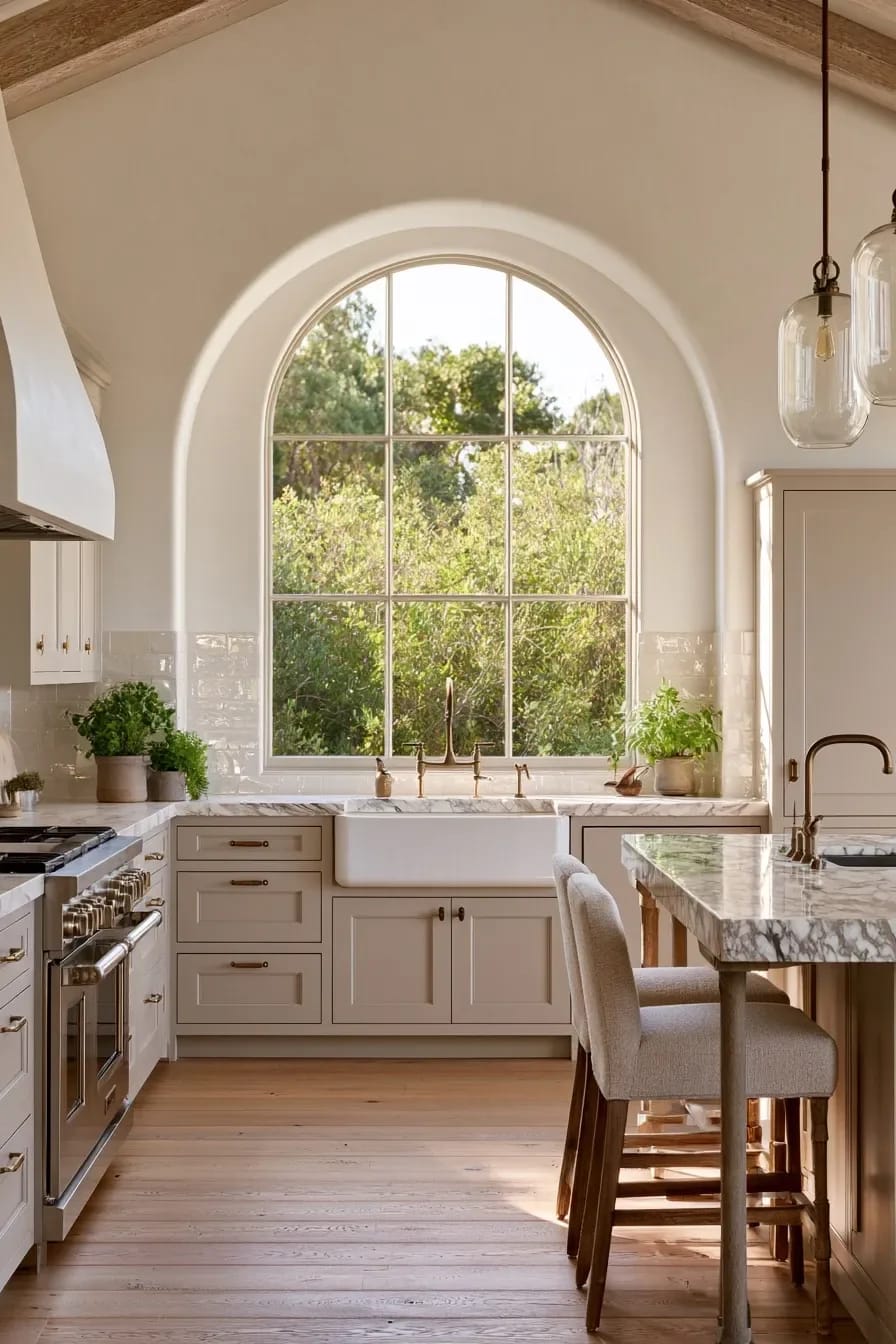
Two things decide whether it looks old or looks like a 1997 builder's flourish: the spring point and the casing. Start the curve high, at least a foot above the door head height, so the arch is shallow and wide rather than a semicircle. And return the plaster into the opening with no architrave at all. A trimmed arch is a doorway wearing a hat.
11. Cabinets to the ceiling, especially in a small kitchen
Stop the uppers at 42 inches and you get a dust shelf and a horizontal line that cuts the wall in half. Run them to the ceiling and a small kitchen gains both storage and height, which is the rare upgrade that is practical and visual at once. In an eight-foot room, a single tall door does it. In a nine-foot room, stack a shorter glazed cabinet above the working uppers and light the inside; that top box is for the things you use twice a year.
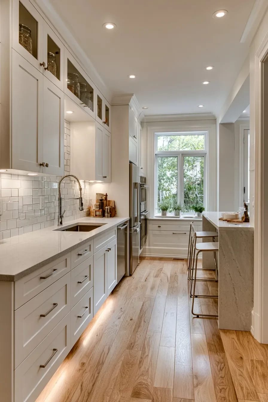
Ceilings are rarely level, so the fix is a scribed filler panel at the top rather than crown moulding pretending the gap is a design feature. Budget a little extra for the installer’s time there. If you are stuck with a 42-inch run you cannot change, the gap above the cabinets can be styled rather than ignored, though I would still take the taller doors given the choice.
Order matters more than most of these lists admit. The hood and its make-up air question have to be settled before the cabinet order goes in, because the duct path decides how wide the flanking cabinets can be. The stone decision comes before the backsplash template, not after. And the arch, if you want one, happens while the walls are open, which is roughly six weeks before anyone is thinking about arches.
One honest gap: I could not find plaster hood pricing that holds up across regions, because the number depends entirely on whether your plasterer treats it as a small wall or a piece of sculpture. Get two quotes for that item specifically. Everything else here has a fairly predictable cost, and the two cheapest moves on the list, panelling only the dishwasher and curving one opening, change a room more than the ones people save up for.
Related Posts
- Timeless Kitchen Ideas That Still Look Right in a Decade
- 15 Organic Modern Kitchen Inspiration You’ll Love
- Modern Kitchen Ideas That Age Well (and the One Already Dating)
- 15 Unique Mid Century Modern Kitchen Ideas
- 21 Inspiring Kitchen Cabinet Ideas: From Modern to Classic Designs
- 45 Timeless Kitchen Design Ideas for Everlasting Style