
Kitchen color goes wrong at the paint counter, under fluorescent tubes, from a chip the size of a business card. Nothing chosen there survives contact with your own light. The thirteen ideas below are grouped by where the color goes rather than by which shade is having a moment, because the decision that matters is usually cabinets versus everything else, and most of the good options in the second category cost a quart of paint and a Saturday.

Neutrals That Have a Temperature, Not Just a Shade
1. Paint the walls putty and keep the cabinets warm white
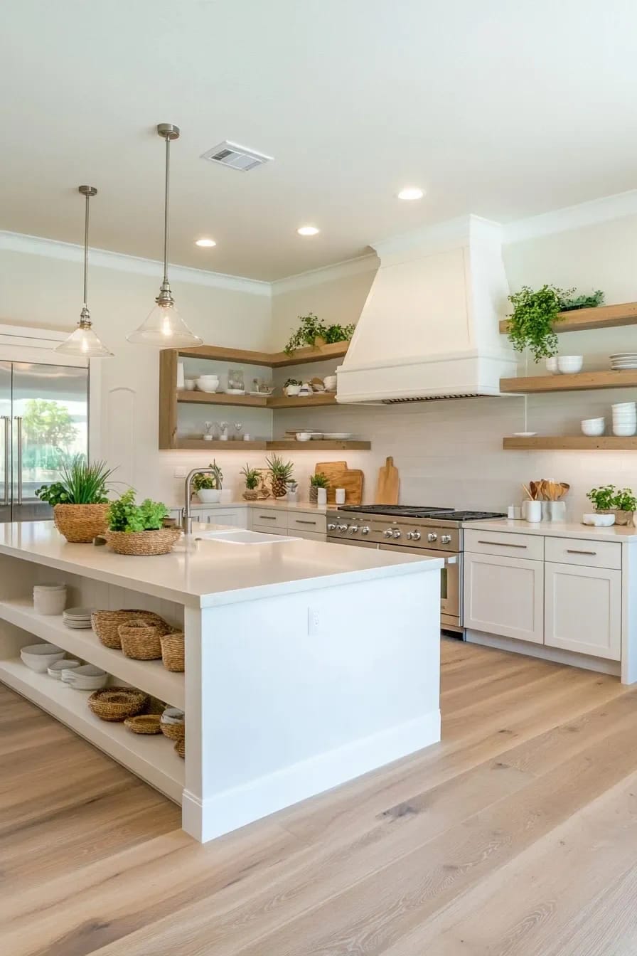
White cabinets look better against a wall that is warmer and deeper than they are than they do against more white. Sherwin-Williams Alabaster (SW 7008) sits at an LRV of 82 and pulls faintly yellow; take the walls down to Accessible Beige (SW 7036) at 58 and you have a gap of roughly 24 points, which is about the distance at which cabinet frames start reading as objects instead of as one continuous pale surface.
The all-white kitchen photographs beautifully and lives badly. Every grease shadow above the range shows, every appliance panel turns out to be a slightly different white than the doors, and there is no variation in the room to hide any of it. This is not an argument for going back to grey, though: the swing from cool greige to warm putty and cream over the last few years is the reason this pairing works now and looked muddy in 2016.
Test the putty on whichever wall gets the least light. If it goes pink there at eight in the morning, it will go pink all winter.
2. Split the run: greige below, warm white above
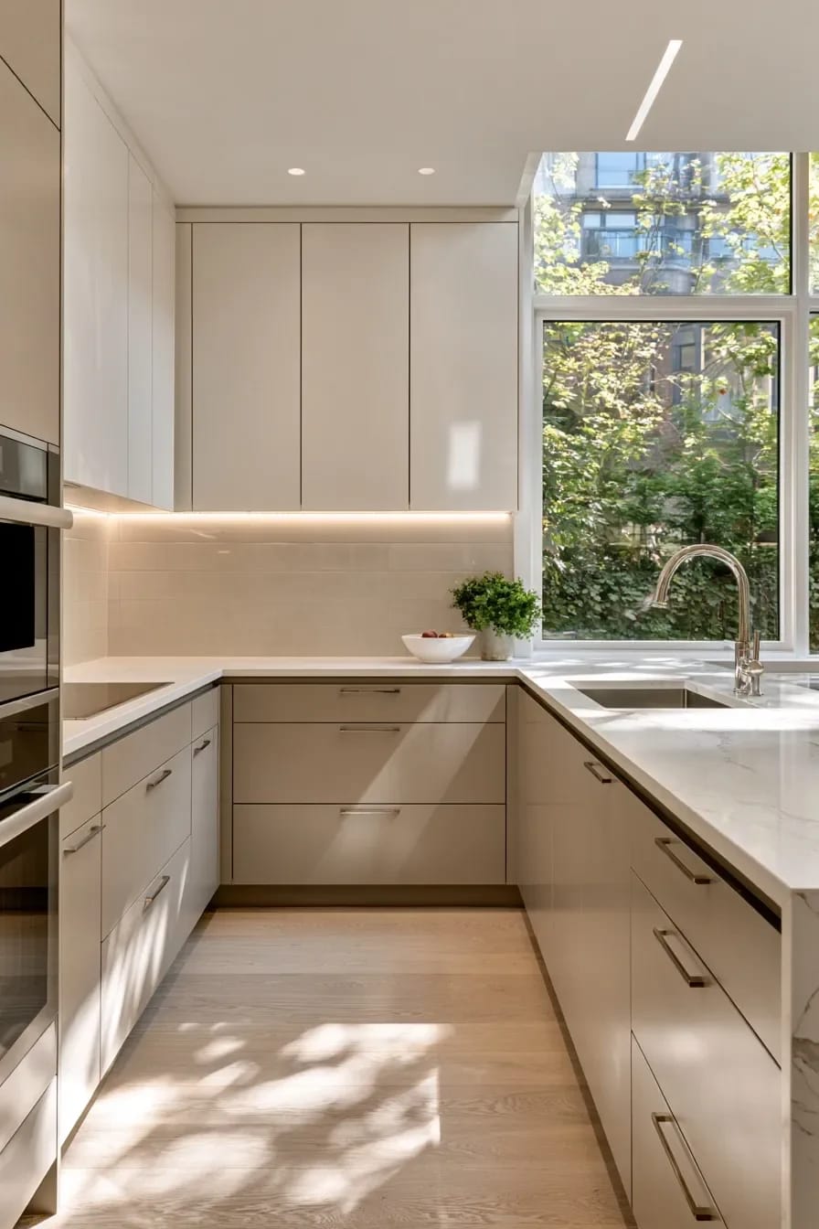
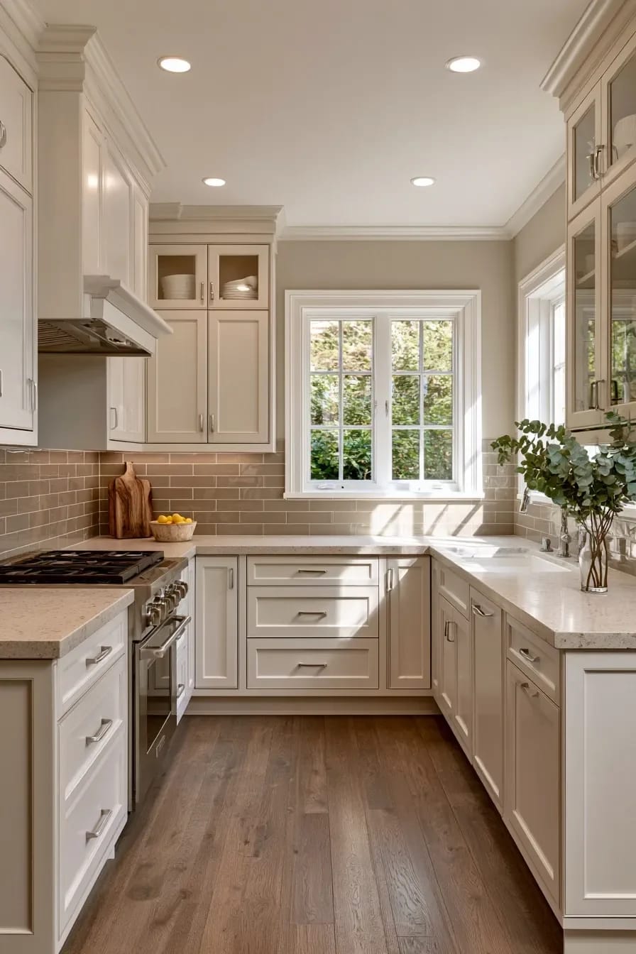
Two colors in one cabinet run is the cheapest depth available in a kitchen, and the version that never dates is neutral on neutral. Put the deeper color on the base cabinets, where the scuffs land, and keep the uppers light so the room does not close in at eye level.
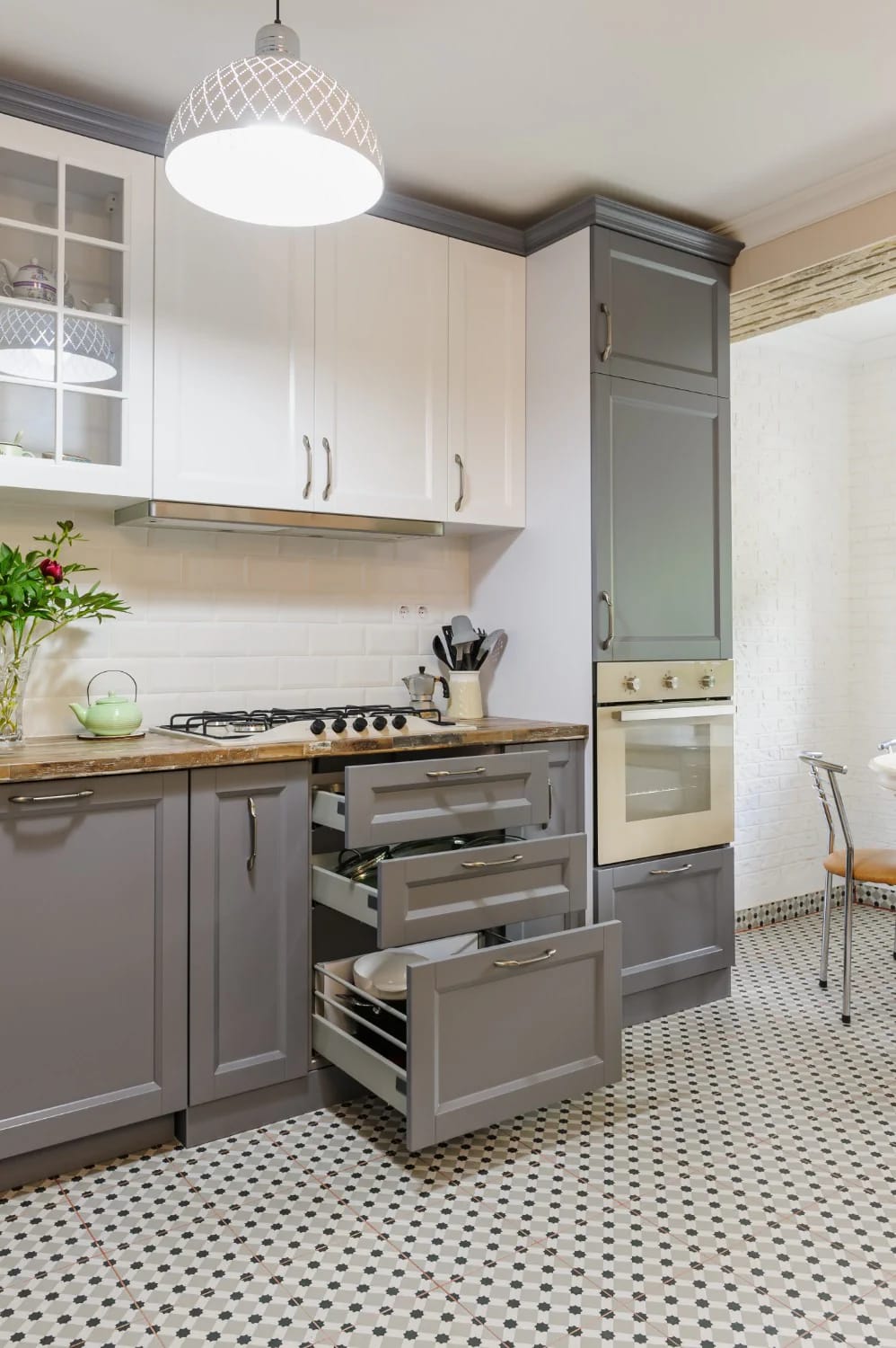
The choice here is temperature rather than lightness, which surprises people. Repose Gray (SW 7015) and Accessible Beige (SW 7036) both sit at an LRV of 58, identical on the meter, and they behave nothing alike on a door: one goes cool and slightly violet under LED, the other holds its warmth and can slide toward yellow next to a cream countertop. Pick the one that argues with your floor the least.
 11 Beige Kitchen Ideas That Don’t Read Builder-Grade Eleven ways to use beige on cabinetry without landing back in 2004 spec-house territory.
3. Cream cabinets read older than white, in the useful way
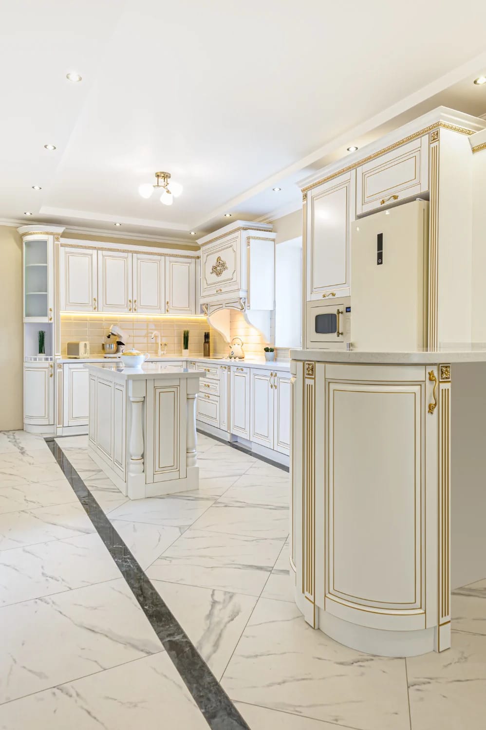
Cream buys you the look of cabinetry that was already there when you moved in. Benjamin Moore White Dove (OC-17) is the reliable one, though its published LRV has moved from 85 to 83 with the company’s newer measuring system, so treat any number you read as approximate and judge it on the door. Where it fails is against a bright white quartz countertop, which turns the cream distinctly yellow, and if that is the countertop you already own, a properly cool white on the cabinets is the safer call.
When the Cabinets Carry the Color
4. Count raw white oak as one of your three colors
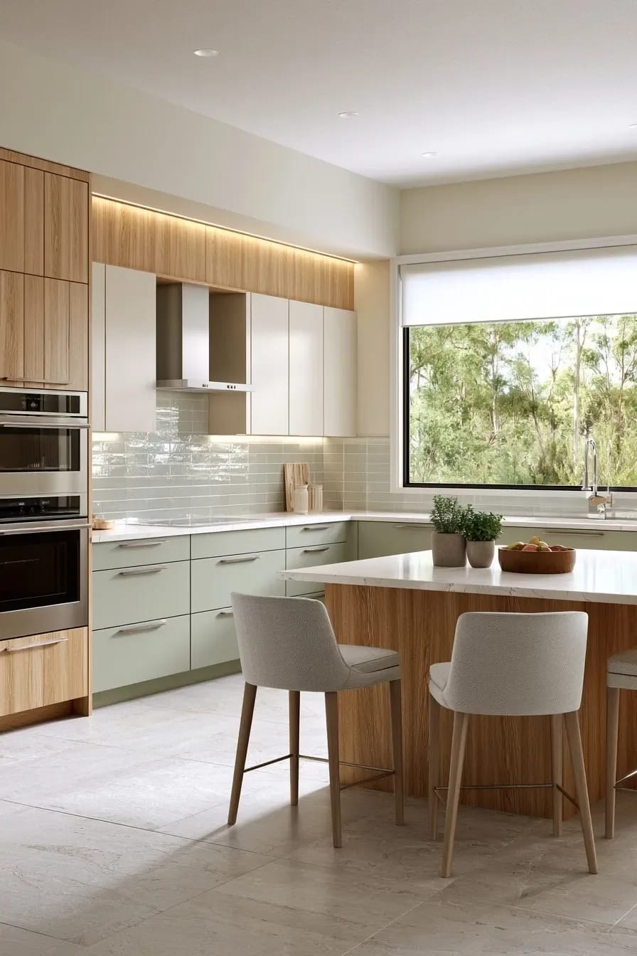
Wood is a color, and treating it as a texture is how palettes come apart. White oak is a warm mid-value neutral with a yellow-to-pink undertone depending entirely on the finish: rift-sawn oak under a hardwax oil reads pale gold and slightly grainy, and the same board under a water-based polyurethane reads greyer and flatter. Choose the finish before you choose the wall color, not after.
The reason this ends up on so many mood boards is that oak fronts do the job a second paint color would do, without committing you to a hue. It is also the pivot point between warm minimalism and the cold, showroom version of the same layout, and the deciding factor is usually whether the oak is left matte or lacquered to a shine.
5. Olive green cabinets, brass, and one stone with visible movement
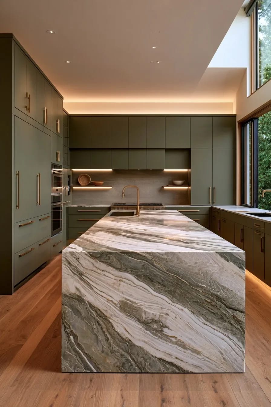
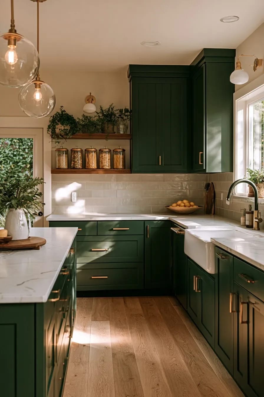
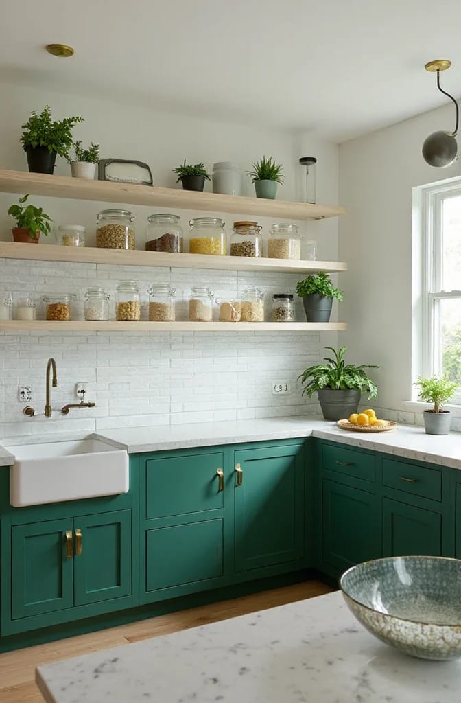
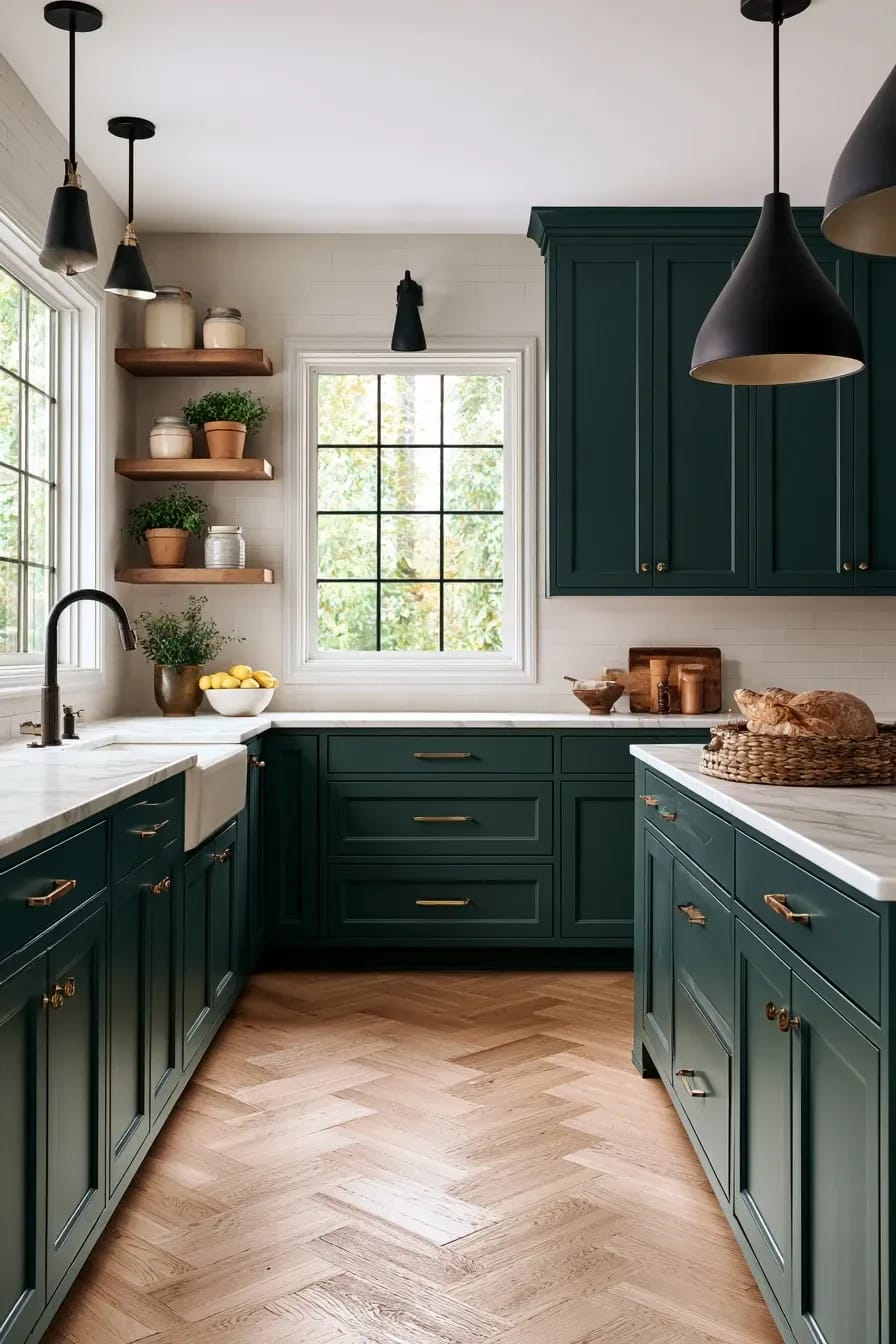
Olive holds up in a kitchen where sage does not, because it has enough yellow in it to survive incandescent light. Evergreen Fog (SW 9130), the green that went on half the cabinets in the country around 2022, has an LRV of 30 and sits much closer to grey than most people expect; a true olive is darker, yellower, and considerably less prone to going dusty against warm wood floors.
Green cabinets are also the strongest argument in the house for checking what bulbs you own. At 2700K the yellow comes forward and the doors warm up; at 4000K the same paint goes grey-green and slightly institutional, which is why a color that looked right in the showroom can look wrong the first night you cook under it. Brass is the standard partner because the metal supplies the warmth that green subtracts, and unlacquered brass in particular darkens where hands land, so the pulls stop matching each other within a year. That is a feature if you like it and an irritation if you do not.
Worth saying plainly: green cabinets date faster than neutrals. Anyone claiming otherwise is selling cabinet doors. If you want green with a longer runway, the deeper pine and near-black greens hold their value better than anything in the sage family.
6. Slate blue beats navy in a kitchen with one window
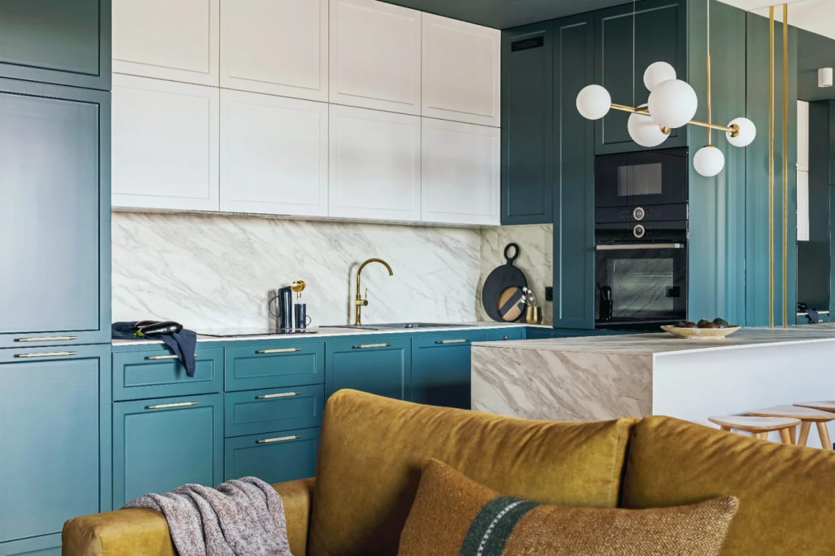
Navy needs light it is not going to get in a single-window galley. Benjamin Moore Hale Navy (HC-154) is a genuinely good color and it is also close to a default at this point, and in a dim room it stops reading as blue at all and just reads as the dark part of the kitchen. A slate blue with grey in it keeps its hue at lower light levels, which is the whole reason to paint cabinets a color instead of a neutral.

Keep the uppers white or leave them off entirely. If you want the full navy treatment on every door, the kitchens where deep blue works almost always have two light sources and a pale floor doing the compensating.
7. Clay and terracotta need a south-facing room
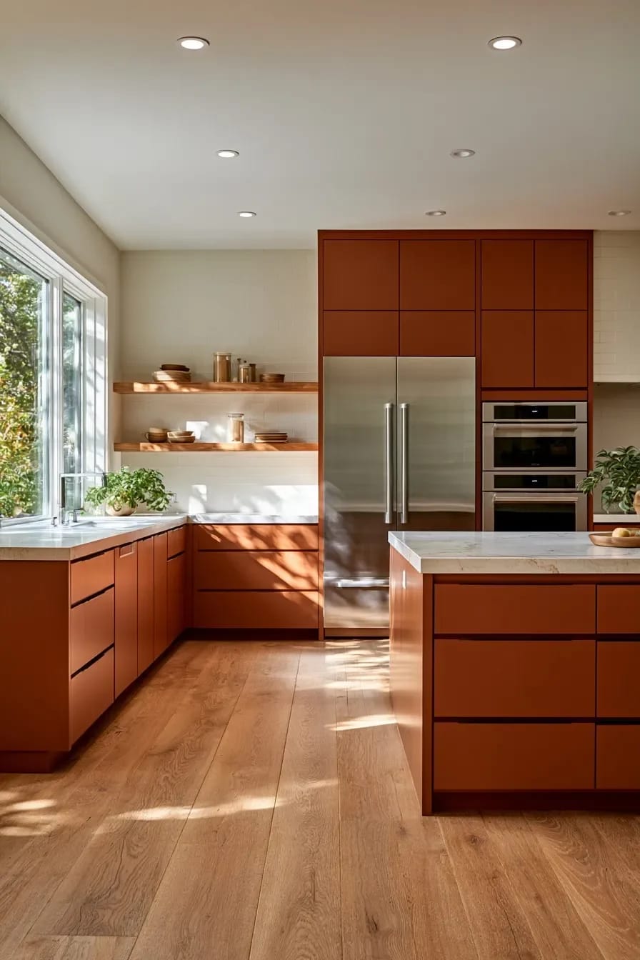
Clay is a sunlight color and it collapses without sun. In a north room the orange drops out and what is left reads as a dull brown-pink, closer to raw liver than to the Mediterranean reference everyone has in mind. Given a south or west exposure, though, it does something no other cabinet color does: it changes across the day, going pale and chalky at noon and deeply saturated by six.
Pair it with cream rather than white, and keep the metals warm. Chrome against terracotta is a genuinely bad combination.
8. Black cabinets make a small kitchen read bigger, not smaller
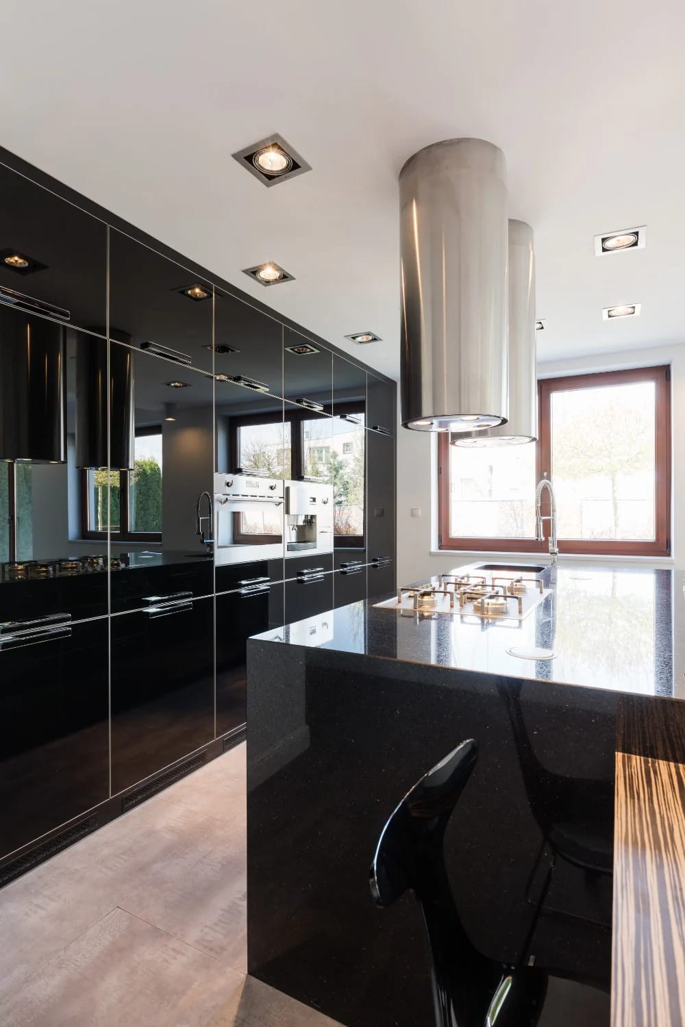
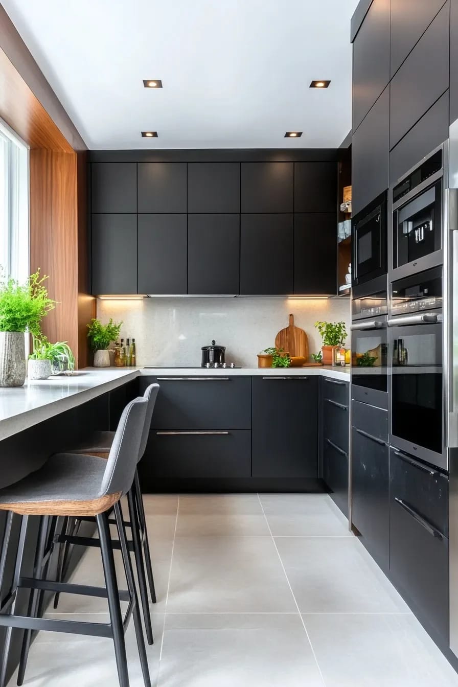
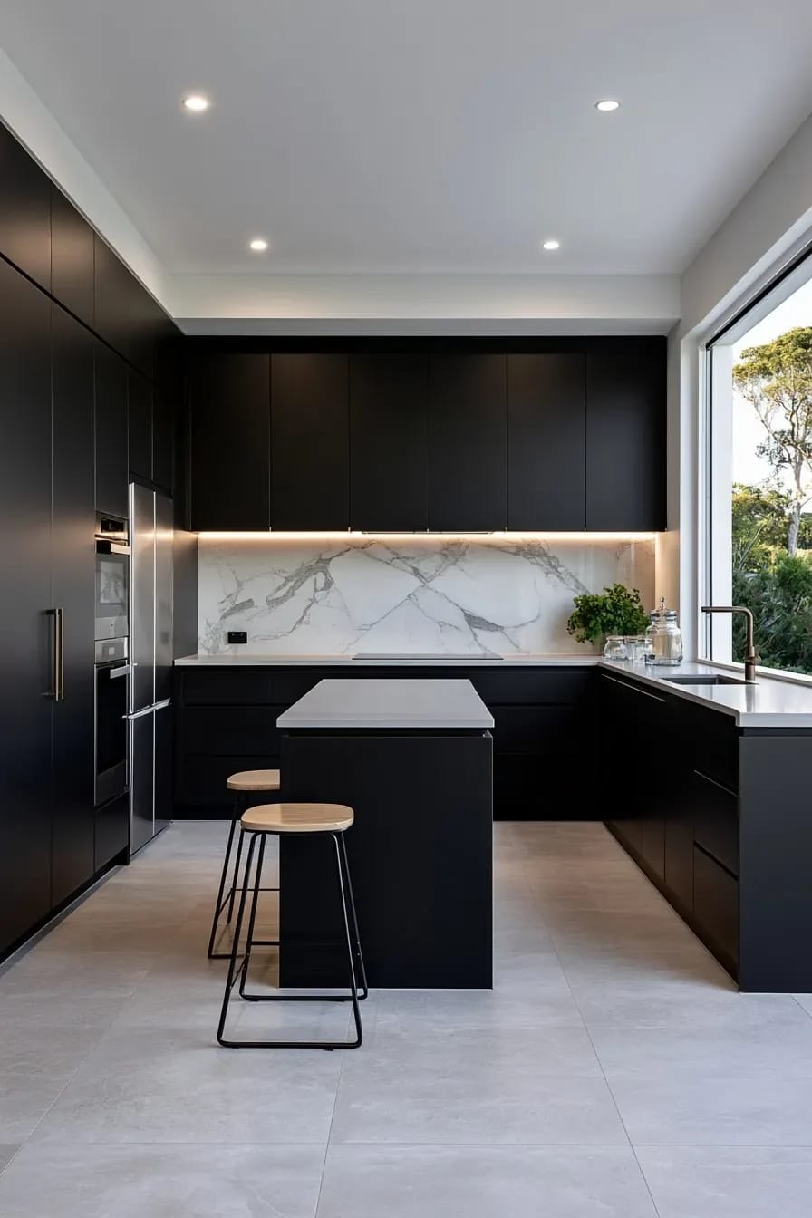
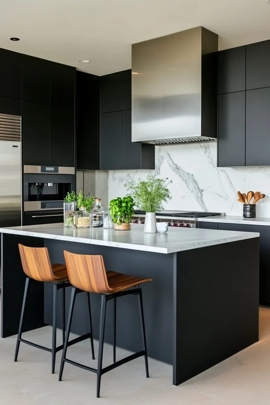
This is the one on the list most people will argue with, so here is the mechanism. A small kitchen feels small because the eye can count its edges: the line where the base cabinets meet the floor, the line where they meet the counter, the corner where two runs turn. Paint the lower cabinets a near-black like Tricorn Black (SW 6258) and those edges stop resolving, the boundary between cabinet and floor shadow disappears, and the room loses the visual measurements it was being judged by. Pale walls above, pale counter, dark below. The room reads deeper than it is.
What actually goes wrong with black cabinets is finish, not color:
- Matte black on a base cabinet next to a dishwasher will show every fingerprint and every splash of oil. Use satin.
- Black doors need a hard, factory-quality finish. A brush-marked black door looks cheap in a way a brush-marked cream door does not.
- Hardware disappears against black unless it contrasts, so brass, nickel, or nothing at all.
It also pairs unusually well with tile, since a dark base makes almost any backsplash read as the feature; running the black up the wall behind the range instead is the version for people who want the drama without repainting the doors.
9. Mushroom is the color nobody picks and nobody regrets
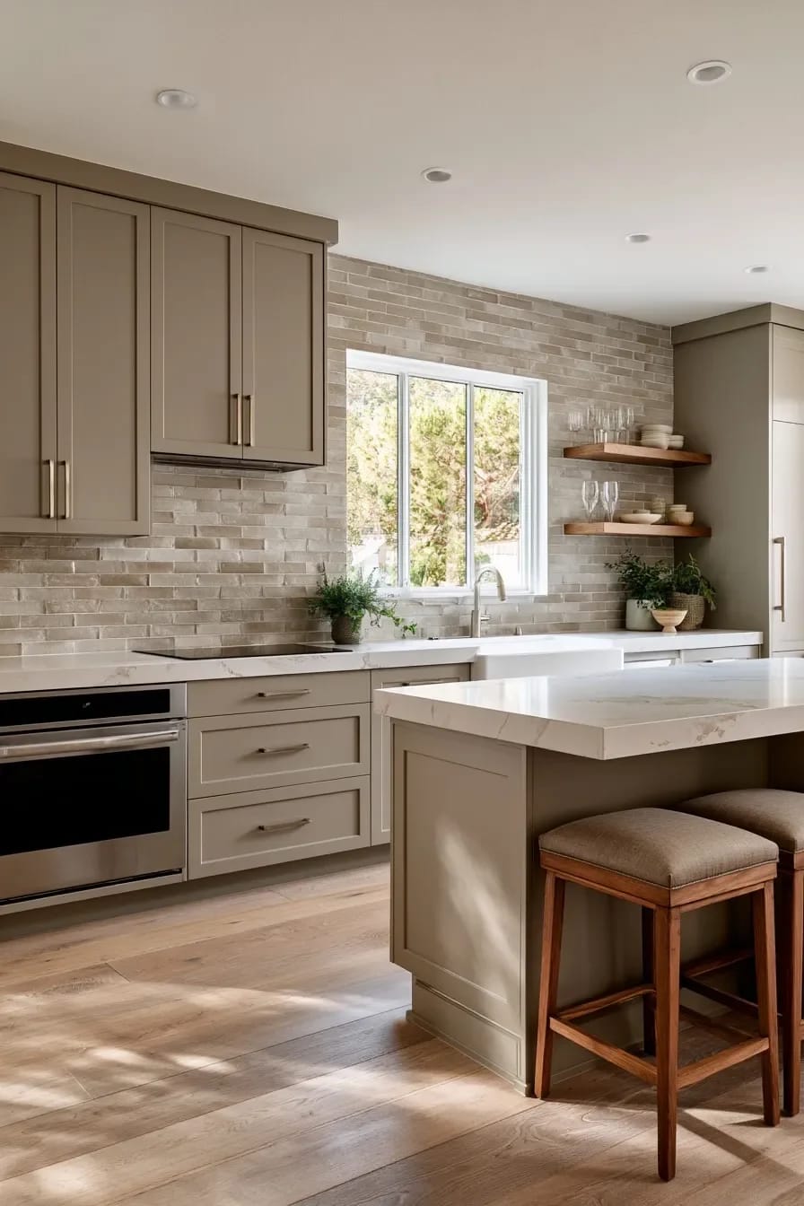
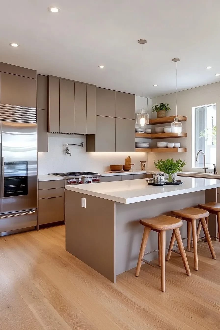
Mushroom is what you land on when beige is too yellow and greige is too cold. It is a brown with grey and a trace of pink in it, dark enough to hold a shape against a white counter and quiet enough that nobody walks in and comments on the color. That last part is the argument for it.
Color That Never Touches the Cabinets
10. Give the island the color the perimeter refused
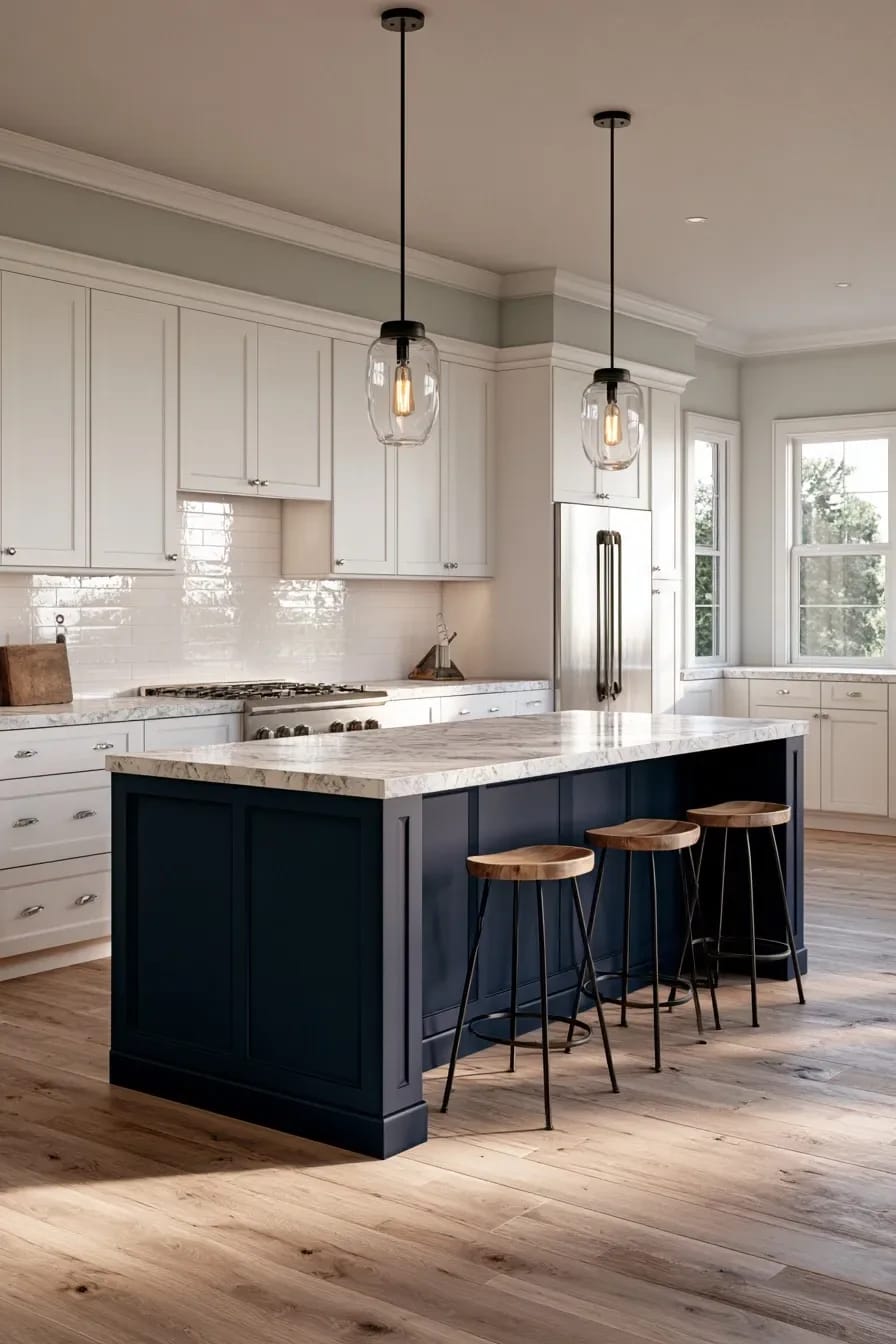
An island is furniture, so it can take a color the wall cabinets would not survive. This is the low-risk route into deep green, oxblood, or near-black: one piece, four sides, and if you hate it in three years you are repainting a fraction of the doors.
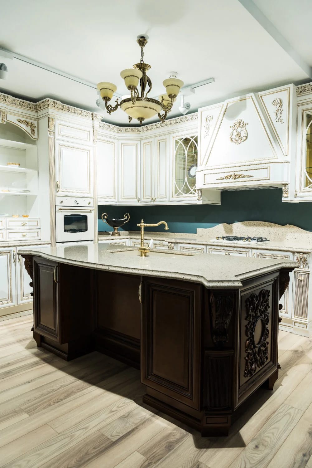
Scale sets the rule. On an island under about six feet, a saturated color turns the thing into a solid block sitting in the middle of the floor, so keep it within a couple of steps of the perimeter color; past eight feet the island is large enough to carry real contrast without looking like a mistake. Whatever you pick, run the same color onto the panel ends and the toe kick, because a painted island with a white toe kick reads as unfinished.
11. Paint the ceiling, not the walls, above white cabinets
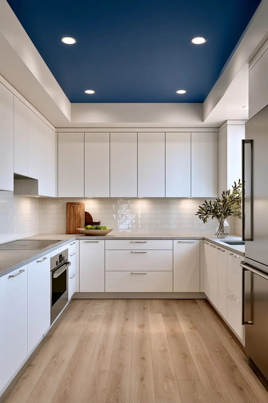
In a kitchen with cabinets to the ceiling and a tiled backsplash, the ceiling is often the only unbroken surface left, which makes it the only place a color can go without competing with anything. Take it three or four steps deeper than the walls in a flat finish and the room gains a lid instead of fading upward into nothing.
Granted, this only works with reasonable ceiling height and decent lighting under the cabinets; below about eight feet, a dark ceiling in a poorly lit galley just feels low. The soffit trick is the related move worth knowing: paint a boxed-in soffit and the ceiling the same color and the soffit stops registering as a mistake and starts registering as architecture.
12. The wall behind open shelving is the cheapest color decision in the kitchen
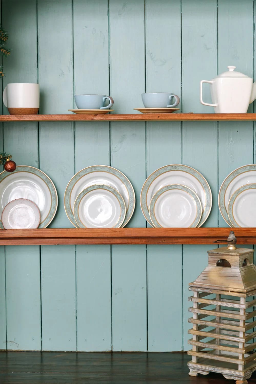
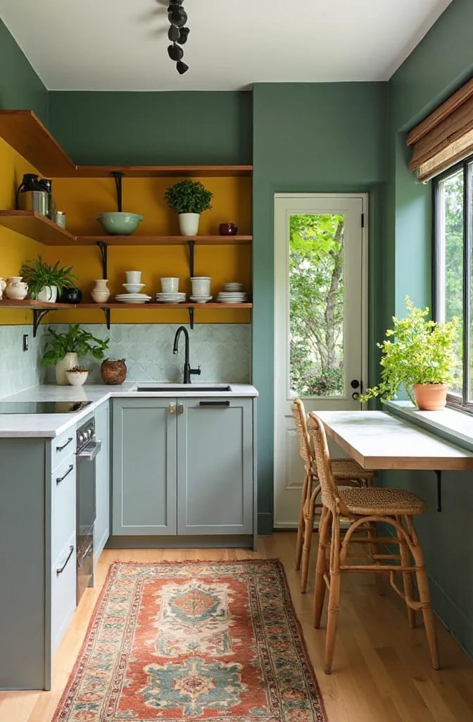
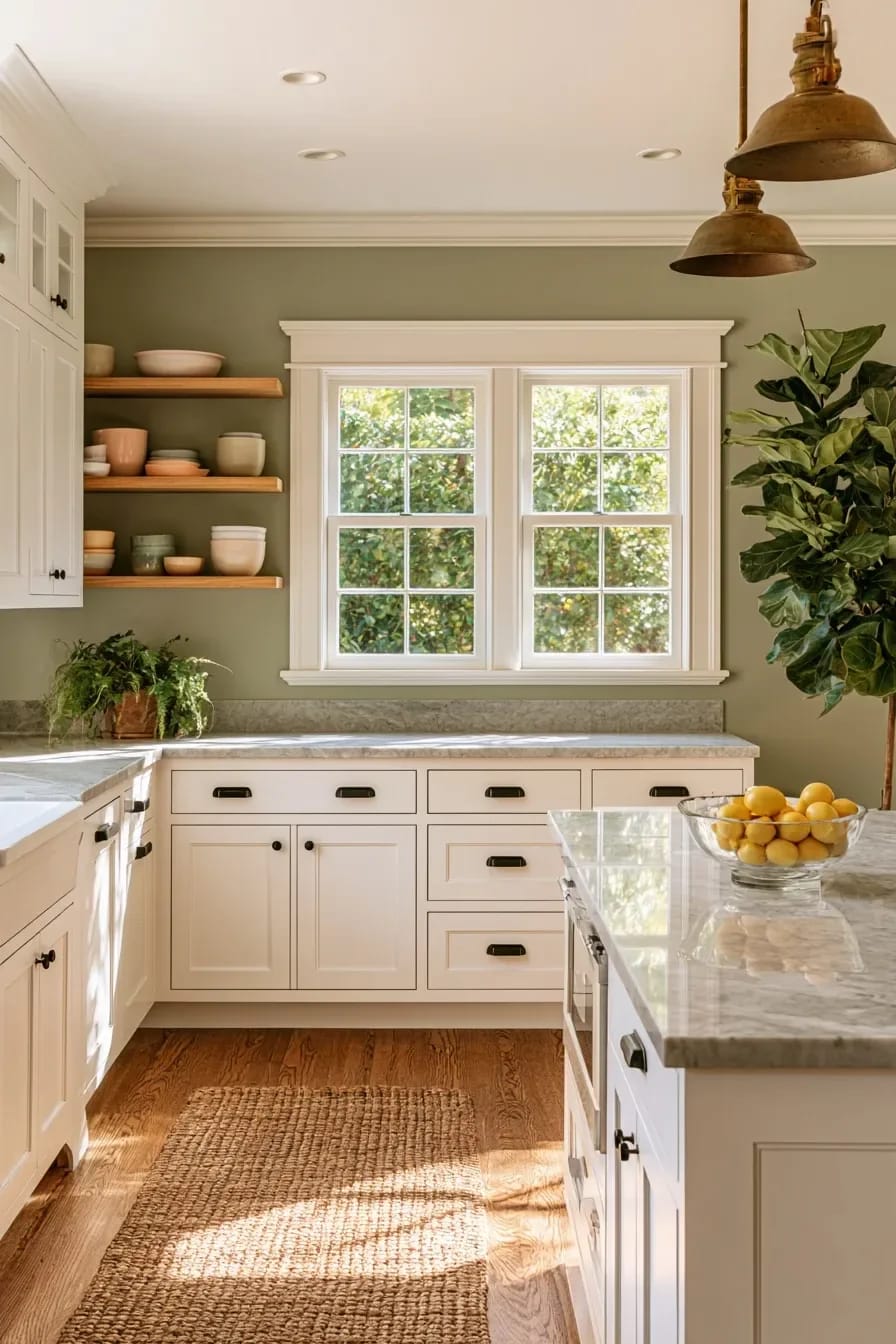
One quart, roughly twenty dollars, and an afternoon with a brush. The wall behind open shelves is small, framed by the shelf boards, and read by the eye as a backdrop rather than as a wall, which means it will carry a color three times more saturated than you would ever put on the room at large. Deep green behind white ironstone, ink blue behind wood bowls, oxblood behind glass.
Renting makes this better rather than worse, since you are repainting a patch the size of a door at move-out. Two coats, a small roller for the flat and a brush for the shelf brackets, and use an eggshell so grease wipes off.
13. Colored grout instead of a colored backsplash
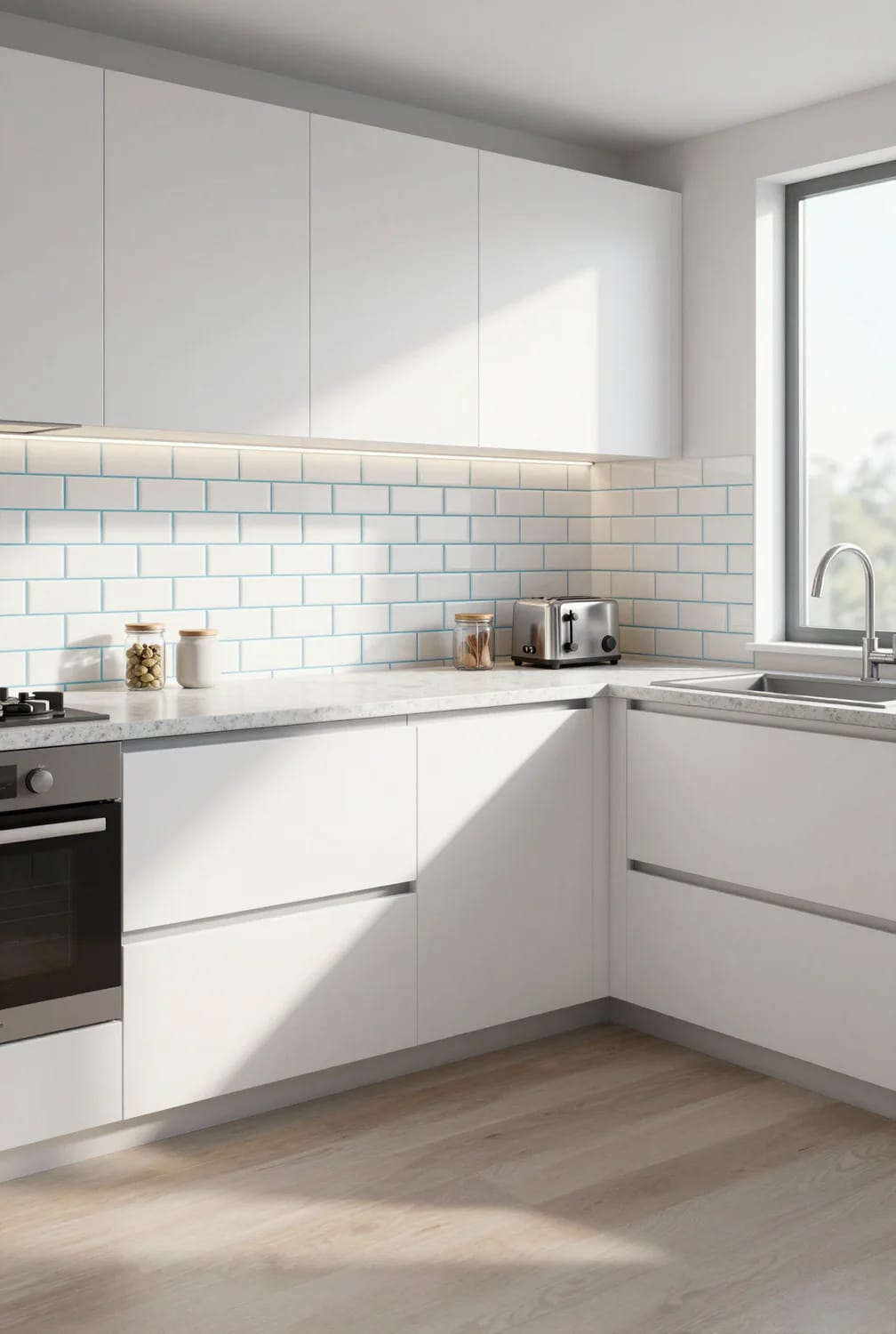
Grout is a color decision that people leave to the tiler, which is why so many backsplashes look flat. Dark grout under a plain white tile turns a surface into a pattern for the price of a different bag of powder, usually a difference of twenty dollars or so across a standard backsplash, and it does more visual work than upgrading the tile itself would.
Two cautions. Dark grout is unforgiving of uneven tile, so any lippage between pieces gets outlined rather than hidden, and cement grout will lighten as it cures, meaning the color you see wet is not the color you get. If the goal is a green kitchen without green cabinets, a green tile with quiet grout is the opposite approach and worth comparing before you commit.
Test the Two Colors You Would Never Choose
If you take one thing from this list, make it the sampling order: paint the two colors you are confident about and the two you have already dismissed, put all four boards on the wall that gets the least light, and look at them at seven in the morning and again at nine at night under the bulbs you actually own. A sample pot runs around ten dollars, which is nothing against repainting a set of doors, and it is the only way to find out whether the putty goes pink in January, whether the olive goes grey under your 4000K downlights, or whether the mushroom you skipped past is the one that works in your room.
Related Posts
- 11 Beige Kitchen Ideas That Don’t Read Builder-Grade
- 43 Inspiring Kitchen Decor Ideas: Stylish and Functional Accents
- 9 Warm, Cozy Christmas Living Room Color Schemes (and the One Undertone Rule That Makes Them Work)
- 15 Organic Modern Kitchen Inspiration You’ll Love
- 15 Rustic Kitchen and Living Room Combos for Modern Homes
- 43 Aesthetic Kitchen Ideas to Transform Your Space