
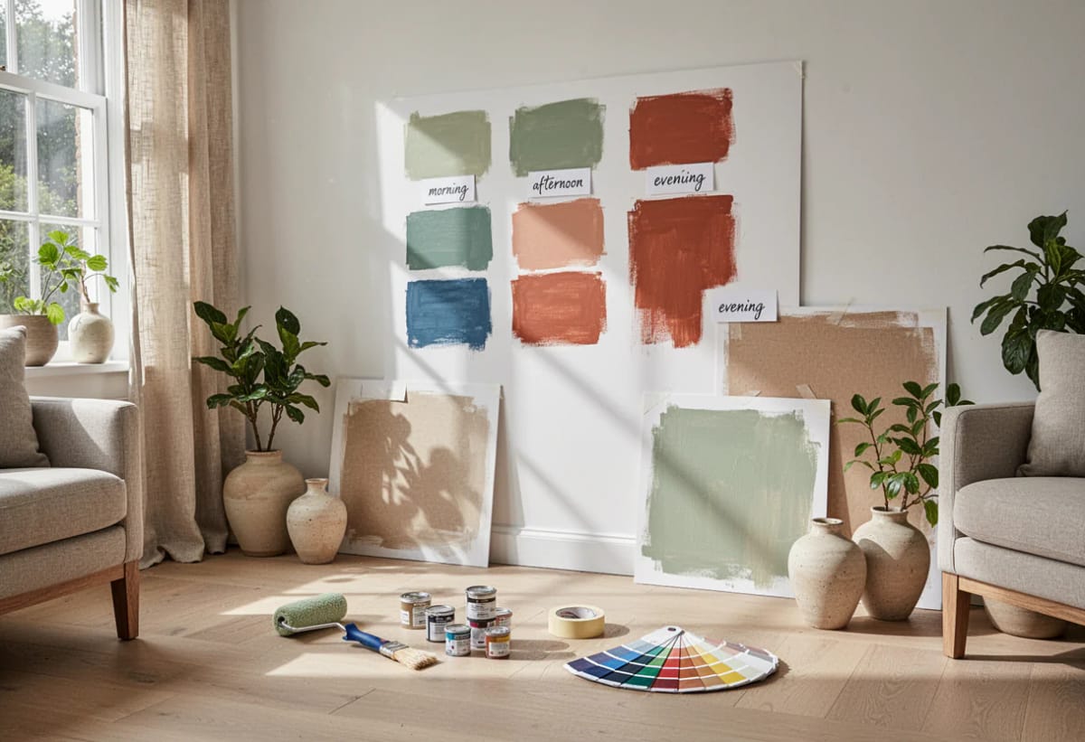
When I repainted my bedroom I tested several shades of sage green side by side, on the wall, over a few days. The shade that had looked best under the store lights was not the shade that looked best in the room. That is the whole problem in one sentence: the swatch you fall for at the counter was chosen in someone else’s light, against someone else’s wall, next to forty other colors competing for your eye.
What follows is the actual method, not the advice to "grab a few samples." Which samples to buy, how to paint them so they tell the truth, where to put them, and when to look at them. Budget roughly $25 to $60 depending on which route you take, which is nothing against two gallons of paint and a weekend you do not get back.
Why the Chip Under the Store Lights Is Not Your Color
A paint chip is a printed approximation viewed under retail lighting, at about the size of a business card, surrounded by competitors. Three separate distortions, stacked. The store’s fixtures are chosen to make the whole rack look appealing; your room has one or two windows facing a fixed direction, a neighbor’s brick wall or a maple tree throwing color back through the glass, and bulbs somebody picked years ago. None of that is reproducible at the counter, which is why the colors that go wrong in kitchens almost always went wrong at the paint counter first.
The same logic applies to the room you saved on Pinterest. That photograph is a different room, different windows, different bulbs, and it was probably color graded before it was posted. You can borrow the idea from an image. You cannot borrow the result.
Two more things worth knowing before you spend money. Most brands’ liquid testers are not the same formulation as the paint you will eventually buy: pigment load, opacity and binder differ, and Benjamin Moore’s own guidance says its pint samples are for color testing rather than as a finish. And testers usually come in one standard sheen (satin or eggshell) no matter what finish you plan to roll on. That matters, because Farrow & Ball’s explanation of sheen levels makes the mechanism plain: the shinier the surface, the more light bounces back, and the same color reads darker in a higher sheen. So a tester is a color test, not a finish test.
Narrow to Three or Four Shades First
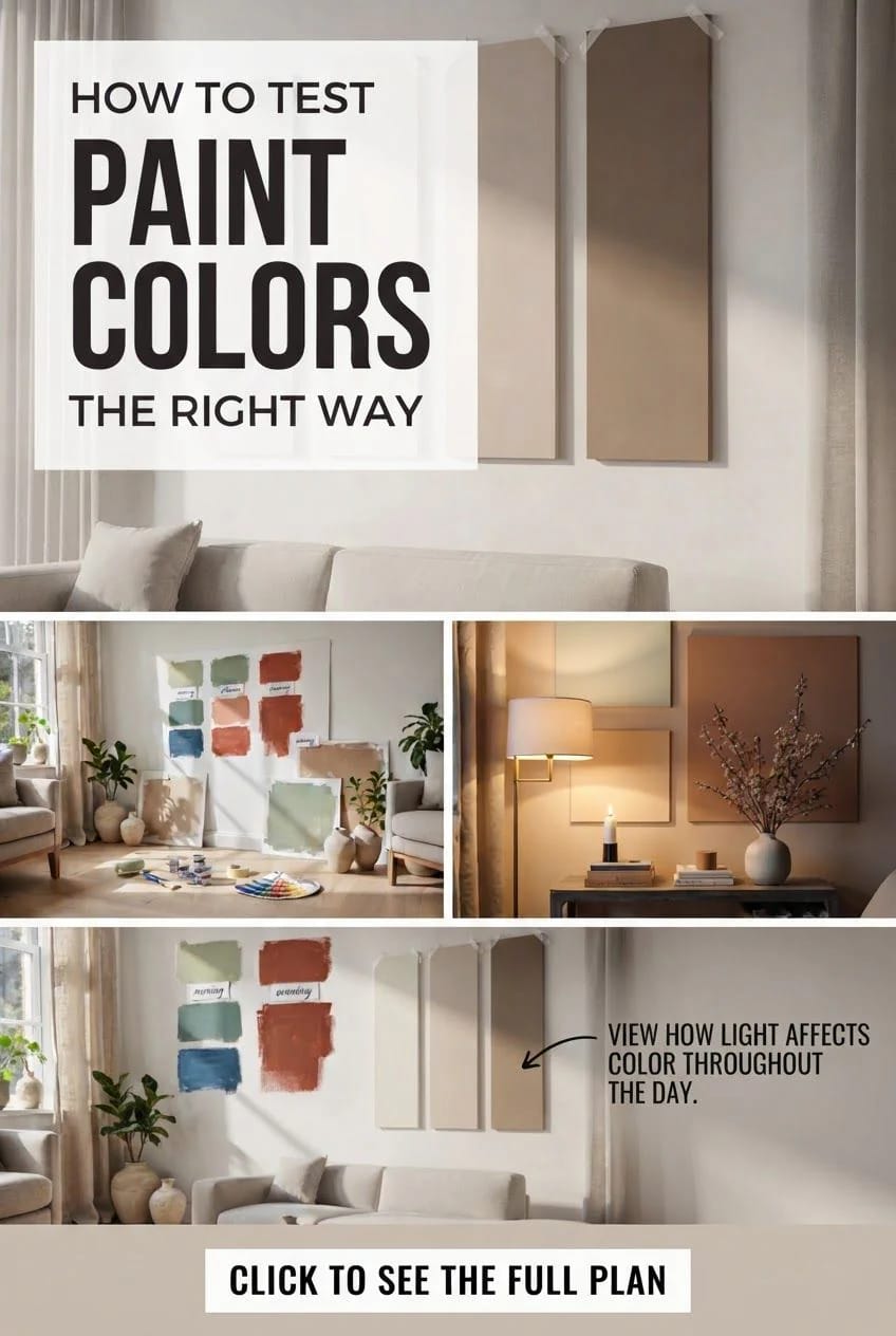
Test a family, never a single color. Pull the shade you like plus the two adjacent to it on the same strip, then add one from a different brand that looks like a near match. Four is the working number: enough to see the drift between them, few enough that you can still tell them apart on the wall.
This is where most people undershoot. They fall for one sage and buy one sample, and because there is nothing beside it, the eye has no reference and calls it fine. Put three sages next to each other and the differences become obvious in about four seconds; one goes grey, one goes yellow, one sits where you wanted it. If you are working from a palette you have already half-committed to, such as the sage-and-cream bedroom look that shows up on every mood board, the shortlist should still include the shade one step warmer than the one you love. That is usually the one that survives.
What You Need, and What It Costs
Materials
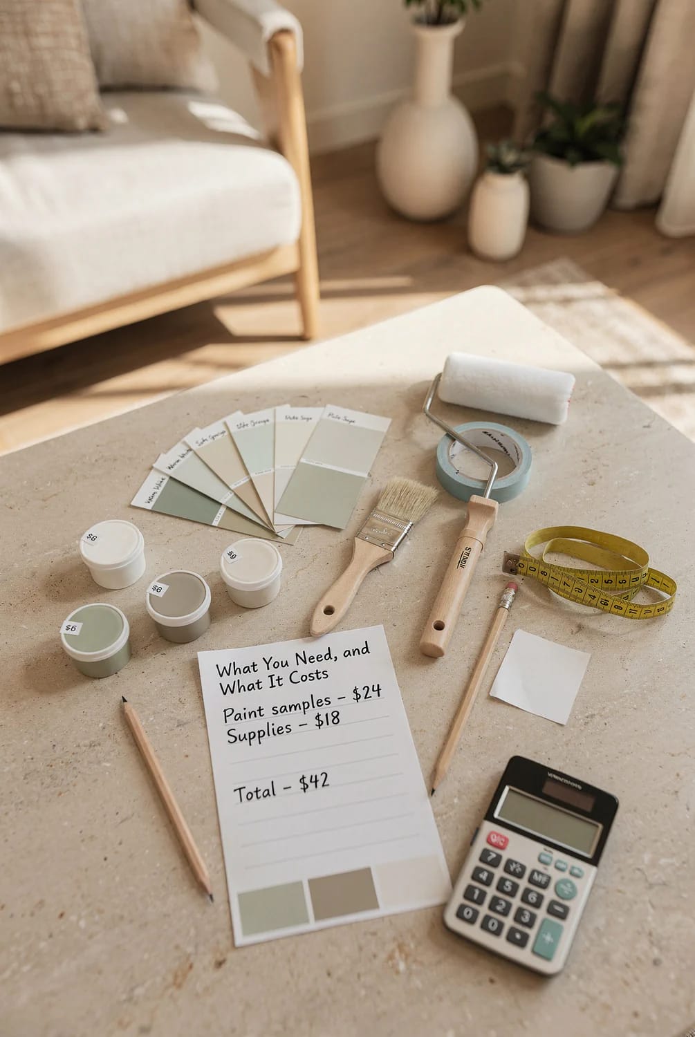
- Peel-and-stick samples, one per shade, roughly $6 each. Painted with two coats of the real manufacturer’s paint and repositionable, which makes them the fastest route: Samplize peel-and-stick paint samples in Benjamin Moore, Sherwin-Williams, Farrow & Ball and PPG.
- Or 8 oz liquid sample pots, roughly $8 to $12 each, bought from the brand’s own store rather than a competitor’s color-match. Cross-brand matching is where half of all “the color came out wrong” stories start.
- White foam board to paint onto, cut down into four panels: Elmer’s acid-free 20 by 30 inch foam board, 3/16 inch, 2-count, about $12 to $18. Skip if you bought peel-and-stick.
- Painter’s tape, for hanging the boards and labeling them: ScotchBlue original multi-surface tape, 1.88 in x 60 yd, 2 rolls. Roughly $10 to $14, and it comes off clean for up to two weeks.
Tools
- A 4 inch mini roller with microfiber covers and a tray, so the sample has the same stipple your wall will have: Bates 4 inch roller kit with tray, frame and six microfiber covers, about $10 to $15. Foam covers lay down too smooth and will flatter the color.
- A 2 inch angled sash brush for the edges: Purdy Clearcut Glide 2 inch angular trim brush, around $12 to $16.
- A pencil. Free, and you already own it.
Materials run about $25 for four peel-and-stick samples, or $45 to $65 for the pots-and-board route. Tools add roughly $25, and nothing at all if you have painted anything before. All in, from scratch: $50 to $90.
Step 1: Paint Boards, Not Your Wall
Paint the samples onto separate boards rather than straight onto the wall, for one reason that outweighs everything else: a board can move, and a patch cannot. The color you need to judge on the north wall at 8am is the same color you need to judge on the west wall at 6pm, and if it is stuck in one place you are testing one condition four times.
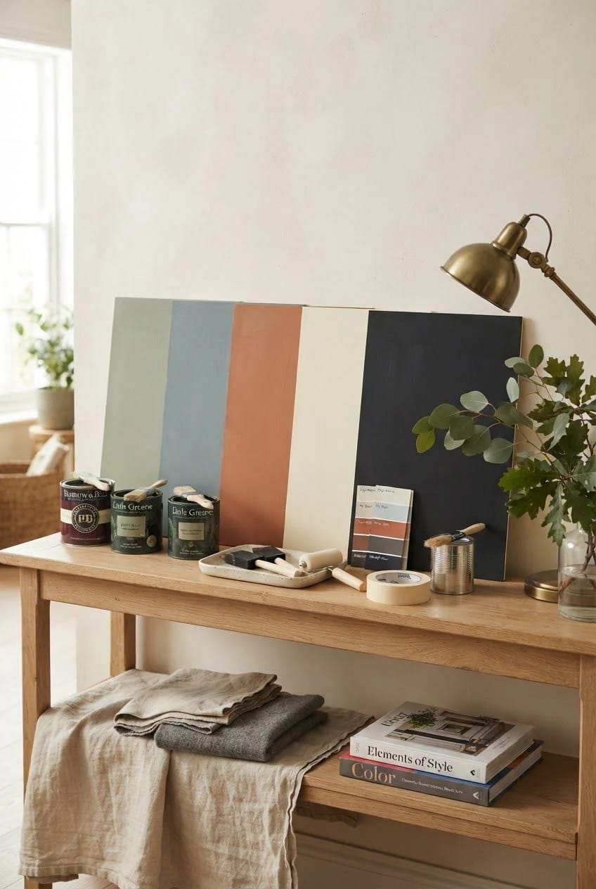
- Cut the board. Four panels roughly 12 by 15 inches from a 20 by 30 sheet. Bigger than a chip by a wide margin, which is the point; anything smaller than about a square foot gets swamped by the color already on the wall around it.
- Prime the board if it is not already white. Foam board’s clay coating is close enough to a primed wall that you can skip this. Cardboard is not, and it will drink a coat and shift the color.
- Cut in the edges with the angled brush, then roll the field. Roll it, do not brush the whole thing. Wall texture changes how light scatters off the surface, and a brushed sample reads smoother and slightly darker than the rolled wall it is predicting.
- Label the back in pencil with the brand, the color name and the code, right now, before you have four boards you cannot tell apart. Everyone thinks they will remember. Nobody does.
Leave an inch of bare white around three edges of the board. That white border stops the old wall color bleeding into your read, and it doubles as a reference point for how much the color is actually shifting between locations.
Step 2: Two Coats, Then Leave It Alone for a Day
One coat is a lie and a wet coat is a different lie. Wet paint reads darker and glossier than the same paint dry, and a single coat is still partly showing you what is underneath it. Two coats, with the recoat window respected (about an hour at room temperature for most latex testers), then hands off until the next day.
Twenty-four hours is the honest wait. The color settles as the film dries down, and the sheen settles with it.
Step 3: Move the Boards Around the Room
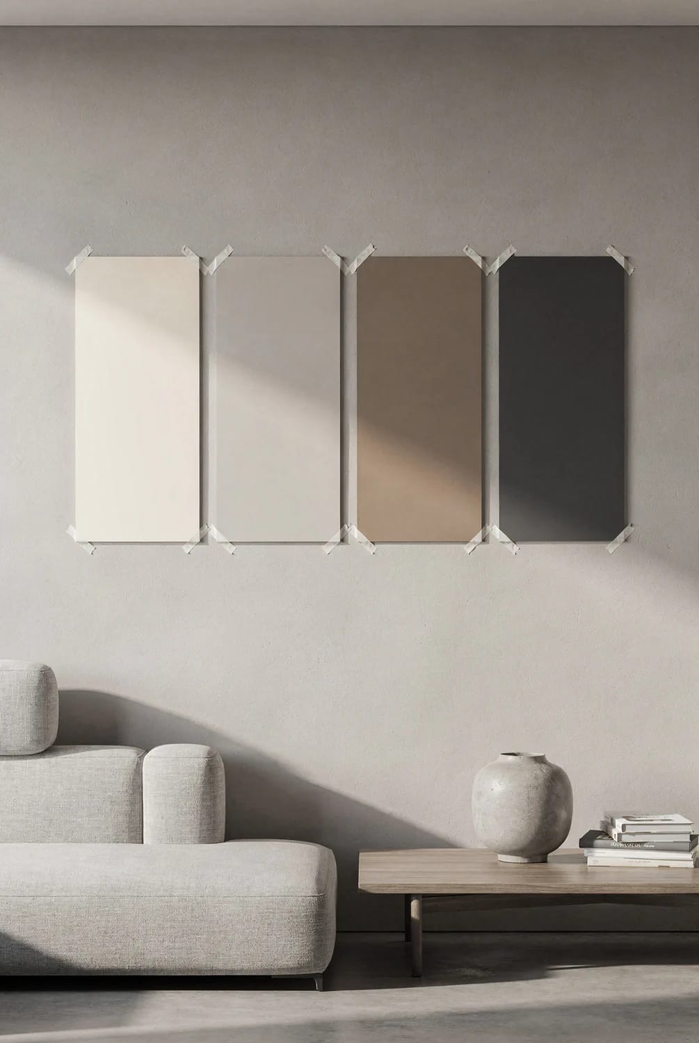
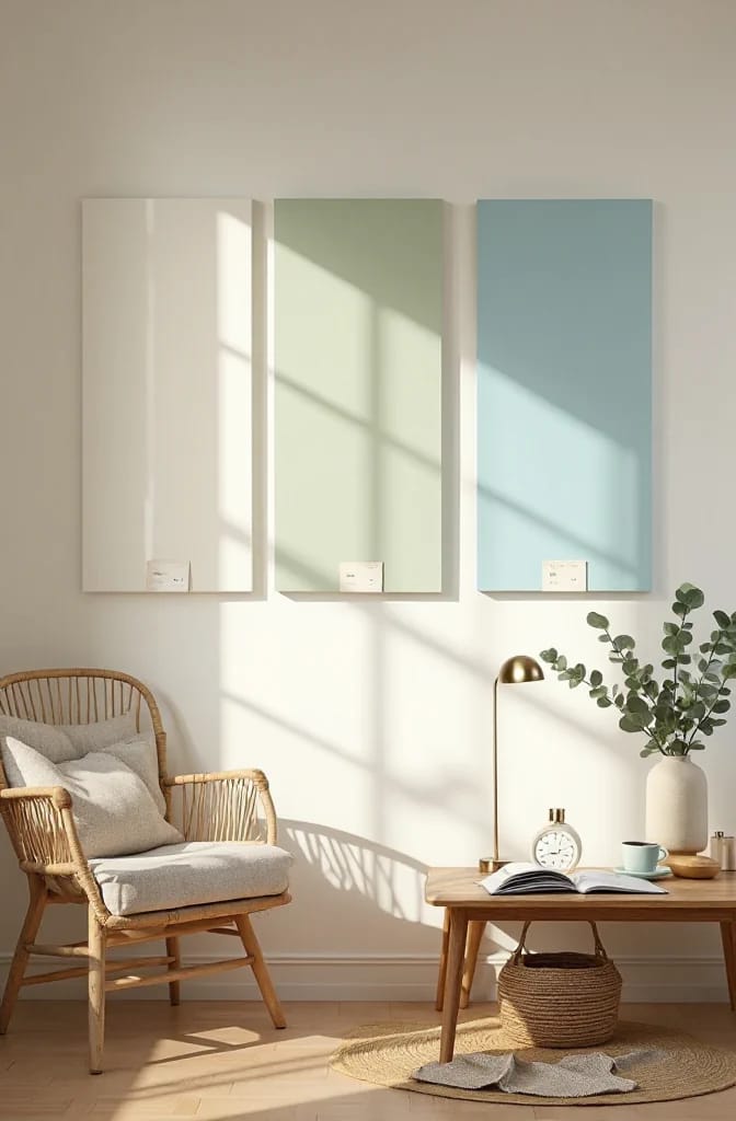
Tape all four boards to the wall you will actually be looking at most, side by side at eye level, then move the whole set to a second wall the following day. Same room, opposite exposure. Light hitting a wall directly and light bouncing onto a wall from across the room are two different colors of light, and a paint that behaves on one will not necessarily behave on the other.
Where to put them, in order of what actually decides the outcome:
- Next to the trim. Your white trim has an undertone, and half the sage greens on the market clash with a cool white baseboard.
- Against the floor, if the floor is staying. Orange-toned oak pushes greens toward olive and greys toward mauve.
- Beside the largest fixed thing in the room, whatever it is: the sofa, the countertop, the tile. In a bathroom the tile is nearly always the boss of the room, which is why choosing a bathroom color without holding it against the tile so reliably ends badly.
- In the darkest corner. Every room has one, and the color you commit to has to survive it.
- Near the window, last. Everything looks good near the window.
Orientation is the single biggest variable, and it is fixed for the life of the house. A north-facing room in the northern hemisphere gets cool, steady, indirect light all day, which pulls colors toward grey and makes anything with a blue base go cold. South-facing rooms get warm light for most of the day and colors read lighter than the chip. East gets warm light early and goes flat by mid afternoon. West is flat all morning and then turns distinctly orange from about four o’clock. If you are testing a color for a single accent wall rather than the whole room, the exposure of that one wall matters more than the exposure of the room as a whole.
Step 4: Look Again After Dark
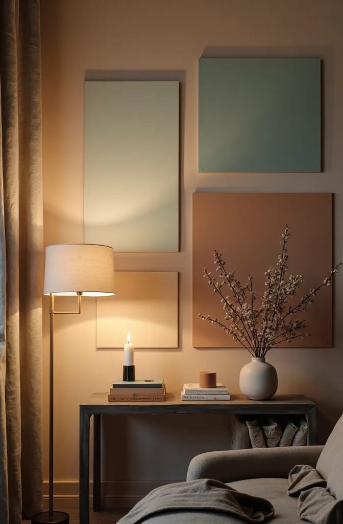
Check every color under your own bulbs at night, because a large share of paint regret is discovered at 9pm in November. Daylight is doing most of the work in the photographs that sold you on the color; your evenings are lit by whatever is screwed into the fixtures. A warm 2700K bulb will push a greige toward beige and a sage toward olive. A 4000K bulb strips the warmth back out and can make the same wall look faintly clinical, which is how a color scheme that reads charming at noon can look cheap by six.
Practical version: switch on exactly the lamps you use on a normal evening, no more, and look at the boards from where you actually sit. Not standing three feet away under the ceiling fixture. If the room is lit by one table lamp in the corner, that is the test.
Worth knowing: bulbs are the cheapest variable in this entire process. If a color you love goes dull under your current lighting, changing four bulbs costs about $15 and changing your mind about the paint costs a weekend.
 Light Colored Kitchen Cabinets: 7 Ways to Get Bright Without Going Cold Why pale cabinets go grey under recessed cans and amber under pendants, and which direction to push instead.
Step 5: Give It Three Days, Then Order
Live with the boards for three full days before you buy anything. Not because the paint changes, but because you do: the first impression is a reaction to novelty, and by day three you are seeing the color the way you will see it for the next six years. Colors that were thrilling on day one and exhausting by day three are extremely common, and finding that out on a $6 sample instead of two gallons is the entire return on this exercise.
The sequence, start to finish:
- Day 1, morning. Buy or unpack samples, cut and label the boards, roll the first coat.
- Day 1, one hour later. Second coat. Then walk away.
- Day 2. Tape all four to your main wall. Look at them at breakfast, at midday, at dusk, and once after dark with the lamps on.
- Day 3. Move the whole set to the opposite wall. Same four checks.
- Day 4. Take the two losers down. Leave the final two up all day, and choose in the evening, under the lights you will live under.
- Then order, from the brand whose sample you tested, in the sheen you intend to use, and buy 10 percent more than the coverage calculator says.
There is no shortcut here, and I have not found one worth having. You might get lucky and land on the right shade first try; plenty of people do, and nobody hands out a medal either way. But a few sample boards and half a week of paying attention is a small price for something you are going to look at every morning for years, and it is the only way to actually know rather than hope.
Related Posts
- 13 Kitchen Color Ideas and Where Each One Actually Works
- 15 Trendy Bathroom Paint Colors For A Stunning Makeover
- 9 Warm, Cozy Christmas Living Room Color Schemes (and the One Undertone Rule That Makes Them Work)
- 15 Creative DIY Room Decor Ideas to Add Color to Your Space
- 25 Stunning Mid-Century Modern Living Room Color Palette to Elevate Your Home
- Light Colored Kitchen Cabinets: 7 Ways to Get Bright Without Going Cold