

Olive limewash is one of the few trends that holds up once you live with it. The wall stops being a flat backdrop and starts moving with the light, and olive gets along with almost everything a farmhouse already owns: oak, brass, linen, terracotta. The catch is that a good share of what is sold as limewash is ordinary paint with a borrowed name, which is why this guide starts with the finish before it gets anywhere near a colour.
What follows walks the look through five rooms of one house, using the same eight colours in each. The palette, the method and the room plans are all here. The exact paint for every colour, across nine brands, is in the subscriber sections: one free sign-up opens all of them.
Every hex above was sampled from the room images, not picked by eye, and the light reflectance values come from those hexes. Olive does the talking; the creams keep it from closing in, and oak and brass are what stop it reading cold.
Limewash, or just the colour?
The difference shows the moment the wall dries. Real limewash is slaked lime with pigment in it. It soaks into the surface instead of sitting on top as a plastic film, so light goes into it and comes back unevenly, and that unevenness is the cloudy movement people are paying for. No roller of emulsion will fake it.
So there are two honest ways to get this look. The first is the real finish: a speciality lime product, tinted toward the palette, brushed on in loose arcs. The second is the palette in ordinary matt paint, which gives you the colours and none of the cloud, with none of the upkeep either. Both work. They are just not the same wall.
| True limewash | Regular matt | |
|---|---|---|
| Look | Cloudy, layered, moves with the light | Flat and even |
| Feel | Chalky, mineral, slightly textured | Smooth film |
| Breathability | Porous, evens out humidity | Seals the surface |
| Durability | Soft; seal the splash zones | Scrubbable everywhere |
| Ageing | Patinas over the years | Eventually chips and scuffs |
| Effort | A learnable technique | Anyone can roll it |
Which brands actually sell lime is where most people go wrong. Bauwerk, Romabio and Portola make genuine slaked-lime and mineral washes, Farrow & Ball sells a real limewash for lime render and bare masonry, and in Australia Porter’s Paints has a true lime wash. Sherwin-Williams, Benjamin Moore, Behr, Taubmans and Resene don’t: anything they call limewash is a standard colour with the word in its name, or a glaze you mix into normal paint.
For subscribers: every colour in the palette, matched in the limewash ranges and in ordinary paint across nine brands, with where to buy each.
The five rooms below all use those eight colours. What changes from room to room is how much of the olive each one takes and which warm material carries it.
The living room
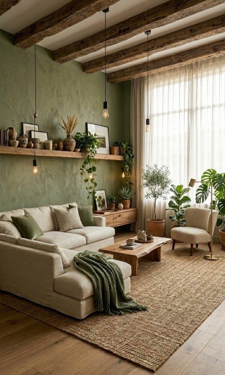
This is where the olive starts, and it starts small: one wall, the one with the shelf on it. The beamed bay above stays Hearth Cream, so the olive reads as part of the architecture rather than an accent someone added later. The limewash texture is the decoration here, which is why the upper wall stays empty.
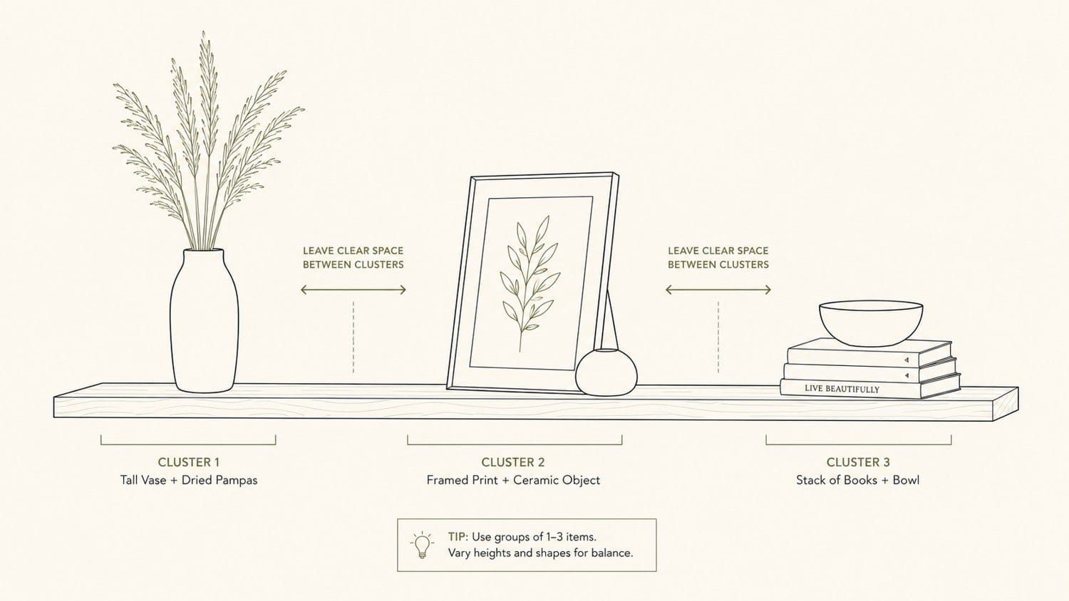
Below it, one long oak shelf, 1.8 to 2.4 metres, does the job a gallery wall would usually do, styled in three loose clusters. A deep linen sectional in a washed loose cover sits in front of it; leave the linen crumpled, because smoothed linen is what makes a sofa look new. The only fully dark thing at eye level is a moss knit throw over one arm. A live-edge oak coffee table adds the rough edge the soft sofa doesn’t have, and a single bouclé chair next to a brass floor lamp keeps the room from turning into rectangles.
- CozeCube sage cable-knit throw: the moss throw over the sofa arm
- nuLOOM Rigo hand-woven jute rug, 8×10: the jute rug under the seating
- MIULEE sage chenille pillow covers (2): the green cushions on the linen
- 60-inch hand-hewn wood floating shelf: the long shelf that replaces wall art
For subscribers: the living room’s paints, element by element, and the room at three budgets, from about $180 to $2,150.
The bedroom
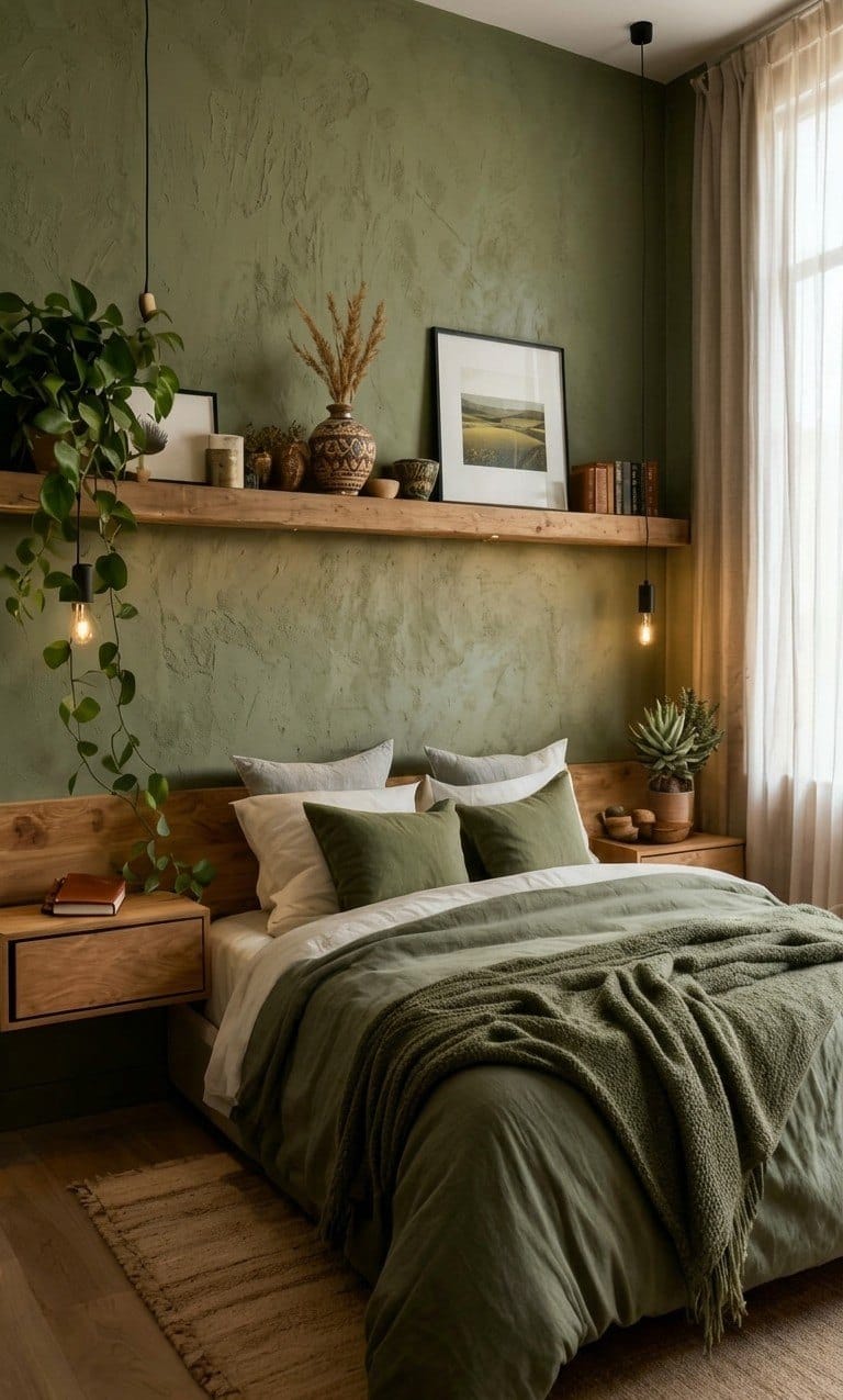
The bedroom takes the same olive and turns it down a notch. Only the wall behind the bed gets it; the return walls and the ceiling go back to Hearth Cream. What makes the room restful is where the dark colours sit: moss on the bed and near the floor, olive at the headboard, cream high up on the curtains and ceiling. Read the room from the floor up and it gets lighter, which is exactly how it should feel at night.
The bedding follows the same order, darkest on top: cream sheet folded back, olive duvet, moss knit at the foot. Floating oak nightstands keep the floor clear so the wall reads taller, and a plug-in cord pendant on each side replaces table lamps without any wiring. Two oat linen euro shams, two sage pillows and one cream lumbar make the stack.
The sculpted relief behind the bed is not from limewash, which adds a cloud of colour and no raised texture. Build the texture first with a skim of joint compound, or use a trowelled plaster instead.
- Nathan James floating nightstands (pair), light oak
- Lightingsky plug-in pendant cords with switch (2): add 2700K globe bulbs
- LinenMe stone-washed linen duvet cover, green
- Vonty sage knit throw with fringe: the knit at the foot of the bed
For subscribers: the bedroom’s paints and the room at three budgets, from about $170 to $1,500.
The bathroom
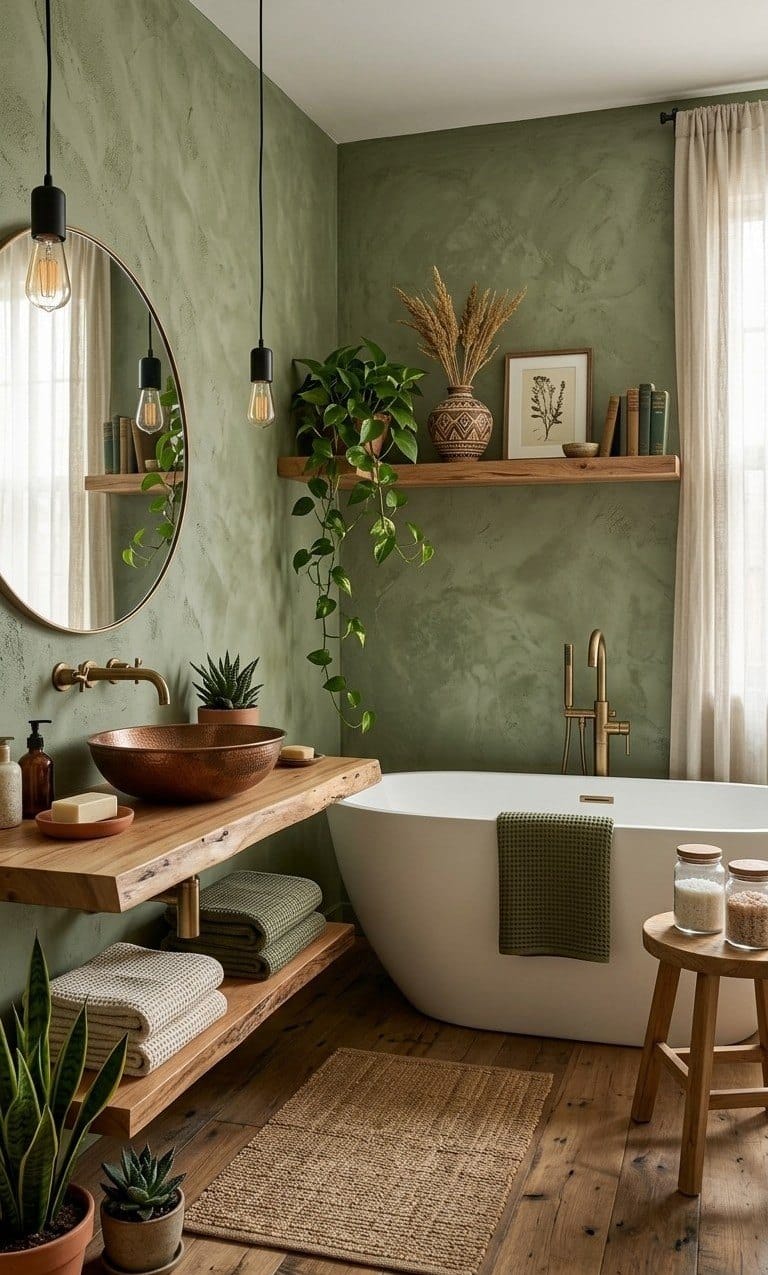
A bathroom is where real limewash earns its place. It is porous, so it takes up steam and lets it go again instead of trapping it behind a film, which suits a room that is wet twice a day. Here the olive wraps all four walls. Seal only the splash zones behind the basin and the bath, and leave the open walls alone so they keep breathing and ageing.
Warm metals are what stop olive turning cold in a wet room: a hammered copper basin on a live-edge oak slab, unlacquered brass taps that will darken as they age, never chrome. Moss waffle towels tie the room back to the bedroom, and one high oak shelf with a trailing pothos repeats the living room’s shelf at a smaller size.
- Premier Copper oval hammered vessel sink
- ARCORA brushed gold wall-mount faucet
- Live-edge walnut floating vanity
- Viva Maison sage waffle bath towels (2)
For subscribers: the bathroom’s paints and sealer, and the room at three budgets, from about $160 to $2,400.
The kitchen
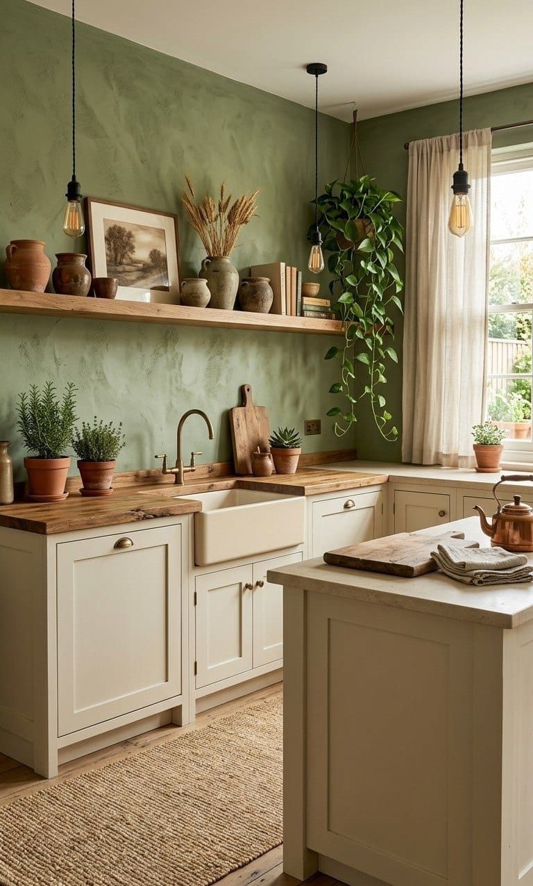
Kitchens are where the scheme pays off, because every hard surface can join in. The formula is short: cream shaker fronts, an oak worktop, brass hardware and one olive wall carried down behind the counter as the splashback. Keep everything else inside the palette, cream and oak and brass and a little terracotta, and the limewash wall stays the only real colour in the room.
The cream matters more than it looks. A warm cream, never a stark white, is what keeps the olive from feeling cold. A fireclay apron sink with a cream front is the most farmhouse thing in the room, and the brass bridge tap is its jewellery; match the shelf brackets and cup pulls to it. The butcher block wants oil and beeswax every four to six weeks at first.
- Crestwood 27-inch fireclay farmhouse sink
- KRAUS Urbix bridge faucet, brushed gold
- Cosmas brushed brass cup pulls (10)
- CONSDAN solid oak butcher block countertop
For subscribers: the kitchen’s paints for the wall and the cabinets, and the room at three budgets, from about $190 to $3,200.
The front porch
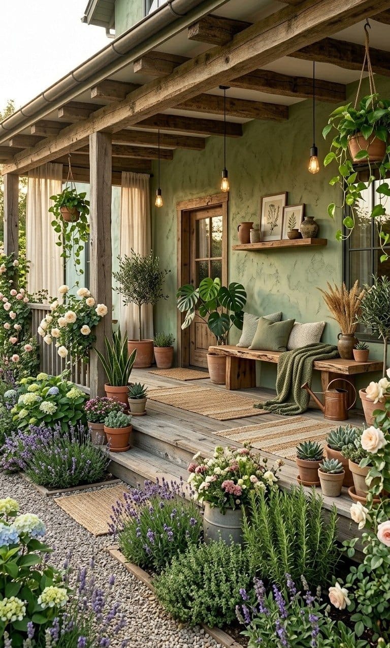
Outside, the thread keeps going, and the reason the porch feels like part of the house is plain repetition: the same olive, oak, moss, terracotta and brass as inside. The walls are lime render in the olive family, the posts and beams are oak left to silver under a clear matt oil, and a reclaimed bench carries the same moss throw and oat linen cushions as the sofa.
Group the terracotta in odd numbers at three heights, aged rather than new orange, and plant soft: lavender, hydrangea and roses read gentle against olive. A brass lantern and a real copper watering can repeat the indoor metals.
Exterior walls need a UV-stable exterior lime render or limewash, not the tin you used indoors.
- INGOFIN terracotta pots with saucers (3)
- Plow & Hearth reclaimed wood outdoor bench
- Master Craft copper watering can
- SAFAVIEH natural jute runner, 2×6
For subscribers: the exterior products for the olive render, and the porch at three budgets, from about $200 to $2,600.
How to apply it
Most of the look comes from the hand, not the tin. Two thin coats, a wide brush and no straight lines will beat an expensive product rolled on flat. If you are doing the budget version in matt paint, follow the same movements with paint thinned about ten per cent, and skip the first and last steps.
- Prime to the right porosity. It depends on the product. True lime won’t grip a glossy film, so painted walls usually need a mineral prep coat; many modern lime paints don’t.
- Mist the wall. Dampen it lightly with a spray bottle just before painting, so the lime moves and blends instead of dragging.
- Load the brush lightly. Dip only the tip and wipe off the excess. A hungry brush and thin coats are the whole secret.
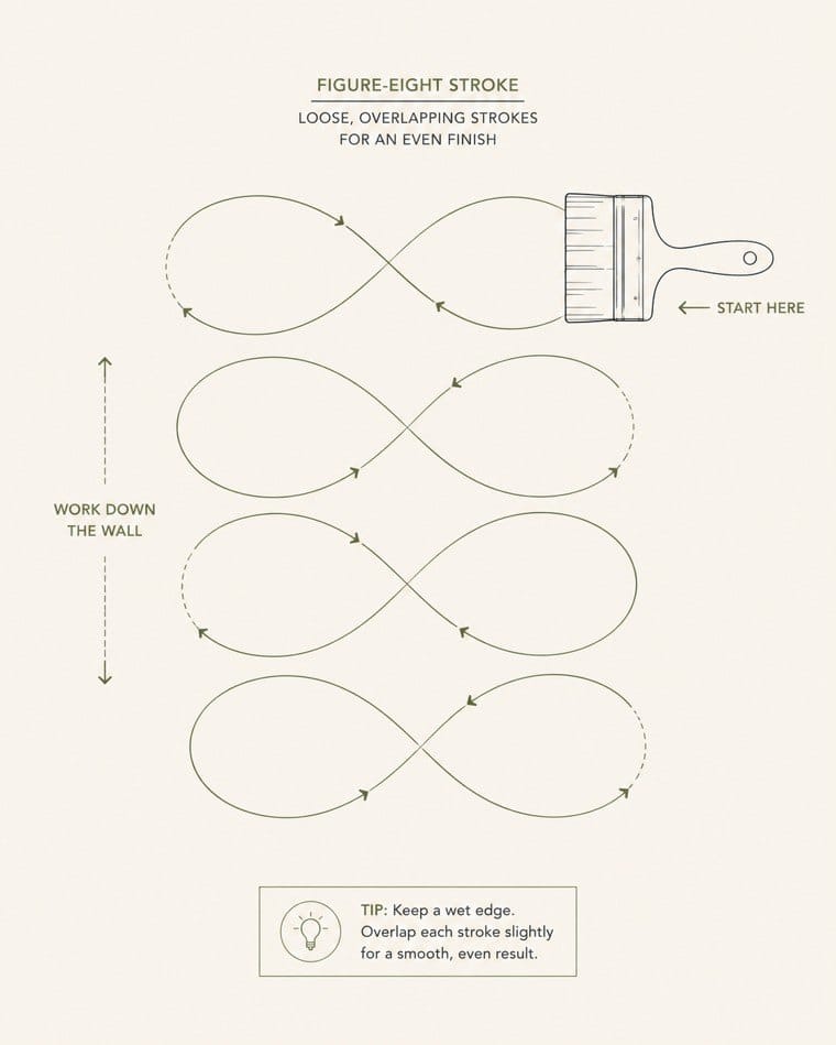
- Paint in loose cross-hatches. Big irregular arcs and figure-eights, 60 to 90 cm at a time, overlapping while wet.
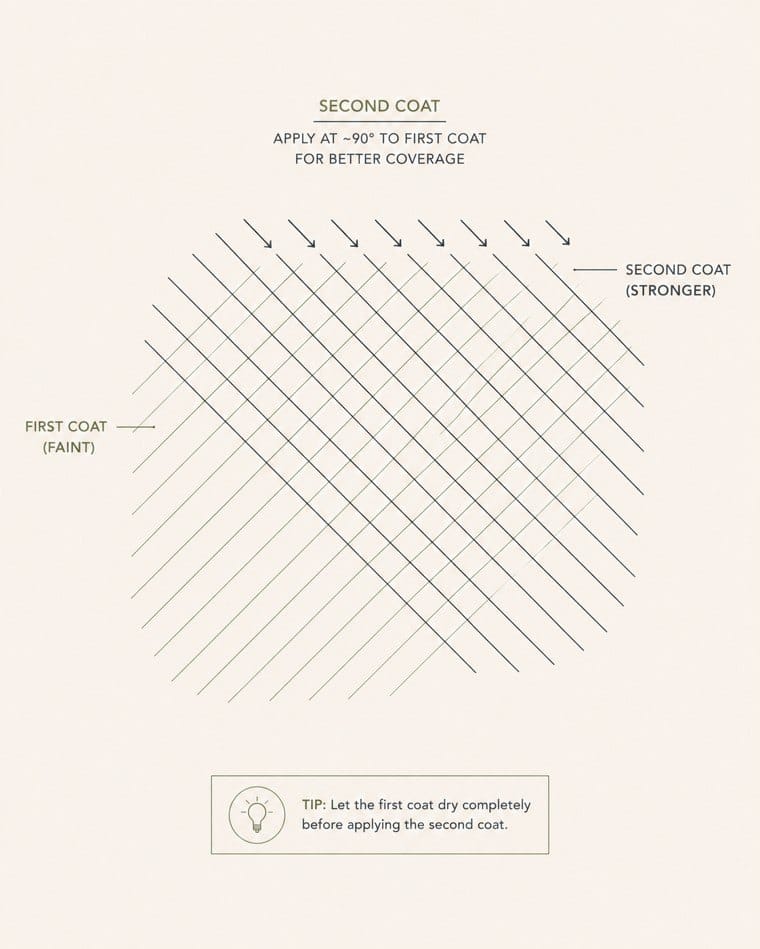
- Let it dry, then a second coat. Leave it at least 12 hours, then cross-hatch the second coat at roughly 90° to the first.
- Seal only where water hits. Behind a basin, hob or bath, brush on the maker’s mineral sealer. Leave open walls unsealed.
Do
- Keep the brush hungry: thin coats only
- Sweep in arcs, figure-eights and overlaps
- Work wet edge to wet edge, no hard stops
- Change pressure and angle on every stroke
Avoid
- A roller: it kills the cloud
- Straight, even lines
- A heavily loaded brush
- Stopping mid-wall and leaving a dry edge
You need a round block or limewash brush, a spray bottle, the right primer for your product, drop cloths and low-tack tape, nitrile gloves (lime is alkaline), a mineral sealer for the splash zones, and a stainless trowel only if you take the plaster route. One thing catches everyone the first time: wet lime looks several shades darker than it dries, and the maker’s swatch already shows the dry colour, so don’t buy darker to compensate.
For subscribers: the three ways to buy it with prices, the mistakes that flatten the finish, and the primer chart for every surface.
When it goes wrong
The limewash looks like normal paint
It probably is. Many brands’ limewash is only a colour name. For the real chalky finish you need a speciality lime product, tinted to the palette.
The wall is flat, with no movement
Limewash adds a cloud of colour, not raised relief. Build texture first with a skim of joint compound, or switch to a trowelled plaster.
The sage looks grey and cold
That is north light or cool bulbs. Olive and sage need warmth to read green: switch to 2700K bulbs and choose the warmer of the olive matches in the paint sheet.
It looks streaky or patchy
Uneven porosity, or strokes that are too straight. Prime for even absorption, paint onto a damp wall, work in loose overlapping arcs; a third thin coat evens out most patchiness.
For subscribers: five more fixes, the sheen chart, the light and bulb rules, the metals rule, a natural-light cheat sheet with the right match for each direction, the shelf styling diagrams and the whole-home checklist.
Do I even need to prime?
Over sound latex, many modern lime paints need nothing; true mineral limewash usually needs a mineral prep coat. Read the data sheet for your product.
The room feels flat and one-note
Too much colour and not enough texture. Add jute, loose-weave linen, a knit throw, stoneware and raw wood before you add any new colour.
The cream cabinets look dirty or yellow
The cream is too warm for your light. Move toward a greige-leaning cream (BM Natural Cream OC-14, SW Natural Tan SW 7567) and keep the trim a shade cleaner.
The wood tones clash
Warm and cool woods are mixed. Keep every wood warm (oak, beech, walnut); grey-washed or black-stained timber flattens olive.
It looks like a showroom
Everything matches and everything is new. Bring in age: one reclaimed piece, aged terracotta, brass left to patina, real or dried greenery.
| Surface | Finish | Why |
|---|---|---|
| Open walls | Matt or limewash | Soft, breathable, hides texture |
| Splash zones | Sealed matt or eggshell | Wipeable behind basin, hob and bath |
| Shaker cabinets | Satin or eggshell | Durable, low glare |
| Trim, doors, beams | Eggshell or matt oil | A little sheen; oil for raw timber |
| Butcher block | Oil and beeswax | Food-safe; re-oil every 4 to 6 weeks early on |
Light: 2700K warm-white bulbs everywhere, ideally on dimmers. Cool 4000K bulbs push olive toward grey-blue and make cream look clinical. Rough lumens: bedroom 1,500 to 3,000, living room 2,500 to 4,000, kitchen 4,000 to 6,000 plus task lighting, bathroom 2,500 to 4,000.
Metals: warm only, aged or unlacquered brass and copper, which patina and glow against olive. No chrome or nickel. A little matt black (a cord, hinges, a lantern) is fine as an accent if brass leads.
| Room faces | What happens to olive | Choose |
|---|---|---|
| North (cool, even) | Drains toward grey-green; cream can turn grey | Olive: Behr Oregano Spice PPU9-23. Cream: BM Natural Cream OC-14 |
| South (warm, bright) | Glows rich, can read yellow at noon | Olive: SW Edamame SW 7729. Cream: SW Natural Tan SW 7567 |
| East (gold mornings) | Lush at breakfast, greyer by evening | Choose for your main-use time; SW Edamame holds mornings well |
| West (orange evenings) | Muddy at midday, very warm at dusk | Olive: BM Tate Olive HC-112. Cream: BM Natural Cream OC-14 |
The rule that beats orientation: 2700K bulbs and a 48-hour sample test. Paint two A4 boards, tape one on the brightest wall and one on the darkest, and look at both at 9am, 3pm and 8pm. Window size sets how strong the effect is: small windows make olive read darker, big ones can wash the creams out at midday.
Decide your path
- Limewash finish: a speciality lime product from the limewash table
- Just the colours: the ordinary-paint matches
- Sample tested for 48 hours in your own light
Paint and finish
- Hero olive, limewash or matt, room by room
- Hearth Cream on ceilings, trim and returns
- Cabinet Cream on kitchen and bath joinery
- Garden Moss for the deepest accents and doors
- The right primer for your product and surface
- Mineral sealer for the splash zones
- Round block brush and a spray bottle
Wood and structure
- Oak floating shelves and nightstands
- Live-edge or slab tables
- Butcher-block worktop with oil and beeswax
- A reclaimed bench for the porch
- Stain to match: Minwax Special Walnut or Golden Oak
- A texture base coat if you want relief
Metal, light, textiles, green
- Aged-brass taps, bridge tap and cup pulls
- A hammered copper basin
- Plug-in cord pendants with 2700K bulbs
- Washed-linen bedding in oat and moss
- Moss knit throws, sage and cream pillows
- Jute rugs and runners, waffle towels
- Terracotta pots, pothos, dried stems
A note on the numbers: every hex was sampled from the images, and every paint code was checked against the maker’s current range and its light reflectance value. Where no honest match exists the guide says “match in store” rather than invent a code. Screens lie, so test a sample pot for 48 hours in your own light before you commit a wall.