
Most light kitchens fail after dark. The cabinets read crisp at eleven in the morning, then go grey under the recessed cans or amber under the pendants, and everyone blames the paint when the problem is the bulb, the countertop, or an undertone nobody checked against anything. What follows are seven directions for light colored cabinets that hold up at seven in the evening: warm off-whites with a known light reflectance value, pale wood that will not turn orange, and two light colors that are not white at all.
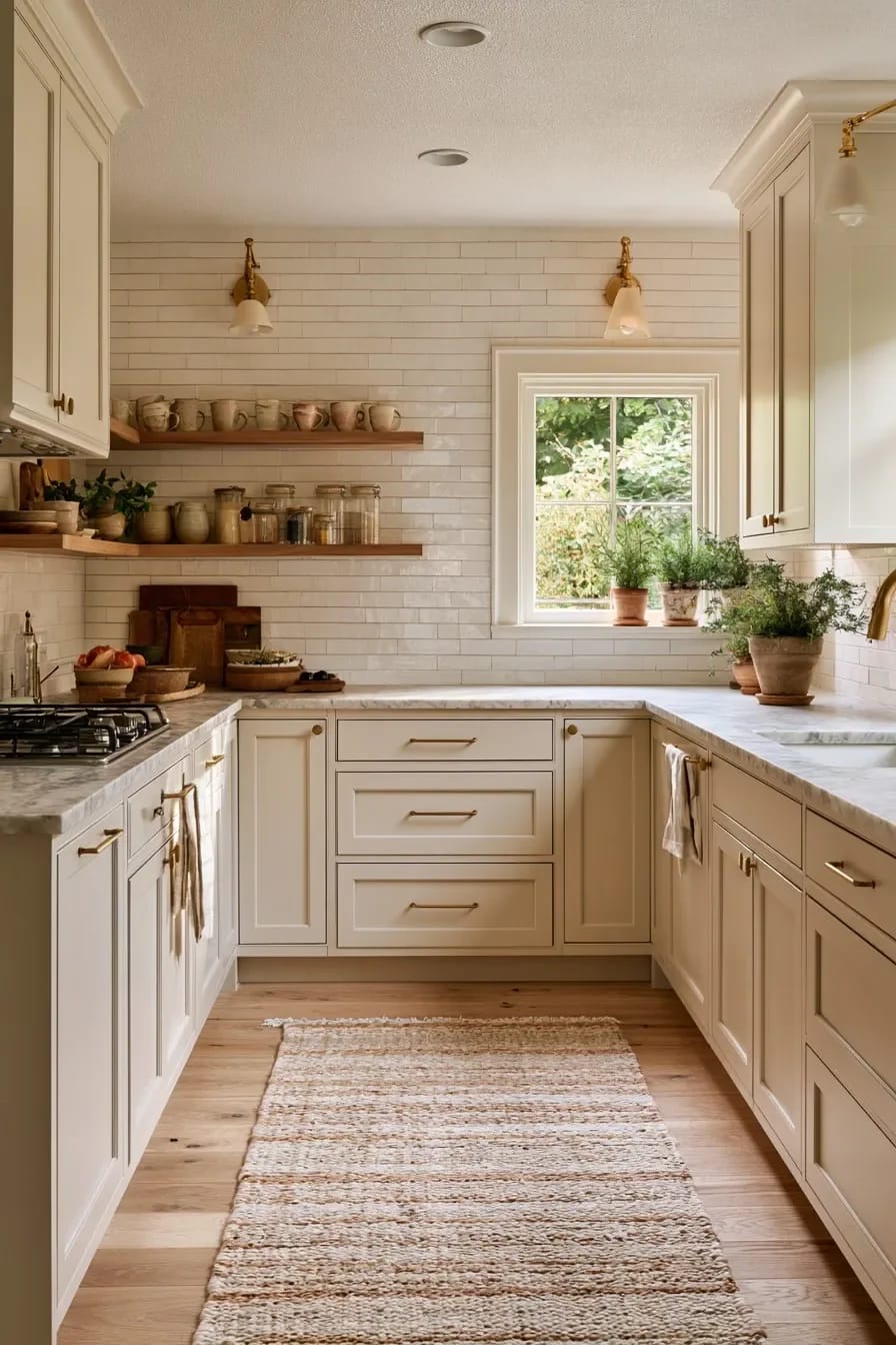
1. Warm Off-White Cabinets Beat True White in Almost Every Kitchen
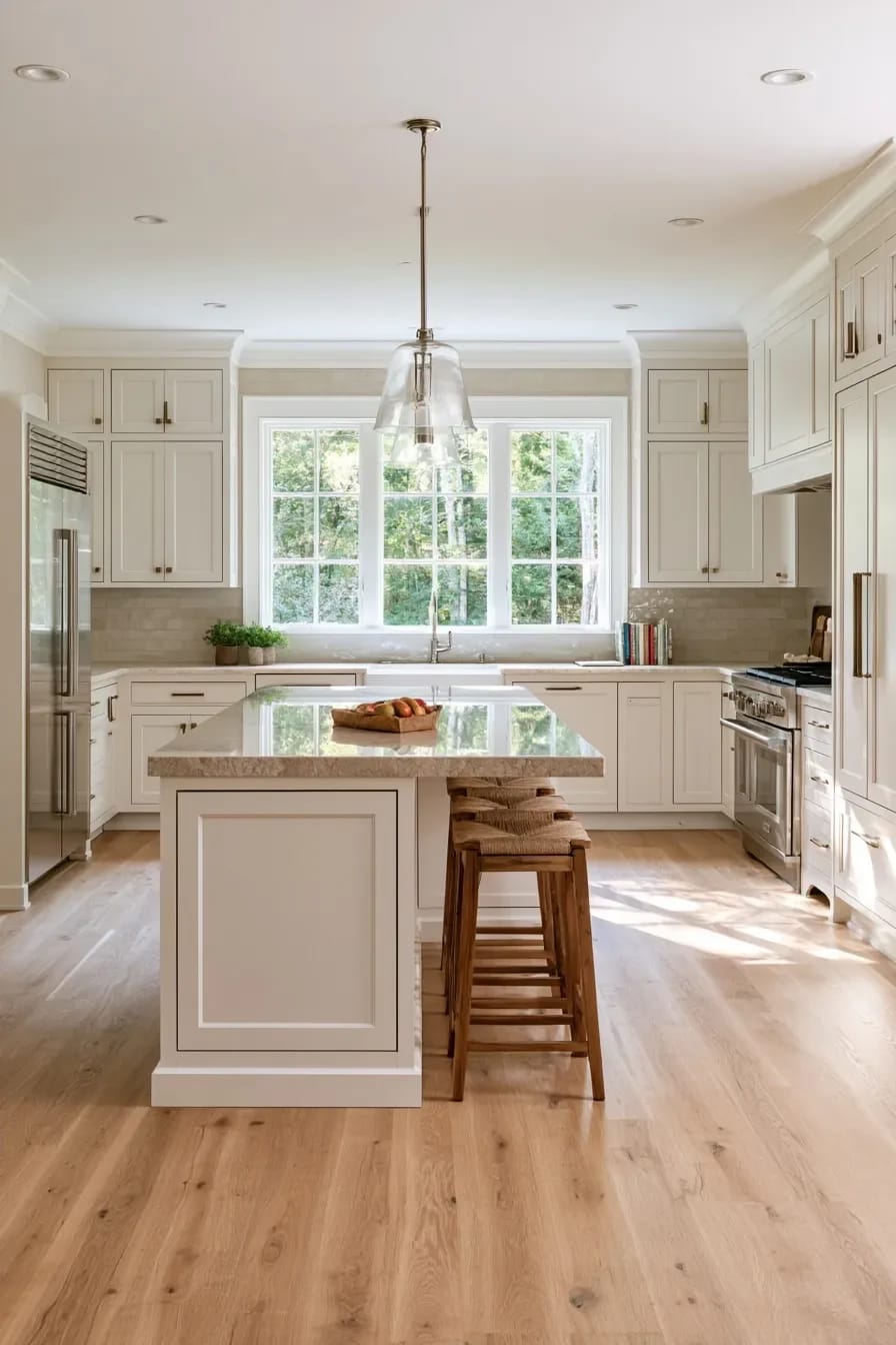
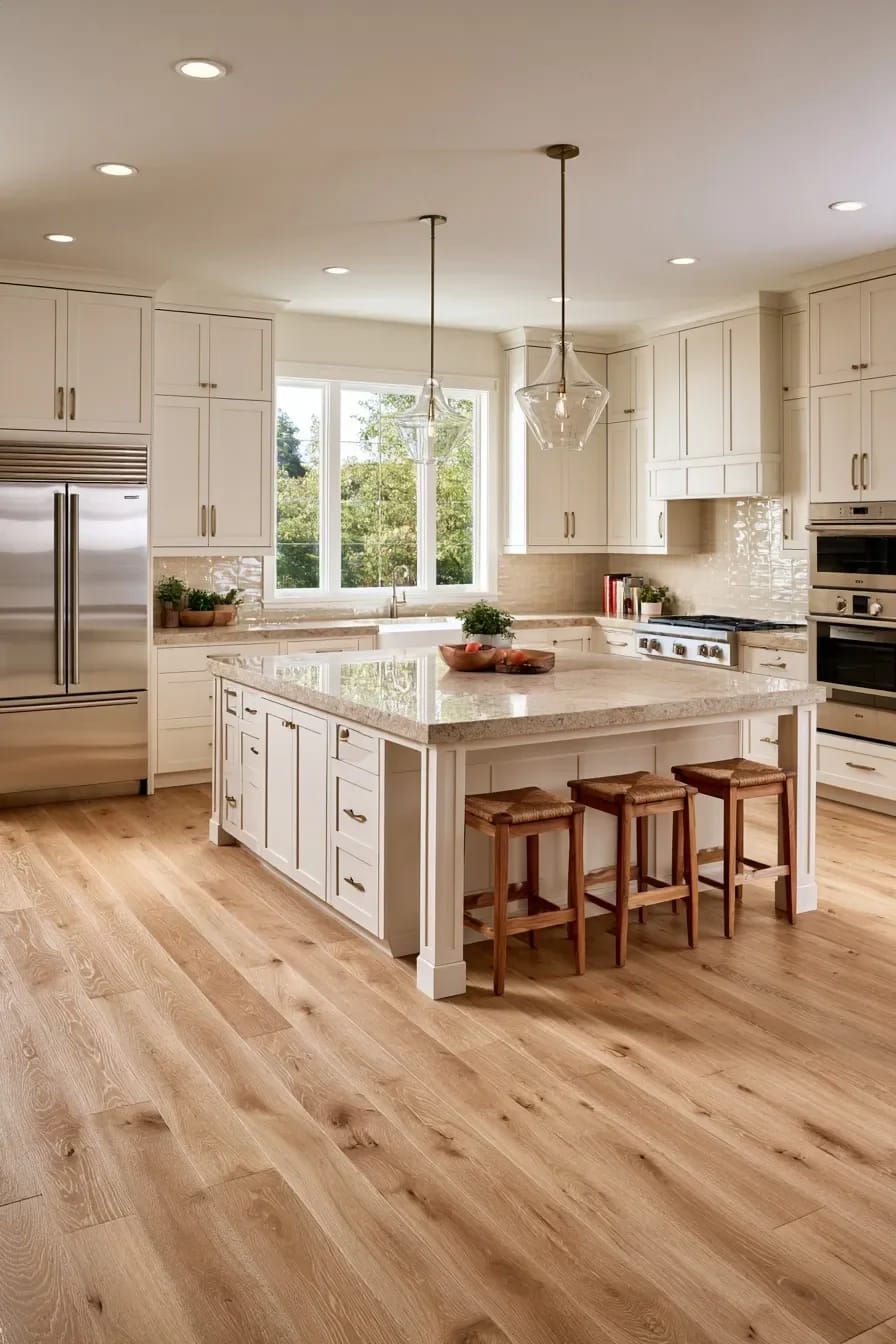
Paint the cabinets a warm off-white and let something else in the room be the whitest thing in it. True white cabinetry only holds up when the counter, the trim and the appliances all run cooler than the doors, and in most kitchens they do not, which is how a brand new cabinet run ends up looking faintly grubby the week the fridge is delivered.
Three off-whites worth shortlisting
- Sherwin-Williams Alabaster SW 7008, LRV 82. Creamy yellow base. The most forgiving of the three next to brass and white oak.
- Benjamin Moore Swiss Coffee OC-45 sits at almost the same light reflectance value, roughly 82, but carries a green-yellow complexity that surfaces under warm bulbs, so it behaves warmer than Alabaster despite the matching number.
- White Dove OC-17, mid-80s and slightly grayed. This is the one for a kitchen with a cool counter already installed.
Granted, none of those numbers survive contact with a real room. Light reflectance is measured on a flat chip, and a shaker door is not flat: the rail casts a hairline shadow into the panel, which reads as a half-step darker in person than the swatch taped to your wall.
Where a warm off-white goes wrong
Put a creamy off-white beside white appliances or bright white subway tile and it stops looking soft and starts looking dirty. Kylie M Interiors’ review of Alabaster flags exactly this pairing, and it is the single most common complaint from people who chose the color off a chip in a store. If your appliances are white and staying white, either go whiter on the doors or commit fully and change the tile, because the crisper end of the cabinet spectrum plays by its own set of rules.
 11 Beige Kitchen Ideas That Don’t Read Builder-Grade Where beige belongs in a kitchen, and the reflectance number that keeps it from going flat.
2. Pale White Oak Fronts Instead of Paint
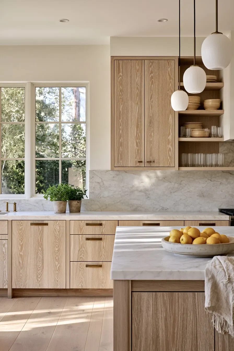
Wood fronts do the one thing paint cannot, which is stay light while still having something to look at. A pale oak door has grain running through it, so the surface changes as the light moves across the room; a painted door at the same reflectance value is inert by comparison. This is the direction the whole warm-neutral swing has been heading, and it pairs with off-white perimeter cabinets better than it pairs with itself.
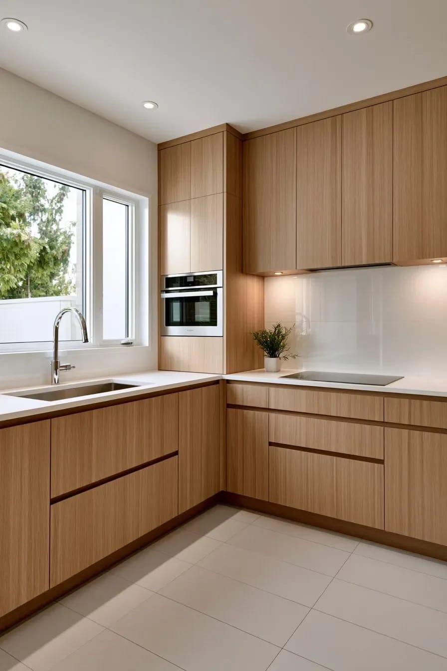
Rift-sawn, not plain-sawn
Rift cut gives you tight parallel grain with no cathedral figure, which is why designers specify it and why it costs meaningfully more per door. Plain-sawn oak has those big looping arches, and on a bank of six drawer fronts the arches fight each other. If the quote comes back and rift is out of reach, ask for plain-sawn fronts sequenced across the run rather than pulled at random from the stack, which costs the shop attention rather than money.
The topcoat decides whether it ambers
Oil-based polyurethane will pull the wood yellow over a few years, and on white oak that shift is the difference between the kitchen you specified and a kitchen that looks like 2004. Ask for a water-based two-component finish or a hardwax oil with UV inhibitors, get it in writing on the order, and check the sample door in the actual room at dusk before the rest go into production. Pale wood belongs to the same family as the warm neutral palette that replaced greige, which is worth understanding before you commit the counters to it.
3. Run the Light Cabinets to the Ceiling in a Small Kitchen
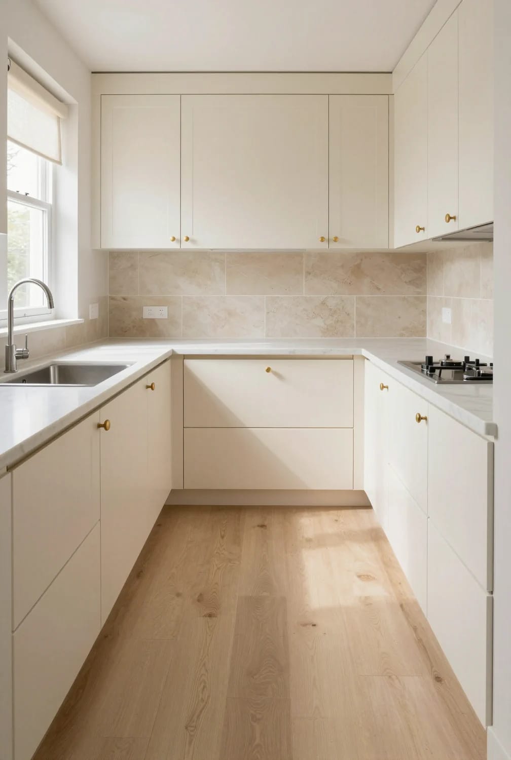
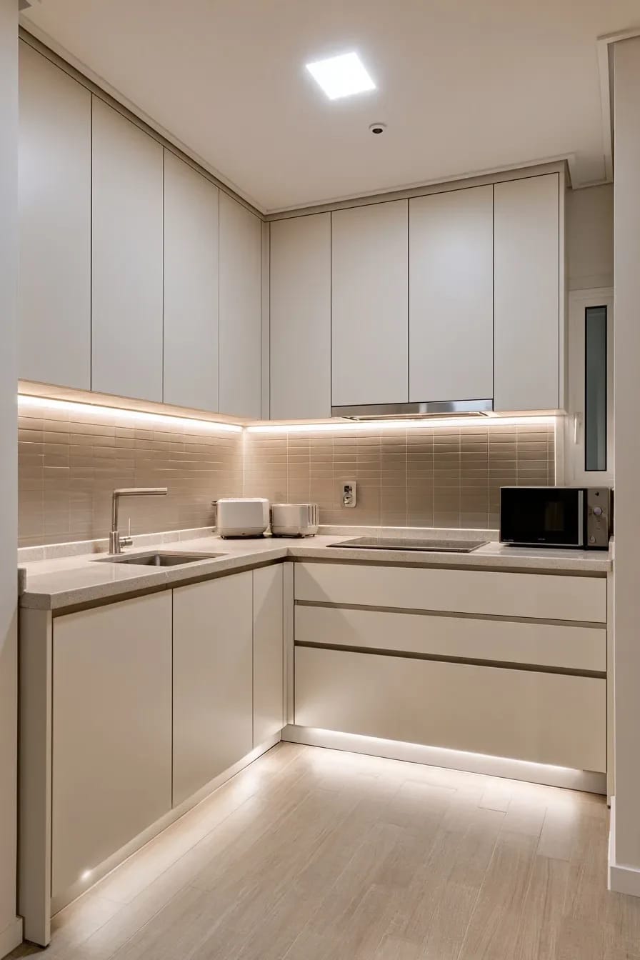
In a small kitchen, take the light cabinets all the way up and stack a second shorter box on top of the wall cabinets. The dust shelf at 84 inches is a horizontal line across the room at exactly the height where the eye stops, and removing it is the cheapest thing you can do to make a galley read taller. Twelve to fifteen inches is the usual top box, and it does not need to be functional storage; it needs to be the same color as everything below it.
The catch is trim. A stacked run only works if the crown or the flat scribe closes cleanly into the ceiling, and old ceilings are not level, so budget for the carpenter to scribe rather than caulk a wedge and hope. That fix is invisible when it is done well and impossible to ignore when it is not.
 Minimalist Kitchen Ideas That Survive Actual Cooking Storage decisions that keep a pared-back kitchen looking pared-back at dinnertime.
4. Greige and Taupe Cabinets Hide What White Cabinets Broadcast
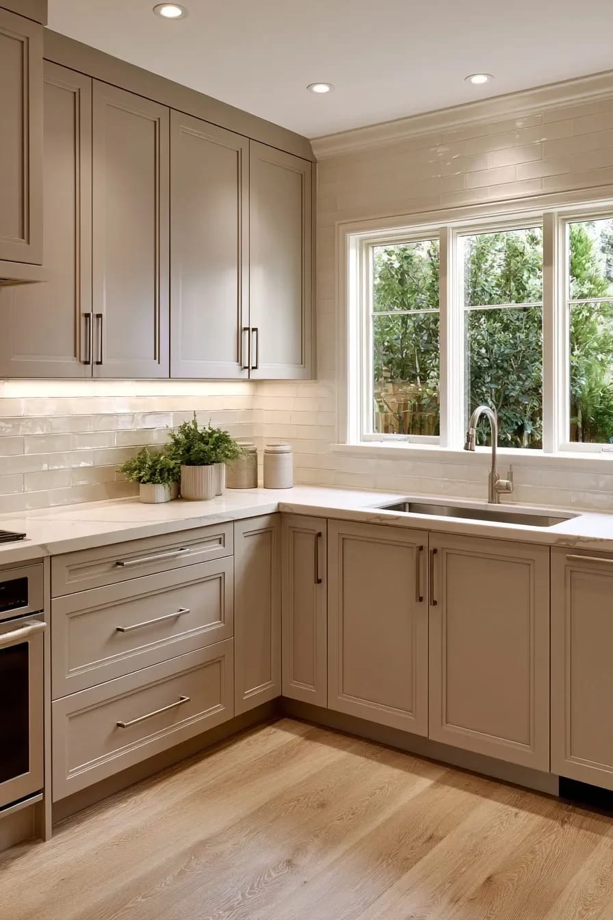
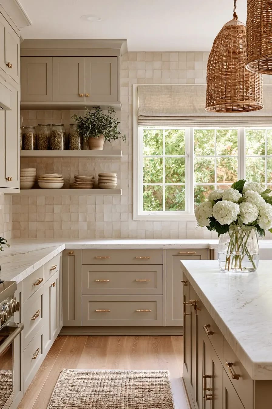
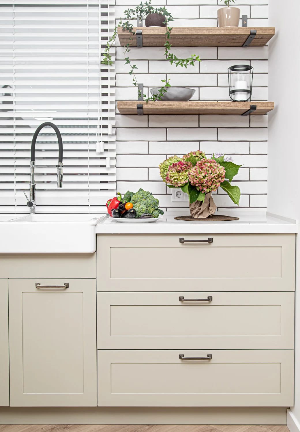
Taupe is the light cabinet color for people who actually cook. It sits high enough on the reflectance scale to keep a room bright and low enough that a wet handprint near the sink does not announce itself from the doorway, which is the practical argument nobody makes in a showroom. Skip anything with a blue base: cool light grey was the 2016 kitchen and it has aged badly, while warm greige has not.
The door profile carries more weight than the color here
A narrow-rail shaker in taupe reads considered. The same color on a slab door reads like office casework, and on a raised panel with an ogee edge it reads like a 2005 builder upgrade, which is a harsh thing to say about a door that costs the same either way. If you are choosing between profiles rather than colors, the range of cabinet styles worth considering is wider than the two most kitchen showrooms display.
5. Pale Sage Is the Light Cabinet Color That Isn't a Neutral
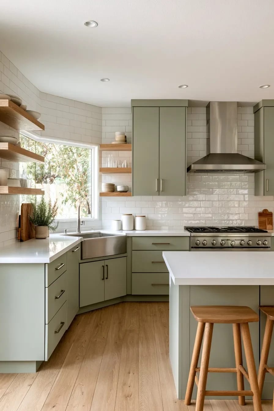
Put the sage on the base cabinets and an off-white above, not the other way around and not on both. Benjamin Moore October Mist 1495 and Sherwin-Williams Sea Salt SW 6204 are the two most people land on, and they are not interchangeable: Sea Salt pulls blue-green in north light and October Mist stays grey-green, which matters more than either chip suggests. A whole kitchen in either one goes institutional fast.
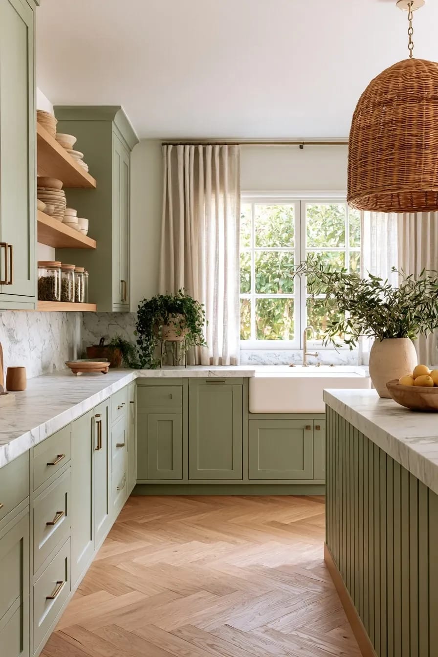
Green also ages differently from a neutral, and pretending otherwise is how people end up repainting. It reads as a decision, which is the point, and a decision is a thing you can tire of. Anyone considering it should look at the full range of green cabinet depths before settling on the palest one available.
6. The Countertop Decides Whether Light Cabinets Read Cream or Dirty
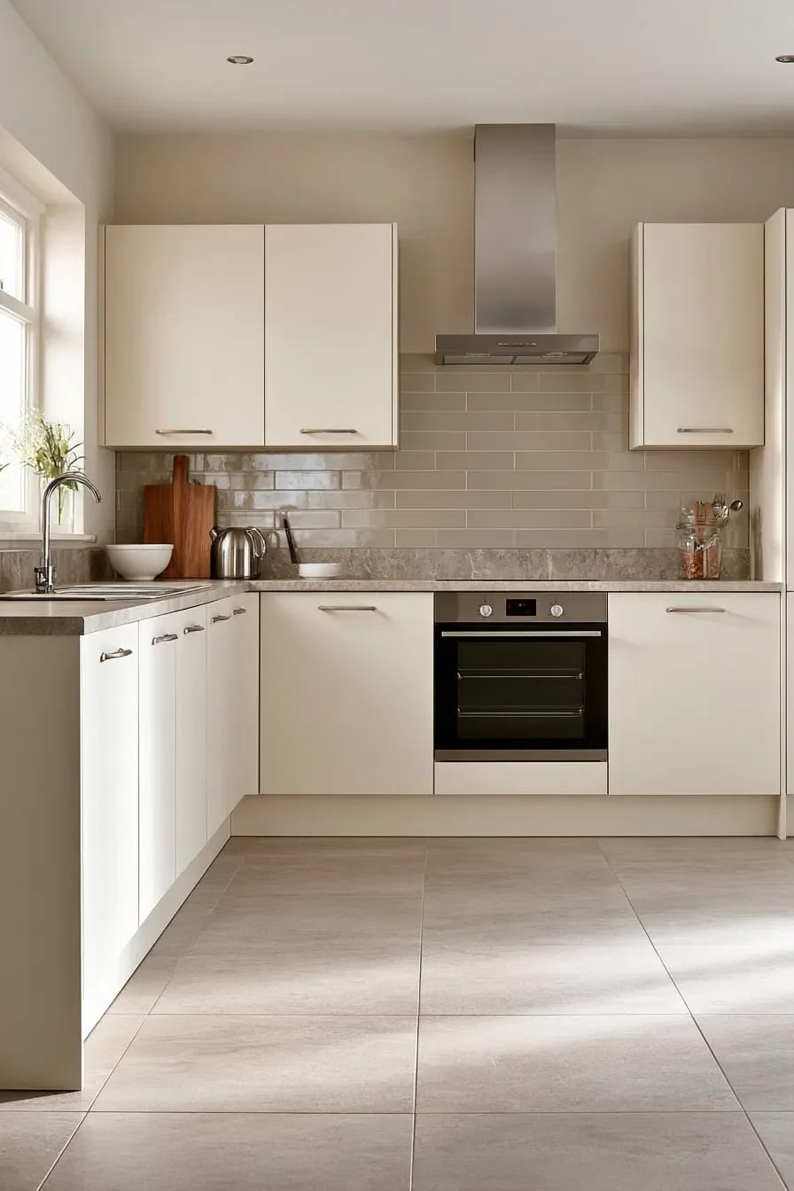
Choose the counter first, then match the cabinet color to it, because the counter is the surface you cannot change your mind about for eight hundred dollars. Almost every complaint that starts with "my cabinets look dingy" ends with a bright cool quartz sitting on top of a warm cream door, and no amount of styling fixes that adjacency.
Cool quartz against a warm door
The engineered whites with optical brighteners in them are the specific problem. They fluoresce slightly, they hold their brightness under any light, and next to a creamy off-white front they turn it beige by comparison. If you love the counter, move the cabinets to a cooler off-white and let the room read crisp on purpose rather than trying to have both temperatures at once.
Match the temperature of the vein, not the color of the door
On a marble or marble-look backsplash, the vein is doing the work. A grey-veined slab wants a cabinet with a hint of grey in it; a slab with warm putty and rust flecks wants the creamy off-white and will make a cool white look sterile. Look at the vein under the kitchen’s own light rather than the fabricator’s fluorescent shed, and remember that a full-height slab shows four times the vein of a four inch upstand. There is more to say about how tile choices behave above a run of pale cabinets than fits in one section.
Take the counter sample and the cabinet door sample home, lay the counter piece flat and stand the door piece upright against it, then look at the pair in the actual kitchen at three in the afternoon and again at eight at night with the lights on. Held side by side in your hand, or upright under showroom halogen, two samples tell you almost nothing about what a horizontal surface and a vertical surface will do to each other.
7. Under-Cabinet Light Is What Makes Light Cabinets Look Light
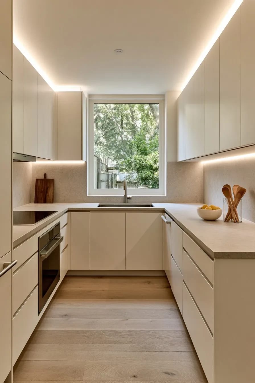
Specify 3000K under the cabinets and stop using 2700K in a kitchen with cream fronts. The warmer bulb is the one people default to because it is what living rooms use, and it pushes an off-white cabinet and a white counter toward yellow at exactly the hour you are standing at the counter chopping something. Waveform Lighting’s under-cabinet guide argues against anything below 3000K for this reason, on color accuracy grounds rather than aesthetic ones.
Color temperature: 3000K, matched to the recessed cans and the pendants. Mixed temperatures in one room read as a fault, not a layer.
Color rendering: CRI 90 or above. A low-CRI 3000K strip still makes food and stone look flat, and people misread that as the bulb being too warm.
Format: a diffused channel or a covered tape rather than bare strip, so the counter shows a continuous wash instead of a row of dots reflecting off polished quartz.
Position: mounted at the front edge of the cabinet bottom, not the back. At the back it lights the backsplash and leaves your hands in shadow.
Control: dimmable and on its own switch, because the same light that is right for prep is too much at eleven at night.
The layer people forget
Toe-kick lighting on the same circuit does more for a pale kitchen at night than another ceiling can, and it costs very little while the floor is up. It bounces light off the floor and back up onto the base cabinet fronts, which is where a light colored kitchen goes dark first.
If you are sequencing this: counter sample first, then the cabinet color chosen against it, then the backsplash, then the lighting spec written into the electrical plan before rough-in rather than after. That order costs nothing and prevents the two failures in this piece that are genuinely expensive to undo, which are a cool counter over a warm door and a 2700K strip you now have to rip out of a finished cabinet.
One thing I cannot give you is a number for the repaint. Professional cabinet spraying is priced by door count, finish system and region, and the quotes I have seen quoted publicly vary so widely that any figure here would mislead someone. Get three, ask each of them which topcoat they are using and whether it ambers, and treat the ones that cannot answer that second question as the answer.
Related Posts
- 27 Breathtaking White Kitchen Cabinets: Ideas to Brighten Your Space with Timeless Elegance
- 21 Inspiring Kitchen Cabinet Ideas: From Modern to Classic Designs
- 11 Beige Kitchen Ideas That Don’t Read Builder-Grade
- 7 Japanese Kitchen Ideas That Feel Warm, Not Sterile
- Neutral Kitchen Ideas That Read Warm, Not Builder-Grade
- 39 Trendy Blue Kitchen Cabinet Ideas: with Cool, Sophisticated Vibes