
Run a swatch of true burgundy next to a white pedestal sink and the sink turns faintly grey. That is the first thing this color does in a bathroom: it chills whatever cool thing sits near it and warms whatever warm thing sits near it, so the room stops being neutral the moment the paint dries. Burgundy rewards a plan and punishes a whim.
This is not a list of eleven near-identical moody showers. Burgundy behaves one way on a vanity and another way color-drenched across a whole wall, one way under gloss and another under matte, one way in a windowless powder room and another in a room with a cold north window. The ideas below are grouped by how much of the room you are willing to hand over to it.
Start small if the color makes you nervous, because it is one of the easier bold shades to over-apply and one of the harder ones to reverse once the tile is grouted. A few of these are a weekend and a quart of enamel. A couple are renovation decisions you live with for a decade. I have marked which is which as we go.

How far to take the burgundy
Do this
- Pick your undertone first. A blue-based burgundy (wine, oxblood) goes cold and formal; a brown-based one (garnet, brick-burgundy) stays warm and forgiving in low light.
- Bring the color up onto the ceiling in a small room. Stopping at the wall line draws a hard border that makes a powder room feel like a box.
Avoid
- Crisp white grout and bright chrome. Together they fight the warmth and make the burgundy read like a 1990s accent wall.
- Testing the color on a north wall only. It looks like a different paint on the sunless side of the room.
1. Color-drench a windowless powder room, ceiling included
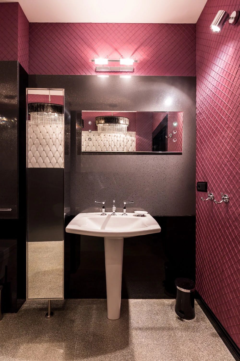
The color-drenched half bath is the lowest-risk way to go all in, because the room is tiny and you were never relaxing in there anyway. Painting walls, trim, and ceiling the same burgundy erases the edges and makes four square feet feel deliberate instead of cramped. Matte or eggshell, not gloss, so the surface swallows light rather than bouncing every ceiling fixture back at you.
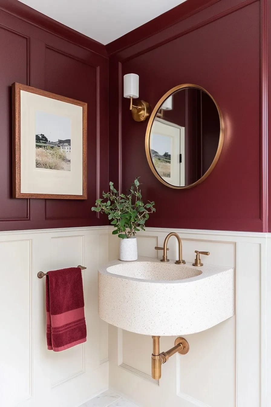
If you are weighing which burgundy to actually put on the walls, the undertone matters more than the name on the can, and our guide to bathroom paint colors that hold up in low light walks through how the same shade shifts between rooms. One quart covers a powder room with a coat to spare, so this is genuinely a Saturday.

 15 Genius Half Bathroom Decor Ideas Storage and layout moves for the powder room a color-drench looks best in.
2. Burgundy on the vanity only, walls left pale
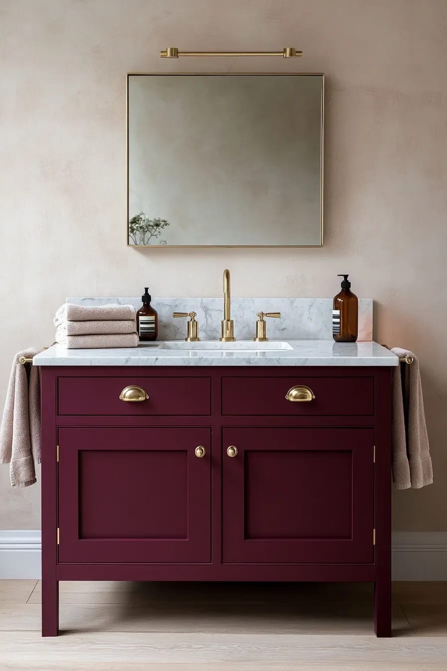
Painting an existing vanity is the reversible version of a burgundy bathroom, and it is the one I recommend to anyone who says they love the color but has never lived with a dark room. The cabinet takes the drama; the pale walls keep the space bright; if you hate it in a year, it is a weekend to repaint. Use a cabinet-grade enamel and degrease the doors first, because bathroom cabinetry carries a film of hand cream and hairspray that ordinary wall paint will peel off of.
Keep the counter light. A cream or pale-veined marble over a burgundy base is the pairing that reads considered rather than heavy, and there are more silhouettes worth stealing in our roundup of bathroom vanity designs.
3. Half-height burgundy zellige with a plaster wall above
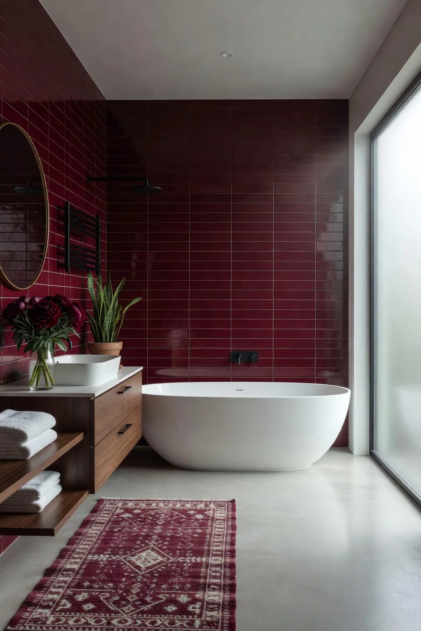
Taking tile only to chair-rail height gives you the color at eye level, where it counts, and leaves the top of the room light so it never closes in. Glossy burgundy zellige is the tile carrying this look right now, because the uneven handmade glaze breaks up what would otherwise be a flat slab of dark color and catches light in a way a machine tile cannot. Bert & May and Zia Tile both stock burgundy and oxblood zellige if you want to see real samples rather than a screen.
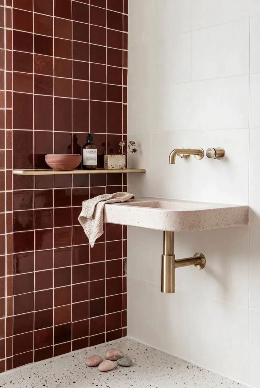
Budget note: zellige runs higher than standard ceramic and needs a tiler who has set it before, since the lippage and irregular edges trip up anyone expecting a uniform grid. If the quote climbs, a pressed ceramic in a similar garnet gets you most of the way, and there are cheaper layouts worth comparing in our bathroom tile ideas.
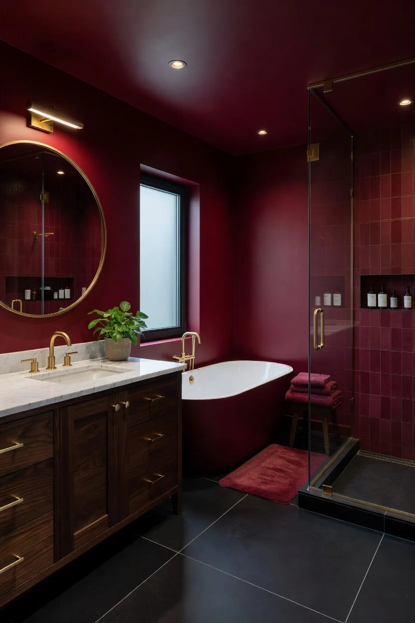
The pairings that decide whether it works
4. Warm it with cream and unlacquered brass, not white and chrome
Burgundy against bright white and polished chrome is the single most common way this color goes wrong. The cool metal and stark white pull the blue out of the burgundy and drop the temperature of the whole room, so it reads dated instead of deep. Swap in cream or bone for the white, and brass, bronze, or brushed gold for the chrome, and the same wall color changes character entirely.
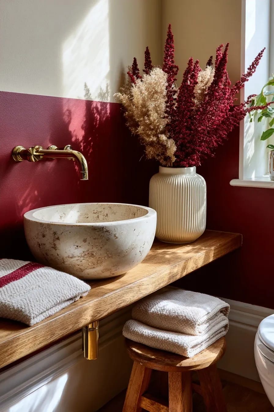
The reason this pairing works is temperature, not taste. Burgundy is a warm dark, and it wants warm neighbors; cream, bone, oatmeal, and aged brass all sit on the same side of the color wheel and let the burgundy read as rich rather than severe. Chrome and bright white sit on the cold side and drag against it. Granted, a blue-based oxblood can take a little cool contrast on purpose, but that is a deliberate high-contrast choice, not the default.
Burgundy lives in the same family as the darker greens and inky blues, so if you are still deciding on the exact depth, the range in our moody bathroom designs is a useful gut check before you commit a whole room.
5. Let the marble supply the burgundy for you
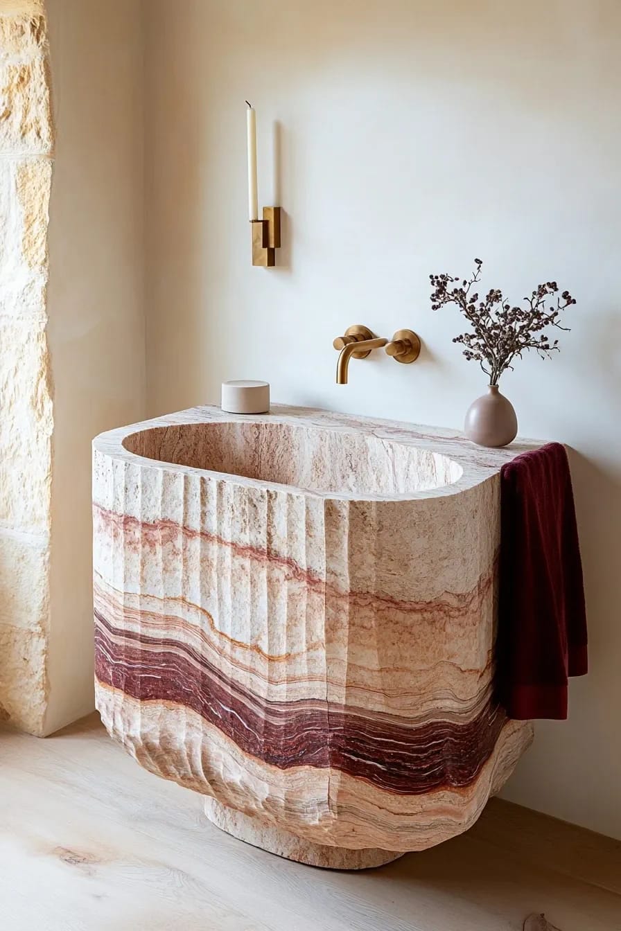
If you want burgundy without painting a wall burgundy, buy stone that already contains it. Calacatta Viola is the marble people mean here: a cream ground shot through with veins of burgundy, plum, and rust, so the color arrives as pattern instead of a flat field. A single slab on a vanity or a shower niche does the work of an entire accent wall and looks far more expensive, because it is.
Two honest cautions. Viola is a natural marble, so it etches when acid hits it, and it wants sealing and a little care around toothpaste and citrus. And the good slabs are pricey and vary wildly, so you buy the actual slab you saw, never a sample chip and a promise.
6. Take the woodsy route with warm oak

Pairing burgundy with warm wood pulls it away from the formal, hotel-bar direction and toward something earthier and more relaxed. Oak, walnut, and clay temper the richness of the color the way a wooden spoon takes the edge off a heavy sauce, and the result reads like a room in an old farmhouse rather than a cocktail lounge. This is the version to choose if the moody burgundy bathrooms you have been saving feel a little too serious to actually live in.
7. Push it toward black for the hardest-edged version
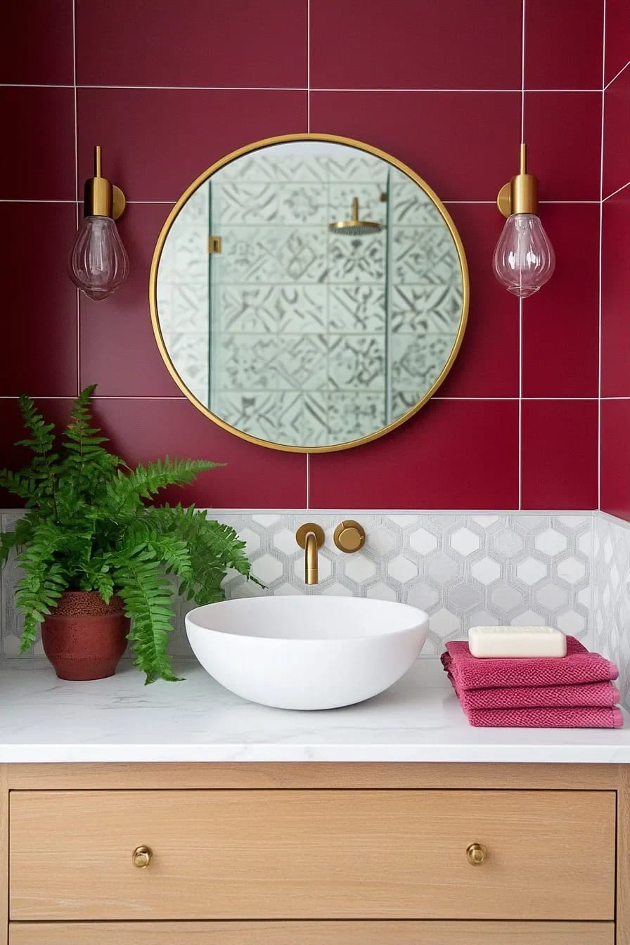
For a room you want to feel enclosed and a little severe, black grout and matte black fixtures give burgundy a sharp architectural edge instead of a cozy one. The dark grout turns the tile into a grid you read from across the room; the black metal keeps it from tipping into anything soft. It is the least forgiving version on this list and the most striking when it lands.
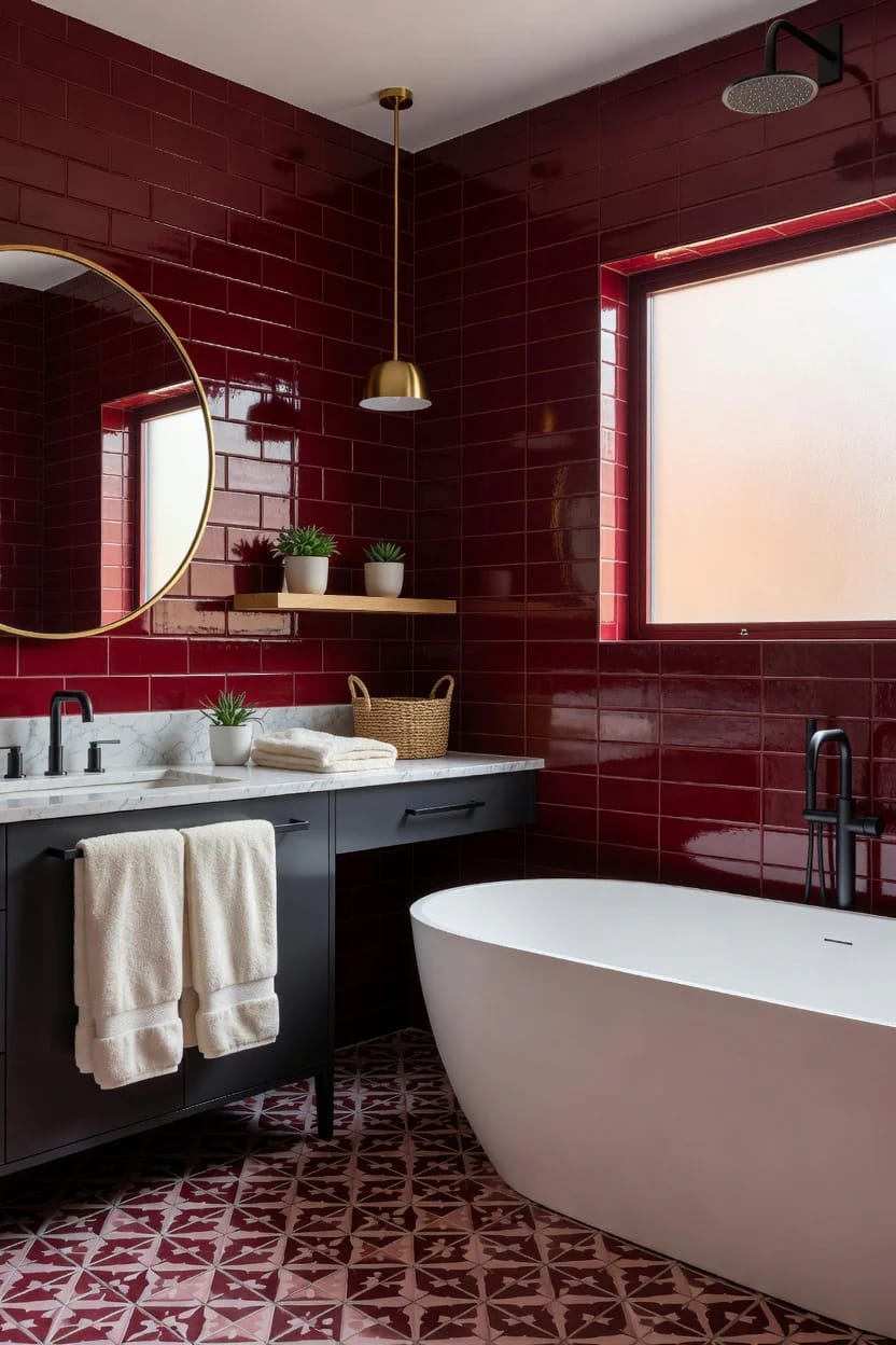
If you find yourself pulling more black than burgundy into the scheme, you are halfway to a different room, and the balance in our black and white bathroom designs is worth a look before you order tile.
Tile, finish, and texture
8. Choose gloss over matte in a north-facing room

Here is the counterintuitive call: in a dim, north-facing bathroom, glossy burgundy tile is the right choice, not matte. Matte swallows what little light the room gets and can go flat and cavelike; gloss bounces the daylight around and keeps the color alive. Save the matte for a room with a big south or west window that has light to spare. It is the opposite of what most people assume, and it is the difference between a jewel-box and a dim closet.
9. Use hand-glazed tile so the color moves
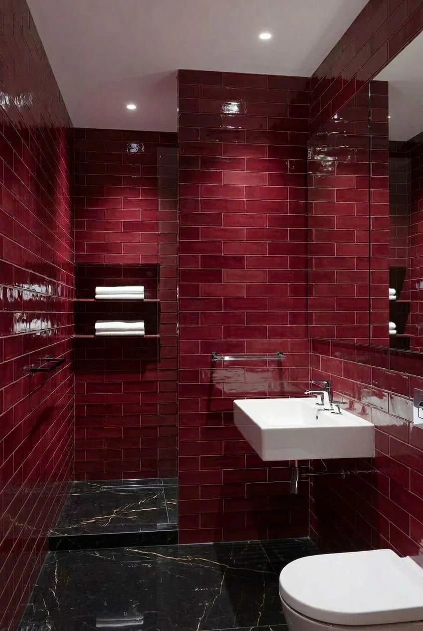
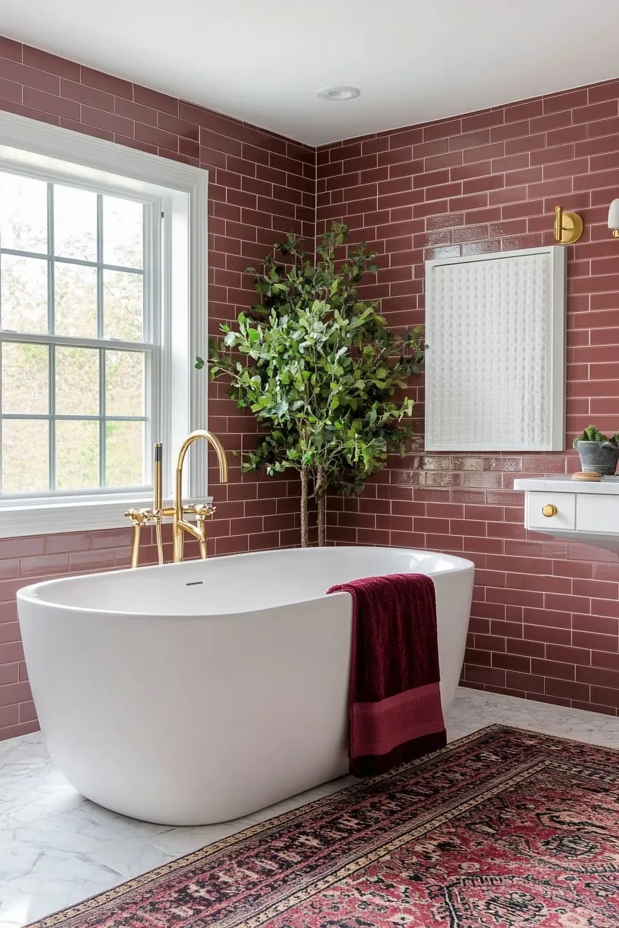
The whole argument for a hand-glazed burgundy over a flat printed one is that the color never sits still. Where a machine-made tile gives you one uniform slab of dark red across the wall, a hand-glazed tile pools and thins, so the surface shifts from wine to brick as you move past it and as the light changes through the day. In a single dark color, that variation is what keeps a wall from going dead. It costs more and it is worth it precisely on the color that would otherwise read as a solid dark mass.
Light, and a way to test before you commit
10. Light it with 2700K and a sconce at eye level
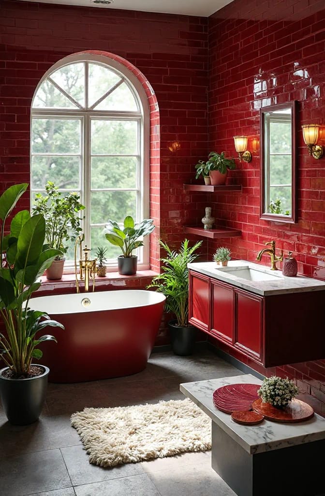
Burgundy eats cool light, so the bulb temperature matters more here than in a pale room. Cool 4000K to 5000K bulbs, the default in most bathroom fittings, drain the warmth straight out of the color and leave it looking grey and flat. Go to 2700K, the warm end, and put a sconce or two at mirror height instead of relying on a single ceiling can, which casts everyone in shadow anyway. This is a cheap fix people skip and then blame the paint for.
11. Test the whole thing with soft goods first
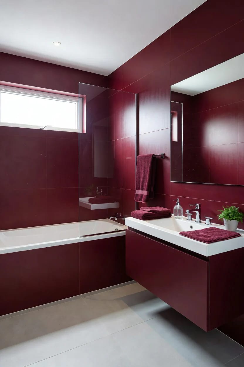
Before you paint a wall or order tile, spend a little and hang the color in fabric. A burgundy shower curtain, a couple of towels, a bath mat, and a taped sample patch on the back of the door tell you within a week whether you actually want to live with the color in that specific light, and every piece of it is returnable. Textiles run about fifteen to forty dollars a piece, against a tiled wall you cannot undo.
The people who regret a burgundy bathroom almost always skipped this step and went straight to the permanent surface. The people who love theirs usually backed into it: towels first, then a painted vanity, then eventually the walls, once they already knew the color held up at seven in the morning on a grey day.

Whatever level you land on, do the lighting before you judge the color, and look at your top two burgundies on the darkest wall in the room, not the brightest. Burgundy that looks right in the sun and wrong in the shade will spend most of its life in the shade.