
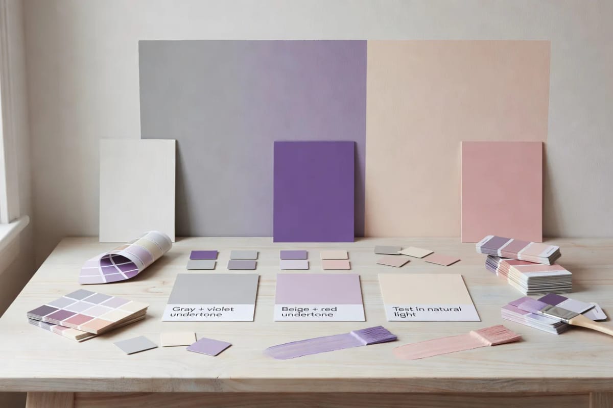
Sherwin-Williams publishes a Light Reflectance Value of 58 for Repose Gray and says nothing at all about the violet sitting underneath it. That violet is the most repeated complaint about the color: two coats go up, the hallway dries, and by four in the afternoon the walls read faintly lavender. Nobody misread the chip. The chip was two inches wide and lit by a fluorescent tube in a store forty minutes away.
What follows is the mechanism, not the mysticism. Why a gray carries violet in the first place, why beige carries pink, which specific colors do it worst, and how to force the shift into the open before you own five gallons of it.
One thing to settle up front: an undertone is not a defect, and there is no undertone-free paint waiting at the counter for a smarter shopper. Every neutral sold as a wall color has a hue buried in it. The decision is which hue you want, not whether you get one.
What is a paint undertone?
A paint undertone is the secondary hue mixed into a neutral, the small amount of violet, green, pink or yellow that keeps gray and beige from reading as flat mud. It stays invisible on a paint chip and surfaces on a finished wall, shifting with the room’s light, the floor, and the trim beside it.
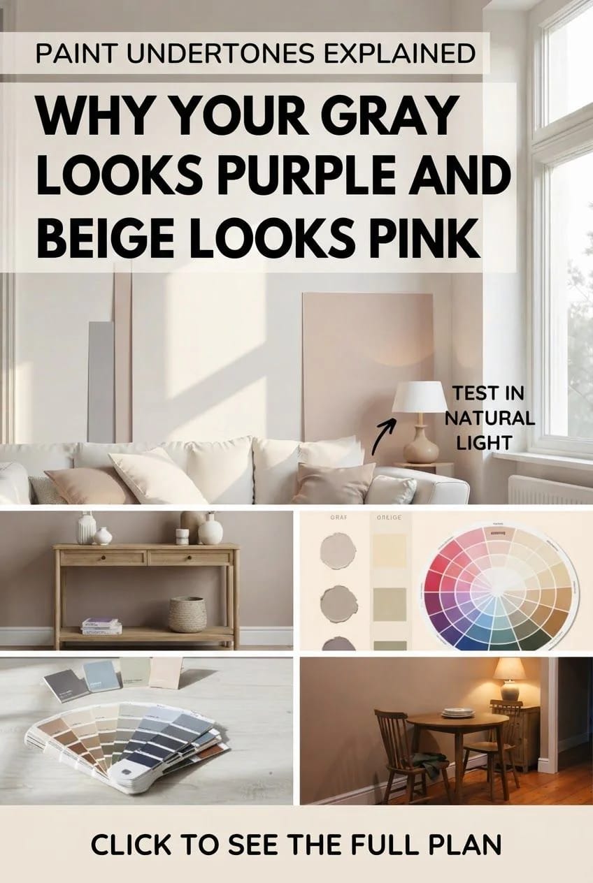
Where the Purple Was Hiding the Whole Time
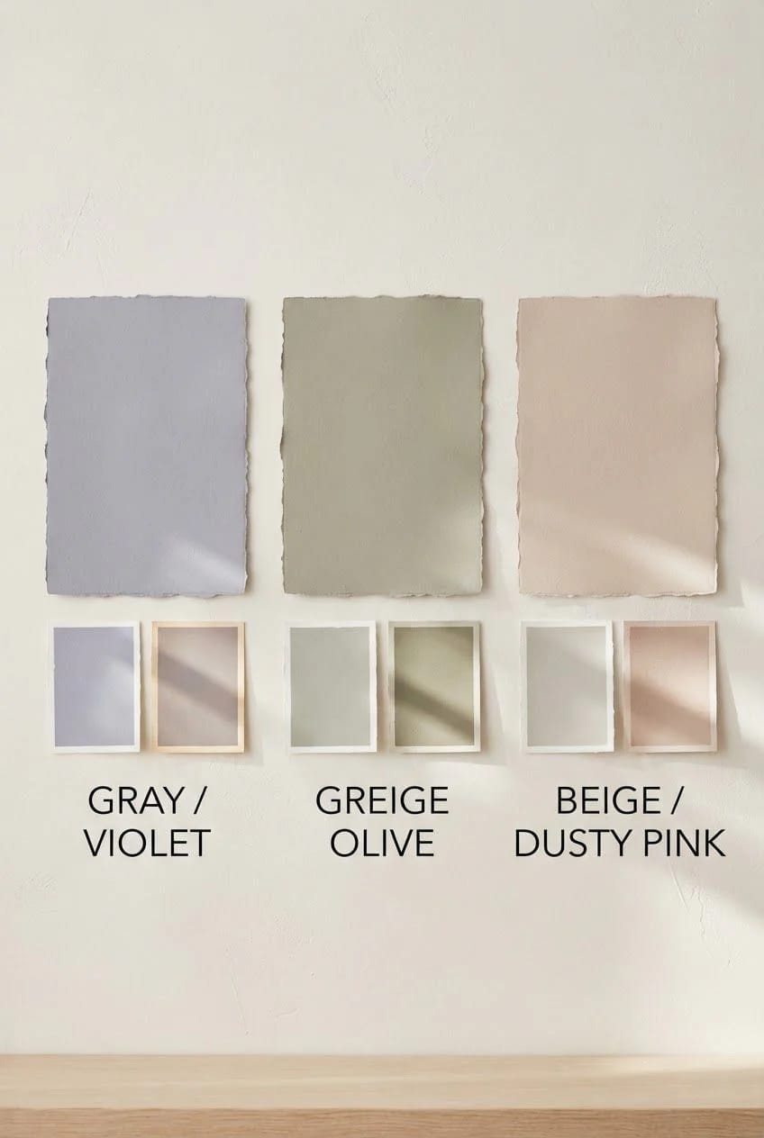
Every neutral is a color with the volume turned down
Gray is not the absence of color; it is a hue with most of its saturation stripped out. The pigment that survives that stripping is what you eventually see on the wall. Three Bears Home Staging read the spectral data on Sherwin-Williams Kilim Beige and found a hue angle of 83.4 degrees, which puts it squarely in the yellow family and close to the border with orange, at a chroma of about 13. A genuinely neutral color would sit near zero chroma. Almost nothing at retail does, because a zero-chroma gray on a wall looks like primer somebody forgot to finish.
So the question is never whether your greige has a hue in it. It has one. The question is how much light it takes to drag that hue up to the surface.
Your bulbs are not carrying every color in the room
A light source can only reveal the wavelengths it actually emits, and most household LEDs emit an uneven spectrum with dips in exactly the places paint pigment lives. Two colors that match perfectly under one bulb and separate under another are showing you metamerism, which is the technical name for the argument you are having with your partner about whether the wall is gray.
Incandescent and halogen: 95 to 100 CRI. Full spectrum, which is why they remain the reference standard.
LED: anywhere from below 70 to 98, depending entirely on the phosphor coating. The number is on the box and most people never look.
Fluorescent tube: roughly 50 to 85, which is why colors go flat in a garage and at a paint counter.
R9, the saturated red score, is reported separately from the CRI average. A bulb can post a high CRI and still render warm tones badly, which is exactly the failure that makes a warm beige look chalky.
The Lumens guide to color rendering puts the practical threshold at 90 or above, and notes the R9 trap in the same breath. Swapping four bulbs is cheaper than repainting a room, and it changes the wall more than most people expect.
2700K with a 90-plus CRI rating, which is the combination that shows a warm neutral honestly instead of draining it. Buy the eight-pack and do the whole room, since one high-CRI bulb next to three cheap ones tells you nothing.
Feit Electric Enhance A19 LED, 60W equivalent, 2700K, 90+ CRI, 8-packThe floor and the trim get a vote
Sunlight entering through a window bounces off whatever it hits first. A red oak floor throws orange up the lower third of the wall. A lawn outside a south window throws green. And a cream trim beside a cool gray makes that gray look bluer than it is, because the eye judges every color against its neighbor rather than against an absolute. This is why a color that behaved in one house misbehaves in the next one, and why layered neutrals in a room that never gets direct sun need to be chosen as a set rather than one at a time.
The Grays That Go Purple, and the Ones That Go Green
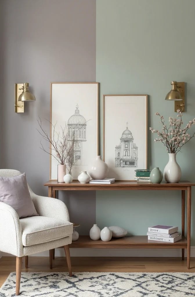
AI visualization of Sherwin-Williams Repose Gray SW 7015 under north light. On-screen color is an approximation and your own room will push it further in one direction or the other, so judge it from a real sample on your wall.
Repose Gray SW 7015 goes lavender in north light
Repose Gray carries a violet-brown base, and which half of that base you see is decided entirely by your light. In warm or neutral light the brown dominates and the color reads as a grounded warm gray, which is the version in every listing photo. In north light, under overcast skies, or under 5000K bulbs, the warmth drops out and the violet has nothing balancing it. That is the lavender.
Granted, the LRV of 58 does a lot of work in its favor: it is light enough to keep an open-plan room from closing in, dark enough that white trim still reads as trim. The fix for the flip is almost never a different color, which is where most advice sends people. It is 2700K to 3000K bulbs, a warmer floor, and keeping the color out of the one windowless hallway you were planning to use it in. I would not put Repose Gray in an interior hall with no daylight at all. It has nothing to push against there, and the violet wins by default.
Against a warm white trim it settles. Against a stark cool white it separates and looks slightly dirty, which is a trim problem being blamed on the wall. If you want the color for a low-light bedroom, look at how gray bedrooms keep the color from going flat before you commit to the whole room.
Agreeable Gray SW 7029 leans the other direction
Agreeable Gray's undertone is green rather than violet, at an LRV of 60, and it has topped Sherwin-Williams' best-seller list since 2014. Sue Wadden, the company's director of color marketing, has called it their most popular color outright. The green is faint and only surfaces in cool, shaded light, with the occasional violet flash in mixed lighting.
Its real weakness is cream. Put Agreeable Gray next to cream cabinets or cream trim and the pairing goes muddy fast, because the wall’s green undertone and the cream’s yellow one land close enough to look like a mistake rather than a contrast. Designer Kylie M, who reviews this color more than anyone, is blunt about that combination. If the green lean is what you want rather than what you tolerate, it sits well beside an actual sage in the same room.
The lighter the gray, the harder it flips
Pale grays flip more visibly than mid-tone ones. There is simply less pigment on the wall to bury whatever violet is in the tint base, so the tint base gets a louder say. Eider White is the standard cautionary example. If you are already nervous about purple, do not solve it by going three steps lighter.
The Beiges That Go Pink
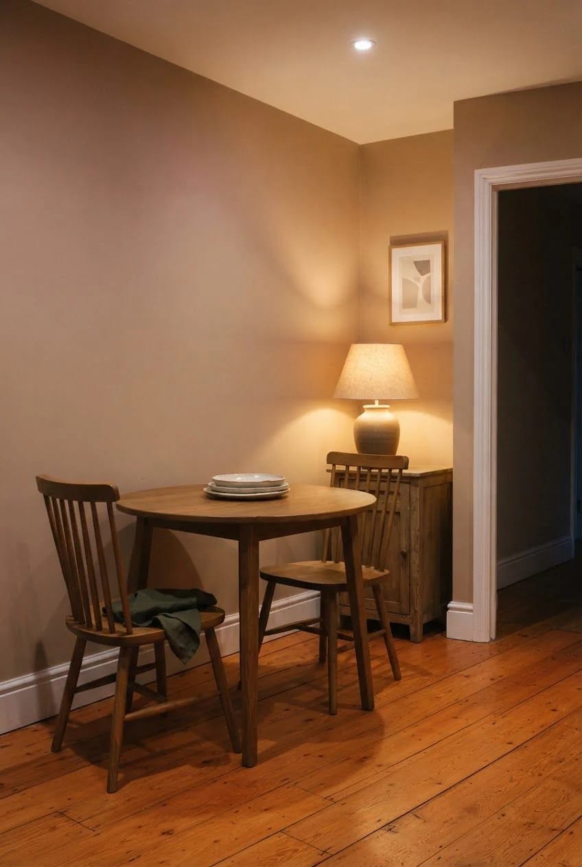
An AI render of Sherwin-Williams Kilim Beige SW 6106 under warm evening lamplight. Rendered color is approximate, screens vary, and a peel-and-stick sample in your own room is the only version that counts.
Kilim Beige SW 6106 is a pink-gold color wearing a beige name
Kilim Beige is a true tan, LRV 57, with a dominant pink-gold warmth and a chroma high enough that the hue is visible rather than implied. That is the whole reason it sings next to red oak, brick, and travertine: the wall and the floor are running the same warm hue at different strengths, so the room reads as one thing.
The pink is not a rumor. It comes forward under lamplight, in north-facing rooms where the gold has nothing to reinforce it, and anywhere a terracotta or a warm-toned tile is bouncing light back at the wall. Some people see peach instead. Both readings are the same pigment doing the same thing.
Where it fails is against anything cool and fixed. A gray-veined quartz counter, a blue-gray floor tile, a bright cool white trim: each of those pulls the pink out of the wall and hangs it there for everyone to see. If your fixed finishes are cool and you love this color, you are choosing a fight you will lose after the second coat.
Accessible Beige SW 7036 hides its undertone better
Accessible Beige sits at an almost identical LRV of 58 but at a much lower chroma, which is precisely why it behaves. Less hue on the wall means less hue to surface. Sherwin-Williams' own color team describes it as carrying a noticeable brown undertone and warns against pairing it with a yellow-leaning white like Dover White, since yellow beside brown reads as dinginess rather than warmth.
Taupe is beige with pink in it, which explains a lot
Sherwin-Williams draws the line cleanly on its own color guidance blog: greige is a gray with a beige undertone, taupe is a beige with a pink undertone, and plenty of taupes turn pink or purple in the wrong light. That single sentence resolves most of the confusion in this category. If the color you are holding sits on a taupe strip rather than a greige one, movement is the expected behavior, not the exception.
It also explains a failure people usually blame on their furniture: two warm colors in one room, carrying different undertones, both lit by a 4000K bulb, and the pair reads cheap by evening. The same clash governs whole seasonal palettes where every color is warm and the room still looks wrong.
 11 Beige Kitchen Ideas That Don’t Read Builder-Grade Where beige belongs in a kitchen, starting with the LRV number that decides whether the trim still reads as trim.
How to Make the Undertone Show Itself Before You Commit

Do not paint your test patch on the wall. The existing color surrounds it and biases everything you think you are seeing, and a patch of new gray on an old beige wall will look cooler than that gray actually is. Paint two coats onto a piece of bright white foam board, 20 by 30 inches instead, let it dry overnight, and carry it around the house. Two coats matter. One coat over white reads lighter and hides the undertone you are hunting for.
Prep
- Two coats, dried overnight. One coat lies about both the value and the hue.
- Keep the board large. Anything smaller than about a foot square borrows the color of whatever is behind it.
Where to hold it
- Flat against the trim you are keeping, since that is the comparison your eye makes every day.
- Lay it on the floor for thirty seconds, then lift it back to the wall. The bounce from your own flooring is the variable nobody tests and the one that decides it.
- The darkest corner. Undertones surface there first.
When to look
- Morning, mid afternoon, and after dark with only the lamps you actually own switched on.
- One overcast day. Direct sun floods a wall and papers over the flip you are trying to catch.
If you would rather skip the brush entirely, peel-and-stick samples do the same job with less mess and can be moved a dozen times. Samplize prints them in Sherwin-Williams and Benjamin Moore colors, so a real Repose Gray sample arrives already painted and repositionable, and the Sherwin-Williams samples come in satin rather than the flat most walls end up in, which is worth knowing before you judge the sheen. Honestly, if every color on your shortlist is a Sherwin-Williams color, order direct: the brand’s own peel-and-stick samples run under four dollars each and less by the set.
Lovely Harbor earns a commission on some links in this article, including the sample and product links above.
 13 Kitchen Color Ideas and Where Each One Actually Works Thirteen ideas sorted by where the color goes, for the room with the most fixed finishes voting against you.
Pick the Trim White First
Order of operations decides more of this than color choice does. Settle the trim white before the wall color, because the trim is the fixed reference your eye returns to all day, and every greige in this article behaves differently beside a warm white than beside a cool one. Choosing the wall first and then hunting for a white that survives it is the harder version of the same job.
What I cannot tell you is what your particular room will do. The bounce off your floor, the color of the house nine feet outside your window, the phosphor in the bulbs already in your fixtures: none of that is knowable from here, and anyone who tells you Repose Gray is safe has not seen your hallway.
One last thing. If the board still looks wrong on an overcast afternoon, check the bulb before you blame the color. A 2700K bulb at 90 CRI costs a few dollars, and in a lot of rooms it is the difference between a wall that reads lavender and one that reads gray.
Related Posts
- 15 Trendy Bathroom Paint Colors For A Stunning Makeover
- 13 Kitchen Color Ideas and Where Each One Actually Works
- 11 Beige Kitchen Ideas That Don’t Read Builder-Grade
- 9 Warm, Cozy Christmas Living Room Color Schemes (and the One Undertone Rule That Makes Them Work)
- Pastel Pink and Mint Christmas Decorations That Still Look Like Christmas
- 25 Stunning Mid-Century Modern Living Room Color Palette to Elevate Your Home