

Pastel Christmas is older than the trend cycle admits. Shiny Brite was lacquering ornaments in baby pink and aqua by the mid-1950s, often under a heavy frosting of glass glitter, and the wartime ornaments before those were pastel-striped only because pigment was being rationed. So the palette has a real lineage. It also has one very specific failure mode: pink and mint together slide toward Easter, or toward a baby shower, unless a few decisions get made before anything is hung.
Those decisions are ratio, undertone, and what your bulbs do to the colours, roughly in that order. Get them right and the room reads as Christmas that happens to be pink. Get them wrong and it reads as a party for a two-year-old.
One caveat first. This palette needs a neutral with some weight to it: cream, warm white, unpainted wood, pewter. If your living room is already saturated, deep green walls or a red brick chimney breast, pastel pink and mint will fight it, and I have no fix for orange brick that I would actually put my name to.
How much pink and mint a room can take
Let cream carry the volume and keep blush and mint at accent scale
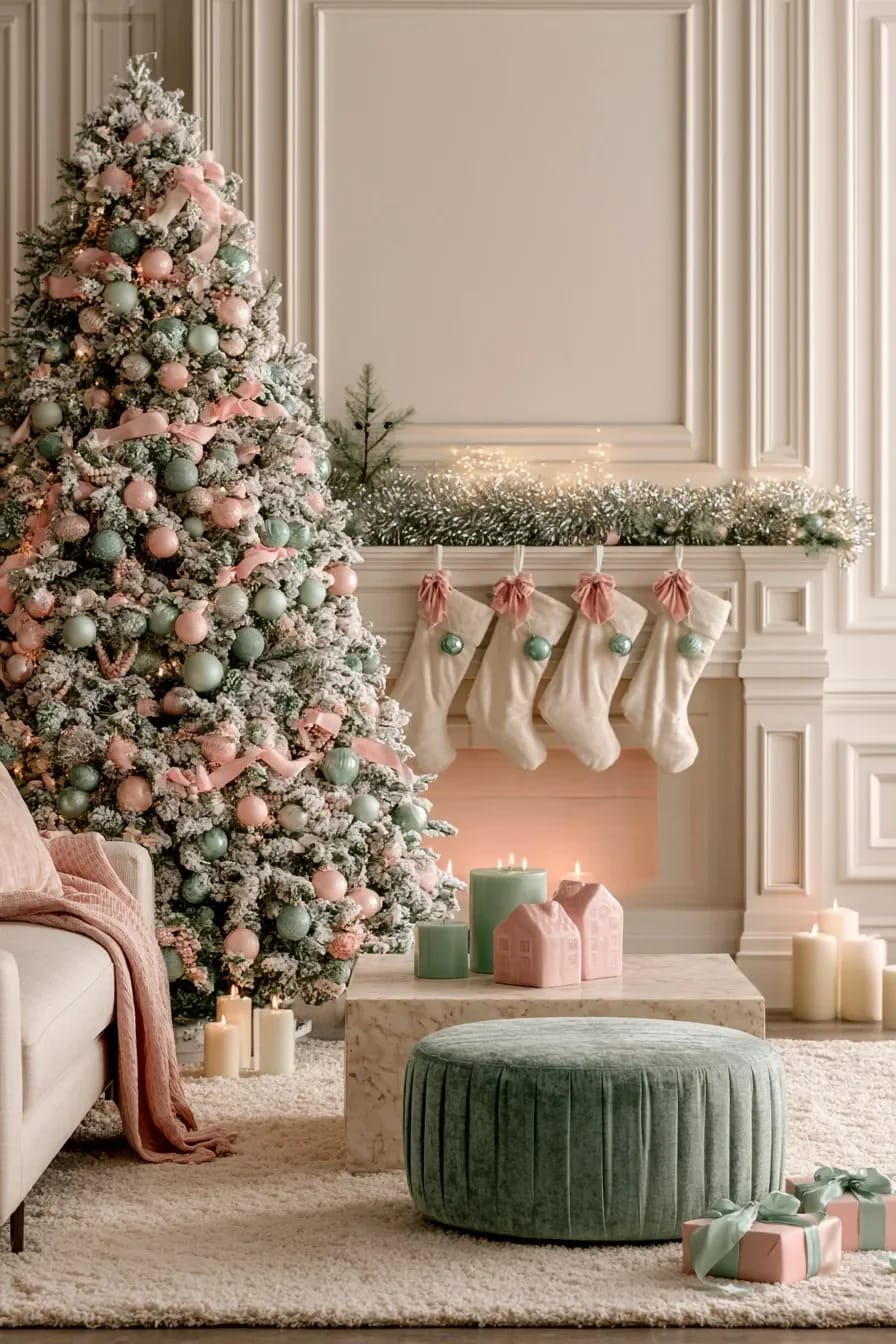
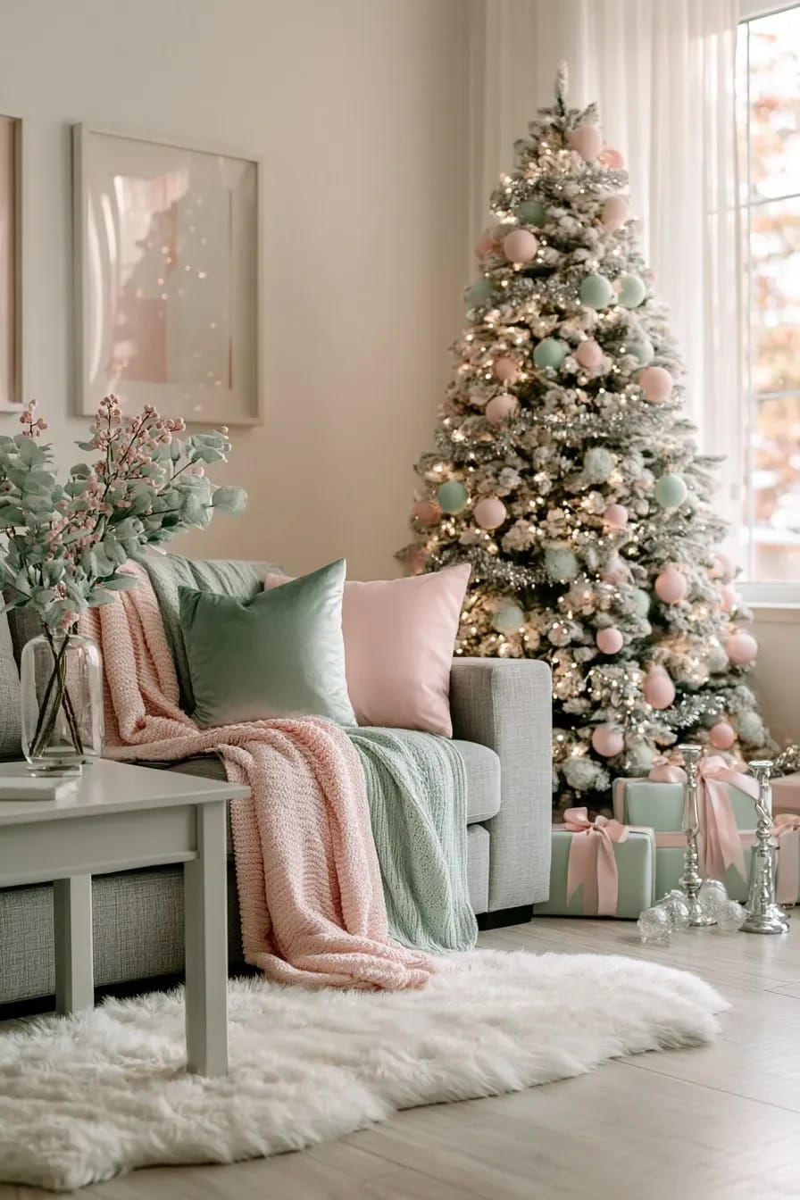
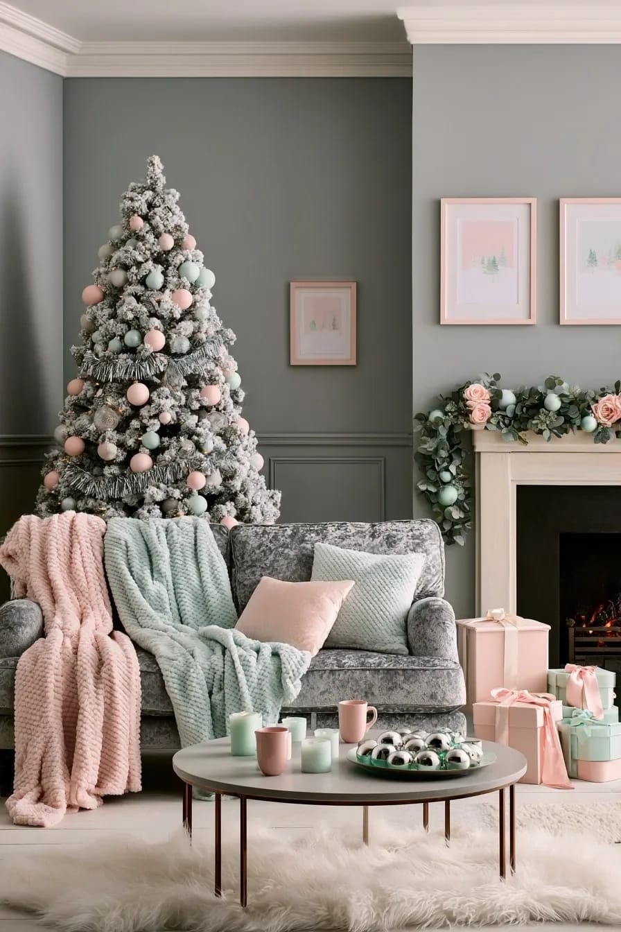
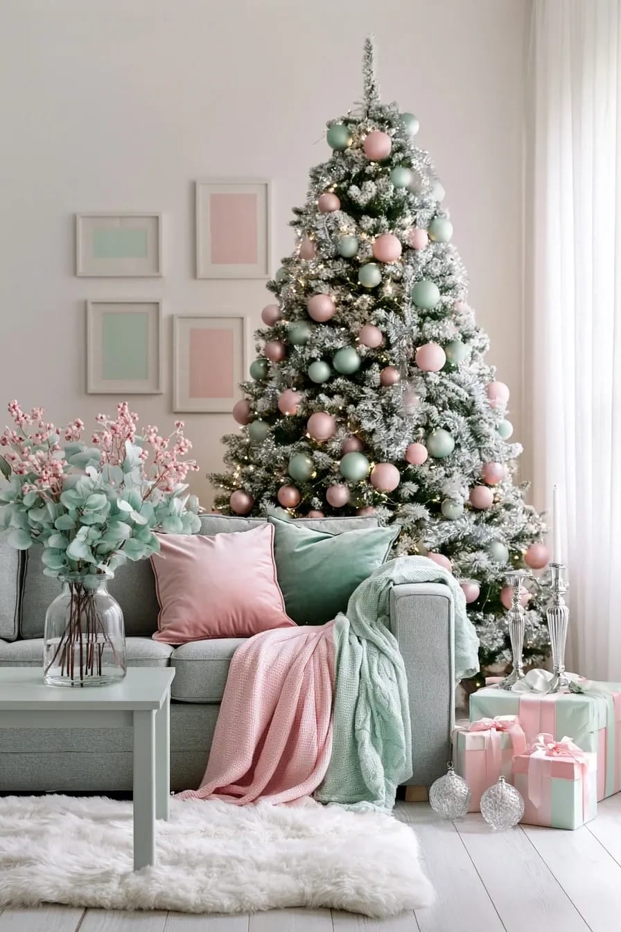
Cream and white should be the largest thing in the room, and blush and mint should split what is left at roughly two to one. Pastels are pale and weakly saturated, which means two of them at equal strength do not layer, they cancel; the eye has nowhere to rest and the whole scheme goes soft-focus. Picking one to lead is the entire trick, and blush is usually the one, because mint at volume turns a room minty rather than festive.
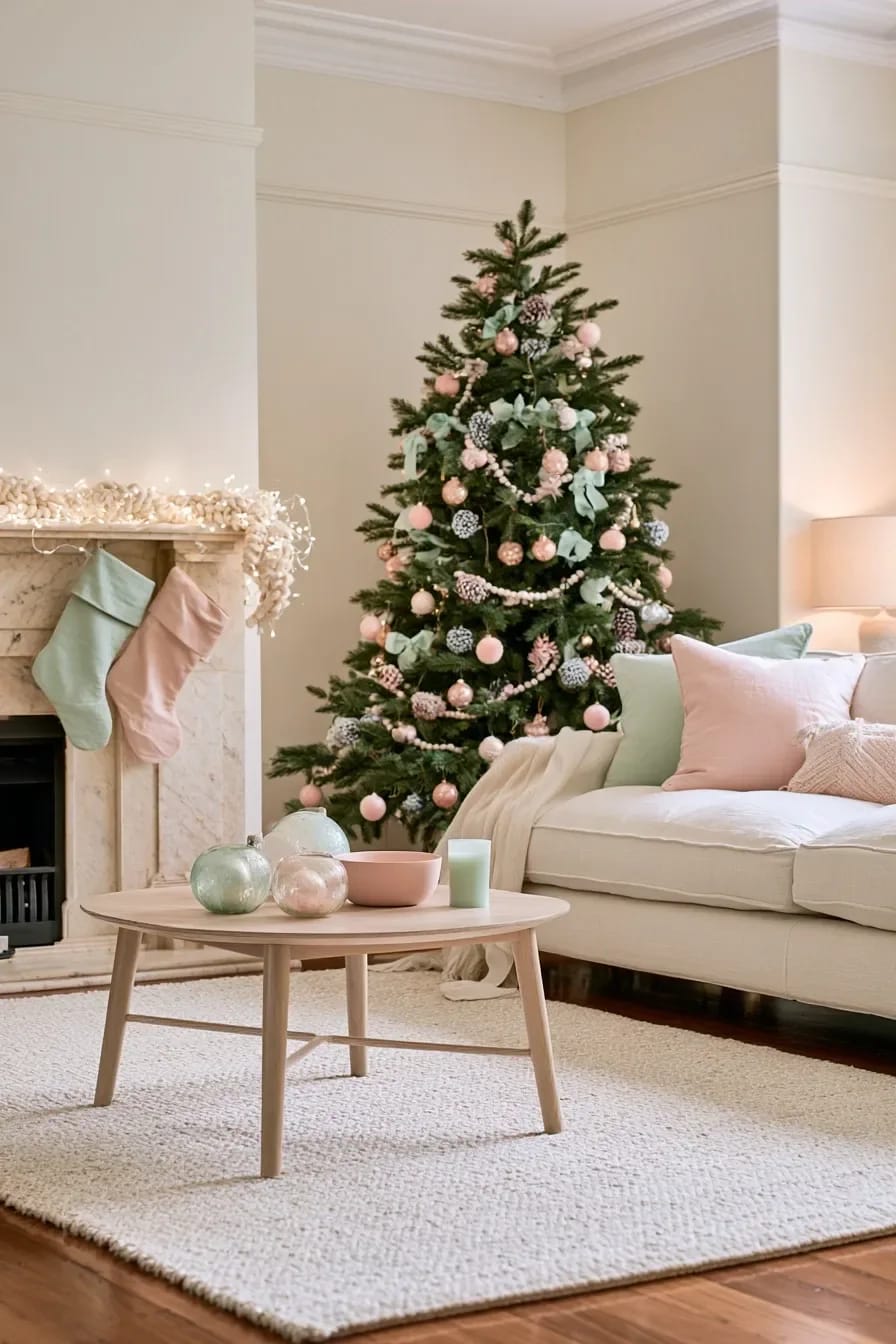
The other half of this is that pastels need something with actual depth nearby or they read as faded rather than chosen. Walnut, pewter, unglazed stoneware, a dark green branch. The same logic runs through a narrow pink scheme where warm metal does the heavy lifting, and it transfers directly here as long as you swap the brass for something cooler.
| Where it lands | Cream and white | Blush | Mint |
|---|---|---|---|
| Tree ornaments | about 60% | about 25% | about 15% |
| Ribbon and garland | ribbon only | none | garland only |
| Stockings (five) | two | two | one |
| Table | cloth, china | napkins, food | glass, runner |
| Metal and candles | all of it | none | none |
Match a grey-based blush to an icy mint, not a peachy one
Undertone decides whether these two colours look related or look like an accident. Mint is a green with blue in it, always; a blush with yellow or coral in it sits at the opposite corner of the wheel and the pair reads like a 1987 bathroom. A blush with grey in it, the dusty rose end, has enough blue to belong to the same family.
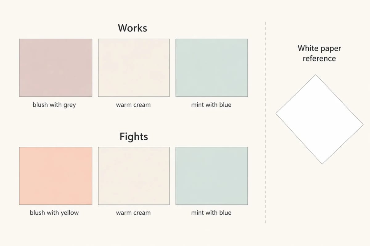
You can test this in ten seconds with a sheet of printer paper. Hold a bauble of each against the white and the yellow in a peach blush jumps out immediately; against the tree it hides, which is why people only notice at the end.
Warm white bulbs protect the blush and flatten the mint
Use 2700K string lights and accept that the mint will lose a little. Warm white has very little blue and green energy in it, so a blue-green surface has less to reflect and drifts toward grey-olive after dark. Blush does the opposite and warms up nicely. This is a genuine trade and there is no bulb that wins both.
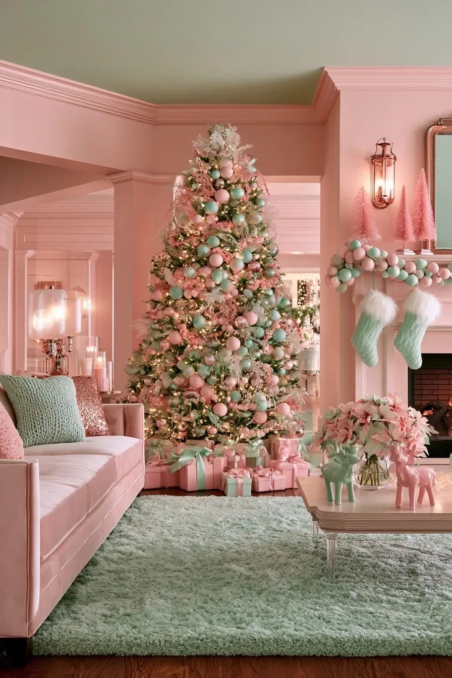
The workaround is placement rather than wattage. Put the mint where daylight reaches it, the garland by a window, the table linen, a wreath on the inside of the front door, and let blush and cream own the parts of the room that are only ever seen lit. In a bedroom, where the only light after four o'clock is a bedside lamp, the mint problem gets worse, so most of the mint in a bedroom scheme is better spent on textiles you see in the morning.
String lights sold as pure white or cool white sit up around 6000K, and under them blush goes grey and mint goes clinical. Check the box for 2700K, then check the colour rendering index: below 80, pastels turn muddy whatever the temperature claims. Most inexpensive string lights publish no CRI figure at all, which is its own kind of answer.
 Classic Red and Green Christmas Decor Ideas for the Whole House The room-by-room version in the palette everyone already recognises, for the years you want no argument at all.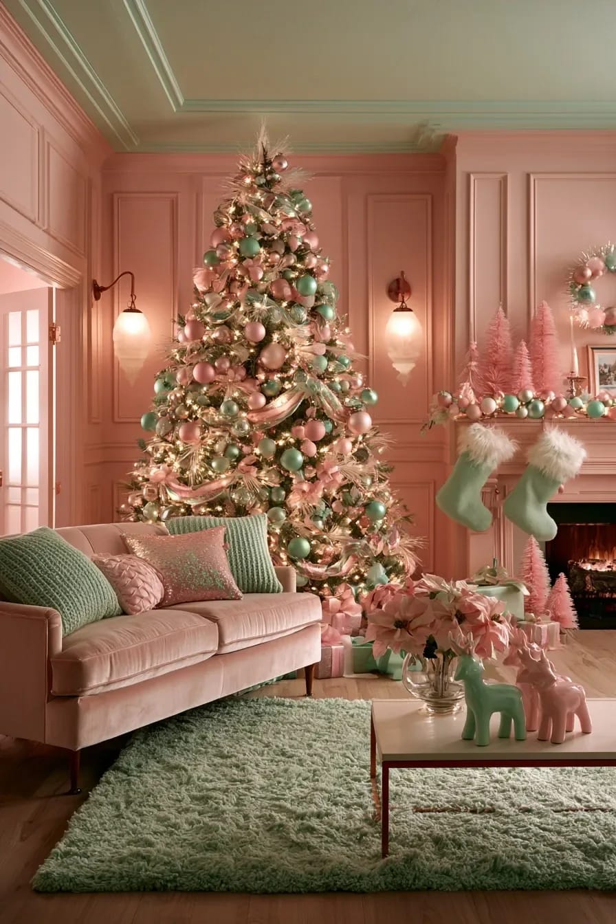
On the tree
A green tree holds pastels better than a white flocked one
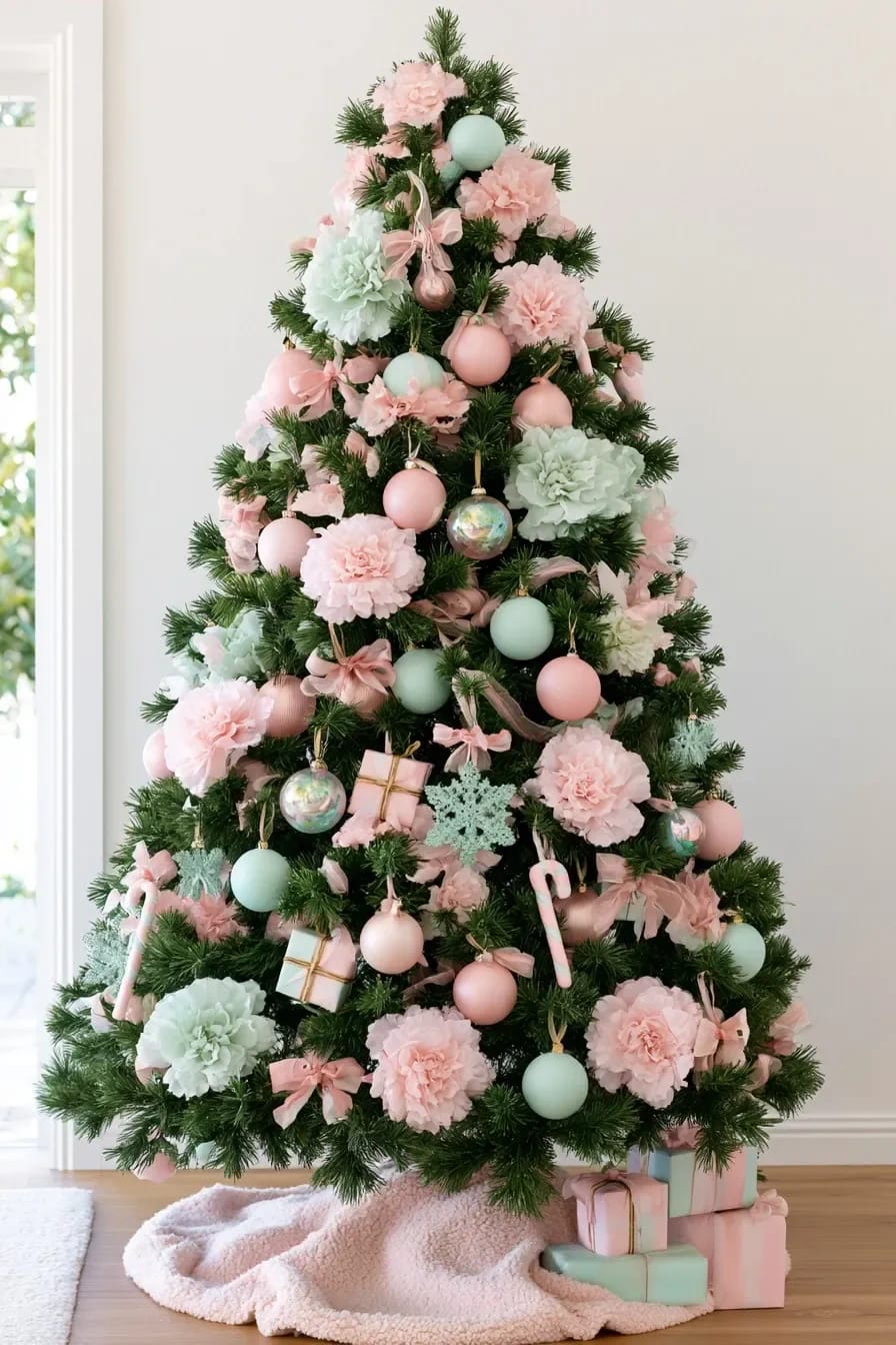
Put the pastels on a dark green tree. The white flocked tree is the reflex here and it is the wrong call: flocking removes the one mid-tone in the scheme, so blush and mint float on a white field with nothing to push against and the whole thing goes powdery. Dark needles give blush its edge back, and mint reads as a deliberate second colour instead of as a stain on the white.
If the white tree is already up in the loft and not going anywhere, the repair is to add darkness rather than colour: dried eucalyptus stems pushed deep, matte black or pewter picks, a few pinecones left their own brown.
Buy the pastel baubles matte and let a handful of iridescent ones do the sparkle
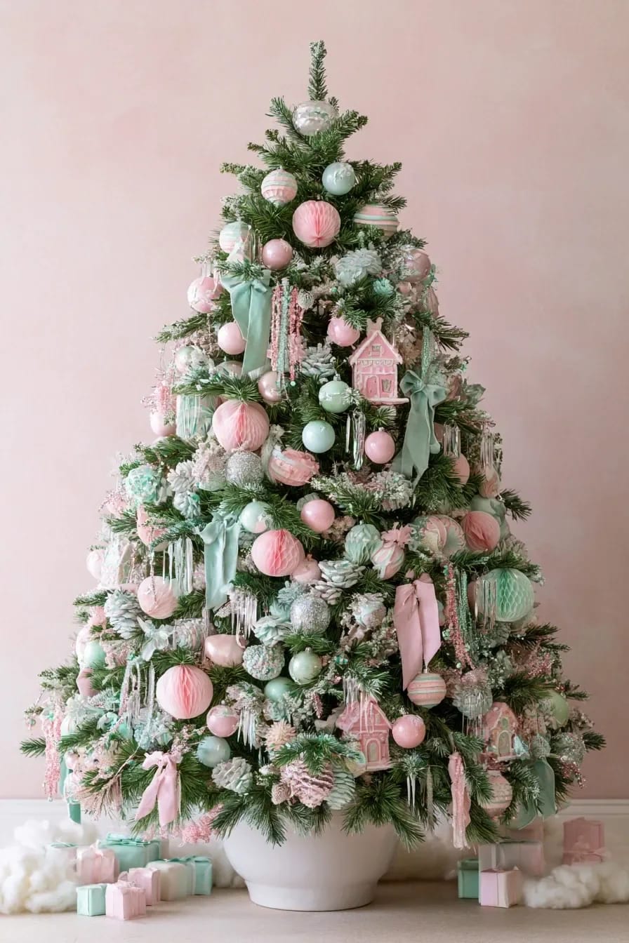
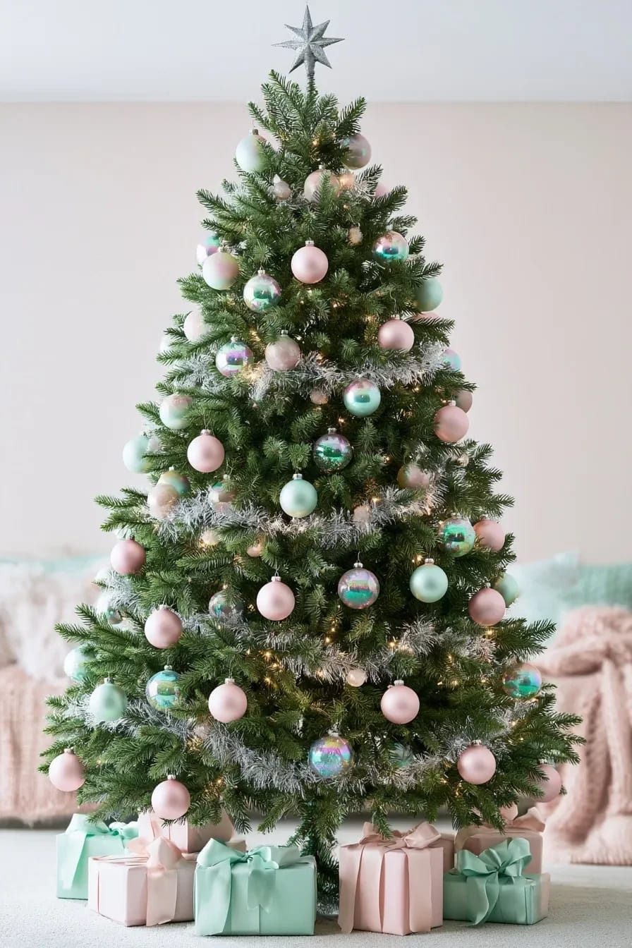
Matte is the finish that keeps this palette out of party-supply territory, and the ratio to hold is roughly one iridescent bauble for every ten matte. Iridescent pastel sets are everywhere now and they photograph beautifully, which is the problem; in an actual room, twenty of them together look like a car wrap. Chalk-finish balls give you the powdery surface that reads expensive at four feet and still reads as colour at ten.
Pastel candy canes belong in this section rather than in a jar by the door, incidentally. Hung in threes with the hooks facing in, they add a stripe of stronger pink without adding another finish.
Do this
- Buy boxed sets of a single finish. Mixed-finish boxes are where the shine sneaks back in.
- Hang the matte ones deep, close to the trunk, where the lights actually pool.
- One iridescent per tier of branches is plenty.
Avoid
- Glitter-coated pastels. From six feet the glitter reads silver and the colour underneath disappears entirely.
- Rose gold next to mint.
Chalk-paint thrifted glass baubles instead of buying a pastel set
A boxed set of matte pastel balls costs real money for what it is, and thrift stores are full of scratched gold and silver glass baubles at a few dollars a box. Chalk paint grips glass without a primer, which is the whole reason this works; the finish comes out flat and slightly chalky in a way the manufactured ones spend a lot of effort imitating. It is the single cheapest move in this article, and it sits comfortably alongside the rest of the low-cost holiday tactics worth doing before you buy anything new.
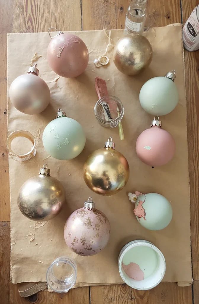
Wipe: rubbing alcohol on a cotton pad over the whole surface, including under the collar of the cap. Storage dust and hand oil are what make paint crawl.
Thin: straight from the pot, chalk paint dries ridged. Stir in water at about one part in ten until it moves like cream.
Coat: two thin coats twenty minutes apart, drying upside down on a bottle neck. A third coat starts filling the texture back in.
Seal: matte acrylic sealer only. A satin or gloss sealer undoes everything you just did.

Skip the star and run a wide mint ribbon down the tree instead
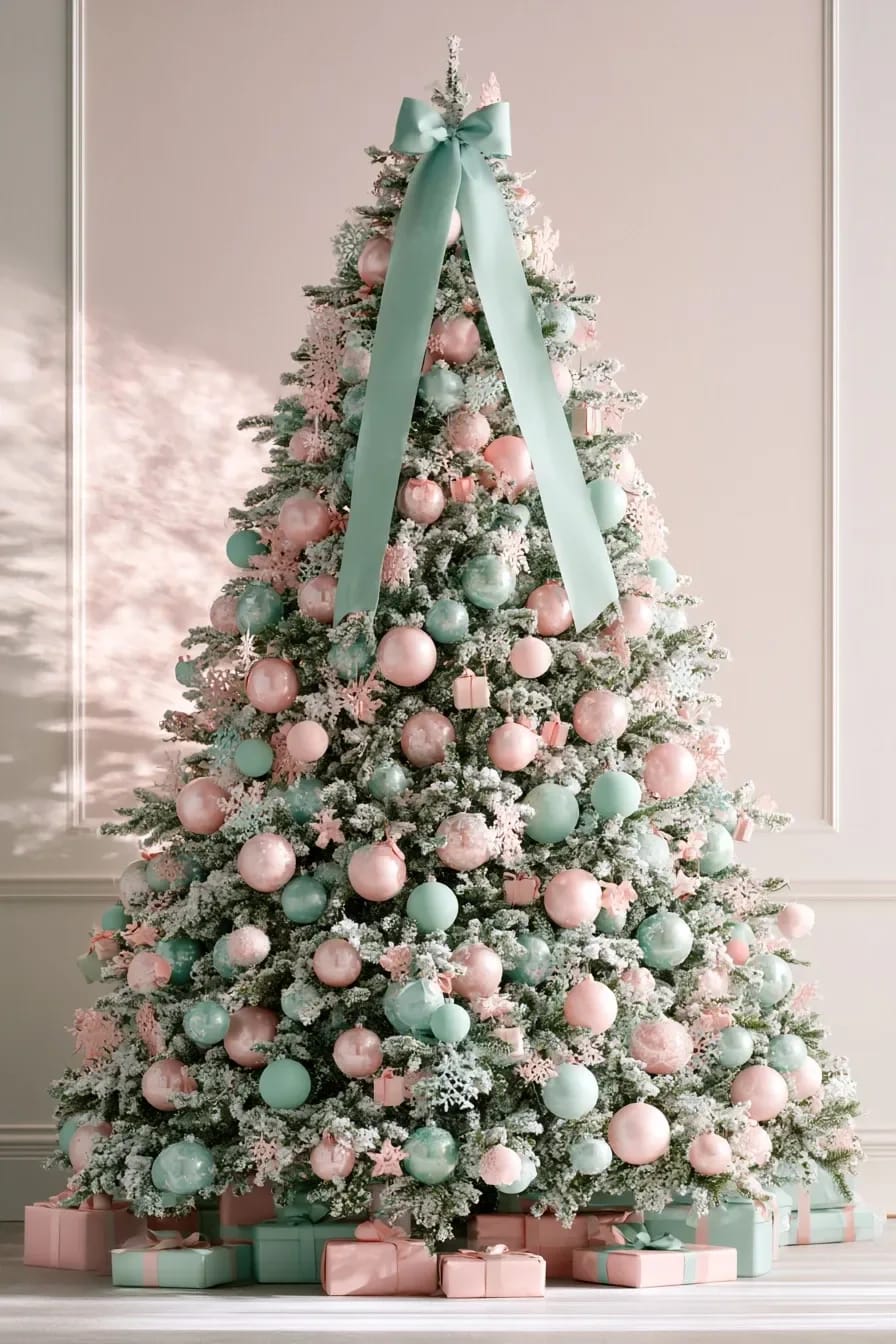
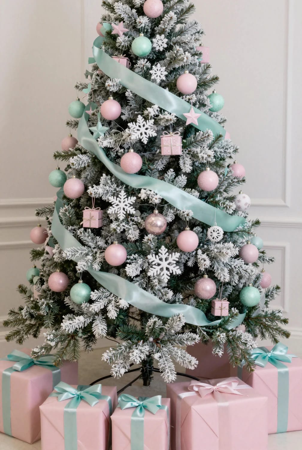
A topper is where pastel schemes usually collapse, because almost every star sold is gold or is lit in a colour that has nothing to do with the rest of the tree. Leave the top bare and give the vertical job to ribbon: four inch wired velvet in mint, cut into five separate lengths rather than one continuous spiral, each tucked in and out so it vanishes behind branches and comes back.
Width is the variable that decides whether this looks designed or looks like packaging, and the argument for going wider than feels sensible is made properly in our piece on how ribbon width and placement change a tree. Notch the cut ends into a V and let them hang at different heights.
 21 Ways to Make Your Pink Christmas Tree Shine! Twenty-one approaches for a tree that is pink all the way through rather than decorated in pink.
Off the tree
A pastel mantel wants three stocking tones and one metal

Hang three tones of stocking and one metal, and stop there. Blush, mint and cream in a run of five (two, one, two) gives the shelf a rhythm without turning it into a colour chart, and the moment a fourth tone arrives the mantel starts reading as a collection of unrelated gifts. Texture is what carries the variety instead: a wool blush, a ribbed mint knit, a heavy cream boucle.
The metal should be pewter, brushed nickel or plain steel. Brass is warm and slightly yellow and it does to mint exactly what a peach blush does, which is a pity, because most of the good weighted stocking hooks sold in the run-up to Christmas are brass.

Everything else about a mantel is quantity and physics rather than palette, and that part is covered properly in our guide to building a mantel that holds up for the whole season. The pastel version just needs less on it than the red and green version does.
Run the mint garland up the stair rail before you touch the mantel
The staircase is the better home for mint than the fireplace is, because a rail runs past a window on most landings and daylight is the only thing that keeps this colour honest. Preserved silver dollar eucalyptus is the material to use: it dries to a dusty blue-green that lands almost exactly on mint, it holds for the season, and it has none of the plastic sheen of a dyed faux garland.
Buy about half again the length your rail measures, since swagging eats length fast. Fix it with zip ties at the balusters and tie a cream ribbon over each tie to hide it. The same logic scales down to a hall console or a doorframe, which is where a hallway that gets decorated rather than skipped starts paying off.
Set the table in mint and let the food supply the pink
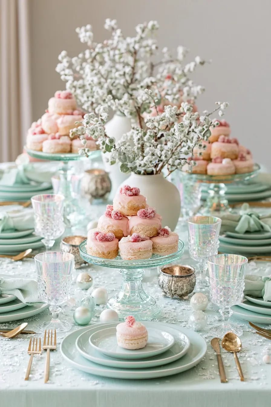
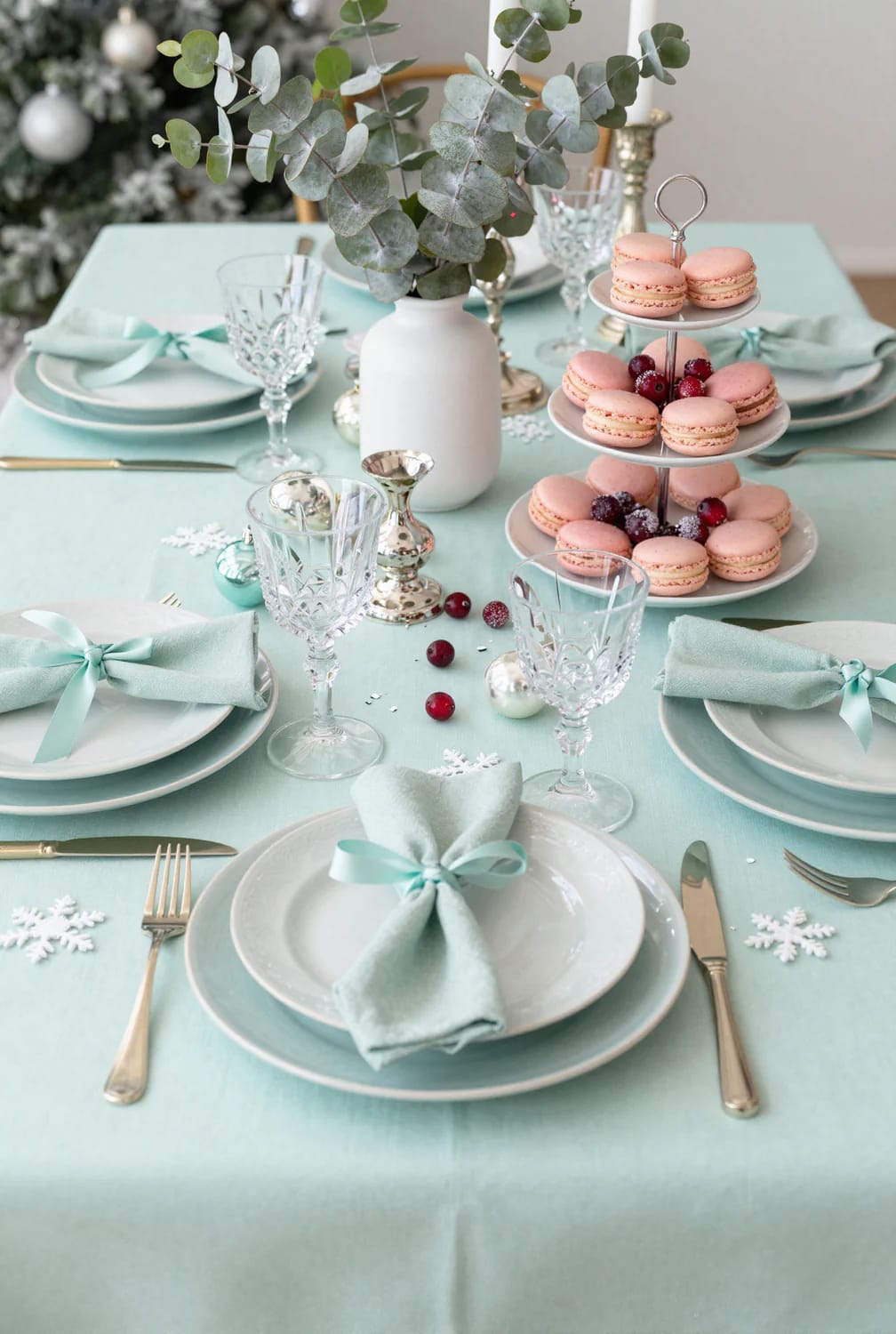
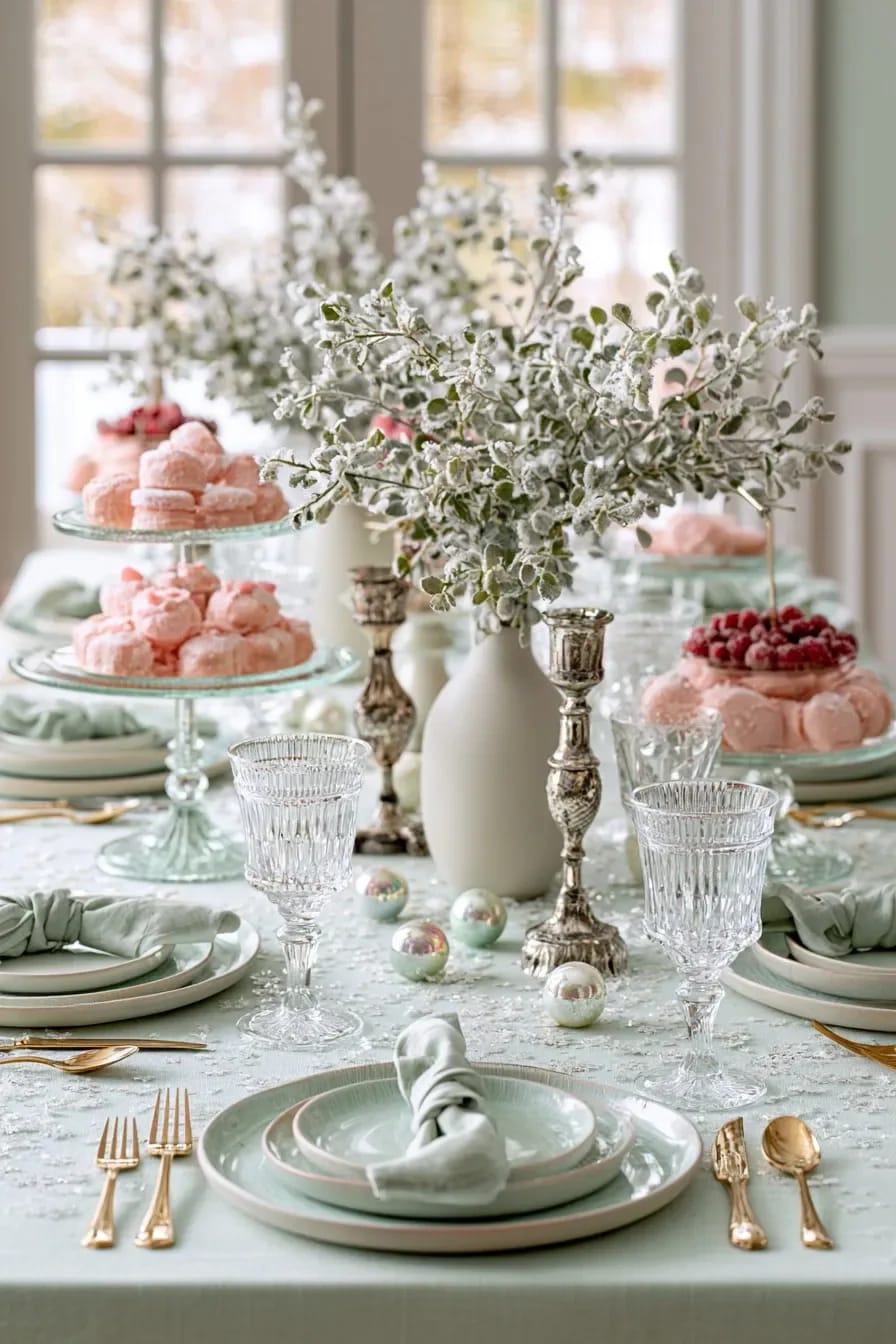
Put the mint on the cloth and the glassware and let raspberries, meringues and iced biscuits carry all the pink. A dining table is lit from above and eaten off, so pink linen picks up every crumb of shadow and goes muddy by the second course, while food sits in the middle of the table where the pink actually wants to be. Mint linen under cream china is calm enough to look at for three hours.
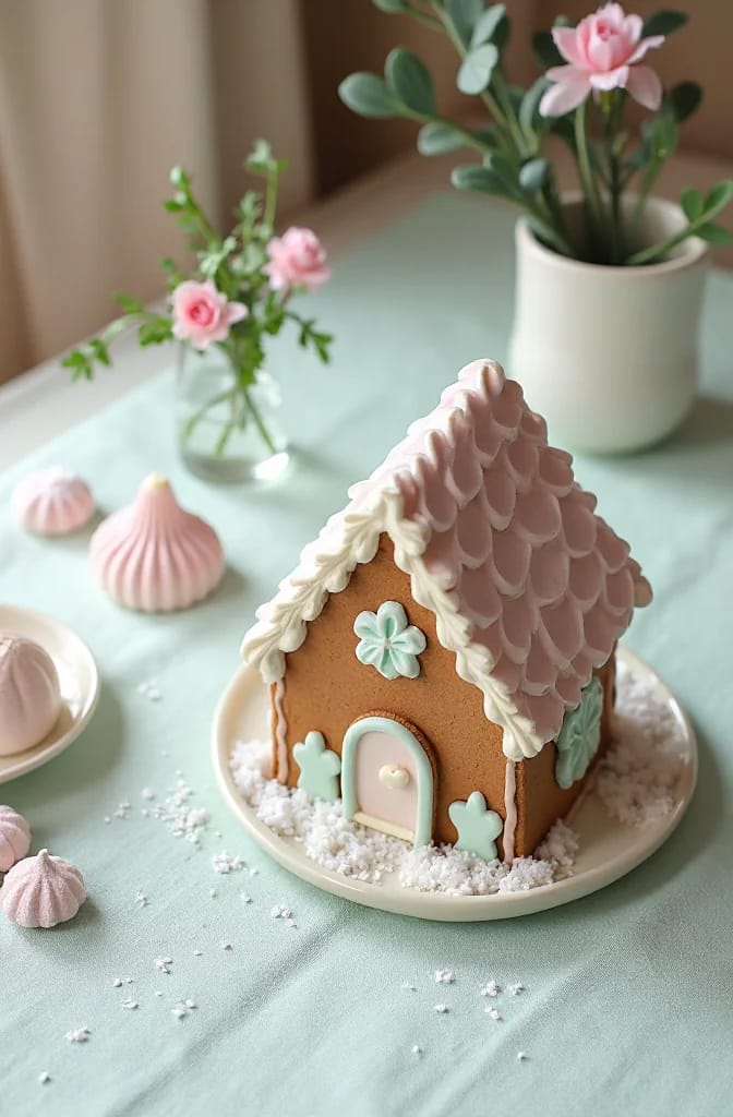
The centrepiece worth the effort is a gingerbread house iced in pastel royal icing rather than the usual white and red: a blush scalloped roof, mint window frames, cream along the eaves. Tint the icing with gel colour, never liquid, because liquid food colouring thins royal icing and the piped scallops slump before they set. It is also the one figurative object this palette can absorb; a pastel nutcracker beside it and the table tips into novelty.
Related Posts
- 23 Minimalist Christmas Decor Ideas Perfect for a Modern Home
- Indoor Penguin Christmas Decorations That Don’t Look Like Lawn Ornaments
- Pink Christmas Decor Ideas for a Glam Living Room
- Front Door Christmas Decorations With Fresh Greenery: 11 Ideas That Look Intentional and Last the Season
- Modern Minimalist Christmas Decor Ideas for the Whole Home
- Retro 1950s Christmas Decorations That Look Collected, Not Costumed