
Unlacquered brass is warm and gold. Most of the sage green currently on the shelf is neither, and that single mismatch is why so many of these kitchens photograph beautifully and then look faintly grey in person. The nine decisions below start with the undertone problem and work outward through the pulls, the faucet, the counters and the backsplash, including the thing everyone asks first: how dark the brass actually goes, and how fast.
Picking a sage that gets along with brass
1. Choose a sage with a yellow base, not a blue-grey one
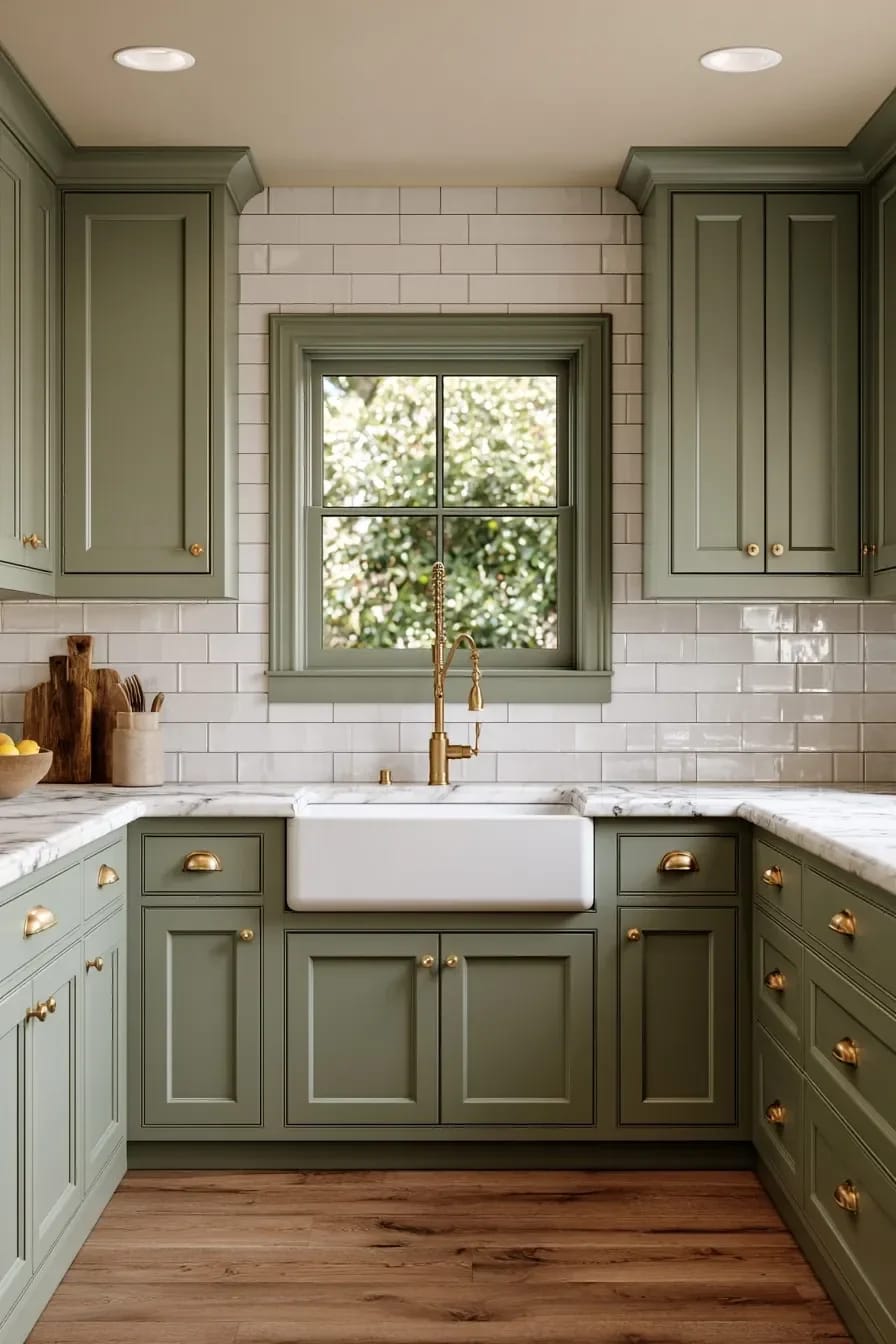
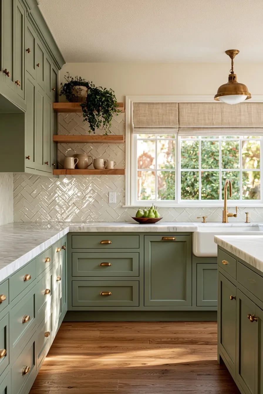
Sage that leans grey-blue fights raw brass; sage that leans yellow-olive absorbs it. This is the whole ballgame, and it is decided before a single pull is ordered. Sherwin-Williams Evergreen Fog (SW 9130, LRV 30) is the sage that made the category famous and the one I would think twice about here, because the grey in it reads cool against a gold metal and the cabinets end up looking like wet concrete on an overcast morning. Benjamin Moore October Mist (1495) sits around LRV 47, is noticeably lighter, and holds a warmer green; Sherwin-Williams Clary Sage (SW 6178) goes further toward yellow and is the safest bet if your kitchen faces north.
Granted, none of this survives contact with your actual light. Paint a full door, not a swatch, and stand it upright against the wall where the cabinets will go, because a horizontal chip on a counter catches ceiling light and lies to you. Then put one brass pull on the floor beside it. Two greens that look identical on the fan deck will separate immediately once there is gold in the frame.
One more thing about depth: a shaker door has a rail, a stile and a recessed panel, so it throws a shadow line the flat chip never shows. Cabinets consistently read one step darker than the sample. If you are torn between two sages, take the lighter one.
2. Sage green on the base cabinets, cream on the uppers
Sage below and cream above buys back the ceiling height that a fully green kitchen spends. In a galley under about ten feet wide, all-sage uppers close the walls in and the brass stops reading as jewellery and starts reading as clutter; the two-tone split keeps the colour at waist height where you actually see it and lets the top half disappear. This is also the version that ages best, since cream uppers can be repainted in a weekend when you tire of the green.
Draw the line at the counter, not at some arbitrary height, and let the backsplash belong to the upper colour. If your kitchen is genuinely tight, the same logic that governs every other decision in a small kitchen applies here: fewer horizontal breaks, more continuous surface.
Do this
- Put the sage on the run that holds the sink and the range, so the colour sits where the brass does.
- Match the cream to a warm white with a yellow bias rather than a bright decorator white.
- Carry the sage onto the range hood if you have one. It reads as intentional rather than as leftover paint.
Avoid
- Splitting the colour at the middle of a tall pantry run, which chops it in half visually.
- Cool white uppers. Next to raw brass they go blue by lamplight.
 29 Stunning Green Kitchen Cabinet Ideas: Lush, Nature-Inspired Hues The full range, from pale eucalyptus through olive to near-black forest, with what each one does to a room.
Brass that is supposed to change
3. Let the sink pulls go dark first and stop polishing them
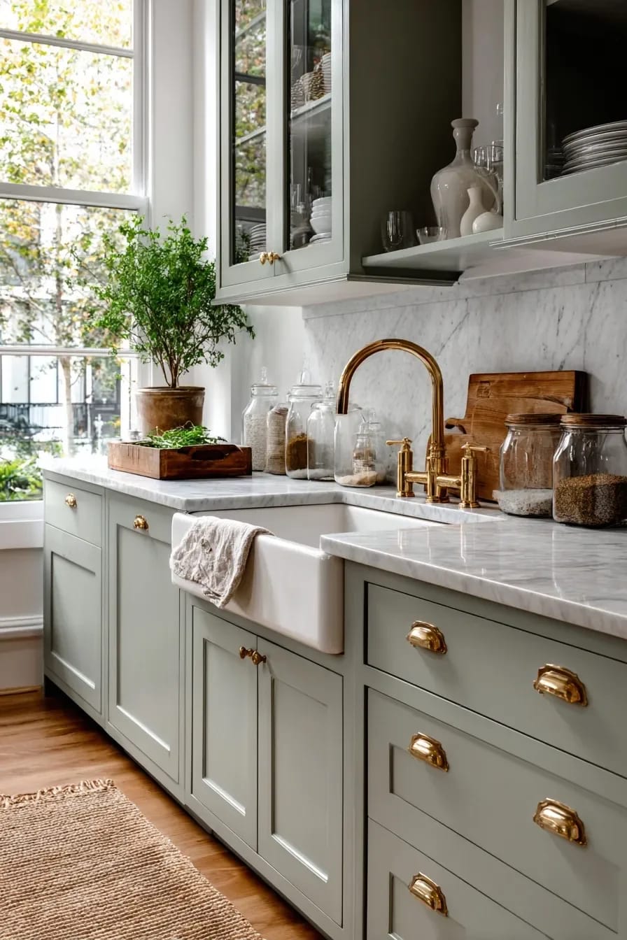
The pulls nearest the sink and the bin drawer will darken months ahead of everything else, and the correct response is to leave them alone. Unlacquered brass has no coating, so oxygen, water and the oils off your fingers work on it constantly; retailers and designers who install it consistently report noticeable change within the first six to twelve months and a settled, considerably darker tone somewhere in year one to two. The rate slows once the surface reaches a rough equilibrium, which is the point at which most people stop noticing it.
What people actually dislike is not the darkness. It is the unevenness during the first year, when the pantry pull is still bright gold and the one under the sink has gone the colour of an old penny. That gap closes on its own. If you polish the dark ones back with a brass cleaner you reset the clock on those pieces only, and six weeks later the mismatch returns worse than before, because you have now got three different ages of brass in one room.
My position, and some people will disagree: if the uneven year sounds unbearable, buy lacquered brass and stop pretending. Champagne bronze and honey brass are the manufacturer-specific compromises, and their long-term wear is unproven and nearly impossible to match later across brands. Raw brass is the one finish you can still source a matching piece for in fifteen years.
4. Bin pulls on the drawers, knobs on the doors, one latch on the pantry
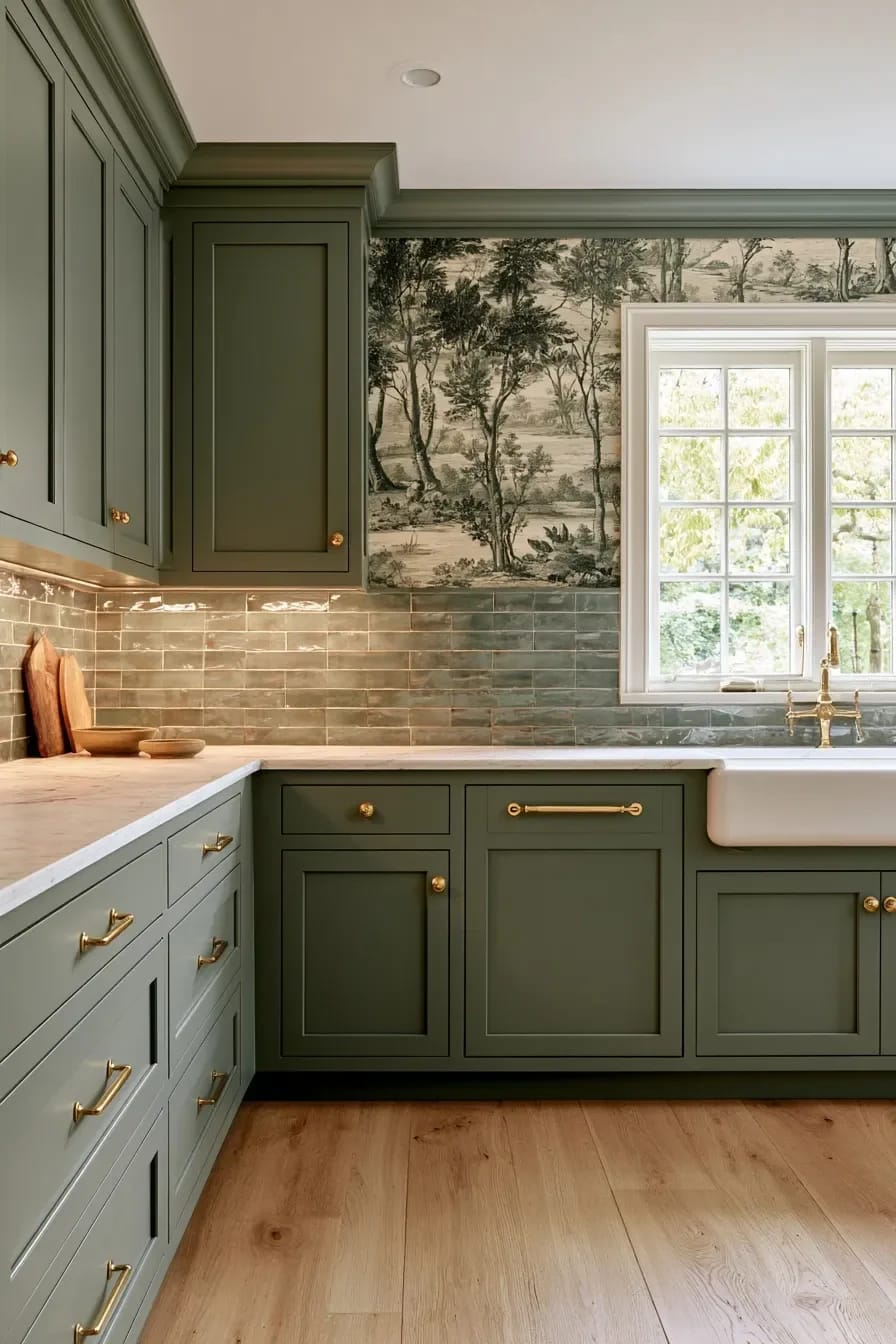
Forty identical pulls in a row is the fastest way to make a hand-finished metal look like a builder package. Vary the shape by function: bin pulls or cup pulls on drawers, knobs on doors, and one working latch on the pantry or a glass-front cabinet, which is the detail that makes the whole set look collected rather than ordered. Rejuvenation, Schoolhouse and House of Antique Hardware all carry solid unlacquered lines deep enough to mix within one collection.
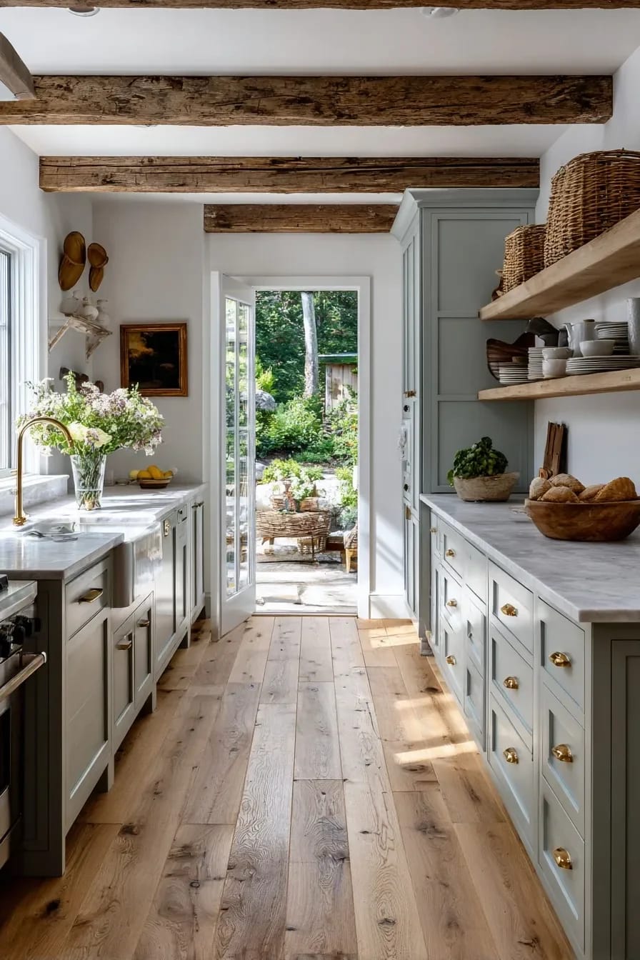
Budget accordingly: solid brass costs more than plated zinc because it is solid brass, and pulls generally land somewhere around twelve to thirty dollars apiece, with panel-front appliance pulls climbing past eighty. In a thirty-piece kitchen that is a real line item, not a rounding error.
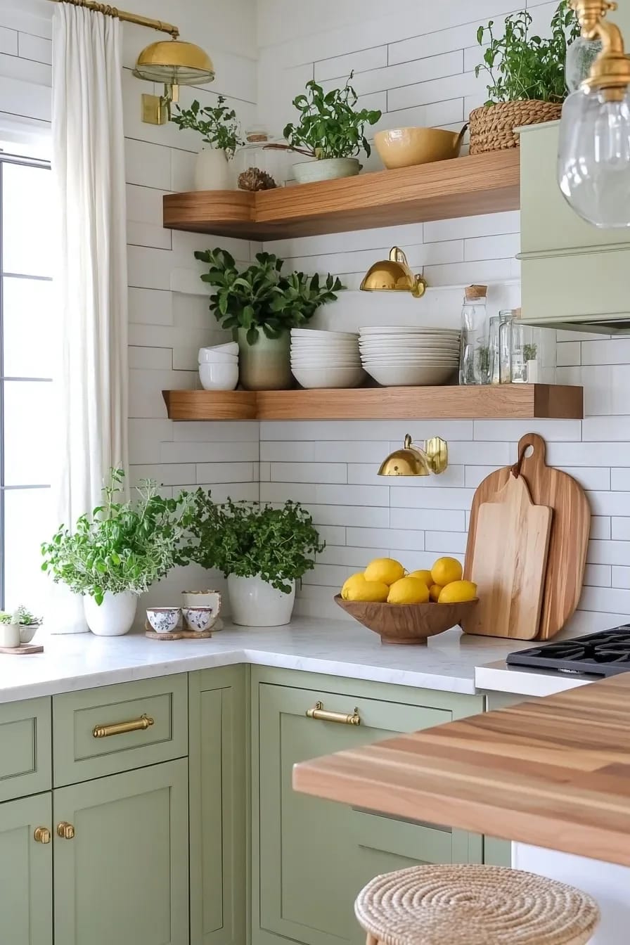
5. The unlacquered brass faucet is a bigger commitment than the pulls
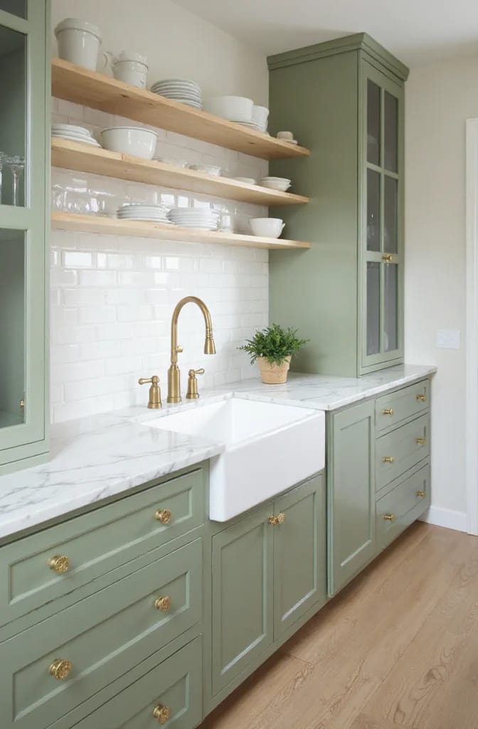
A faucet patinas faster and less evenly than any pull in the room, because it lives in standing water. The handles darken where your fingers land, the base collects a duller grey ring where water sits, and the spout stays brighter than both. Whether it ever goes properly green depends on the copper-to-zinc ratio of that specific casting, which manufacturers rarely publish.
That is a fine outcome if you want the faucet to look like it has been in a farmhouse for thirty years. It is a poor one if you were expecting the pulls' slow amber and got something mottled at the base within a season.
Do not commit to an unlacquered faucet on the strength of a showroom photograph, which is always of a brand-new piece. Buy one small unlacquered item first, a soap dispenser or a single cabinet knob, put it beside the sink and live with it for three months. Pulls can be swapped in an afternoon for a few hundred dollars. Replacing a faucet means a plumber, a possibly redrilled deck plate and a hole in a stone counter you cannot move.
6. Brass pendants that do not match the cabinet hardware
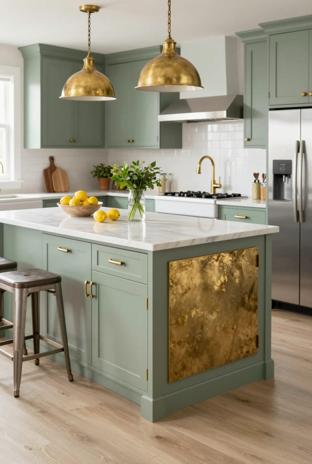
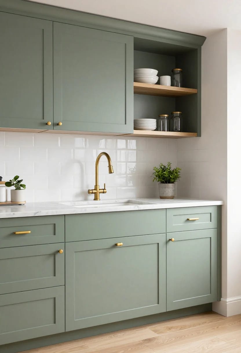
Matching the pendants to the pulls exactly is the single most common way this palette goes flat. Lighting hangs at eye level and reads against the ceiling; hardware sits at hip height and reads against paint. Two brasses in the same room that differ in tone and finish look like a decision, whereas one brass everywhere looks like a bulk order.
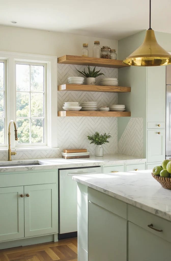
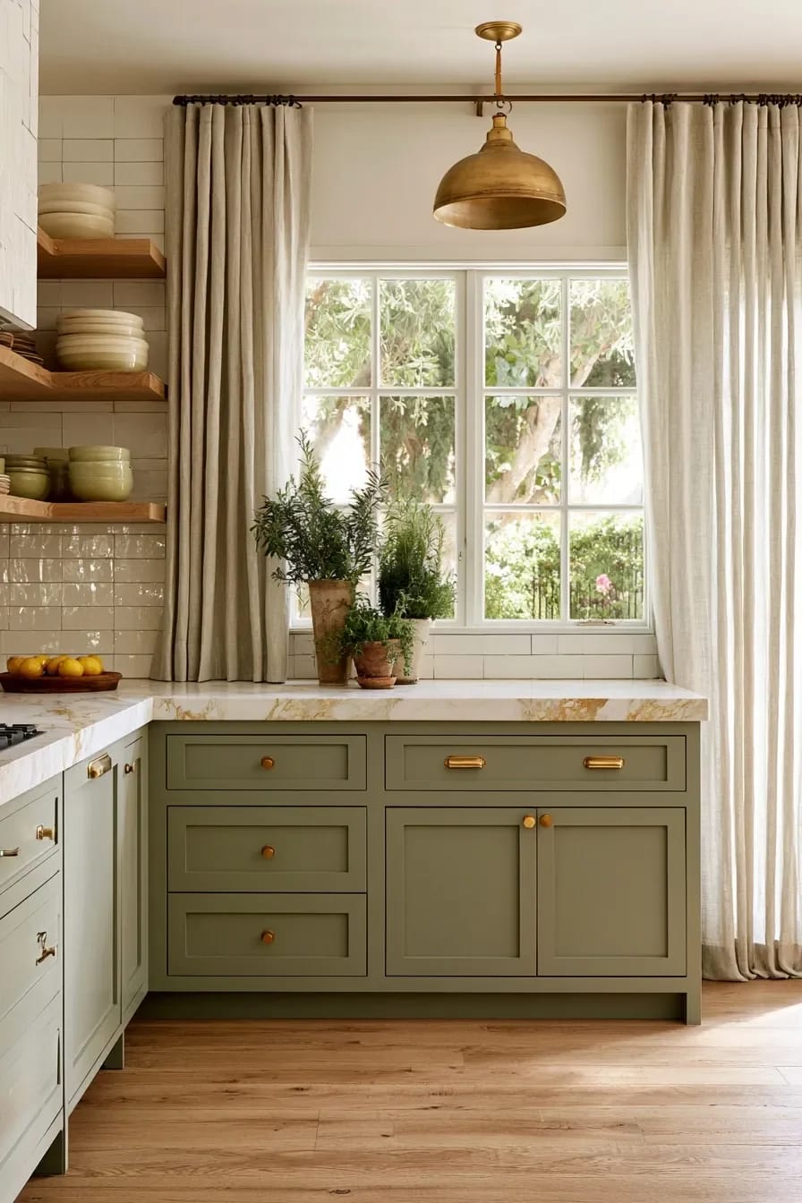
The practical version: run the hardware in polished unlacquered brass and let the pendants be an aged or antiqued brass that is already dark, so the room has both ends of the patina spectrum from day one. This works particularly well over an island, where the pendants set the proportions the rest of the island has to live with.
What the sage green sits against
7. Warm counters over cool white quartz
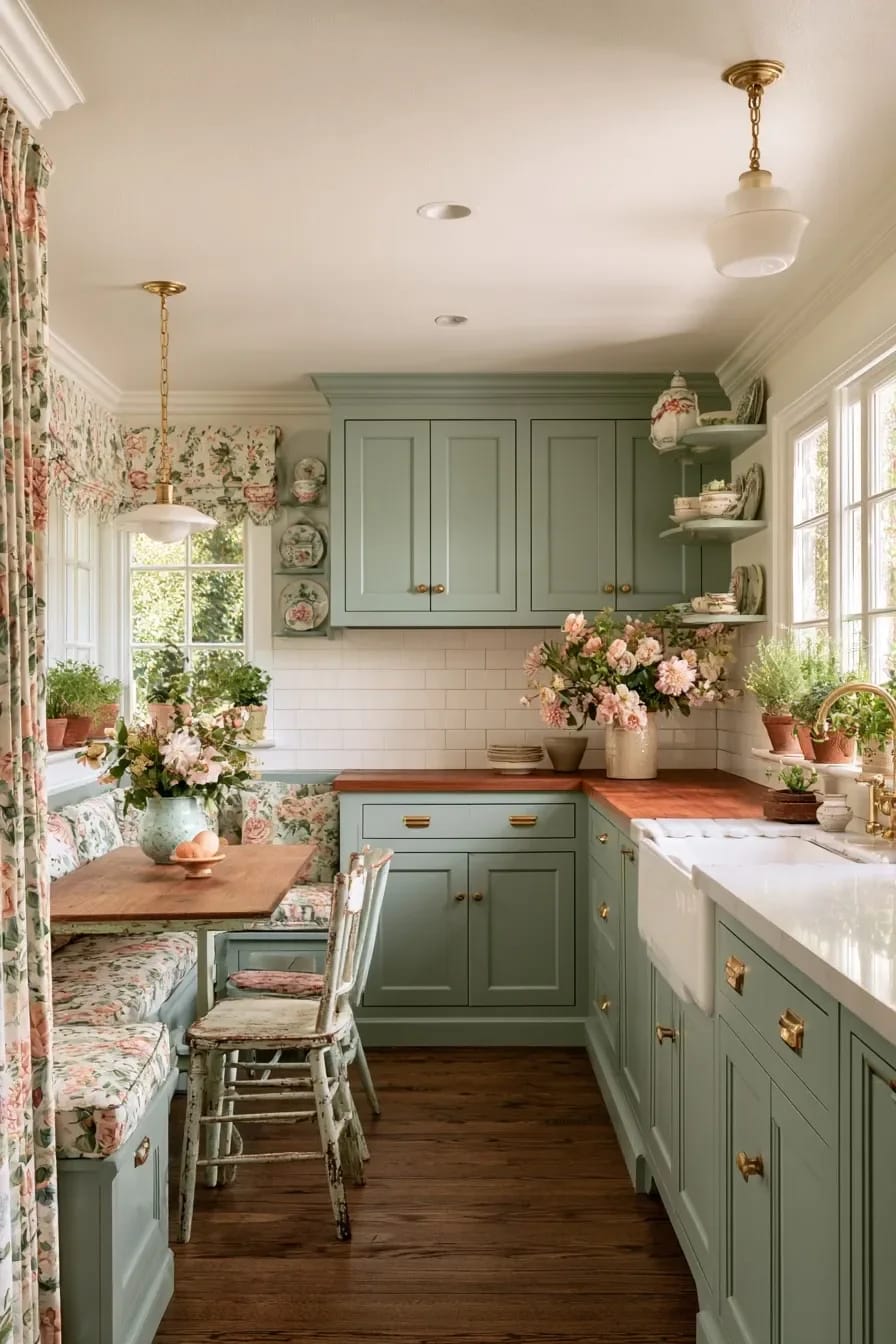
Cool white quartz is the wrong counter for this kitchen, and it is the counter most people are quoted first. Engineered white slabs are colour-corrected toward blue-grey to look clean under showroom lighting, and that blue is exactly what pulls sage toward grey and makes raw brass look yellow rather than gold. Honed marble with warm veining, soapstone, or a warm-toned quartzite all read as part of the same family instead of a correction to it.
Soapstone deserves more attention than it gets here specifically because it darkens with oiling, which puts it on the same trajectory as the hardware. Two living finishes in one room, moving in the same direction, is a coherence you cannot buy in a slab yard. It scratches, and the scratches sand out with a fine pad, which is either a feature or a chore depending on your temperament. The same warm-material logic drives every other decision in a warm minimalist kitchen, where the material count is deliberately short.
| Counter | Against sage and raw brass | The catch |
|---|---|---|
| Honed white marble | Warm grey and gold veining picks up the brass directly | Etches from lemon and wine; honed hides it better than polished |
| Soapstone | Darkens over time alongside the hardware | Scratches easily; needs oiling or an accepted grey |
| Warm quartzite | Stone durability with a cream rather than blue base | Sold under marble-sounding trade names; ask what it actually is |
| Butcher block | Adds the third warm tone on an island without a fourth material | Poor choice around a sink run; keep it to the island |
| Cool white quartz | Drains the green and yellows the brass | Cheapest to live with, which is why it keeps getting specified |
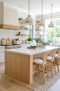 Neutral Kitchen Ideas That Read Warm, Not Builder-Grade Why kitchens finished after 2020 swapped grey and chrome for oak, cream and brass, and what that changes about the specification.
8. A cream zellige backsplash instead of white subway
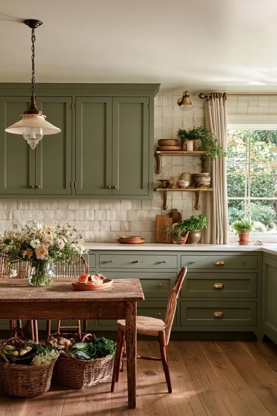
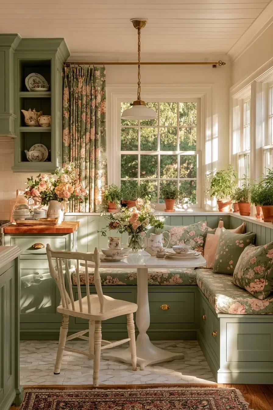
Flat white subway tile kills this palette by introducing the one perfectly uniform surface in a room built on irregular ones. Cream zellige does the opposite: the tiles are individually made, so glaze pools at the edges and every one catches light at a slightly different angle, which is the same visual behaviour the unlacquered brass will develop over the next two years.
Now the money. Genuinely handmade Moroccan zellige runs roughly fifteen to twenty-eight dollars a square foot for the tile alone and can go higher, and a typical kitchen backsplash is twenty to forty square feet, so budget four hundred to eleven hundred dollars in materials before anyone picks up a trowel. Labour also costs more than for standard tile, because uneven edges and varying thickness slow the setter down considerably. Zellige-look ceramic from a mainstream supplier lands around eight to fourteen dollars a square foot and is a defensible choice; Marazzi's undulated ceramic range sits in that band at Home Depot. It will not glow the same way, and only one of those two facts matters to most people.
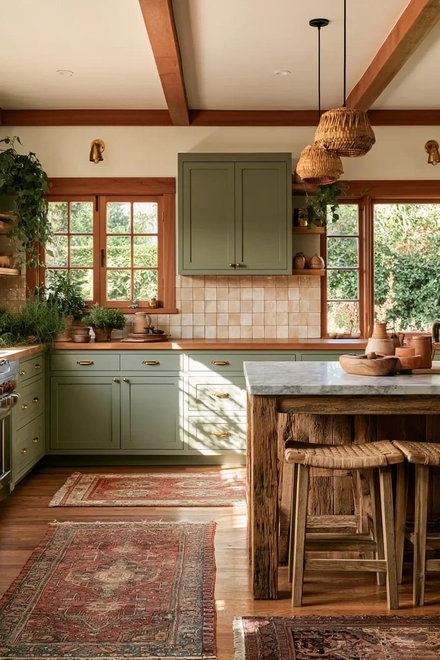
If cream feels too safe, a soft green glazed tile in a herringbone layout is the other direction worth taking, and the green backsplash options that work with green cabinetry are narrower than you would expect, since tone-on-tone goes muddy fast.
9. One piece of unfinished white oak, and only one
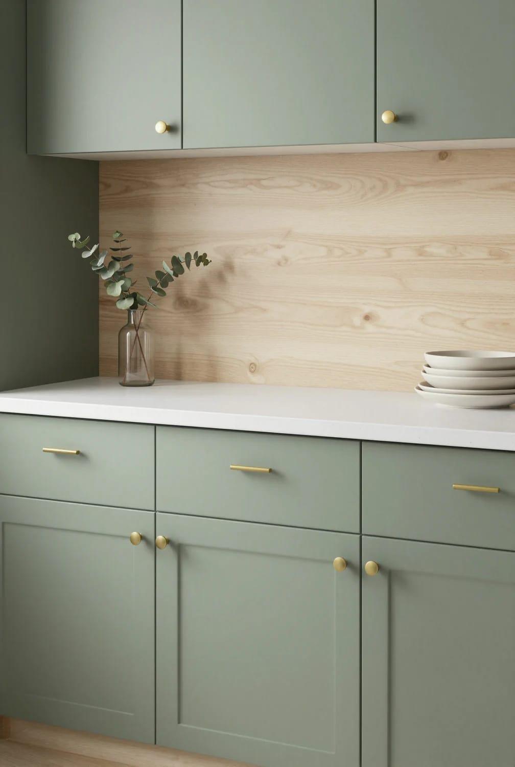
Sage, brass, cream and stone is already four materials, and the room needs one more warm element to stop the green from being the only colour doing work. Make it wood, make it white oak with an oil finish rather than a polyurethane one, and make it a single gesture: two floating shelves, or a butcher block island top, or the floor. Not all three.
Three wood tones in a kitchen this restrained is where the whole thing tips into a showroom set. The restraint that keeps a Japandi kitchen from going clinical is the same discipline that applies here, and it comes down to counting materials before adding another one.
Do the hardware first, the paint last
Buy one pull before you buy anything else. Put it on the counter, look at it at seven in the morning and again under the lamps at nine at night, and only then take the paint samples out. Every mistake in this article comes from choosing the green first and then trying to find a brass that agrees with it.
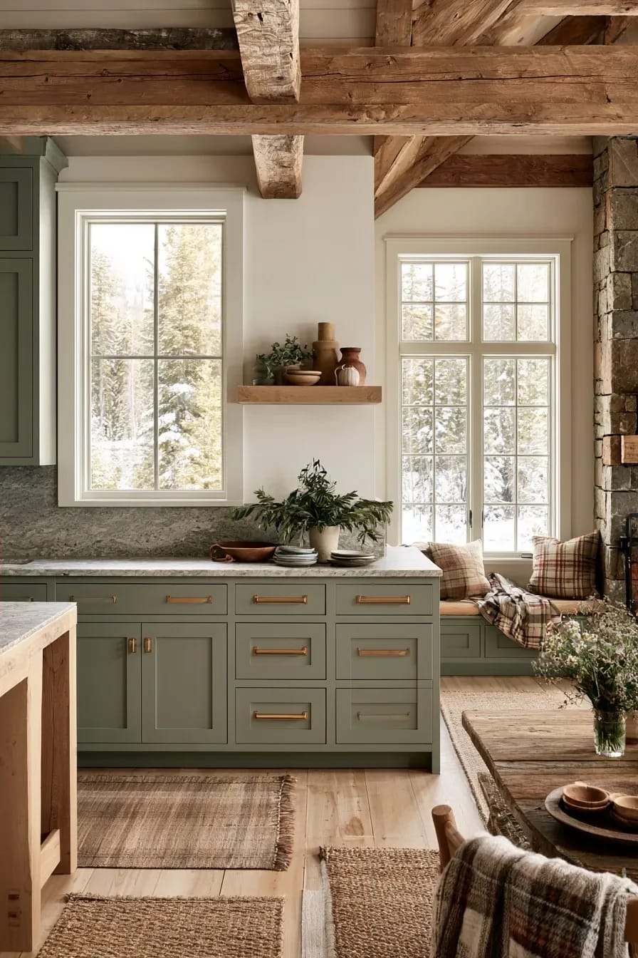
After that the order is counters, backsplash, paint, because the counter is the piece you cannot change your mind about and the paint is the piece you can. If the budget is tight, the two moves with the highest return are the hardware and the cabinet colour, which together cost a fraction of a slab and change the room more.
What I cannot tell you is how fast your particular brass will go. The six-to-twelve-month figure is what installers and retailers consistently report, not a guarantee, and it moves with your water hardness, your humidity and how often you cook. Buy one knob, leave it by the sink for a season, and you will know more about your kitchen than any article can tell you.
Related Posts
- 39 Sage Green Farmhouse Bedroom Ideas: Trendy Rustic Chic
- 29 Stunning Green Kitchen Cabinet Ideas: Lush, Nature-Inspired Hues
- 25 Unique Sage Green Boho Bedroom Ideas For 2025
- 25 Trendy Sage Green Bedroom Ideas For 2025
- 39 Trendy Blue Kitchen Cabinet Ideas: with Cool, Sophisticated Vibes
- Japandi Kitchen Ideas: 10 Design Decisions That Keep It Warm, Not Clinical