
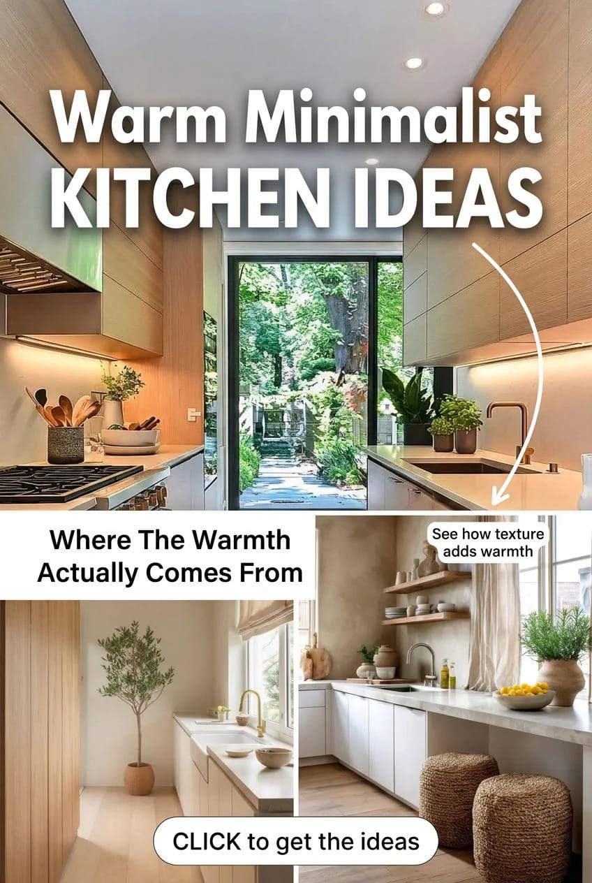
A kitchen finished entirely in white quartz, white walls and white handleless fronts photographs well at ten in the morning and turns clinical by eight at night, because nothing in the room holds warm light. Warm minimalism fixes that with about four materials, not with more objects on the counter. The ten decisions below are the ones that change the temperature of the room, roughly in the order they come up during a build.
None of this requires a bigger kitchen, and two of the ten are written for people working with a galley and no island at all. The parts that look expensive (the timber, the stone, the plaster) are also the parts where the cheap version shows first, so those get the most space here.
1. The cabinet timber decides everything else in a warm minimalist kitchen
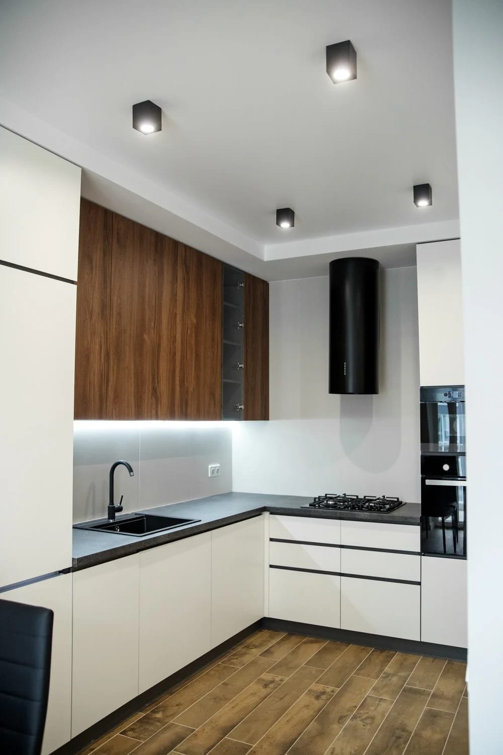
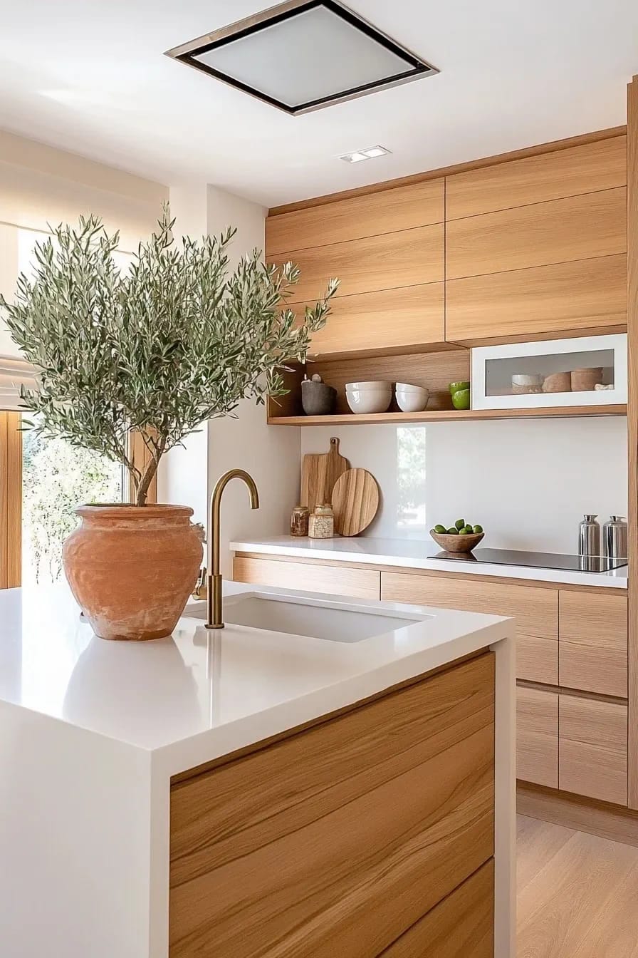
Choose the species before you choose a single paint colour, because the timber is doing all the work and the paint is only agreeing with it. Warm minimalism reads warm at night because wood pores scatter low-colour-temperature light instead of bouncing it back, which is why an oak kitchen under one dimmed pendant still looks like a room and a lacquered white one looks like a corridor.
| Species and cut | How it reads under warm light | The catch | Where to use it |
|---|---|---|---|
| Rift-sawn white oak | Pale honey, tight straight grain, no arching figure | Highest waste in milling, so the priciest cut of a common timber | Tall door runs and full-height pantry fronts |
| Plain-sawn white oak | Same tone, loud cathedral figure on wide doors | Figure fights itself across a long run | Islands, short runs, single drawer banks |
| European ash | Paler than oak, faintly pink at 2700K | Moves more with humidity swings | A lighter room than oak can give you |
| American walnut | Brown-grey and heavy once the sun goes | Fades toward honey in direct sun within a couple of years | One accent element, not a whole kitchen |
Rift-sawn or plain-sawn on a run of tall doors
On anything above about five feet, pay for rift. Plain-sawn oak throws cathedral arches that repeat door to door at slightly different heights, and on a full-height run the eye reads that as a mistake rather than as grain. Below five feet the figure is an asset, so an island or a drawer bank is where the cheaper cut belongs.
When veneer is the right answer
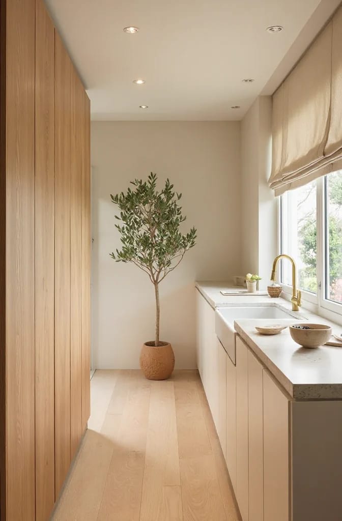
Veneer on a stable core beats solid timber for tall fronts, and anyone telling you otherwise is selling solid. A 90-inch solid oak door will cup; a sequence-matched veneer will not, and the sequencing means the grain flows across four doors as though it came off one log, which it did.
2. Put the texture on the walls: lime wash or plaster instead of another coat of white
Flat paint is the single biggest reason a warm minimalist kitchen still reads cold. Mineral finishes carry depth because the surface itself varies, so the wall changes through the day instead of sitting there at one value, and it costs less than the equivalent square footage in tile.
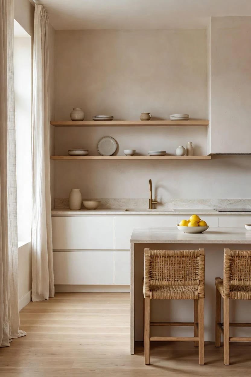
Know what you are committing to before the primer goes on. Portola’s own technical sheet calls lime wash a non-wipeable finish and warns that wiping or rubbing it can leave staining or white flashing; sealed with their matte wall sealer you get a barely damp rag and mild soap, and that is the whole cleaning protocol. That is workable on a hood or a breakfast wall and a bad idea directly behind a hob, which is the same trap that catches people in boho kitchens, where the materials that create the look are exactly the ones that resent being cleaned.
Lime wash: two brushed coats over a lime-proof undercoat, roughly 1mm total. Cloudy, streaked, non-wipeable unless sealed. The only one of the three most people can apply themselves.
Lime plaster (marmorino, tadelakt): two to three troweled coats at 2 to 3mm, burnished to a low sheen, soap-sealed where it meets water. A trade job quoted by the square foot.
Microcement: 2 to 3mm over a primed substrate with a fibreglass mesh, then a polyurethane sealer. The one you can put behind a hob and scrub, and the one that looks least like a mineral finish and most like a product.
3. In a small warm minimalist kitchen, run one stone and stop
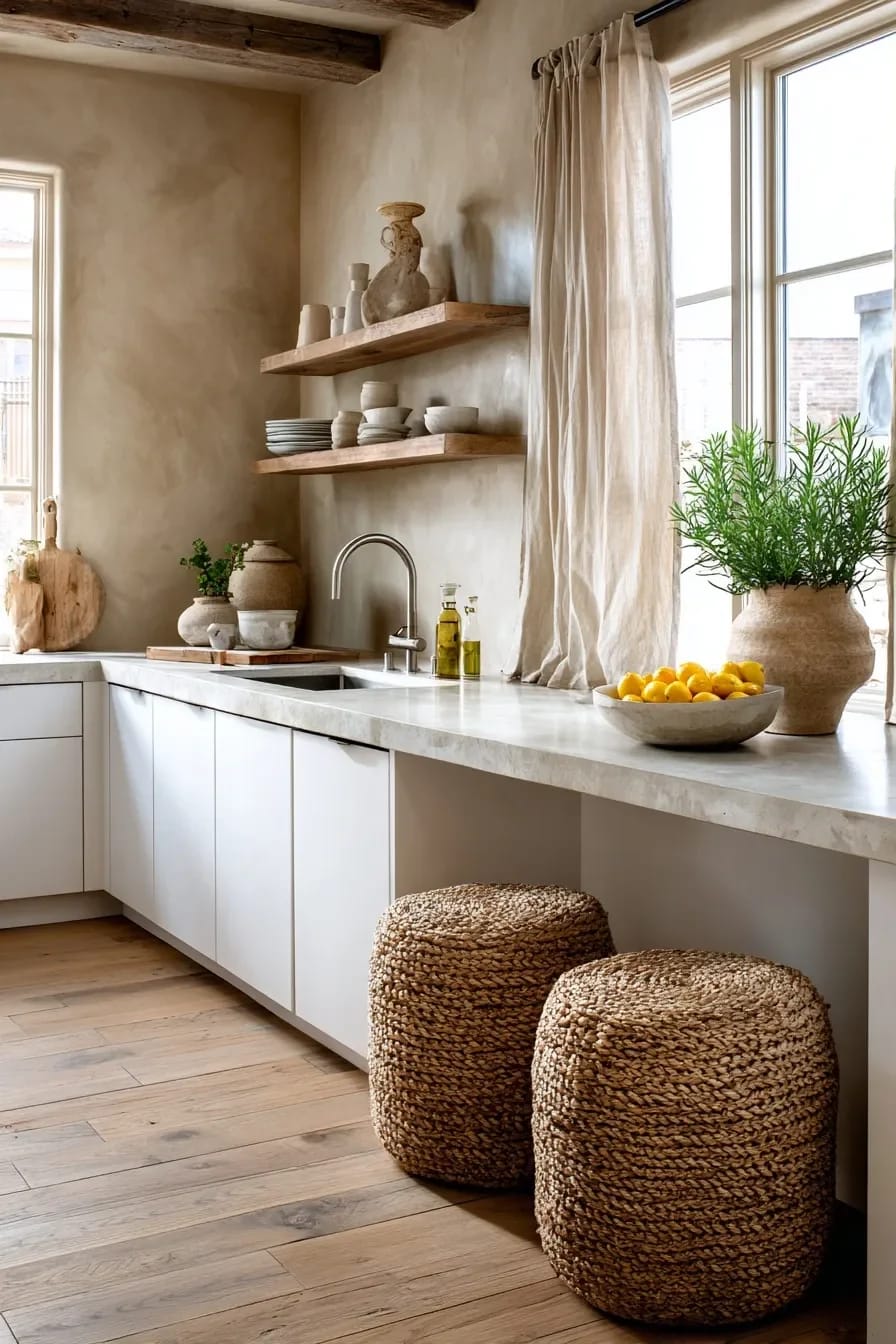
Under about 150 square feet, take the counter material up the wall as the backsplash and use nothing else. Two surfaces in a small room create a horizontal seam at counter height that chops the wall in half, and the grout lines you avoid are the ones that go grey first anyway. In a larger kitchen the opposite holds: one continuous stone across sixteen feet of counter and wall starts to read as a bathroom.
Do this
- Ask for the slab layout drawing before fabrication and check that the waterfall end is bookmatched, so the veining turns the corner instead of stopping dead at it.
- Honed or leathered. Polished quartzite shows every smear at a low sun angle and you will be wiping it twice a day.
- 3cm on anything with an overhang.
Avoid
- Calacatta marble anywhere a lemon might land. Etch marks appear within weeks and no sealer prevents them, because etching is acid dissolving the surface rather than a stain sitting on it.
- Three different surface materials in a room with one window.
- Buying from a photo. Go to the yard and see your slab.
4. Keep the handles. Handleless is where warm minimalism turns cold
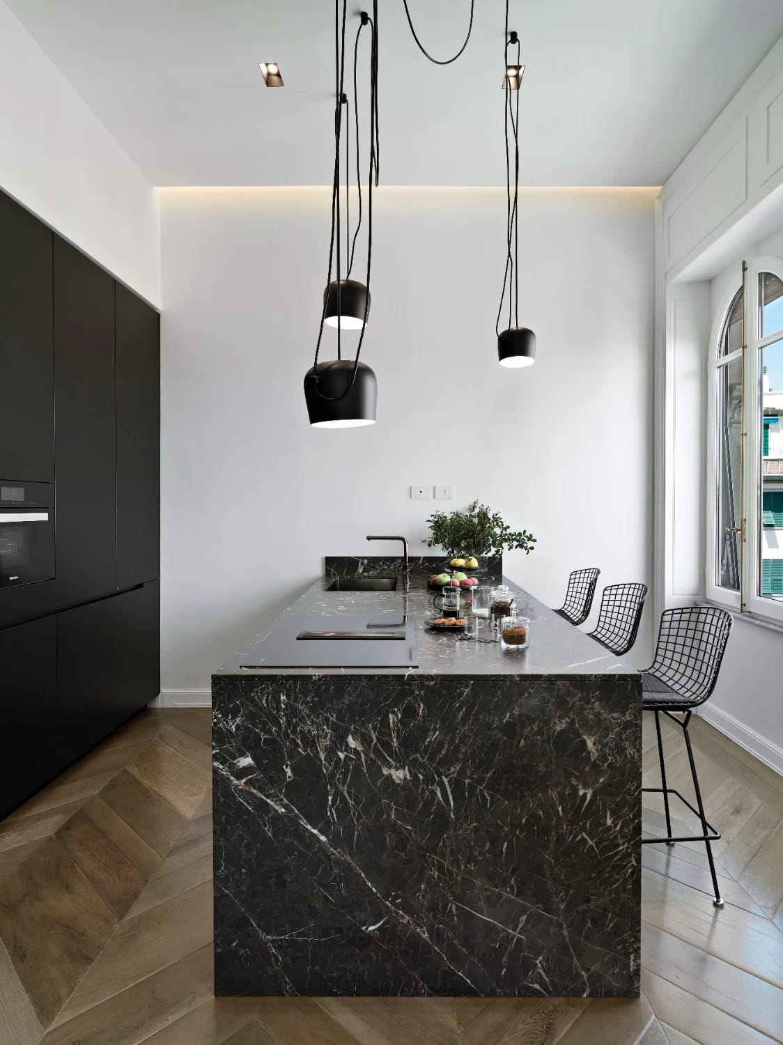
Push-to-open fronts are the most common way this look goes wrong, and they are also the part most likely to annoy you by year three. The mechanisms lose calibration, the doors stop sitting flush, and in the meantime every front carries a smudge where your hand lands because the door itself is the handle.
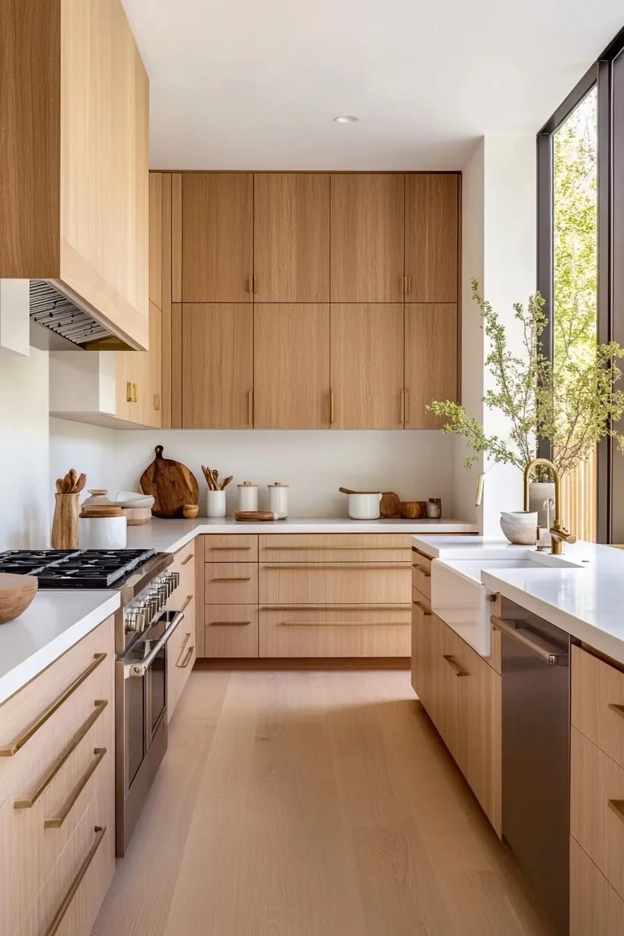
Unlacquered brass is the right call here for the same reason it works in the warm neutral kitchens that replaced the 2016 chrome and greige palette: it darkens unevenly within weeks, and that unevenness is the only element in the room that changes on its own. If you want the look without the visual noise of hardware, ask for a routed finger channel along the top edge of the drawer front instead of a surface pull. It gives you something to grab and no mechanism to fail.
5. Warm light at 2700K, in three layers, or the timber goes grey after dark
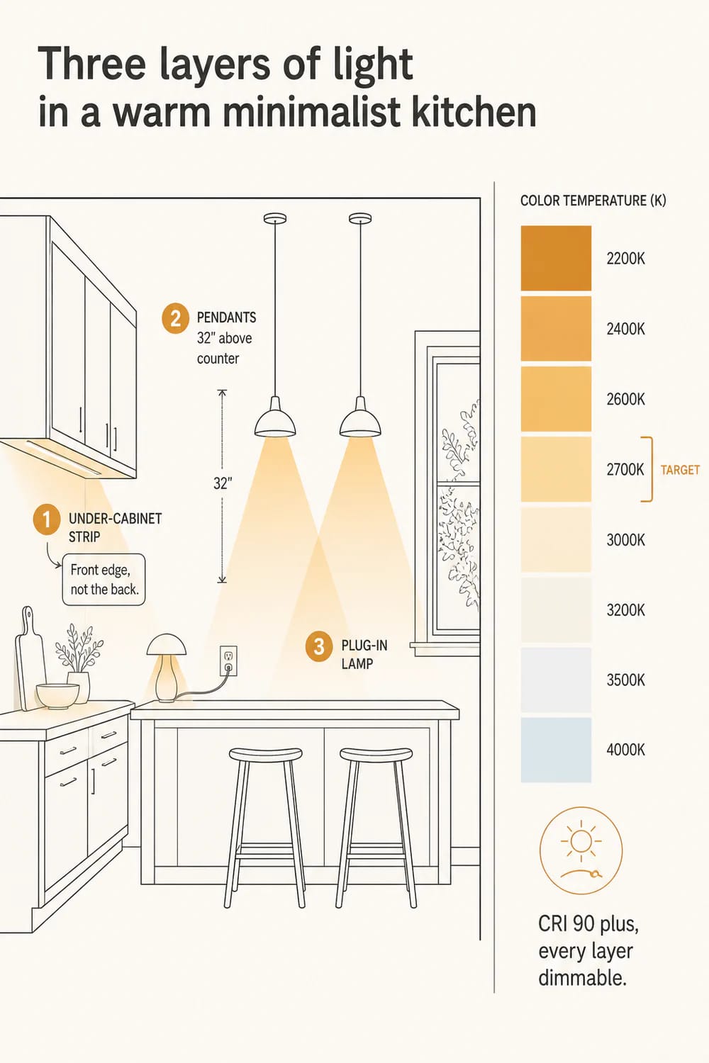
Set every light source in the room to 2700K with a colour rendering index of 90 or better, and put all three layers on dimmers. This matters more than any material choice you have made so far, because 4000K light drains the red out of oak and puts it back at a shade close to concrete, which is the exact thing the timber was bought to prevent.
Where the strip actually goes
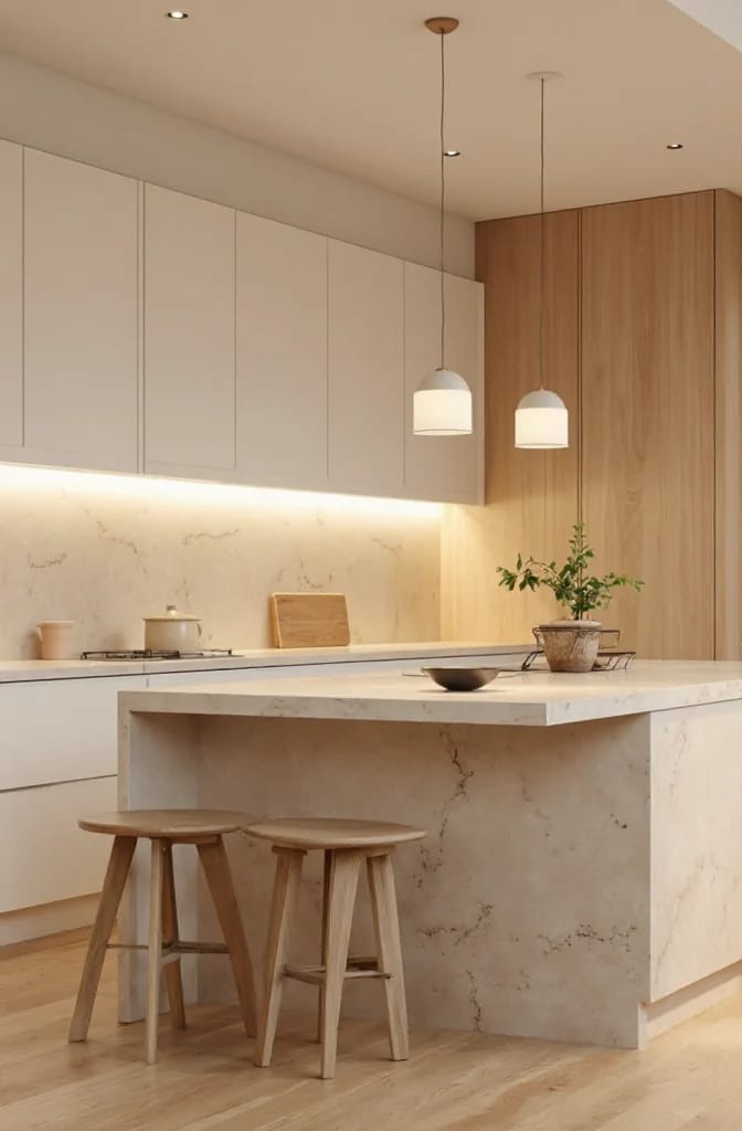
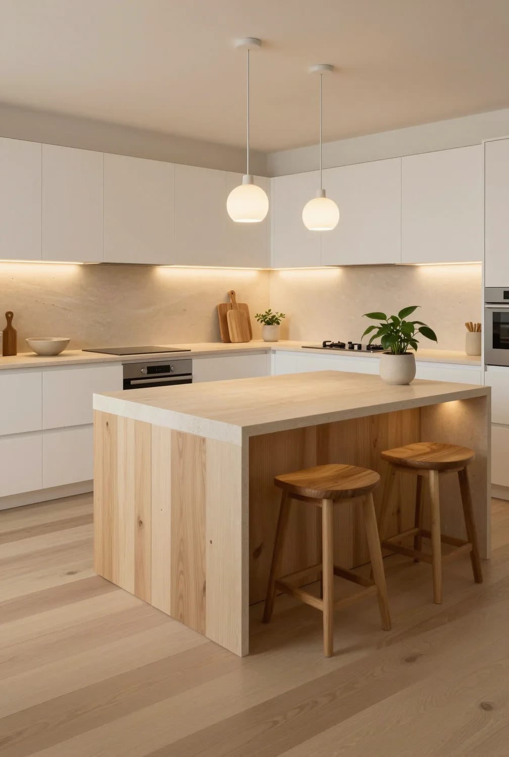
Mount under-cabinet tape at the front edge of the cabinet bottom, behind a small batten, not shoved against the back wall. Back-mounted tape lights the backsplash and leaves your hands in shadow, which is backwards; front-mounted tape lights the working surface and washes the backsplash indirectly. Aluminium channel with a frosted diffuser costs a little more than bare tape and removes the row of visible dots reflecting in a stone splash.
The pendant question
Two pendants over an island, hung about 30 to 36 inches above the counter, is the arrangement that has survived every version of this style. Three small ones over a standard eight-foot island is a fussier look than the room wants. Frosted glass globes diffuse better than open metal shades, and they hide the bulb, which matters when you are dimming to 20 percent and the filament becomes the brightest object in the room.
 Japandi Kitchen Ideas: 10 Design Decisions That Keep It Warm, Not Clinical The ten calls that separate a japandi kitchen from a showroom floor.
6. Seat the island on one long side and give the coffee mess its own corner
Put the stools along a long side, never wrapped around a corner, and leave 15 inches of overhang so knees fit under. Corner seating looks generous in a plan drawing and puts two people at right angles to each other, which nobody enjoys.
The coffee corner is the pressure valve
Designate one two-foot section of counter as the place where the machine, the grinder and the cups live permanently, and accept that it will never be clear. Every clear-counter kitchen has one of these, whether or not it was planned, and planning it means the outlet is behind the machine rather than running across the splash. This is the same logic behind Japanese kitchens, which stay calm because of where the clutter is hidden rather than because there is less of it.
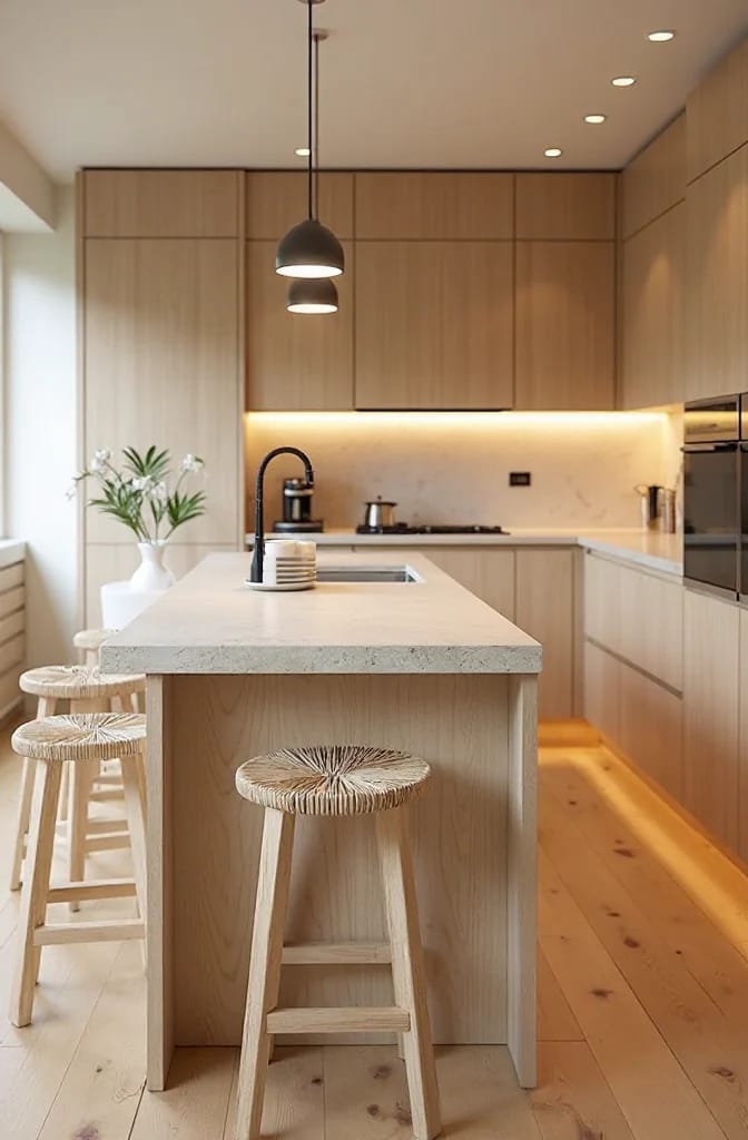
7. Wide oak boards, matte, and no floor pretending to be timber
Seven to nine inch boards in white oak, finished in hardwax oil rather than polyurethane. The oil sits in the timber instead of forming a film on top, so a scratch takes a spot repair with a cloth rather than a full sanding of the room, and the sheen stays low enough that the floor does not compete with the stone.
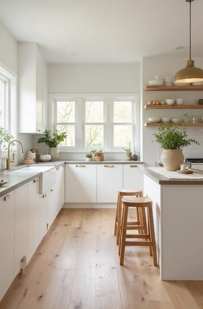
Wood-look porcelain is a reasonable product in a wet room and a bad one here, because it sits three feet from real oak cabinet fronts and loses that comparison in every light. If the floor has to be tile for underfloor heating, go to a plain warm limestone-look large format instead and stop pretending. Getting the floor temperature right is also most of what separates this look from its nearest neighbour, and the differences are worth knowing if you are still deciding between warm minimalism and modern coastal.
8. One run of open shelving, and not above the hob
Open shelving works in exactly one place per kitchen and fails everywhere else. A single run near the sink or the coffee corner holds the things you touch daily, so it stays in rotation and does not accumulate dust; a run above the range collects an invisible film of aerosolised fat that turns sticky in about six weeks.
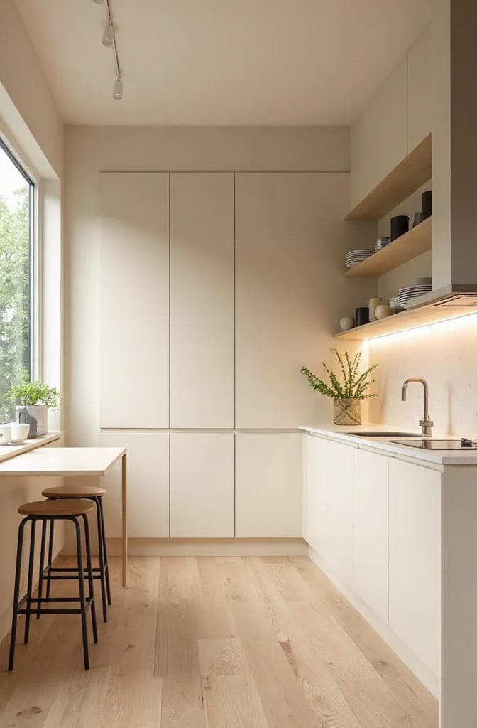
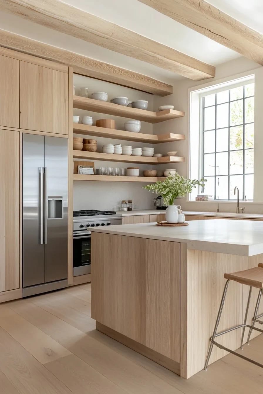
Make the shelf itself substantial. A 3/4 inch board on brackets reads as a fix; a solid oak shelf 1.5 to 2 inches thick, floating on concealed steel rods set into the studs, reads as joinery. Depth of 10 to 12 inches holds dinner plates and stops people stacking two rows deep.
 Minimalist Kitchen Ideas That Survive Actual Cooking Why the tidy ones at 7pm are the ones with somewhere for objects to go.
9. Panel the fridge, skip the panelled dishwasher
The refrigerator is the one appliance whose scale breaks a run of timber, so panel it and let the rest show. A dishwasher sits below the counter line where the eye already reads a horizontal band of drawer fronts, and the panel-ready version costs more, complicates the door spring, and buys you very little.
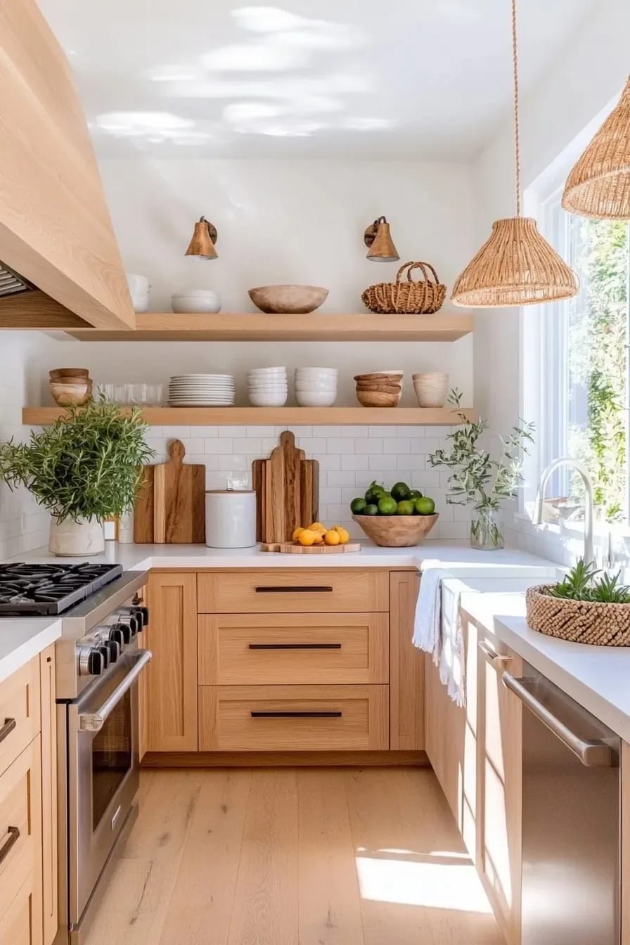
Leave the sink and the tap visible and let them be metal. A kitchen where every functional object has been buried stops reading as a kitchen, and the tap is the one piece of hardware you use fifty times a day.
10. The galley version: warm minimalism without an island
A galley does this look better than most open-plan kitchens, because the whole style is about long uninterrupted runs and a galley is nothing but long uninterrupted runs. Keep 42 inches of aisle for one cook and 48 if two people work in there at once, then put full-height storage on one wall and nothing but counter, one shelf and a window on the other.
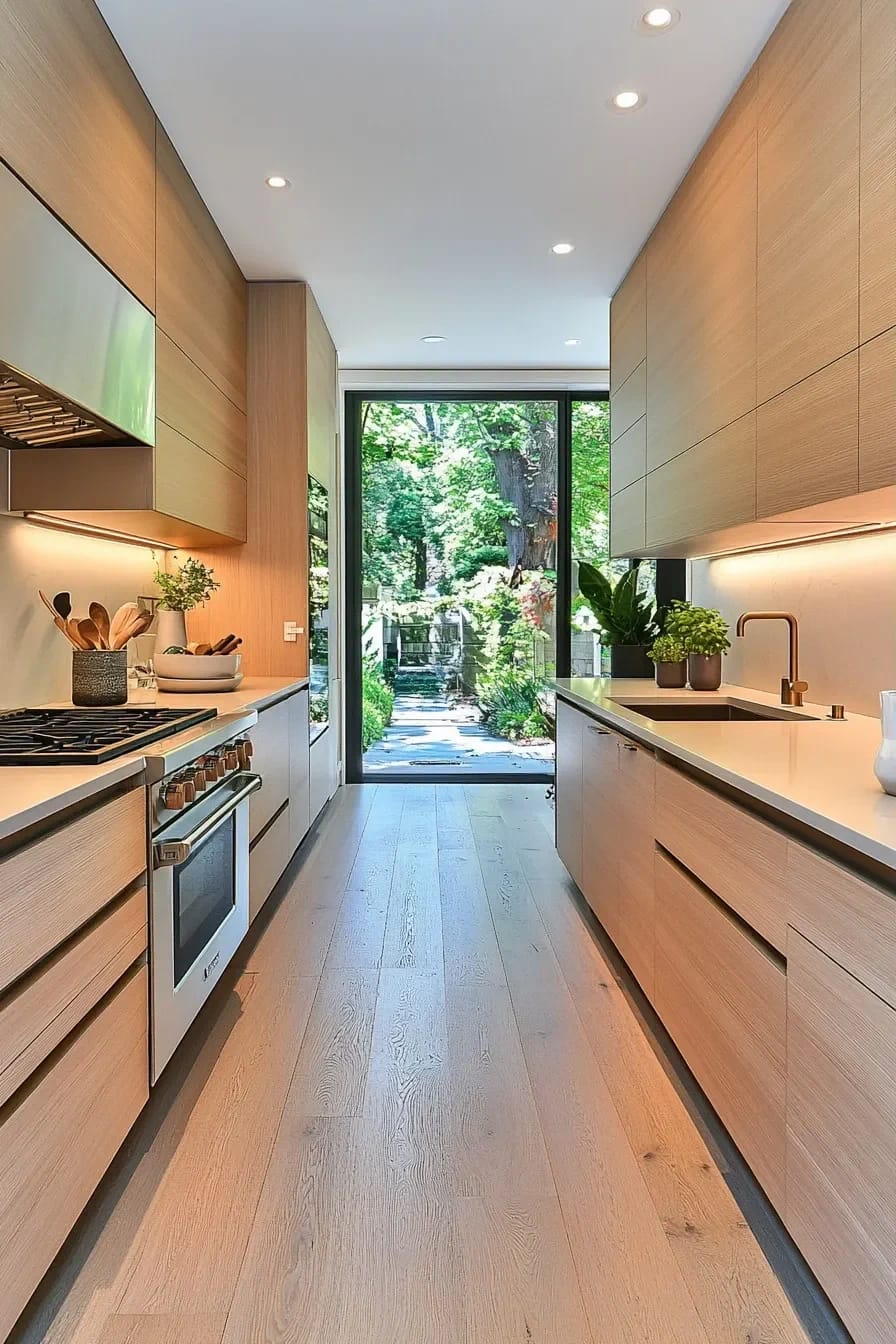
Counter-depth appliances matter more here than anywhere else, since a standard fridge protruding six inches into a 42 inch aisle takes it down to a genuine squeeze. The rest of the compromises are the usual ones, and the wider set of small-kitchen workarounds covers the storage side in more detail than there is room for here.
If you are building rather than refreshing, the order matters: timber and stone get specified first because lead times run long, lighting positions get resolved before the drywall closes, and the mineral wall finish goes on last, after the joinery is in and the trades have stopped leaning things against the walls.
One honest gap. Reliable pricing on any of this is close to impossible to state usefully, because lime plaster quoted by the square foot in one city and rift-sawn oak fronts quoted by a local joiner in another vary by multiples, not percentages. Get three quotes and expect them to disagree wildly.
If the budget only stretches to one of the ten, make it the lighting. New cabinet fronts under 4000K downlights still read cold, and 2700K dimmable light over a laminate counter and a rented white kitchen gets you a surprising distance toward the same room.
Related Posts
- Neutral Kitchen Ideas That Read Warm, Not Builder-Grade
- Japandi Kitchen Ideas: 10 Design Decisions That Keep It Warm, Not Clinical
- Minimalist Kitchen Ideas That Survive Actual Cooking
- 7 Japanese Kitchen Ideas That Feel Warm, Not Sterile
- 43 Aesthetic Kitchen Ideas to Transform Your Space
- 33 Modern Farmhouse Kitchen Ideas: Blending Rustic Charm with Contemporary Design