

Paint samples get taped to a wall in a row and then judged against each other, which is the one comparison that tells you nothing. The eye reads left to right, picks a favorite, and the favorite turns out to be the swatch that sat most comfortably beside its neighbors rather than the one that works beside the oak floor three feet below it.
So the order is the whole method. Everything you cannot move without a truck, a permit, or a second mortgage, meaning the flooring, the stone, the tile, the millwork, the window glass, sets the constraint. Paint is the free variable: $30 to $90 a gallon, one weekend of work, reversible with a second weekend. Choosing it last is not a compromise, it is the only sequence in which the expensive decisions get to win.

What follows is the sequence itself, the specific colors that answer the fixed elements most American houses actually have, and a ten-day test that costs less than one wasted gallon. If the floor is already coming out, this is the wrong article, because then the floor is the free variable and you should pick the paint first.

What to gather before you look at a color
Nothing on this list is expensive, and the whole kit costs less than the gallon you will get wrong if you skip it. The point of buying it up front is that it commits you to testing rather than deciding.
Materials
- Peel-and-stick samples, 12 by 12 inches, five colors. These are two real coats of paint on a low-tack sheet at roughly $7 to $9 each, and they are worth it over paper chips because a paper chip is a print, not paint. Samplize peel-and-stick sample of Sherwin-Williams Agreeable Gray SW 7029
- Sample boards, 12 by 12 inches, if you would rather brush out pots you already own. Offcuts of drywall are free at any job site, and a foam board from an art store runs about $5. Two boards per color, because you will want them in two rooms at once.
- Painter’s tape, 1.41 inch, for holding boards at eye level while you work. A three-roll pack runs $15 to $20 and you will use it later for the actual painting. ScotchBlue Original Painter’s Tape 2090, 1.41 in, 3 rolls
- Latex sample pots, if you are brushing out. Half a pint per color is more than one board needs, and most brands sell them for $6 to $8.
Materials land around $50 to $70 for five colors, and about $35 to $45 of that is the samples themselves. If you own the tape already, closer to $40. Product links below and in this list are affiliate links; the sample service ships its swatches in a satin finish only, so it will not tell you how a color behaves in flat or eggshell.
Tools
- Foam brushes, 2 inch. Sixteen of them cost about $6 and they leave no brush marks on a sample board. Bates foam paint brushes, 2 in, 16 pack
- Two LED bulbs of the same wattage, one 2700K and one 4000K, to swap into a single lamp. A four-pack of each runs $10 to $17. Buy both temperatures; replacing only one is how a room ends up lit in two different colors.
- A sheet of plain white printer paper. It is the cheapest reference in the house and you will use it in step two.
- A phone with the white balance locked, or a notebook. Auto white balance quietly corrects the exact cast you are trying to see.
Tools add $16 to $23 if you own none of it. Everything together, testing five colors properly costs roughly $65 to $95, and the mistake you are avoiding costs $60 a gallon plus a weekend.

1. Inventory the fixed elements, in writing
Walk the room and write down five things: the flooring, any stone or solid surface, the millwork, the tile, and the windows. For each one, record the material and the finish rather than the color, so "red oak, site-finished, satin" rather than "light wood," and "filled and honed travertine" rather than "beige."
Then photograph each in the room's own light with the sheet of white paper in the frame. The paper does two jobs: it gives you a neutral reference that your eye cannot invent, and it gives the camera something to expose against so the floor does not come out orange in one shot and grey in the next.
That last part matters more than it sounds. The order of operations here is the same one that ruins building projects: people commit to the thing they can picture first and then try to wedge everything else around it, which is the mistake that costs the most when the first decision is the wrong one. Paint is the cheapest thing in the room to get wrong, so it should be the last thing that is allowed to be wrong.

2. Read the undertone, not the color name
Hold the white paper flat against each fixed element, in the room, in daylight, and look at the floor rather than the paper. The element's cast shows up immediately. Red oak throws pink in the earlywood and reads noticeably warmer against the paper than it does on its own. White oak throws yellow-green and grey. Hickory is inconsistent enough from plank to plank that the paper can look cool against one board and warm against the next.
This is also the step where the light reflectance value starts doing work, and it is the number almost nobody checks. Sherwin-Williams Accessible Beige (SW 7036) carries an LRV of 58. Sherwin-Williams Agreeable Gray (SW 7029) sits at 60. Two points apart is a difference you cannot see on a wall, yet the two colors behave very differently, which tells you the decision between them is about undertone and not about depth. Accessible Beige leans warm with a green-taupe edge; Agreeable Gray stays balanced. That LRV number is doing more quiet work in beige kitchens than most people realize, and it is the reason a beige that photographs well can still read flat in person.
Against a white oak floor, Benjamin Moore White Dove (OC-17) is the reliable answer. Its LRV is 83.16, its undertone is warm with a faint grey-yellow lean, and it is balanced enough that it will not tip yellow under south light or grey under north light. It also pairs cleanly with oak, walnut, maple, warm stone, and brass, which is a short way of saying it works with the materials most houses already have. Its failure mode is a cool stark white trim: put the two together and White Dove stops reading as a white and starts reading as dirty.
Alabaster (Sherwin-Williams SW 7008, LRV 82) is the warmer sibling and the more fragile one. It is a cream-yellow with a greige anchor, and it reacts hard to its neighbors. A cool grey stone beside it makes it look soiled; a stark white trim makes it look yellow; and in a north-facing room or under flat overcast light the greige half surfaces and it goes grey-green, occasionally mauve.

AI visualization of Benjamin Moore White Dove OC-17; screen color is approximate and shifts with your monitor and your room’s light, so verify against a real sample before you buy.
3. Sample on boards, not on the wall
A sample painted straight onto the wall sits on top of two to four existing coats in whatever sheen is already there, which means you are judging your color through someone else's finish. A board has none of that history, and more usefully, it moves. You can lay it flat on the counter, stand it against the baseboard, hold it under the lamp, and carry it to the next room.
Two coats, dry between them, or the board lies about the color. One coat reads lighter and thinner than the finish will, and a great many people have bought a gallon based on a single coat.
What you must not do is tape the boards in a row and pick a winner. A row turns a decision about your room into a beauty contest between five near-identical neutrals, and the winner is always the one with the most contrast against its neighbors rather than the one that answers the floor. Judge each board against a fixed element, one at a time, and then judge it again in a different room. Color chosen at the paint counter under fluorescent tubes survives contact with almost no real room, and the boards exist so that you never have to find out which one.

4. Run the boards through a full day and both bulb temperatures
Midday is the least informative hour there is, and it is the hour most samples get judged in. Daylight at eleven in the morning is bright and fairly neutral, which flatters nearly every color; the information you need arrives at four in the afternoon and again at nine at night.
Two bulbs do the work. A 2700K lamp shows you what the room does in the evening as most people actually live in it. A 4000K lamp shows you what happens when someone installs cool bulbs, and this is where fixed elements and paint start fighting, because cool light pulls the warmth out of a warm floor and a warm wall at the same time. A room that reads putty at noon reads grey at nine if the bulbs are 4000K, and no amount of repainting fixes it.
Individual colors separate here. Benjamin Moore Pale Oak (OC-20, LRV 68.64) is a warm greige with a warm yellow undertone in daylight, and under cool 4000K light it swings toward lavender. Agreeable Gray holds. It has an LRV of 60 and a balanced undertone, and it resists turning purple, green, or pink across north light, south light, and lamplight, which is why it survives open plans and north-facing rooms where more characterful neutrals do not.
The failure is not the paint in that case. It is the bulb, the countertop, or an undertone nobody checked against anything, and the after-dark version of a room is where that gets diagnosed.
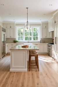 Light Colored Kitchen Cabinets: 7 Ways to Get Bright Without Going Cold Seven ways to keep pale cabinets from going grey after dark, including how to tell whether the bulb or the undertone is the actual culprit.
5. Break the tie with the largest fixed element
Two boards will usually both work, and this is where people stall for a week. Three tiebreakers, in order. First, whichever color answers the biggest fixed surface in the room, measured in square feet rather than in drama. Second, whichever color answers the element you cannot repaint even if you wanted to, which is almost always the stone. Third, whichever one's failure mode you can live with, because both of them have one.
Sheen belongs in this decision and usually gets left out of it. Trim carries a higher sheen than walls in most houses because it gets wiped, and factory-finished cabinets and prefinished flooring have a sheen you cannot change at all. So the wall and trim finish has to answer those. Keep the trim and the wall in the same white family and the contrast in sheen reads as intention; use a stark cool white trim against a warm off-white wall and the sheen difference stops being a decision and starts reading as a mismatch.
Warm materials narrow the field fast. Where the room already has white oak, cream, putty, and brass doing the work that chrome used to do, the paint has one job, which is to not introduce a second temperature, which is the shift that separates a warm neutral room from a cool one built the same year.

Do this, not that: pairing paint to what is already there
These are the pairings that hold up and the ones that fail, with the reason each failure happens, because knowing only that something is wrong tends to produce a different version of the same mistake.
Works
- Benjamin Moore White Dove on both walls and trim, over a white oak floor, at any time of day. Same color on both surfaces removes the contrast that makes a warm white look dirty.
- Sherwin-Williams Agreeable Gray wherever the light changes across the day and the stone runs cool, meaning marble, quartz, or anything with a grey cast. Its balanced undertone is the reason it survives that, not its depth.
- Accessible Beige with warm wood, warm stone, brass, or bronze. It reads as a settled beige in warm south light and it wants warm neighbors.
- Alabaster on the walls when the trim is already Alabaster, and only then. It is a color that wants to be unopposed.
- Pale Oak on the walls with White Dove on the trim. Pale Oak leans toward colored trim, so it should never be the trim itself.
Does not work
- Alabaster next to a cool grey stone. The grey drains the cream and the wall reads soiled rather than warm.
- Accessible Beige in a north-facing room under 4000K bulbs. The green-taupe half surfaces and the room goes earthy; this is an LRV-58 beige with real warmth in it, and it needs warm light to show it.
- Pale Oak as a trim color. It reads as a colored boundary rather than a crisp edge, and every door casing in the house will look slightly beige.
- A builder-grade cool white trim against White Dove or Alabaster walls. The trim makes the wall look yellow by comparison, and repainting the trim to match costs more than the wall did.
One honest caveat about all five: they are neutrals, and neutrals are the hardest colors to judge from a screen, a fan deck, or a photograph. Every claim above can be falsified by your own room in about four hours of testing, which is exactly the argument for checking the undertone against a fixed reference instead of trusting the color name. Undertone, not the label on the can, is what makes a scheme work.

AI visualization of Sherwin-Williams Accessible Beige SW 7036 in north light; the render is approximate and the real color will read warmer in a south room, so test the actual sample in your own exposure.
The ten-day test, in order
The sequence below is the compressed version of what color consultants do, and it fits inside two weeks because most of it is waiting rather than working.
- Day 1. Order the peel-and-stick samples or brush out two coats on the boards. Label the backs with a pencil; every neutral looks identical once the row is gone.
- Day 2, mid-morning. Put each board against the floor, then against the stone, then against the trim. One at a time, never in a row. Write one line per board before you look away.
- Day 2, after dark. Move the boards under the lamp with the 2700K bulb. Note which ones go warmer and which go flat.
- Day 3, after dark. Swap in the 4000K bulb and repeat. This is the test that eliminates colors, and it eliminates more of them than any other step.
- Days 4 and 5. Leave the boards where they are through a cloudy day. Overcast light is the least forgiving test for a warm white and the most honest one for a beige.
- Days 6 and 7. Carry each surviving board into the room where it will actually live, tape it at eye level, and step back eight feet. A color that works at arm’s length often does not work from the doorway.
- Days 8 to 10. If a rug, a sofa, or a counter is coming later, hold the board against the sample of that thing. Paint is the last decision, but it is not the only pending one.
- Days 10 to 14. Buy one gallon, paint one full wall, and live with it for two evenings before buying the rest.
Where this goes wrong

Six failures account for most of the repainting that happens in a house that was painted correctly.
- Judging samples against each other instead of against the room. The row produces a preference, and the preference is relative to the row, so it disappears the moment the samples come down.
- Deciding at the paint counter. Fluorescent tubes at the store render a greige as a grey and a cream as a white, and the sample size is a business card.
- Reading the name instead of the undertone. Greige covers both a green-grey and a purple-grey, and the two are not interchangeable in the same room.
- Testing only at midday. The color is bought in daylight and lived with after dark, which is where the mismatch actually shows up.
- Buying the gallon before the dark test. A five-gallon commitment made at three in the afternoon is the single most expensive version of this mistake.
- Matching the paint to something not yet purchased. If the sofa is still hypothetical, it is not a fixed element, and painting toward it turns a constraint into a guess.

Before the gallon leaves the store
The last check is the cheapest one and almost nobody runs it: after the paint is on one full wall and before you buy the rest, look at that wall twice, once in daylight and once under the bulbs you actually live with. The boards told you what the color does. The wall tells you what the paint does in your house, at your sheen, over whatever was already there, and the two answers are not always the same one.
Related Posts
- 13 Kitchen Color Ideas and Where Each One Actually Works
- 15 Trendy Bathroom Paint Colors For A Stunning Makeover
- 9 Warm, Cozy Christmas Living Room Color Schemes (and the One Undertone Rule That Makes Them Work)
- 12 Christmas Window Box and Exterior Sill Decorating Ideas That Survive January
- Sage Green Kitchen Cabinets With Unlacquered Brass Hardware: 9 Decisions That Make It Work
- 35 Stunning Bedroom Accent Walls for a Cozy Makeover