
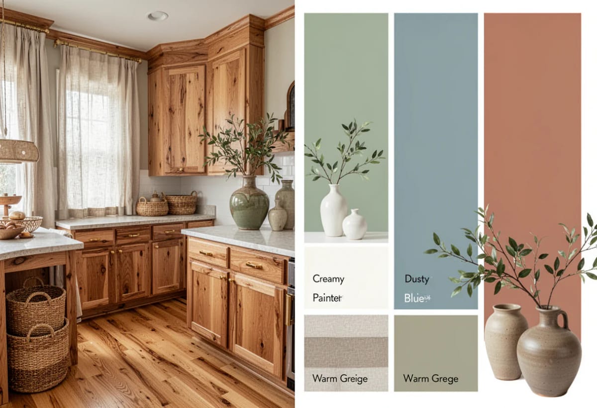
The same gray paint chip reads blue-gray on top of a gray-washed oak floor and soft sage over honey oak. Nothing about the paint changed. What changed is the light coming back up off the wood, and the wood is the one thing in the room almost nobody is willing to move.
So the useful question is not which paint color is nice. It is which way your wood leans, and how far apart in value the wall should sit from the trim and the floor. Get the undertone right and a plain beige looks deliberate. Get it wrong and a color people love in photographs turns muddy on your wall, and the paint takes the blame for a problem the wood caused.
The thirteen colors below are grouped by the job they do rather than by family: the whites that flatter oak, the neutrals that stop fighting an orange floor, the greens that cool it down, and the darks that hold their own against dark wood. Each one comes with its documented failure mode, because a color list without the caveats is how a room gets painted twice.

Whites and creams, where the wood decides which white
White is not a decision you get to make in the abstract, because every wood floor has an undertone and a white either agrees with it or argues with it. The argument is visible from the doorway.
White Dove (OC-17): the safest white you can put next to oak trim
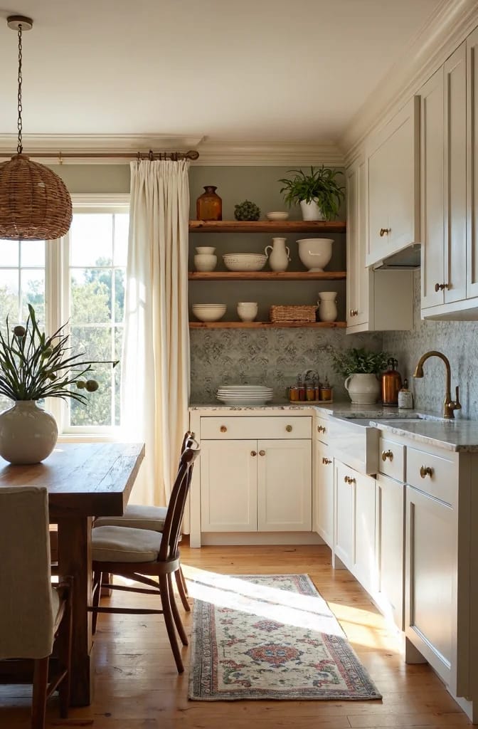
AI visualization of Benjamin Moore White Dove OC-17. Screen color is approximate and moves with your light, so put a real sample on your own wall before you commit to it.
White Dove is the white to reach for when the wood is the point and the trim only has to step back. It is a warm white with a gray-cream cast rather than a yellow one, and that distinction is the whole job next to oak: a yellow-based white turns golden oak dirty, and this one does not. On cabinets, doors and casing over a mid-tone oak floor it is the pairing designers come back to, which is also why it is the least interesting answer in this article.
Benjamin Moore lists its light reflectance value at 83, bright enough to keep a north-facing hall from going gray. The catch is scale and light. On four walls in a room with no direct sun it can read faintly dingy, and its warmth grows at night under 2700-kelvin bulbs, which is a shift you will notice in a room you use after dark and not at all in a hallway.
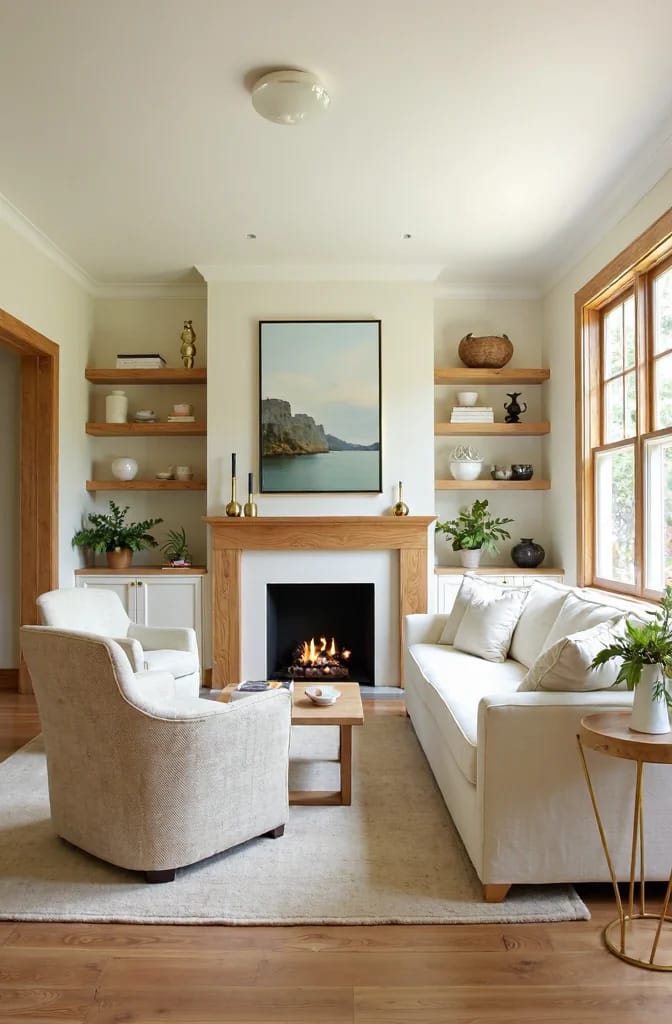
Rendered view of White Dove OC-17 under 2700K bulbs. This is an AI visualization rather than a photograph, and the color shown is only a rough match for the paint.
Its other use is as the trim white for a color further down this list: Saybrook Sage is documented as being trimmed with White Dove for contrast, and that pairing is one of the few in which the white does the work rather than the green.
Alabaster SW 7008: warm enough to sit beside honey oak cabinets
Alabaster is the warm white for the house that still has honey oak in it. Sherwin-Williams gives it an LRV of 82, and its base leans beige-greige, so it flirts with cream and then pulls back toward neutral before it gets there. Over golden oak cabinets it lets the wood read intentional instead of dated, which is a harder trick than it sounds.
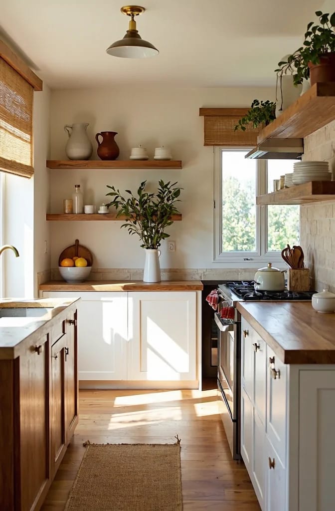
AI visualization of Sherwin-Williams Alabaster SW 7008. On-screen paint is approximate, and a peel-and-stick sample on your own cabinet door is the only check that counts.
What it does not do is hold up in a cool, dim room. In flat north light the cream lean drains out and the white goes chalky, and its warmth is exactly why it is the wrong trim white for Hale Navy HC-154 further down this list, where it reads yellow against the navy rather than clean. The paint did not change between those two rooms; the wall beside it did.
Where it earns its place: cabinet fronts over mid-tone oak, or a wall in a room with warm light coming in from the south or west. A north-facing kitchen with cool gray counters is the one room I would take it out of.
Simply White is the contrast white, and it goes muddy on a cool gray wall
Simply White is the crisper of the two Benjamin Moore whites here. Benjamin Moore lists its LRV at about 90, the highest figure in this article, with a restrained yellow undertone under all that brightness. Over pale white oak or ash it gives you the clean line that makes trim read as trim. Over honey oak it loses its point, because a warm white trim and a warm oak floor agree so completely that the trim stops being a feature at all.
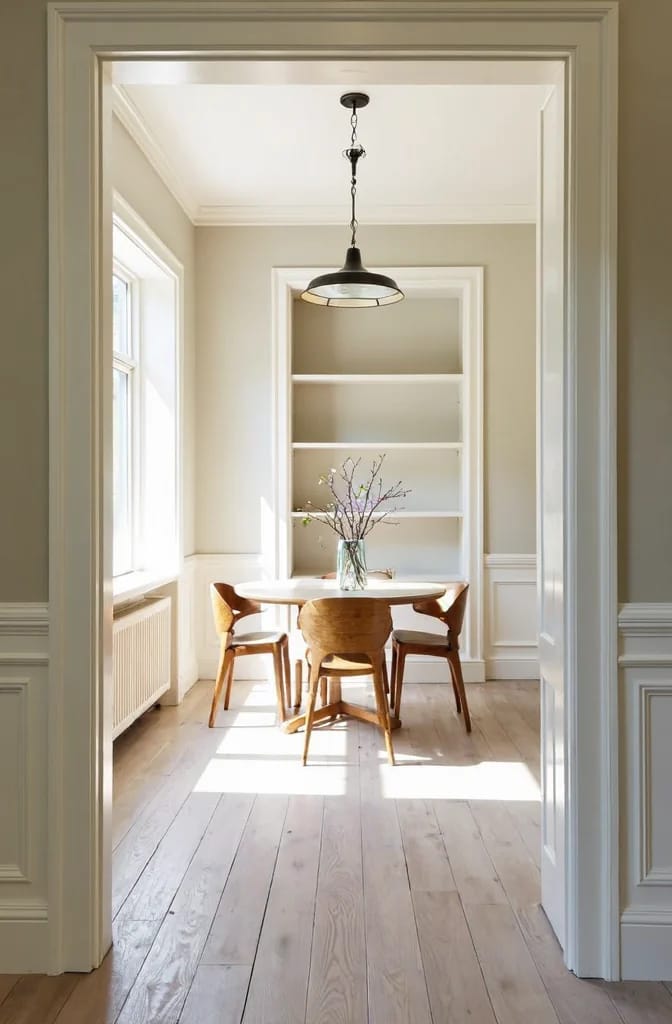
AI visualization of Benjamin Moore Simply White OC-117. Color on screen is approximate and will shift with your room’s exposure, so verify it against a real sample.
Its documented worst pairing is a cool gray wall. Put Simply White trim beside a gray with a violet lean and the yellow in the white pulls the violet forward, so the wall goes lavender and the trim goes muddy at the same time. Designers call this one of the most visible pairing mistakes in the whole warm-neutral argument, and it is a value problem as much as a temperature problem: two paints a few points apart in LRV give the eye nothing to separate them with.
The fix is either a warmer wall or a wider value gap. If the cabinets are the light surface and they are reading cold after dark, that is usually the bulb and the countertop rather than the paint, and working through light cabinets that go gray after dark is worth an hour before you order another gallon.
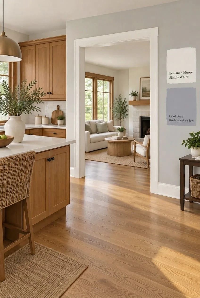
Rendered detail of Simply White OC-117 meeting a cooler gray wall. AI visualization; on-screen color is approximate and no substitute for a sample held against both surfaces.
Every pairing in this article comes down to two decisions made in order. First: does the paint lean the same way the wood leans, or does it lean against it on purpose? Second: how far apart in light reflectance should the wall sit from the trim and the floor? Get the undertone right and a mid-value beige looks deliberate. Get the undertone right but leave the value gap at zero, with wall, trim and cabinets all sitting at the same lightness, and the room reads flat no matter how good the color is.
Warm neutrals that stop fighting an orange floor
The difference between a greige that works with oak and one that goes purple is a couple of LRV points and which way the undertone leans. These three are the ones with a documented track record on warm wood.
Accessible Beige SW 7036 is the beige that keeps white trim reading as trim
Accessible Beige is the beige to buy when you want the trim line to be visible. Its LRV of 58 sits in the useful middle: dark enough that a bright white baseboard registers as trim rather than disappearing into the wall, light enough that a kitchen does not close in around you. Sherwin-Williams built it on a neutral beige with a gray base and a faint green note, and that green is what keeps it off the yellow track that makes older beiges look like the inside of a shopping mall.
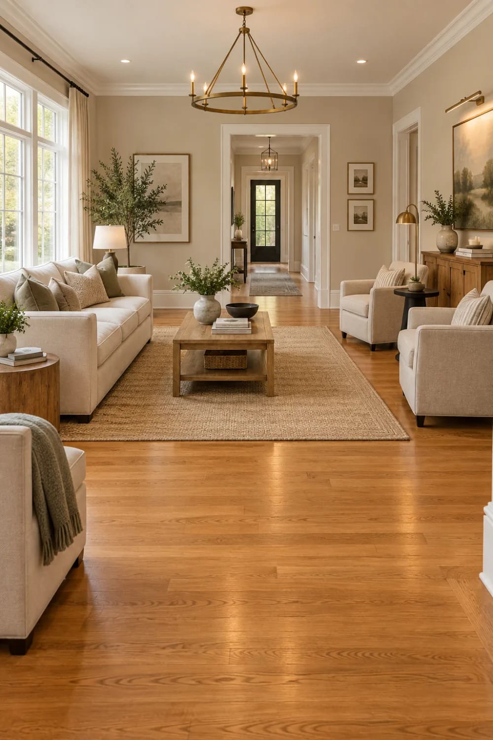
AI visualization of Sherwin-Williams Accessible Beige SW 7036. Screen color is approximate, so order a sample before you commit to a gallon of it.
That same green base is why it is not a universal fix, which is the part the color's popularity tends to bury. It can read flat and faintly khaki in a dim or north-facing room, and its green undertone is documented as clashing with floors and cabinets that run strongly orange or red. So the honest split is this: Accessible Beige is excellent over a honey oak floor with white trim, and a poor choice in a room where the same oak has gone deep orange under an old oil-based finish.
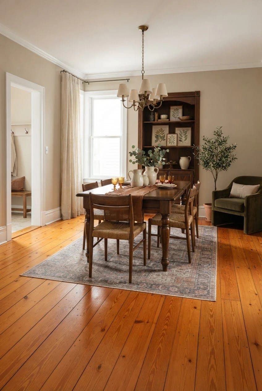
Positioned against Agreeable Gray below, it is the warmer and slightly greener of the two, and it is the better of the pair if your trim is a bright white. Agreeable Gray is the safer one if your trim is cream.
Agreeable Gray SW 7029, and the purple that shows up at night
Agreeable Gray is the most-painted greige in the country and it does one thing better than anything else in this list: it sits down quietly next to honey oak without going muddy. It is a warm greige with an LRV of 60 and a beige core, and it is explicitly one of the colors designers name for oak and for mid-tone walnut floors.
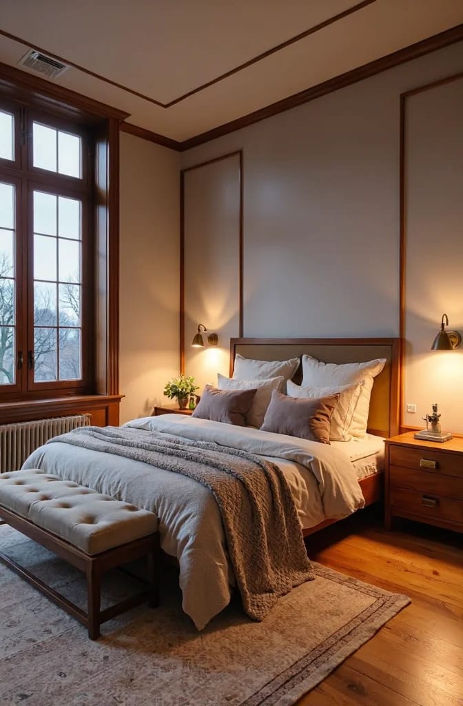
The violet edge is the part to plan for. Agreeable Gray carries a faint violet undertone, and in a cool north-facing room or under 4000-kelvin LEDs that violet is what you see rather than the beige. Search the color with the word purple and you get years of complaints from people whose walls turned lavender in one room and stayed greige in the next. That is not a bad batch of paint. It is the undertone doing what violet does under cool light, and it is why the room you test in matters as much as the color you test.
AI visualization of Sherwin-Williams Agreeable Gray SW 7029. The color shown is approximate and will read differently in your room’s light.
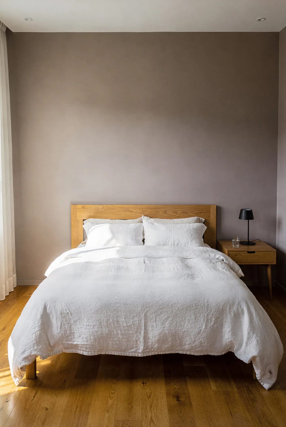
This is the one color in the article I would sample in the actual room before buying anything else, and a peel-and-stick sample of Agreeable Gray is the cheapest version of that test. Put it above the baseboard where the floor throws light at it, look at it at noon and again at nine at night, and decide from that rather than from a chip the size of a business card.
Rendered view of Agreeable Gray SW 7029 in flat north light. AI visualization; the on-screen color is approximate and no substitute for a sample on the wall.
Revere Pewter HC-172 is the greige that answers a red-cast floor
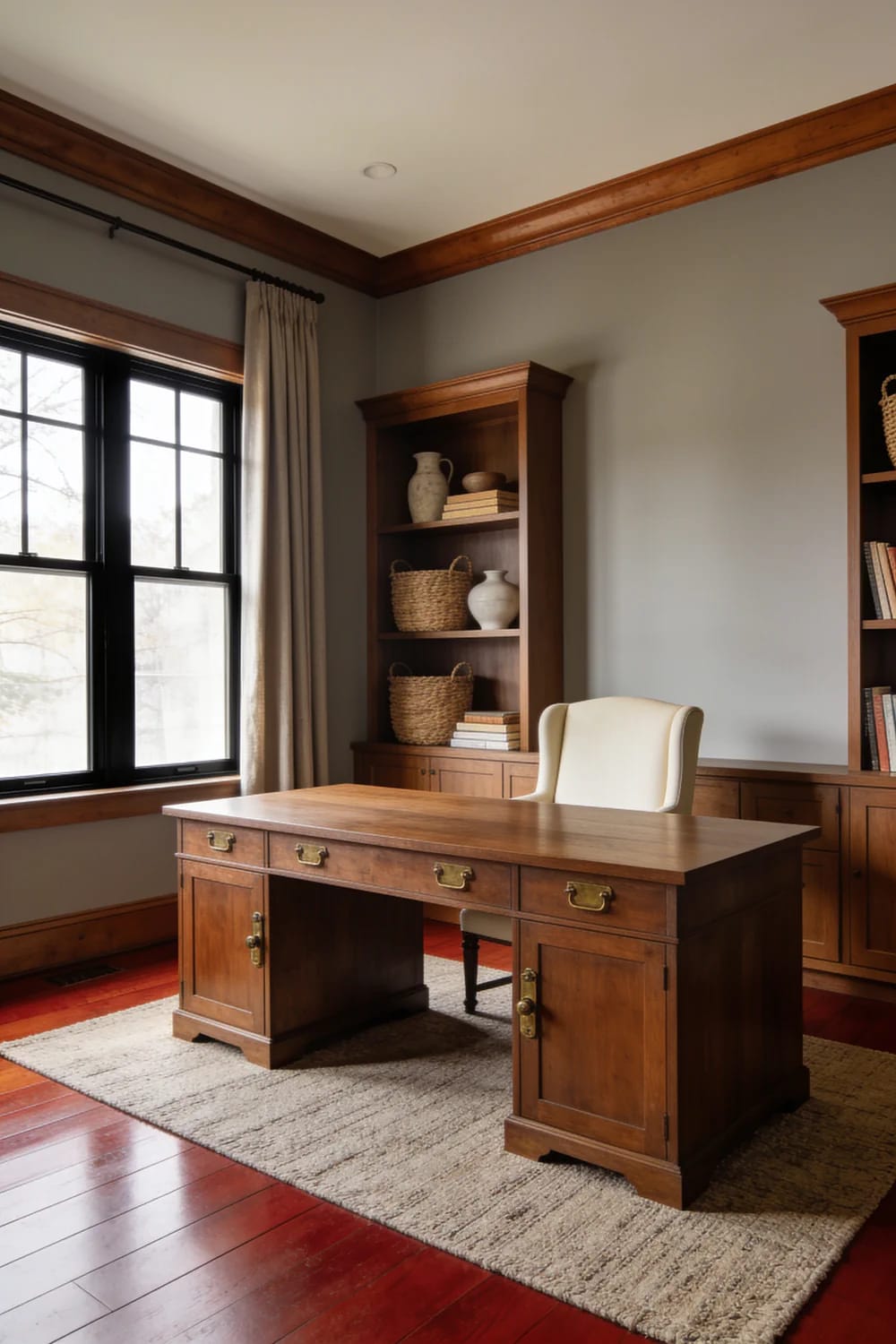
AI visualization of Benjamin Moore Revere Pewter HC-172. On-screen color is approximate, so test a sample low on the wall, where the wood throws the most light at it.
Revere Pewter is what to use when the floor is red oak and you have run out of patience with the red. Its LRV is 55, and its warmth comes from green rather than yellow, which is the useful part: green is the family that neutralizes red in wood instead of amplifying it. If a floor has gone pink or rust rather than gold, this is the wall color that answers it.
That green is also reactive. In dim, flat, north-facing rooms and under 4000-kelvin bulbs it can read olive, khaki or faintly mauve, which is the source of the complaint that a warm gray looked sad in a hallway. Under a warm bulb it is a different and better color. Swap the 4000-kelvin bulbs before you swap the paint.
Against Agreeable Gray it is the greener and warmer of the two, with no violet in it at all. Both sit in the mid-50s and mid-60s on the LRV scale, so they are alternatives rather than companions, and how warm neutrals avoid reading builder-grade in a kitchen is the same argument applied to cabinetry.
 11 Beige Kitchen Ideas That Don’t Read Builder-Grade Eleven beige kitchens that stay on the warm side of the line, plus the LRV math that keeps them out of builder-grade territory.
| Your wood | What the wall should do | Trim move | From this list |
|---|---|---|---|
| Honey or golden oak | Sit in the same warm range without adding orange | Warm white, never blue-white | Agreeable Gray, Revere Pewter, White Dove |
| Red or pink-cast oak | Bring green in, since green neutralizes red | Warm white with a cream-green cast | Revere Pewter, Saybrook Sage |
| Pale white oak or ash | Go cool, or go deep for contrast | Crisp white, for a visible line | Simply White, Evergreen Fog, Hale Navy |
| Gray-washed or driftwood plank | Warm creams as a deliberate contrast, or deep muted greens | Warm white | Alabaster, Pewter Green |
| Dark walnut or espresso | Match the depth rather than fighting it | Any warm white | Agreeable Gray, Urbane Bronze |
Greens and pale blues that cool the orange down
Green is the only family on this list that can quiet an orange floor by temperature rather than by covering it in gray. Sage, gray-green and pale blue-green are not interchangeable, though, and the wrong one goes flat the moment the sun goes down.
Evergreen Fog SW 9130 reads as a neutral until the light goes flat
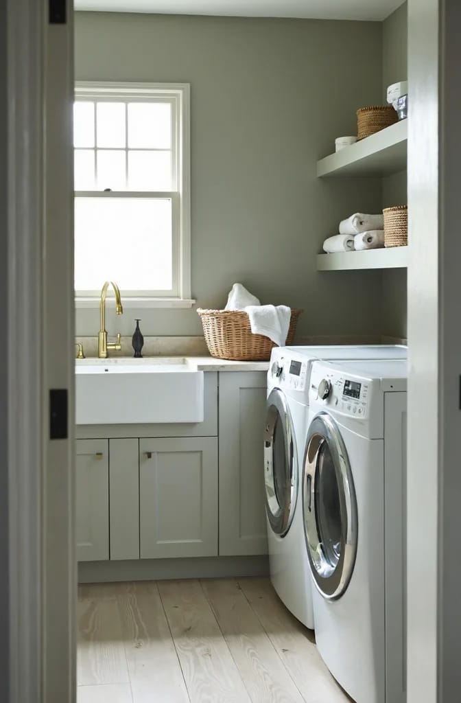
AI visualization of Sherwin-Williams Evergreen Fog SW 9130. Screen color is approximate; the real paint reads deeper across a large wall, so sample it.
Evergreen Fog was Sherwin-Williams' 2022 Color of the Year, and the reason it stayed popular is that the gray does the talking. Its LRV of 30 makes it a mid-to-dark color that behaves like a neutral on cabinets and on a wall behind a bed, and its cleanest pairing is white oak. On white oak, the gray in it and the gray in the wood agree, and the green just sits there.
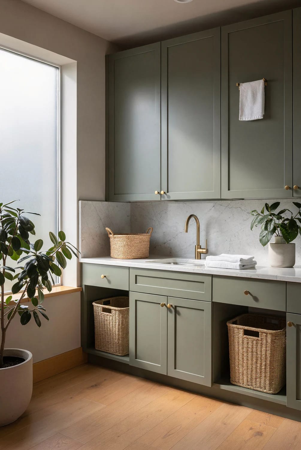
The failure is decibels of light. On a large wall it reads deeper and grayer than it does on the chip, and in a dark north-facing room it collapses into a flat muddy gray-green that people describe as dusty. It is also documented as reading sickly against dark wide-plank espresso floors, and it should not go near a gray-washed plank. Use it where it has light or on cabinets under a bright counter, not in the darkest room in the house.
Rainwashed SW 6211 cools an orange floor without going beachy
Rainwashed is a pale blue-green with a gray base and an LRV of 59, and it is the color people reach for when the honey oak is staying and the room needs to feel less orange. It leans blue in most rooms and greener in warm southern light. On a light oak floor it is one of the few cool colors that does not read as a coastal theme.
It is also fussy, which most pale blues are not. Rainwashed has a documented record of clashing with warm greiges and taupes, and unpainted warm wood can pull it toward a yellow-green that nobody intended. In a north-facing room it goes icy and slightly flat. If the wood in the room is orange and the walls beside it are a warm gray, this is the wrong choice, and that combination is common enough to have its own complaints.
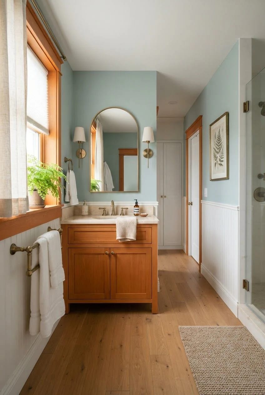
AI visualization of Sherwin-Williams Rainwashed SW 6211. Color on screen is approximate and shifts with exposure, so check a real sample before you order.
Pewter Green SW 6208 is a cabinet color, not a wall color
Pewter Green is the darkest green here at an LRV of 12, a grayed, muted green with a warm olive lean in good light and almost charcoal in shadow. It belongs on cabinetry, an island base or a built-in, and it is the color that makes brass hardware look intentional rather than added. Behind it, white oak floors and a warm mid-tone stained wood both work.
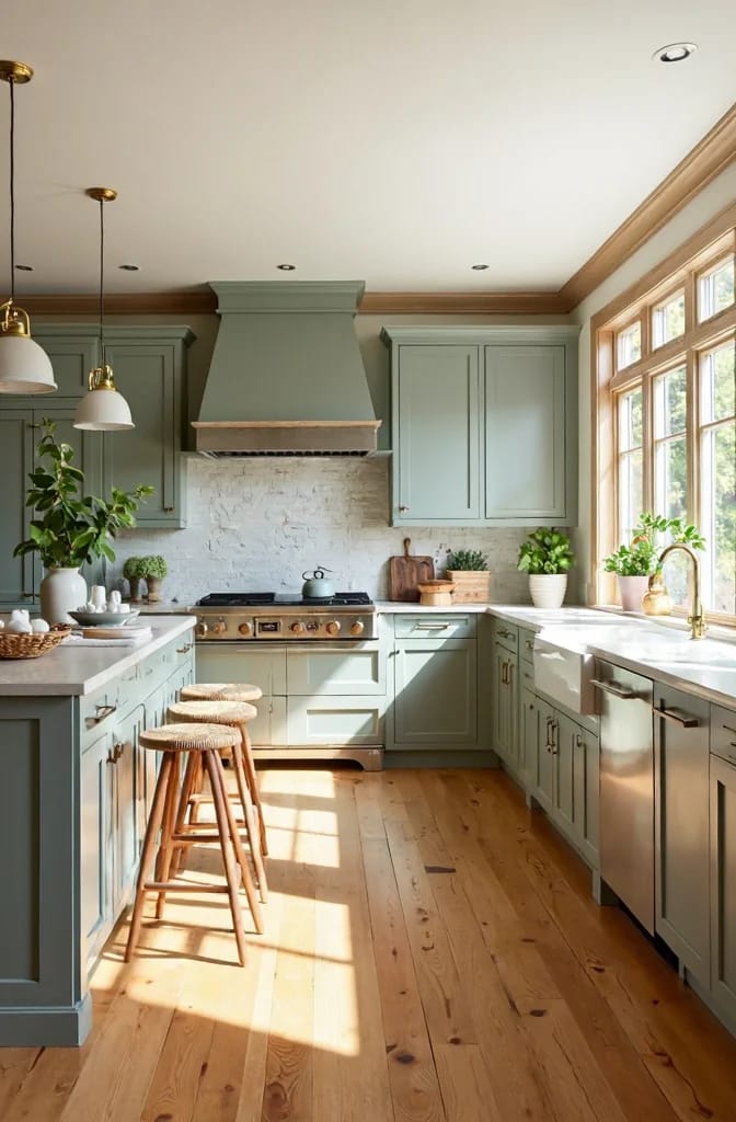
AI visualization of Sherwin-Williams Pewter Green SW 6208. On-screen color is approximate, and a dark like this needs a sample in the actual room rather than at the paint counter.
Where it fails is the obvious place: small, dim, north-facing rooms, where it goes muddy and can read nearly black by late afternoon. It needs a light countertop above it and a real light source in the room. The white-uppers and green-lowers kitchen is the standard version of this, and if you want to see how far the green family stretches before you settle, there are green kitchen cabinet directions well past this one sage.
Saybrook Sage HC-114, and the north-facing room that dulls it
Saybrook Sage is the sage that stays gray. Benjamin Moore has carried it in the Historical Colors line since 1976, describes it as an aloe cooled with gray, and gives it an LRV of 45. It reads as a quiet green in daylight and as a soft gray-green in the evening, which is what separates it from the pastel sages that look like a nursery by noon.
The caveat is that it is a chameleon in exactly the rooms where people want it most. In north-facing or low-light spaces it leans bluer, grayer and flatter, and the color that looked alive in the showroom goes dull. It wants warm wood floors and warm stone, and it wants a warm white on the trim, which is why White Dove at the top of this list is its documented partner rather than a cool white.
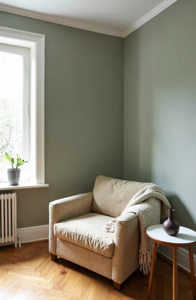
AI visualization of Benjamin Moore Saybrook Sage HC-114. Screen color is approximate; this one changes with the hour, so test it where it will actually live.
One pairing to check before you buy hardware: most sage on the shelf is cooler than the brass that people put with it, and that single mismatch is why so many sage kitchens photograph well and then look faintly gray in person. The decisions that make sage and unlacquered brass work together are worth reading before the pulls go on.
A cool violet-leaning gray on a wall above honey oak. Repose Gray SW 7015 is a good gray in the right house, with dark walnut or whitewashed plank under it and nothing orange in sight, and the wrong one above golden oak, where the violet in the gray makes the wood look more orange and the wall look lavender. A cool gray needs a floor with no red in it.
Alabaster SW 7008 used as the trim white for Hale Navy HC-154. Alabaster leans cream, the navy is nearly black, and the temperature gap between them turns the trim yellow against the cabinet. Same white that flatters honey oak cabinets, wrong job entirely.
Warm cream walls over a cool gray-washed or driftwood floor. The cream throws yellow, the floor throws gray-blue, and each makes the other look dirty. This is the one case on this list where you pick the paint from the floor up rather than from the wall down.
That last failure is worth a second look, because the floor finish is doing more work than most people give it credit for. A wide-plank floor with a cool washed surface is a different color problem from an orange oak one, and what a driftwood-effect plank does to the colors above it is the place to start if that is the floor you have.
Deep anchors for dark wood and dark cabinets
With dark wood the argument inverts. You are no longer trying to avoid clashing with orange; you are deciding whether to match the depth of the wood or to sit clearly lighter than it. These three all sit below an LRV of 24, which means every one of them depends on a real light source in the room.
Urbane Bronze SW 7048: the dark that still reads brown
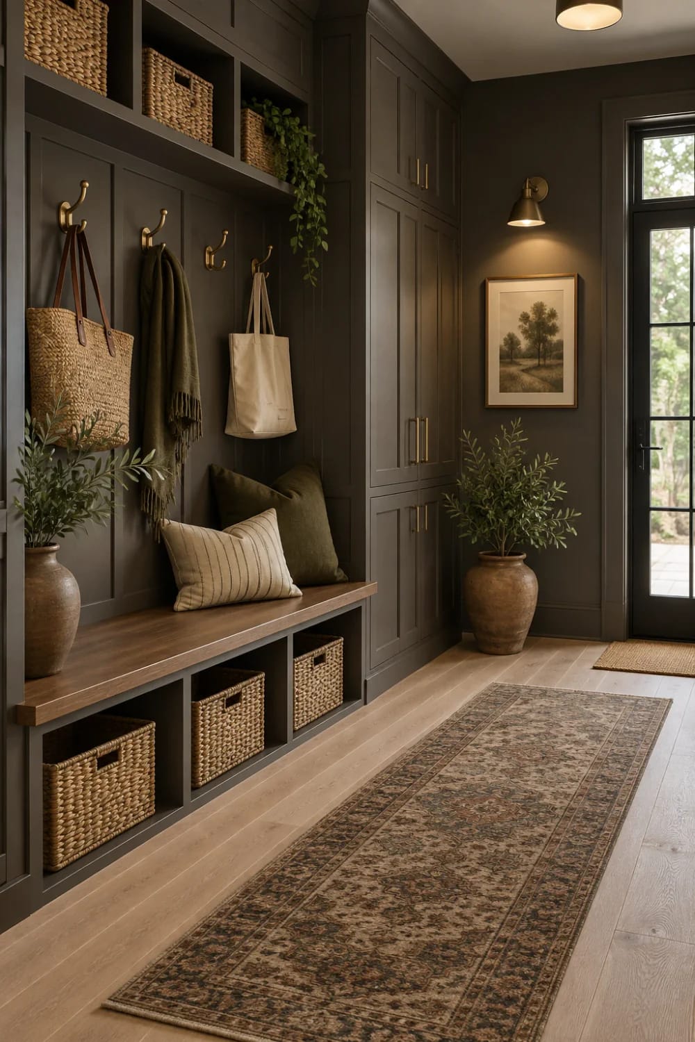
AI visualization of Sherwin-Williams Urbane Bronze SW 7048. On-screen color is approximate, and a dark at this depth needs a real sample in your own light.
Urbane Bronze is the dark that still reads brown rather than black. It is a warm earthy bronze with a brown-gray base, an LRV of 8, and a faint green whisper that keeps it from going flat. Its documented partners are white oak, which lightens and balances it, and walnut, which adds richness instead of contrast.
At an LRV of 8 it is nearly as dark as interior paint gets, and that comes with maintenance facts nobody mentions at the counter. It shows dust, fingerprints and pet hair on a wall the way a dark car shows road salt. It also needs actual light in the room or it flattens into a lifeless dark taupe, and reviewers report occasional peachy or plum casts in specific light. I would not put it on four walls of a room without a window.
Floors that bounce yellow up at it make it look more intense than it is, which is the opposite of what most people expect from a dark wall.
Chelsea Gray HC-168 holds its color next to dark wood
Chelsea Gray is the dark gray that does not turn blue. Benjamin Moore describes it as a handsome gray with the slightest hint of brown, gives it an LRV of 23, and builds it on a green-brown base. Next to dark wood that is exactly what you want: a gray that keeps some warmth, so the furniture and the floor do not separate from the walls.
Its documented problem is scale. Chelsea Gray is generally too dark to run through a whole house, and in a dim north-facing room the green-brown nuance disappears and it becomes a flat dark gray. Cold blue-white trim makes it look dingy, so the trim wants to be a warm white or a cream rather than the brightest thing in the hardware store.
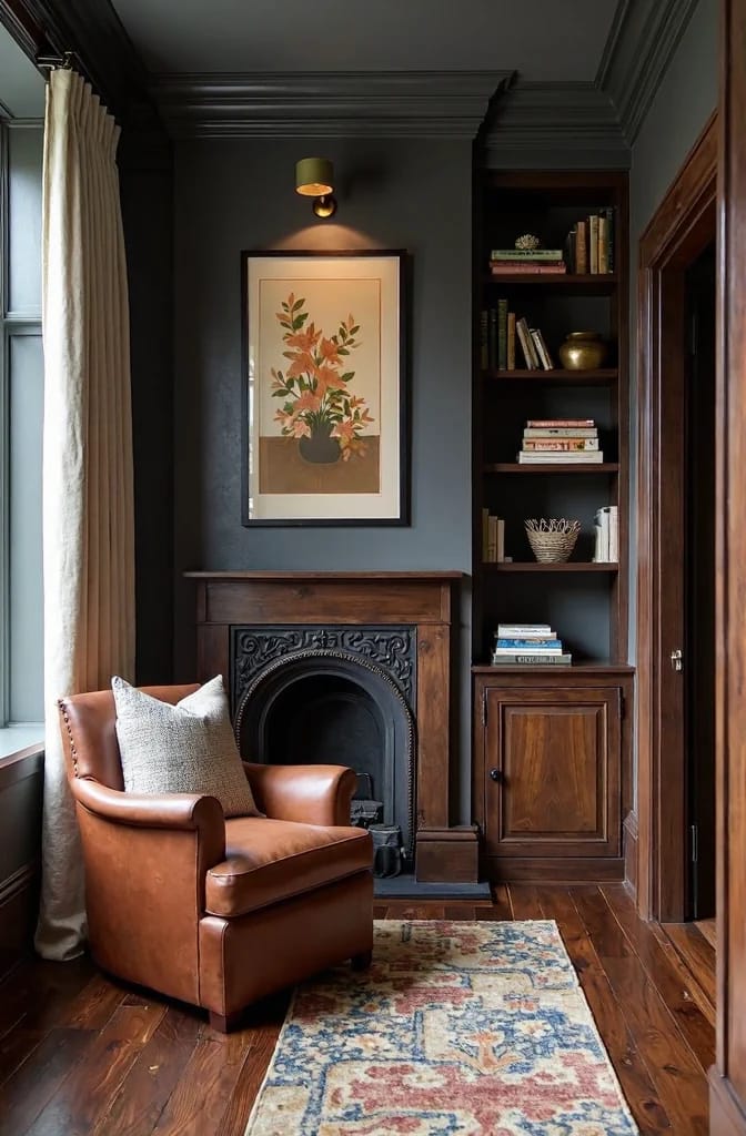
AI visualization of Benjamin Moore Chelsea Gray HC-168. Color on screen is approximate, so verify with a sample before committing a room to it.
With white oak and brushed brass it is close to a sure thing, and in warm southern light it drifts toward a deeper taupe-brown, which is the version of it most people are actually picturing. A cozy study, a dining room, an exterior door: rooms with a defined job and a light source.
Hale Navy HC-154, and the trim white you must not use with it
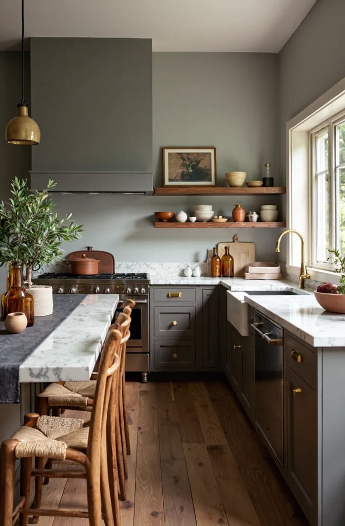
Hale Navy is the dark that a wood floor can carry without the room turning into a cave. It is a gray-based navy with an LRV of 8, and it is documented as reading slate-navy rather than purple or teal, which is the line most dark blues cross somewhere after the second coat. Its runaway favorite pairing is wide-plank white oak, natural or quarter-sawn, with mid-tone walnut working as an island or an accent piece.
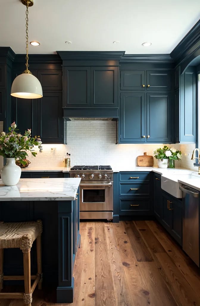
AI visualization of Benjamin Moore Hale Navy HC-154. Screen color is approximate and reads lighter than the paint does across a full run of cabinetry.
Two things go wrong with it. It flattens toward charcoal in dim or north-facing rooms, losing the blue entirely, and it is too dark to use as a whole-house color, which one color consultant has said plainly enough that it is worth repeating. The other is the trim. Alabaster, one of this list's warm whites, is warned against as the trim for Hale Navy because its cream lean reads yellow beside the navy, so pair it with a cleaner white and let the navy and the brass carry the warmth instead.
Red oak is the floor to avoid here, since the orange in the wood and the blue in the cabinet argue all day. For a broader look at where a cabinet color sits in the room’s hierarchy, kitchen color ideas grouped by where the color goes is the same logic applied across a whole kitchen.
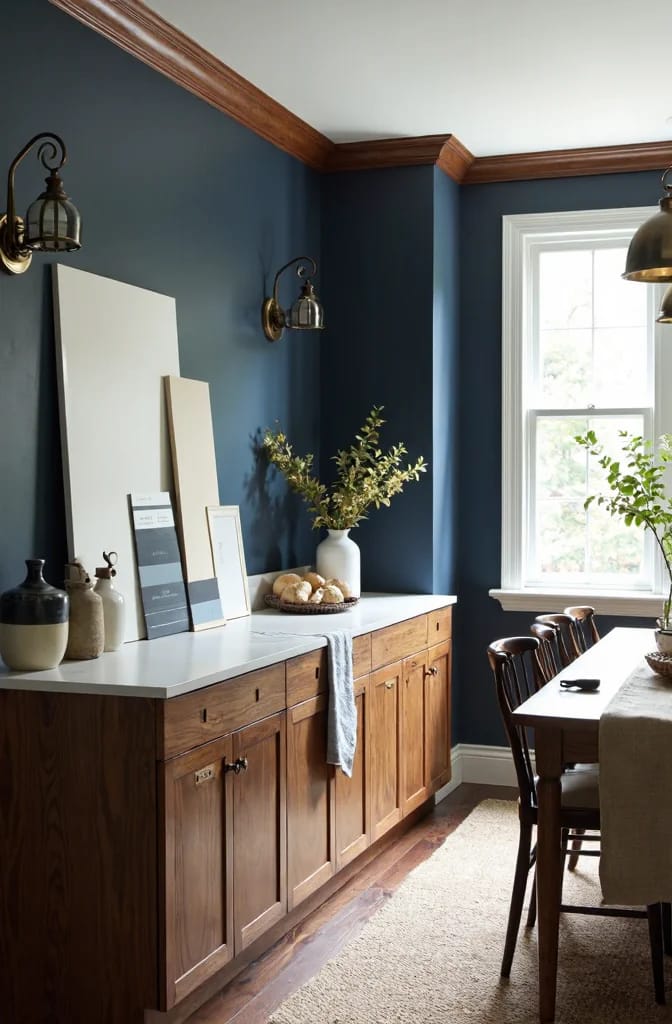
Rendered detail of Hale Navy HC-154 against walnut. AI visualization; on-screen color is approximate, so test a sample against your own floor.
The order that keeps you from painting twice
Every failure above is the same mistake in a different color: choosing the wall before reading the wood. Work in this order and they stop happening. Decide what stays, meaning the floor finish, the trim and the cabinet doors. Read its undertone, which for anything orange-cast is the color you are answering to. Pick the wall color for that undertone. Then pick the trim white against both, because the trim is where a value gap either shows up or disappears. That sequence is why Simply White over Repose Gray turns muddy while the same white over white oak looks clean, and why Alabaster cannot trim Hale Navy.
Then buy samples rather than gallons. Two colors, on the wall, at noon and again at nine at night under your own bulbs, because a color that is right at noon can be wrong by dinner. Sherwin-Williams ships free chips and peel-and-stick samples you order direct, and Samplize and Benjamin Moore’s own store do the same for Benjamin Moore colors. And if the floors are getting replaced anyway, do that first and ignore everything here about the floor you have, since the paint is the last decision in the room and not the first. Some of the links in this article are affiliate links; if you order through one we may earn a small commission at no extra cost to you, and it does not change which colors get recommended.
Related Posts
- 13 Kitchen Color Ideas and Where Each One Actually Works
- 15 Trendy Bathroom Paint Colors For A Stunning Makeover
- 9 Warm, Cozy Christmas Living Room Color Schemes (and the One Undertone Rule That Makes Them Work)
- Light Colored Kitchen Cabinets: 7 Ways to Get Bright Without Going Cold
- Sage Green Kitchen Cabinets With Unlacquered Brass Hardware: 9 Decisions That Make It Work
- 29 Stunning Green Kitchen Cabinet Ideas: Lush, Nature-Inspired Hues