
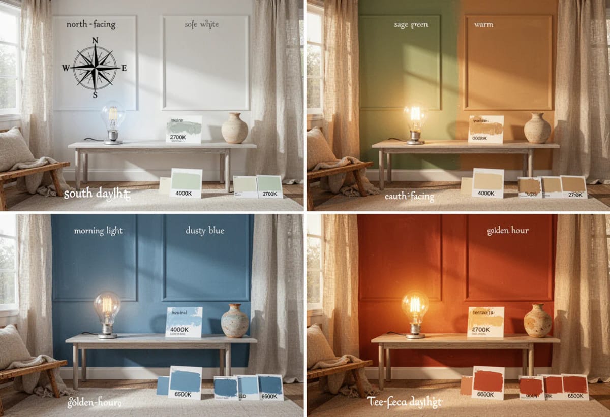
The chip rack at a paint counter sits under overhead strip lighting, and the chip you carry home is roughly the size of a business card. Neither of those conditions exists anywhere in your house. That gap, between the light a color was chosen under and the light it has to live in, is why a greige that looked warm and easy at the store turns grey, or green, or faintly purple on your wall by the second coat.
Four things decide what you actually see: which direction the window faces, what comes out of the bulbs after dark, how much light the sheen throws back, and what the floor, the trim, and the tree outside are bouncing up onto the wall. Two of those you can change this afternoon. The other two you work around, and knowing which is which saves a repaint.
How does lighting change paint color?
Lighting changes paint color by changing which wavelengths a wall has available to reflect. Pigment absorbs part of the light that hits it and returns the rest, so a color mixed to read warm will look flat and grey under cool north daylight or a 4000K bulb, and the undertone underneath it surfaces or vanishes with the light source.

1. Why the Same Paint Reads Differently in Two Rooms
Paint has no color of its own. It is a filter, and the light source decides what there is to filter. Move the same gallon from a south-facing kitchen to a north-facing bedroom and you have not changed the paint, you have changed the spectrum arriving at it, which is the entire visible result.
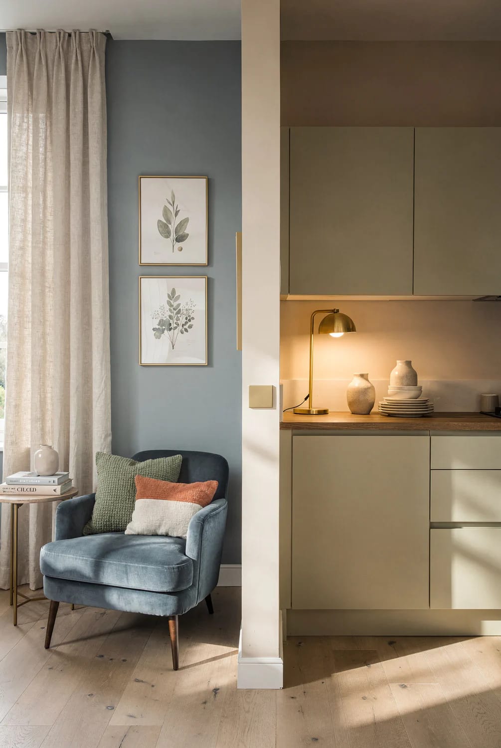
Two colors can match in the store and separate at home
This is metamerism, and it is the mechanism behind most paint regret. Two samples that look identical under the showroom's fluorescents can pull apart under your kitchen's LEDs, because they arrive at the same appearance by reflecting different parts of the spectrum. Nothing was mislabeled. The light changed, and the match was never a match, only an agreement under one specific illuminant.
The one number worth learning is LRV, light reflectance value, published by every major brand on a scale where 0 is black and 100 is white. Sherwin-Williams Agreeable Gray SW 7029 has an LRV of 60; Repose Gray SW 7015 sits at 58; Benjamin Moore Revere Pewter HC-172 is around 55. Those are close enough on paper to feel interchangeable, and they behave nothing alike once the light gets involved.
The undertone is the part that moves
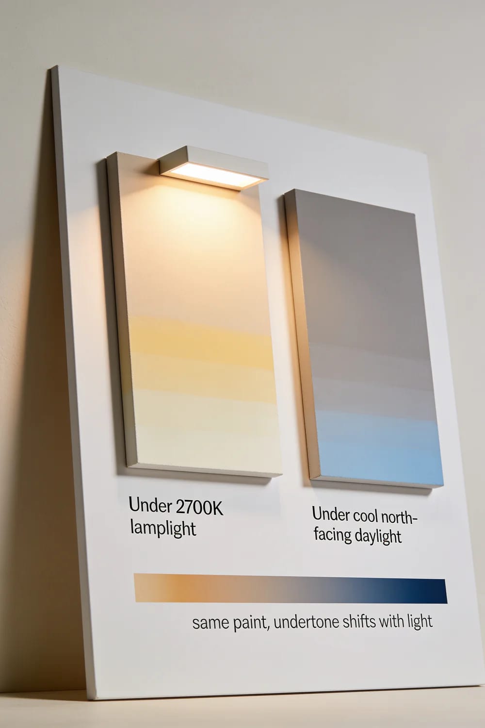
A neutral is never neutral all the way down. Agreeable Gray is a warm cream-beige greige carrying a faint green-grey that only shows up in cool, shaded light; Repose Gray runs cooler and can throw violet or blue; Revere Pewter shows green in some rooms and reads simply beige in others. The base color holds steady. The undertone is what swings, and it swings toward whatever the light is already doing.
That is also why the whole industry drifted from cool grey to warm putty over the last decade, a shift worth seeing side by side in the difference between a 2016 grey kitchen and a warm one finished this year. Grey did not stop working. It stopped working under the warmer bulbs and warmer floors that came in alongside it.
2. Room Orientation Sets the Baseline You Cannot Change
Window direction is the biggest single variable in the room, and the only one you cannot buy your way out of. Everything below assumes the Northern Hemisphere; south of the equator, swap north and south and the rest holds.
North-facing rooms subtract warmth all day
A north window never receives a direct beam. It collects ambient sky light, which is cooler in color temperature and lower in intensity, so it behaves like a soft grey filter laid over the whole room. Cool undertones get amplified, warm undertones get muted, and apparent lightness drops a step below the chip. A crisp white slides grey, a pale grey slides blue, a beige goes flat.
The standard fix is a warm color with a high LRV, which is why Sherwin-Williams Alabaster SW 7008 (LRV about 82) and Benjamin Moore White Dove OC-17 (low-to-mid 80s) get recommended for these rooms constantly. That advice is correct and also a little timid. North light is soft and even, with no glare and no hard shadow, which is exactly the condition a deep saturated color needs to look expensive rather than gloomy. Benjamin Moore's own guidance for north rooms points the same direction. If your north-facing room is a study or a dining room you use at night, stop fighting the light and paint it something dark.
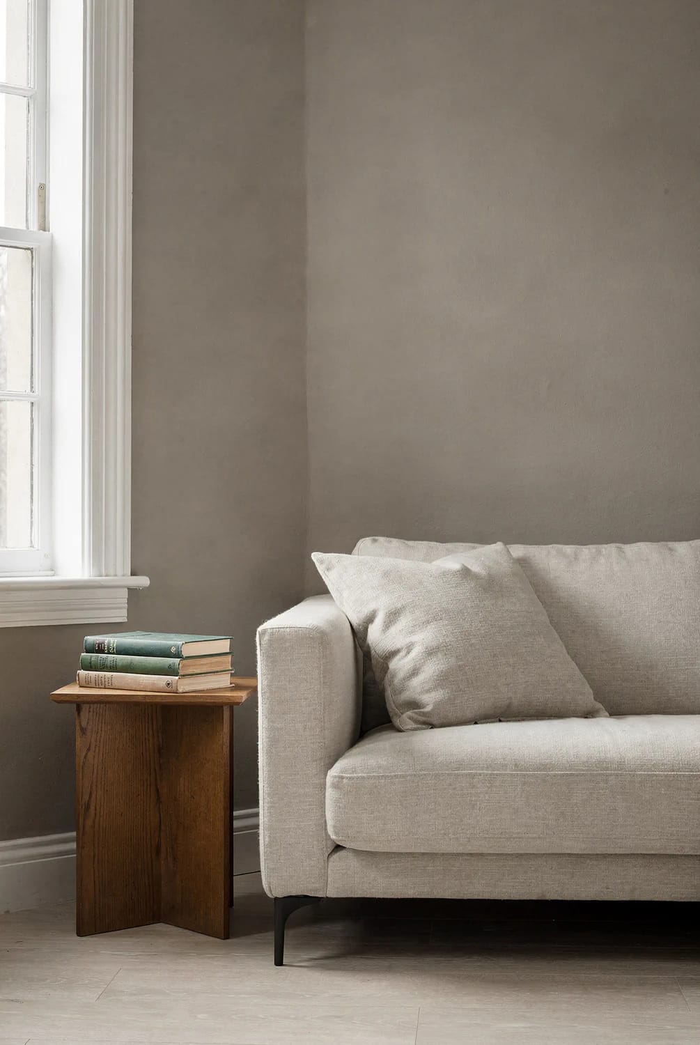
AI visualization built around a warm greige in the Agreeable Gray SW 7029 family; on-screen colour is approximate and shifts with your own light, so judge it from a real sample on your wall.
South-facing rooms get enough light to bleach
South windows take warm, yellow-leaning direct sun for most of the day, and intensity does two opposite things at once: it washes pale colors out toward white and it saturates deep ones. A soft greige that looked grounded on the chip can read as an off-white for six hours a day here, then come back down to its actual color at dusk.
Season matters more in these rooms than anywhere else in the house. Winter daylight runs cooler and sharper than summer daylight, and the sun sits lower, so it drives further into the room. Choose a south-facing color in July and you are choosing under the warmest, shallowest light that room will ever get.
East and west rooms are two different rooms per day
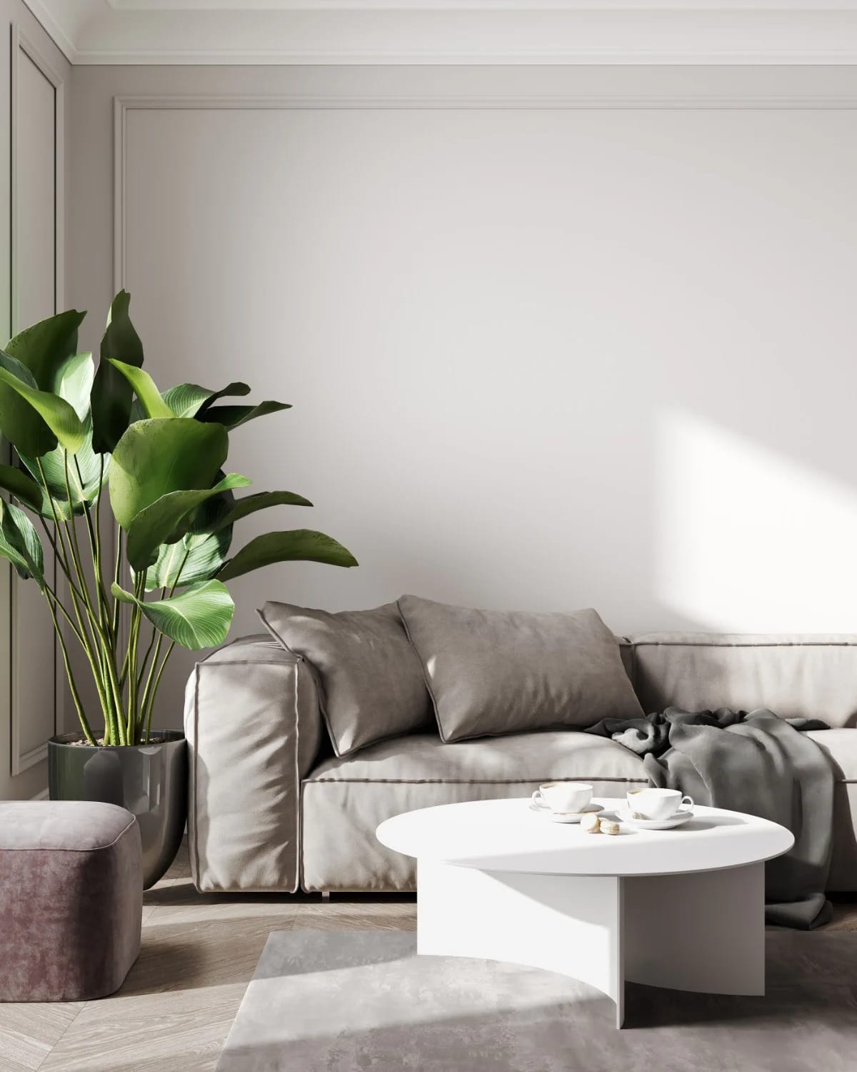
East light arrives bright and slightly warm in the morning, thins out by midday, and turns grey and dim after noon. West light does the reverse: flat and cool until mid-afternoon, then low, amber and strong enough to turn a pale wall orange for an hour. Same wall, two verdicts, and whichever one you saw when you decided is the one you designed for.
The practical move is to pick by usage rather than by average. A west-facing bedroom is judged at 7am, when the light is cool, so a warm neutral there earns its keep; a west-facing living room is judged at 6pm, when the light is doing the warming for you. This is also the reasoning behind choosing which wall takes the darker color, since the wall facing the window and the wall beside it are effectively two different colors already.
| Exposure | What the light does | What happens to the color | The usual correction |
|---|---|---|---|
| North | Indirect sky light only, cool and flat, consistent all day | Whites go grey, greys slide blue, warm tones mute out, lightness drops | Warmer color, higher LRV, or commit fully and go dark |
| South | Warm direct sun most of the day, high intensity | Pale colors bleach toward white, saturated colors deepen and hold | More pigment than feels necessary; check it again in January |
| East | Warm and bright until mid-morning, grey and dim from noon | Cool colors go drab in the afternoon, warm colors stay readable | Warm neutrals; decide the color at the hour you use the room |
| West | Cool and flat until mid-afternoon, then low amber sun | Everything runs orange late in the day, including trim white | Avoid yellow-based colors; test at 5pm, not at noon |
3. Your Light Bulbs Are the Second Coat of Paint
For roughly half the hours you spend in a room, the bulb is the only light source, which makes it the color's co-author. A wall that behaves perfectly at 11am and looks dirty at 8pm has a bulb problem, not a paint problem.
Color temperature, from 2700K to 5000K
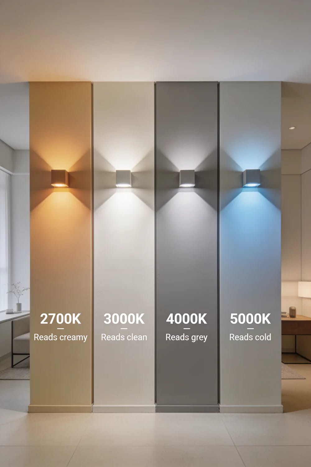
2700K is the classic incandescent glow and the default for living rooms and bedrooms. 3000K is crisper, closer to halogen, and the point at which most warm neutrals still hold their warmth. 4000K is neutral white, where warm colors go flat and distorted while cool colors sharpen up. 5000K is a blue-white close to a clear north-facing day, which is fine in a garage and punishing in a living room.
The most common lighting mistake in an otherwise careful renovation is 4000K downlights in a room painted a warm neutral. The paint gets blamed. It is worth reading how quickly two undertones start fighting under 4000-kelvin LEDs, because that specific clash accounts for a great many rooms that photograph beautifully and feel wrong in person.
A 2700K bulb with a 95 CRI rating and a filament format, so a table lamp with a bare or open shade still looks like a lamp rather than a diode.
95 CRI 2700K A19 E26 filament LED bulb, 40W equivalentCRI tells you less than the number on the box suggests
CRI is an average of how faithfully a light renders eight pastel test colors, R1 through R8. R9, saturated deep red, sits outside that average and is reported separately, which means a bulb can advertise CRI 90 and still render reds poorly. Most packaging never mentions R9 at all. As a rough guide, R9 runs around 25 at CRI 80, around 50 at CRI 90, and around 90 at CRI 95.
Red is not a niche concern in a house. It is in oak and walnut floors, terracotta, brick, leather, and every warm neutral on your shortlist, since the warmth in a greige is red doing quiet work. Strip the red out with a cheap 80 CRI bulb and a warm greige reads as plain grey. For any room where the palette was actually considered, 90 CRI is the floor and 95 is where the difference stops being subtle.
Kelvin (CCT): 2700K or 3000K for living spaces, 4000K only where you need task clarity.
CRI or Ra: 90 minimum, 95 if the room has a considered material palette.
R9: rarely printed. If the manufacturer publishes it, look for 50 or higher.
Lumens, not watts: 800 lumens is the old 60W bulb.
Dimmable and flicker-free: both, and check that the existing dimmer is LED-rated.
Dimming warms an incandescent and does nothing of the sort to an LED
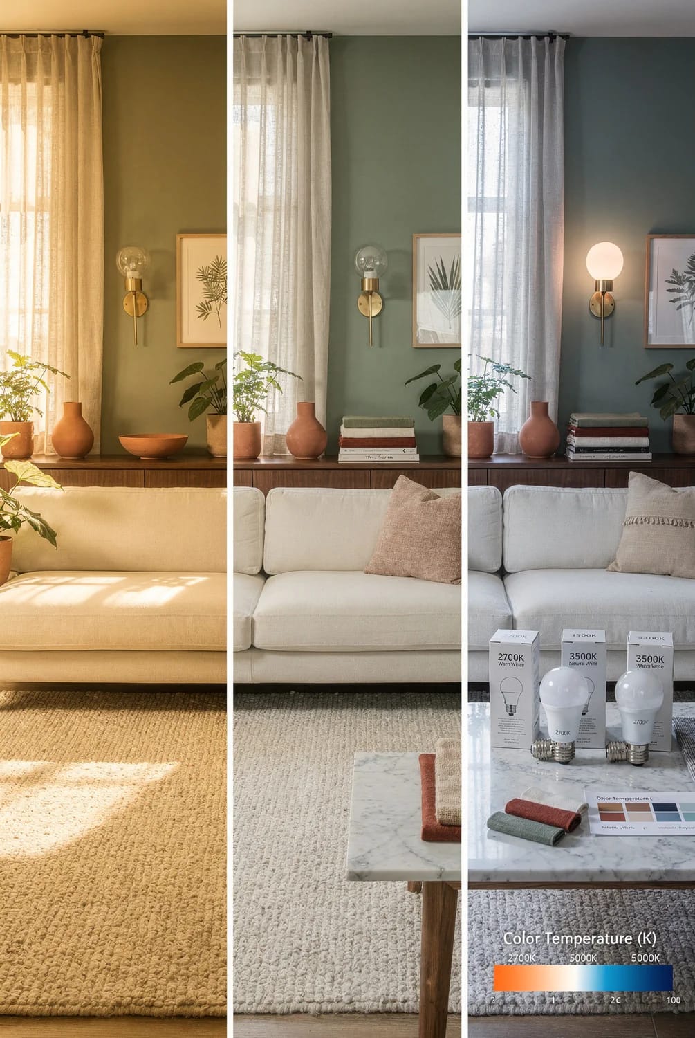
A dimmed incandescent drops in color temperature as it dims, which is where the expectation comes from: turn it down, the room goes amber. Most LEDs hold their rated Kelvin flat across the dimming curve, so a dimmed 3000K room is simply a darker 3000K room, and the warmth people are chasing at 9pm never arrives. Warm-dim and warm-glow LEDs are engineered specifically to correct this, sliding from 2700K down toward 2200K as they dim.
If you cannot decide between 2700K and 3000K on paper, do not. Put a set of Philips tunable white A19 smart bulbs, 2700K to 6500K in the room’s main lamps for a week and move through the range with your sample on the wall. It costs one evening and settles the argument with your own eyes.
 Light Colored Kitchen Cabinets: 7 Ways to Get Bright Without Going Cold The same bulb problem, in the room where it shows up worst and costs the most to fix.
4. Everything Else in the Room Is Also a Light Source
Light rarely reaches a wall untouched. It bounces off the floor, the countertop, the roof overhang, and whatever is growing outside the window, and it carries the color of each of those surfaces with it. A mature tree three feet from a south window throws a green wash across the lower wall from May to October, then stops in November. An oak floor sends warm amber up onto the baseboard all year. A red brick wall across a narrow side return will tint an entire room, and the owner will spend a season blaming the paint.
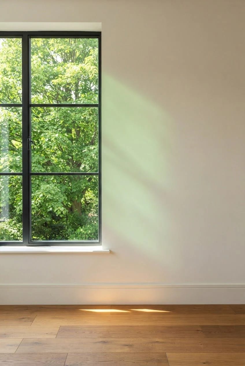
The fixed finishes matter just as much, and unlike the tree you chose them. Warm metals, warm wood and warm stone all push the room’s ambient bounce toward yellow-red, which flatters some undertones and exposes others; the mismatch between unlacquered brass and a cool-leaning sage is the clearest example of that going wrong. Test the color against the floor and the hardware you already own, not against a white primer wall.
Sheen decides how much of that light comes back
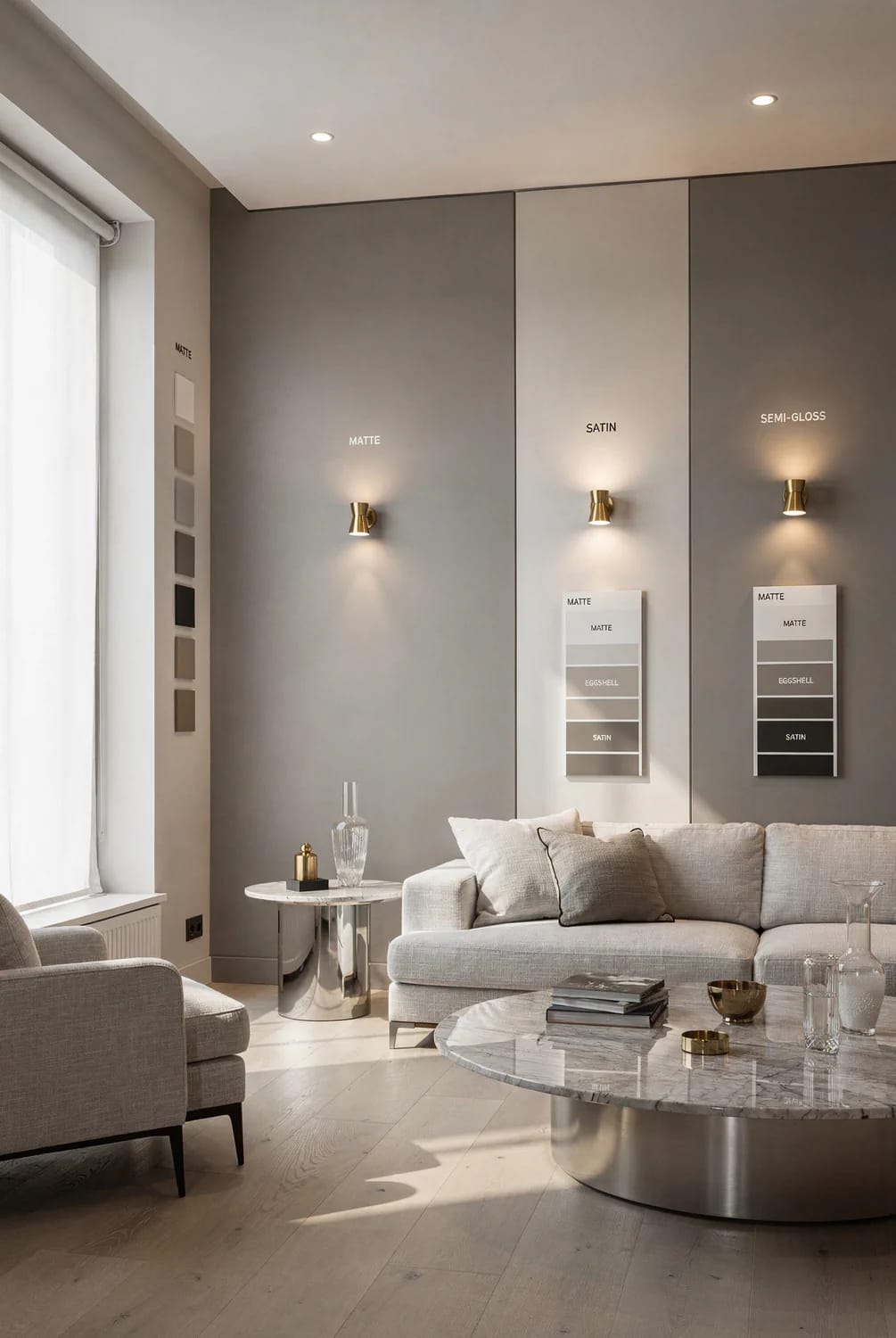
Flat and matte finishes scatter light in every direction, which keeps the color stable across the day and hides wall flaws. Eggshell and satin reflect more of the light directly, so the same color reads lighter where the beam strikes and darker in shadow, effectively giving you two versions of one paint on a single wall. Gloss goes further still.
Granted, this is a smaller effect than orientation, but it works in the same direction and compounds. A north-facing room can take eggshell and gain a little of the light it lacks. A south-facing wall in raking afternoon sun with a satin finish will show every roller mark, every patch, and a color shift of what looks like two full steps between the sunlit and shaded ends.
5. How to Test a Color So the Light Cannot Surprise You
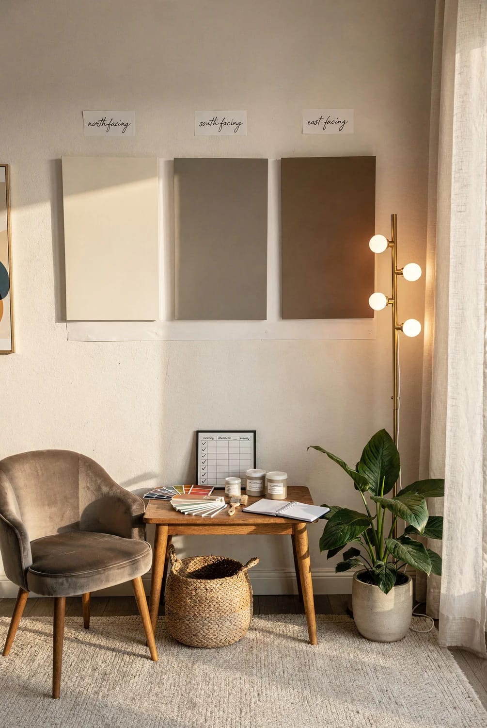
Test on boards rather than on the wall, at the largest size you can stand, and look at least three times. Everything else is detail, but the details are where people cut corners.
- Paint two full coats onto FoamPRO 120 color tester sample boards, 24-pack, one color per board, labeled on the back. A board moves; a painted patch does not.
- Leave bare white showing around each board. A sample painted straight onto an existing beige wall is being judged against that beige, and it will read cooler than it is.
- Look at 9am, at 3pm, and again after dark with the lamps you actually own switched on. Three looks, one day.
- Then move every board to the wall opposite the window, and into the darkest corner of the room. This is the step almost everyone skips, and it is the one that catches the undertone.
- Never decide in the garage, the store, or under a work light.
Peel-and-stick samples solve the mess and the drying time, and they are made with real manufacturer paint rather than a printed approximation, which is the reason they are worth the money over a printed chip. One honest limitation: Samplize peel-and-stick sample of Agreeable Gray SW 7029 and the rest of its Sherwin-Williams range are finished in satin, so the sheet will read slightly lighter and glossier than the same color rolled in flat matte on your wall. Useful to know, and easy to correct for once you do.
 13 Kitchen Color Ideas and Where Each One Actually Works Thirteen directions sorted by where the color goes, for the room where light and color argue most.
Change the Bulbs Before You Choose the Color
Sequence is the part most color advice leaves out. If you test samples under the 4000K bulbs that came with the house, you will pick a color that compensates for them, and then someone swaps in 2700K bulbs next spring and the compensation becomes the problem: the warm greige you chose to counteract cold light now reads yellow. Put the bulbs you intend to live with into the fixtures first, give it a night, and only then tape up the boards.
Related Posts
- 9 Warm, Cozy Christmas Living Room Color Schemes (and the One Undertone Rule That Makes Them Work)
- 13 Kitchen Color Ideas and Where Each One Actually Works
- Light Colored Kitchen Cabinets: 7 Ways to Get Bright Without Going Cold
- Cozy Hygge Christmas Living Room Ideas, Built Around Light and Texture
- 15 Trendy Bathroom Paint Colors For A Stunning Makeover
- Bring Nature Indoors: 15 Earthy Living Room Designs to Inspire