
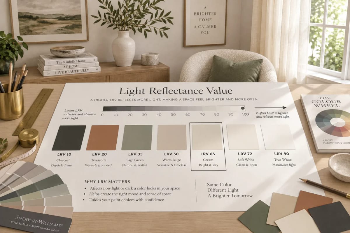
Almost nobody reads the back of a paint chip. The front is where the color lives, so the front is where the decision gets made, and the back goes into the trash with the cardboard fan. That is backwards. Printed next to the code is a figure called light reflectance value, or LRV, and it is the only number on a chip that predicts how much light your finished wall will send back into the room. It settles a few arguments outright, it gets misused constantly (the widely repeated rule that dim rooms want a 40-to-60 color is half wrong), and it takes about ten minutes at the counter to use properly.
What is LRV in paint?
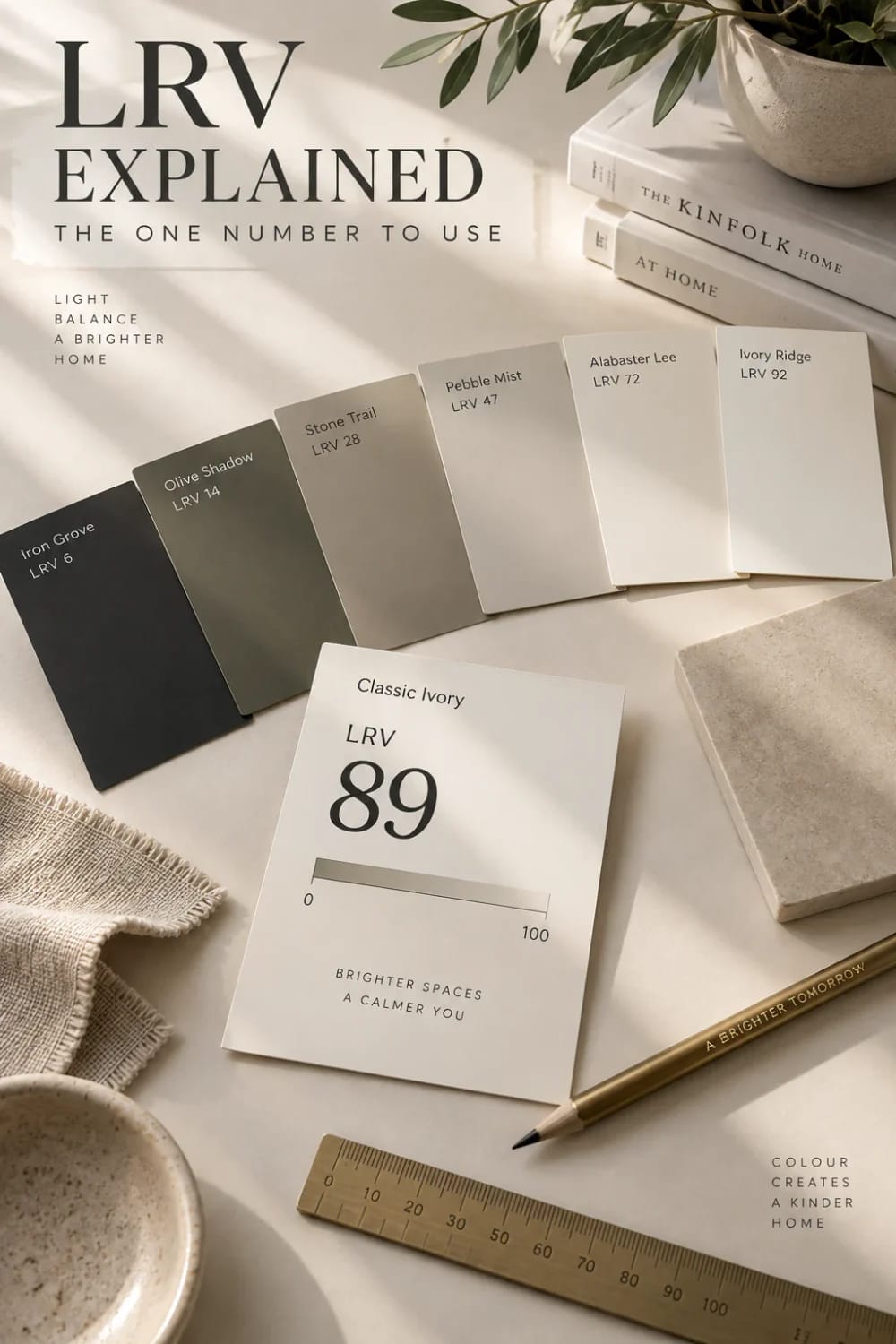
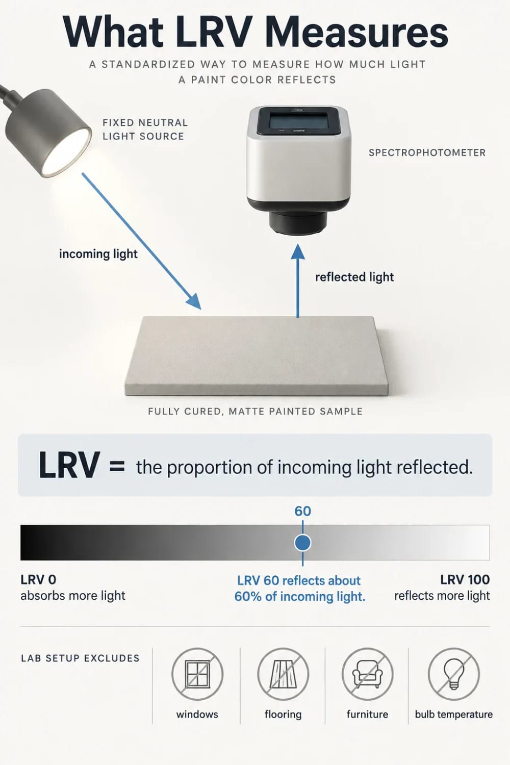
LRV in paint is the percentage of light a color reflects, on a scale from 0 (black) to 100 (white). A color at 60 sends roughly 60 percent of the light that reaches it back into the room and absorbs the rest, which is why the figure predicts how bright a wall will read better than the color’s name does.
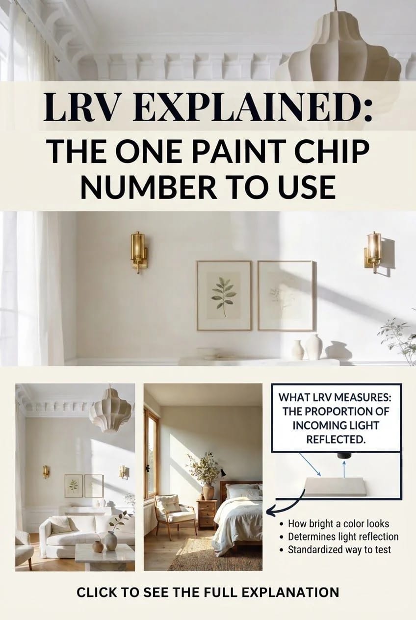
What the number measures, and what it ignores
LRV is measured in a lab, on a flat, fully cured sample, under a fixed light source, with a spectrophotometer. No window in the room, no floor, no furniture, no bulb temperature. Your room has all four, so treat the printed figure as a starting condition rather than a result. The instrument answers one question and only one: how much of the light arriving at this surface comes back off it.
- Under 20: dark in almost any room. Absorbs nearly everything it receives.
- 20 to 40: the moody band. Keep it to accents, islands, and small rooms.
- 40 to 60: mid-tone, reflecting and absorbing in roughly equal measure.
- 60 to 80: light. Where most wall colors in most homes land, and for good reason.
- 80 and up: white territory, and the band where undertone decides the outcome.
Two things the figure does not cover. Undertone is the first: a color can sit at a healthy 70 and still go green on you. Sheen is the second, and it is the one people forget, because sheen changes the angle at which light leaves the wall. Flat paint scatters light and can deaden a dim room; too much gloss aims reflections straight at your eyes and makes the wall read brighter than its number.
The same 60 looks different in your room
Granted, the printed number is honest; the room is what lies. A wall at LRV 60 in a south-facing room with two windows and pale oak floors reads bright and slightly warm. The identical paint in a north-facing bedroom with a dark floor and one small window reads a full step or two darker, because less light arrives to be reflected in the first place, and the light that does arrive is cool.
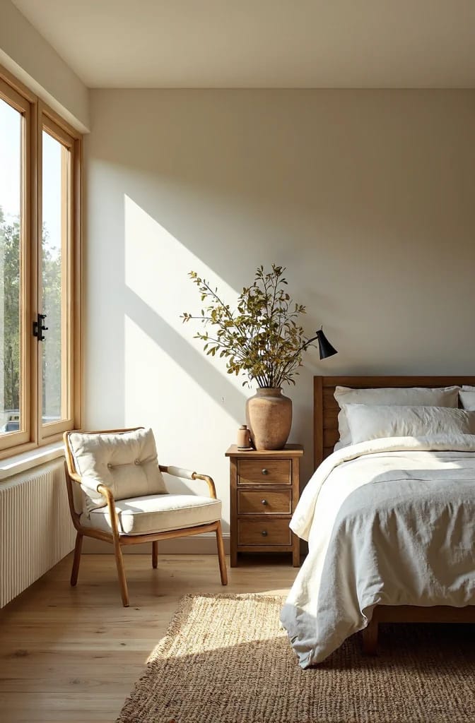
Rendered with AI, so the greige on your screen is an approximation of Sherwin-Williams Repose Gray SW 7015 rather than a color match; order a real sample and check it in your own north light.
Bulb temperature does the same work after dark. A 2700K bulb pushes a mid-tone greige toward beige; a 4000K tube pulls the same wall toward gray and lets its violet undertone surface. If the room is lit by 4000K LEDs at night, judge the color at night under those bulbs and not at noon through the glass. Repose Gray (SW 7015) is the standard example: spec sheets and color databases list it at 58 or 60 depending on the source, and in cool north light the greige tilts faintly purple. That complaint is the single most common thing written about the color, and it is not a bad batch. It is the LRV and the undertone doing exactly what they do.
 Light Colored Kitchen Cabinets: 7 Ways to Get Bright Without Going Cold Why the same off-white reads crisp at eleven in the morning and gray under the recessed cans at seven, and what to change first.
High LRV, 80 and up: what a white actually does
The whites that dominate the market cluster inside a two-point band, and those two points matter more than the marketing around them. Sherwin-Williams Alabaster (SW 7008) sits at LRV 82 with a cream-yellow undertone that keeps it steady through the day. Greek Villa (SW 7551) sits at 84, also creamy, with no gray or pink in it. Two points apart, and Greek Villa reads visibly whiter on a wall, which is why it turns up on trim and cabinetry while Alabaster goes on walls.

An AI visualization of Sherwin-Williams Alabaster SW 7008. Screen color does not reproduce paint faithfully, so treat this as a reference for how a warm 82 behaves in direct sun and test the real thing on your wall.
An 80-plus wall brightens a room with no help from you, and that is where the risk lives. A cool white in the high 80s can read cold and slightly institutional against a warm floor, and a bright white magnifies every imperfection in the drywall because it bounces light straight back at the texture. Warm whites in the 80s are more forgiving and hold up better when the light drops. There is also a supply catch: peel-and-stick samples ship in one sheen, so the Alabaster sample tells you about the color but not about how it behaves in matte on a big wall. To see how SW 7008 handles your own light, order a peel-and-stick Alabaster 7008 sample, 12×12 and move it around the room across a day.
The middle band, 45 to 65, is where most homes actually live
Agreeable Gray (SW 7029) at LRV 60 and Accessible Beige (SW 7036) at 58 are two points apart and are not interchangeable. Agreeable Gray carries a violet-leaning greige that goes a little beige in warm light and a little gray in cool light; Accessible Beige is a committed warm beige on a green-beige base. Side by side on the same wall, the difference reads as undertone rather than depth, which is exactly the sort of distinction the front of the chip cannot show you.
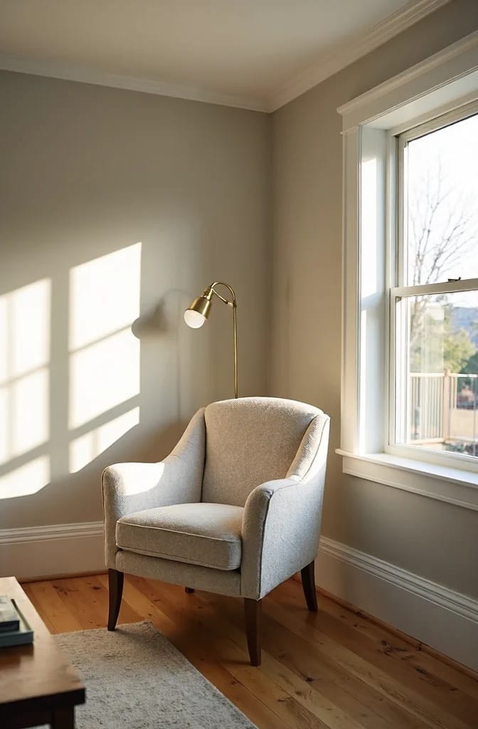
AI visualization of Sherwin-Williams Agreeable Gray SW 7029; the greige you see is an approximation, and this color shifts between beige and gray with the light, so confirm it with a physical sample.
This is also the band where wall and trim can finally separate without effort. Accessible Beige on the walls at 58 with Alabaster trim at 82 is a 24-point gap, which is plenty for white trim to register as white. Trim within three or four points of the wall stops reading as trim at all. Agreeable Gray behaves well in a bright room and gets moodier in a dark one, so if your only window faces north, order a sample of Agreeable Gray 7029 before committing a gallon to it.
 11 Beige Kitchen Ideas That Don’t Read Builder-Grade Why Accessible Beige at 58 keeps a kitchen bright while still letting white trim read as trim, and where beige belongs instead of the walls.
Low LRV, 3 to 15: what dark paint costs you
Tricorn Black (SW 6258) is LRV 3 and Urbane Bronze (SW 7048) is 8, and both do something no mid-tone can: they push one plane of a room backward and make everything around it read more spacious. Urbane Bronze on a kitchen island or a bathroom vanity gives a pale room a grounded center of gravity because the painted area is small. That is the whole trick, and it works best at cabinet scale, not wall scale.
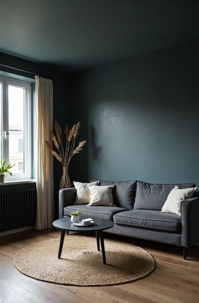
AI visualization of Sherwin-Williams Urbane Bronze SW 7048; a screen cannot show a bronze this dark accurately, so judge the real depth from a sample in your own room.
A whole room in that range is a different transaction, and the bill arrives two ways. Light first: an LRV 8 wall absorbs nearly everything you throw at it, so you end up paying for that darkness in fixtures and electricity rather than in paint. Practicality second: dark matte door fronts and dark trim show scuffs, dust, and fingerprints far more than mid-tones, and semi-gloss makes the marks worse, not better. If a single dark surface is the goal, a dark accent wall behind a bed is the cheapest place to spend it.
Dark rooms: why the 40-to-60 sweet spot is half wrong
Qualification first, because the popular advice is not nonsense; it just gets repeated past the point where it holds. The claim is that windowless and north-facing rooms want a color between 40 and 60 so the walls neither swallow light nor wash out. The second half is right. The first half is where it breaks: a 40 in a dim room with a dark floor is a wall that eats what little light exists, and the room goes flat rather than moody.
What works in a low-light room is the upper middle, roughly 55 to 70, in a warm undertone, in matte or eggshell. High enough to catch light and throw it back off the ceiling; not so high that it goes chalky. An icy white at 88 with no direct sun turns into a flat, faintly gray white on the wall, which is what people mean when they say a bright white went dull in their dark room. The Color Concierge, a color consultancy that publishes an LRV guide, sends walls toward 60 to 80 in small dim rooms and keeps ceilings at 80 or above so the ceiling does the bouncing, which is the same logic run in the other direction.
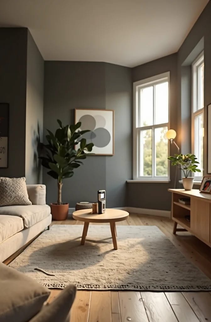
AI visualization of Sherwin-Williams Greek Villa SW 7551, shown here in weak north light where a cooler white at the same number would go chalky. On-screen color is approximate; test a real sample in the actual room.
And if the room is genuinely dark, the bulb is usually worth more than the paint. A 4000K LED in a north-facing room will make any warm neutral you choose read gray, whatever its LRV. Swapping to 2700K does more for the finished wall than moving two points on the scale does, and it costs less than a gallon. Fix the light, then choose the chip.

Cabinets, trim, and ceilings: the tighter decisions
Light cabinets fail after dark, and the mechanism is LRV plus bulb. An off-white cabinet at 82 reads crisp at eleven in the morning and turns gray under 4000K recessed cans at seven, which is why a warm off-white beats a true cool white in a kitchen more often than not. Beige on cabinets instead of walls is the related move: a 58 like Accessible Beige on door fronts reads as a deliberate color rather than a shadow, while the same paint across a large wall can go heavy and flat.
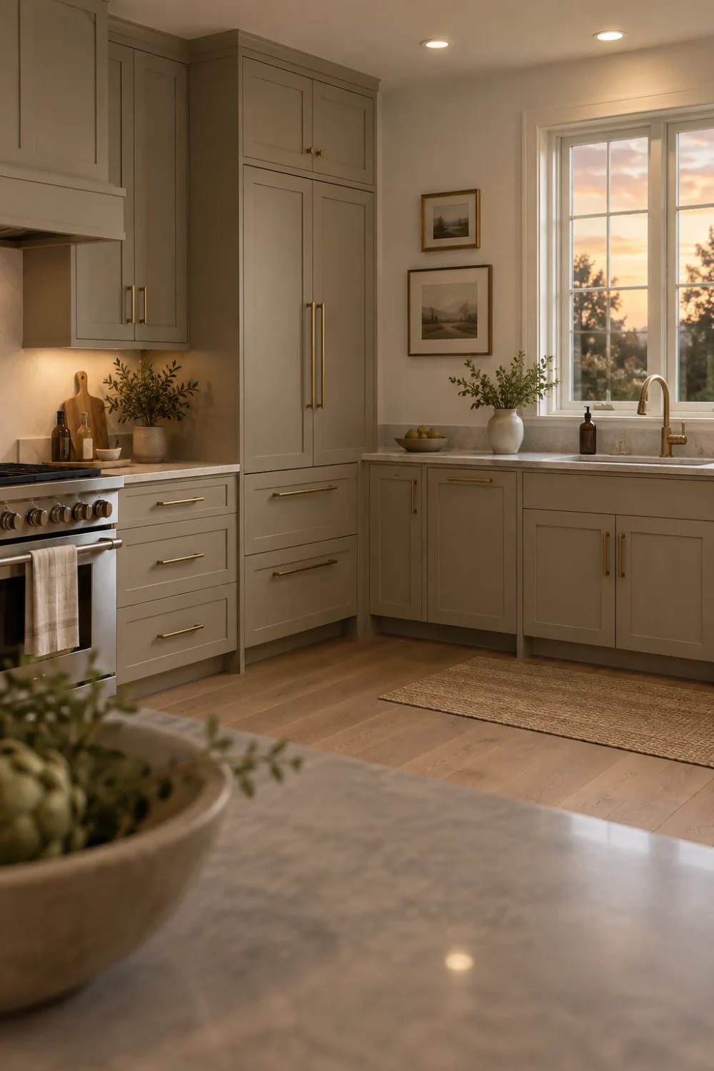
AI visualization of Sherwin-Williams Accessible Beige SW 7036; the beige on screen is an approximation of the real paint, so order a sample and check it against your counters before you commit the cabinets.
Trim is the one place where the bigger gap wins. Walls in the 50s and 60s want trim in the 80s; anything closer and the trim stops reading as trim. Ceilings are the same principle applied where nobody looks: a ceiling at 80 or above reflects light back down into the room for free, and a ceiling in the 60s quietly costs you brightness on every wall below it. If you are rethinking a whole kitchen at once, the warm neutral direction is where most of these numbers land these days, replacing the cool greige-on-charcoal of the 2016 remodel.
Using the number at the counter, in ten minutes
Start on the back of the chip. Most brands print LRV beside the code, and where it is missing, the brand’s own color page carries it. Then compare the chips that sit next to each other on the same strip rather than stacking four favorites from four different color families. Neighbors on a strip are usually within two or three points, which forces the real question to the surface: which undertone you want, not which depth. That single habit prevents most of the color decisions that go wrong at the paint counter, where a chip the size of a business card has to answer for a room it has never met.
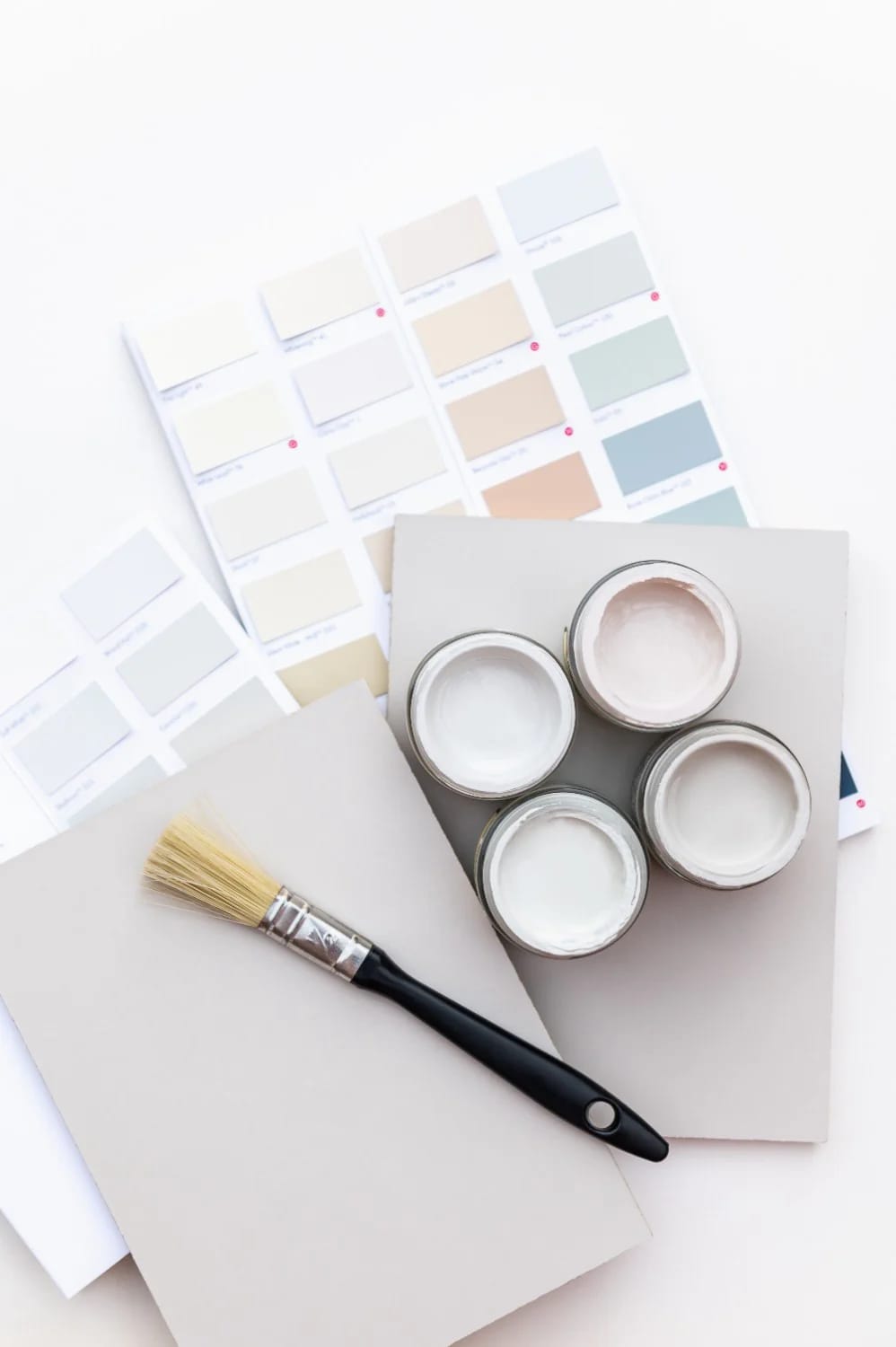
AI visualization of warm off-white samples in real room light; the colors shown are approximate and your own light will shift them, which is the entire argument for testing a physical sample.
Samples are the part everyone skips. Peel-and-stick samples run about $7 each, ship painted with real product rather than printed like a chip, and arrive overnight in most cases. Order three to five, tape them to the actual wall, and leave them up for a full day: morning, noon, and under the room’s own bulbs at night. Move each sample so it touches the trim and reaches the floor, because a color that works alone on a wall can still fight the floor it sits on. For Greek Villa, that is a Greek Villa 7551 peel-and-stick sample rather than a photo on a phone.
Two honest limits on the method. Peel-and-stick samples come in one sheen, so they cannot settle a matte-versus-satin question on cabinets. And a screen is not a reference: a phone photo of a sample taken in your room shifts with the camera’s white balance, which is why the physical sample and not the picture is the thing to judge. Some sample links in this piece are affiliate links, which does not change what the article recommends: test the color in your room before you buy a gallon.
Where the number should lose the argument
LRV ranks depth and says nothing about whether a color is warm or cool, and every genuinely hard call here turned out to be an undertone question: Alabaster and Greek Villa two points apart but visibly different whites, Agreeable Gray's violet lean, Repose Gray going faintly purple in a north room. Use the figure to narrow the field, to check a dim room against a realistic target instead of a 40-to-60 slogan, and to keep trim separated from walls by enough points to matter. Then put the chip down. On a small, saturated surface (a navy vanity, a green pantry door, a painted stair rail) the hue is doing all the work and the number barely registers, so choose with your eye and skip the arithmetic.
Related Posts
- 13 Kitchen Color Ideas and Where Each One Actually Works
- 9 Warm, Cozy Christmas Living Room Color Schemes (and the One Undertone Rule That Makes Them Work)
- 20 Rectangle Pool and Spa Combos Designers Love
- How Much Do House Plans Cost? The Real Number, Not the Sticker Price
- How to Paint Santa Pebbles: A Simple Christmas Rock Project
- Wide Plank Driftwood LVP: 11 Design Ideas That Don’t Read “Beach House”