
The standard advice on navy in a bathroom is to keep it to one wall or one vanity and let everything else stay pale, on the theory that the room is small and dark paint will close it in. That advice is backwards in exactly the rooms most people are asking about. A windowless five-by-eight with a single overhead light does not get bigger when you paint it greige; it gets flatter. What follows sorts where the navy earns its place, room element by room element, and where it quietly ruins the job.
Navy is also not one color. Hale Navy and Naval are both sold as navy and behave nothing alike once the daylight goes; sheen changes the answer again, since the same color in eggshell and in high gloss will not read as the same blue. The color decision and the finish decision are one decision.
Most of what follows is a weekend. Two of them are not: tile and any wallpaper that ends up near a shower. The section on metals is where the money usually goes wrong, so read that one before you buy a faucet.

Paint the vanity navy before you paint a single wall
The vanity is the cheapest place to find out whether you actually like living with navy. It is a contained box, it takes about a quart of paint, and if you hate it in March you have lost a Saturday rather than a renovation. Doors off, degrease, scuff-sand, a bonding primer, then two thin coats of an alkyd-modified enamel that levels rather than a wall paint that ropes.
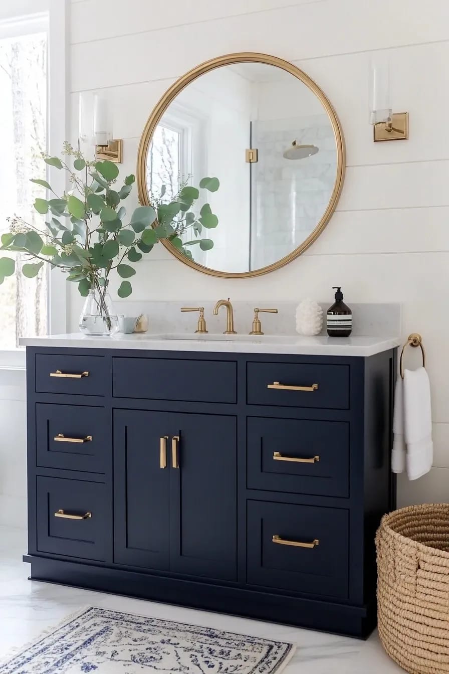
Granted, this only works if the vanity is a real cabinet. Melamine flat-pack takes navy badly at the edges, where the paint film sits on a printed foil that is already lifting. On those, the honest answer is a new door front or nothing. And if you are also redoing the strip of wall behind the sink, decide the two together, because the backsplash is what stops a painted vanity looking like a painted vanity rather than a piece of joinery.
A windowless bathroom is the strongest case for navy, not the weakest
Paint all four walls and the ceiling. A room with no daylight has no lightness to protect, and a pale color in there only exposes how yellow and uneven the artificial light is. Dark navy absorbs that unevenness and turns the sconces into the whole visual event, which is closer to how a good hotel bathroom is lit than anything a can of soft white will get you.
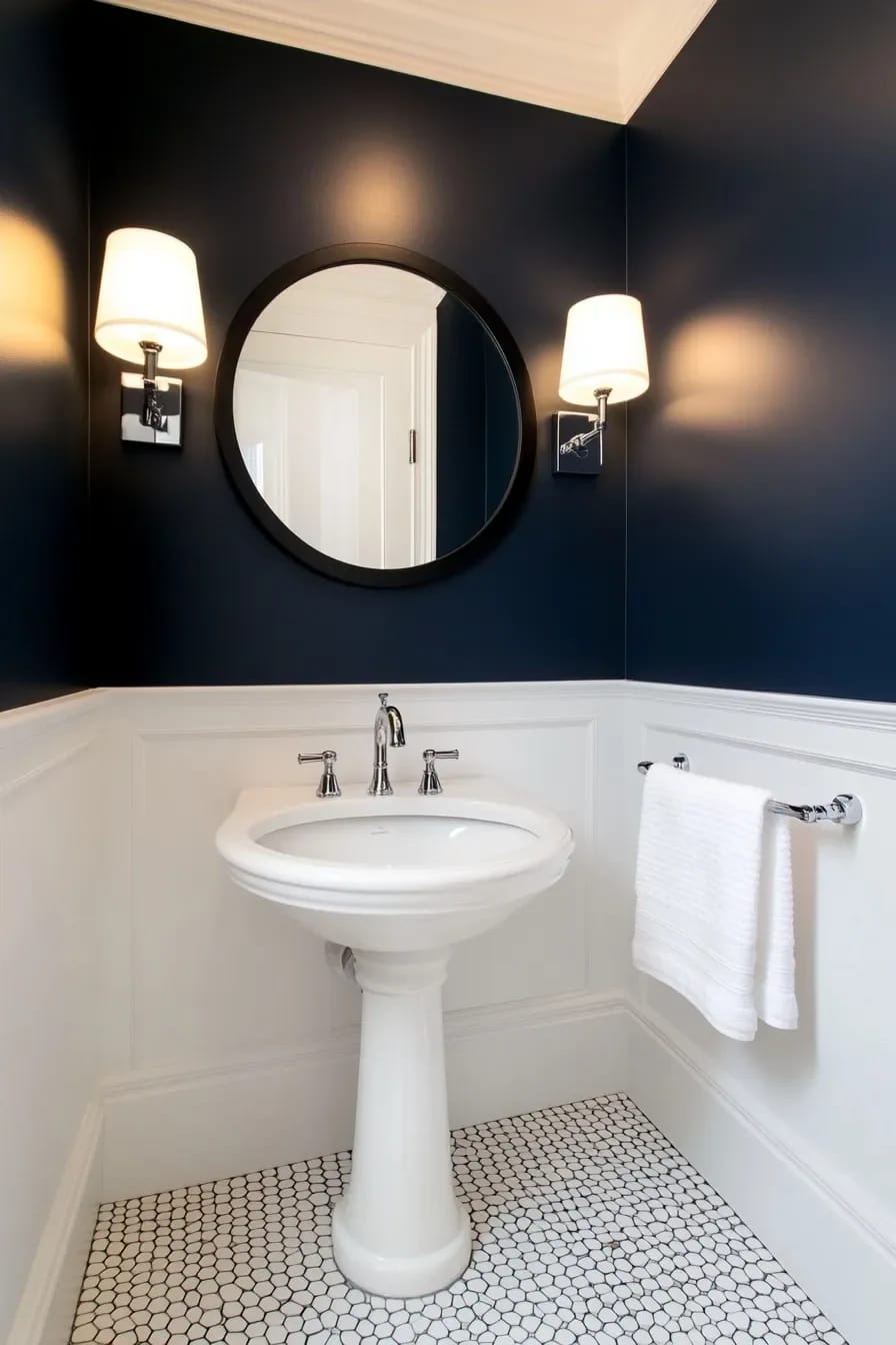
Which navy matters more here than anywhere else in the house, because low-light rooms flatten chroma and push dark colors toward black. The table below is the short version of the difference.
| Color | LRV | What it does with no daylight |
|---|---|---|
| Benjamin Moore Hale Navy HC-154 | about 8 | Grey in the undertone, so under warm bulbs it drifts toward charcoal and stops reading blue |
| Sherwin-Williams Naval SW 6244 | 4 | Darker on paper but more saturated, and it holds its blue identity in low light better than Hale Navy |
| Sherwin-Williams Cyberspace SW 7076 | 6 | Least chroma of the four; the likeliest of these to simply look black in a dark room |
| Farrow & Ball Hague Blue No. 30 | not published | Greener than the others and closer to a dark teal on a wall. Farrow & Ball does not publish LRVs, and third-party estimates for this one range from roughly 3 to 7, so treat any number you see as a guess |
 22 Moody Bathroom Designs to Inspire Your Remodel The wider dark-bathroom playbook, past navy into charcoal, oxblood and near-black schemes.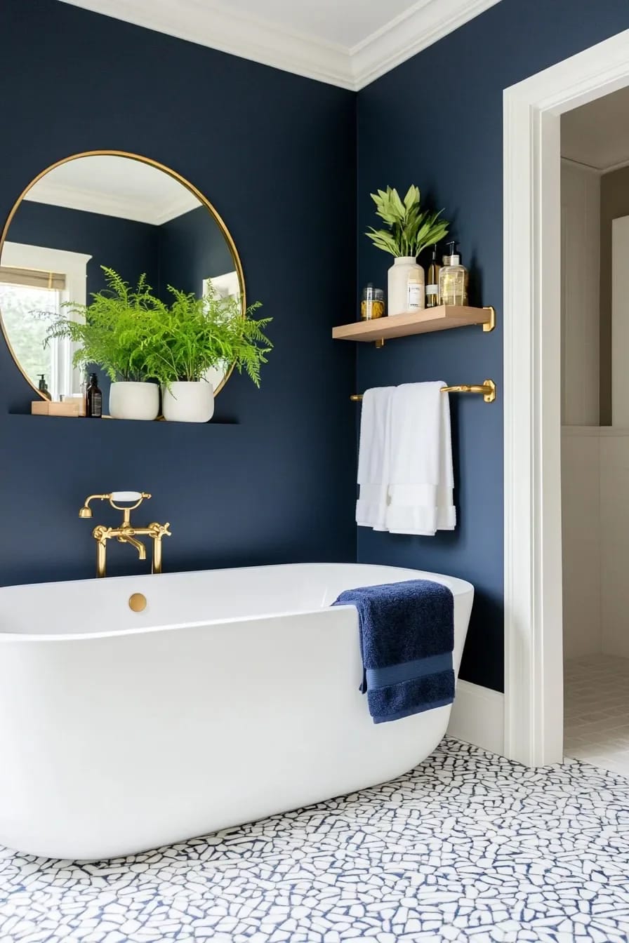
Glossy navy tile in the shower, matte navy everywhere else
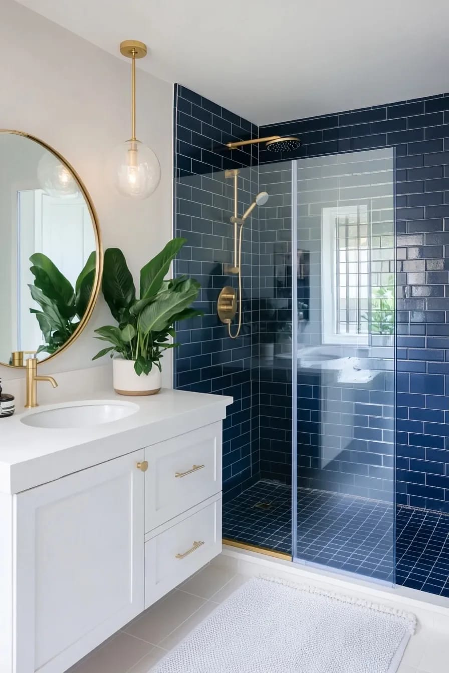
Gloss is doing structural work in a shower, not decorative work. A dark matte tile in an enclosure absorbs what little light gets in there and the whole box goes dead; a glossy glaze bounces the sconce or the ceiling light around and keeps the navy legible as blue. Handmade tile with an uneven glaze does this best, because the variation gives the eye something to catch. Fireclay Tile's pressed shapes are the reference point for this if you want to see what an uneven navy glaze looks like at scale before committing.
Long thin formats around two and a half by sixteen inches, stacked vertically, have taken over from standard subway in the last two years and they suit navy specifically: fewer horizontal lines, more uninterrupted color. The cost is grout. A stacked vertical layout is unforgiving of a wall that is out of plumb, and in an older house that is most walls.
Unlacquered brass against navy, and why polished gold usually misses
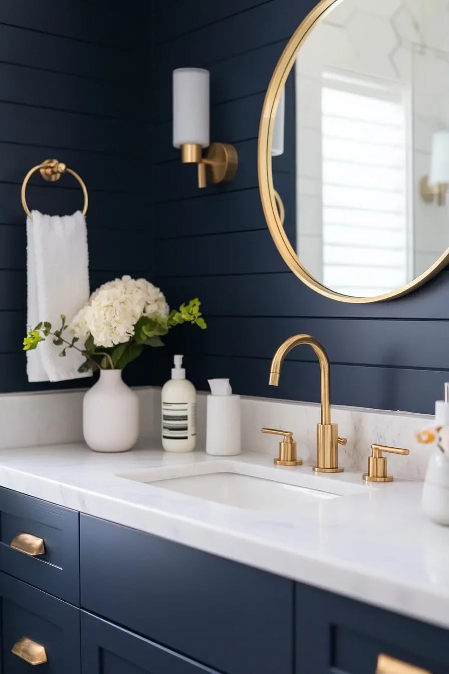
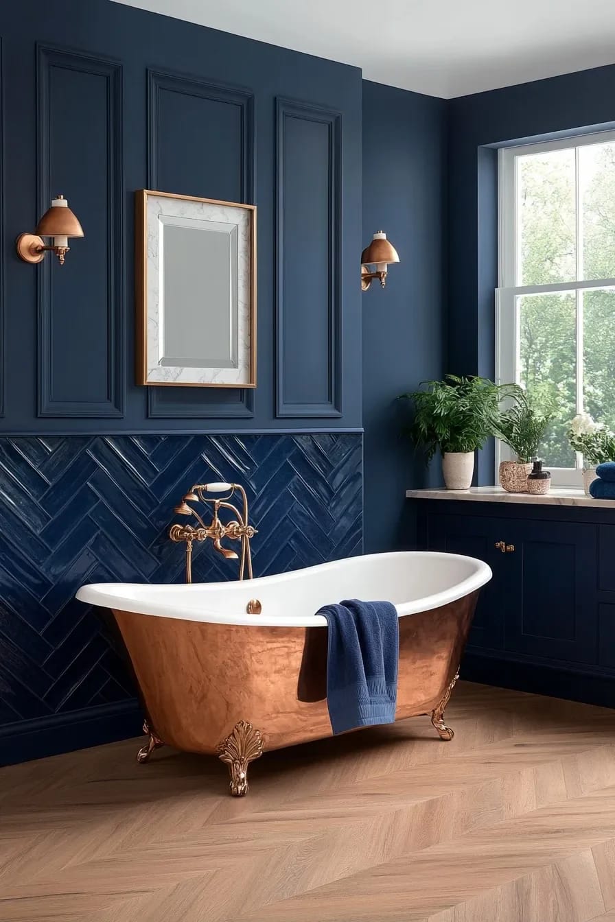
Navy plus gold is the pairing everyone shows and the one most people execute badly, because they buy polished brass PVD instead of unlacquered brass. The PVD finish is a hard, permanently bright yellow coating. Against a deep matte navy it reads as trim rather than metal, and in photographs it is the thing that dates a bathroom to the year it was installed. Unlacquered brass is raw and will darken unevenly, brightest where hands land, brownish in the recesses within about six months. That variation is what makes it sit next to navy instead of on top of it.
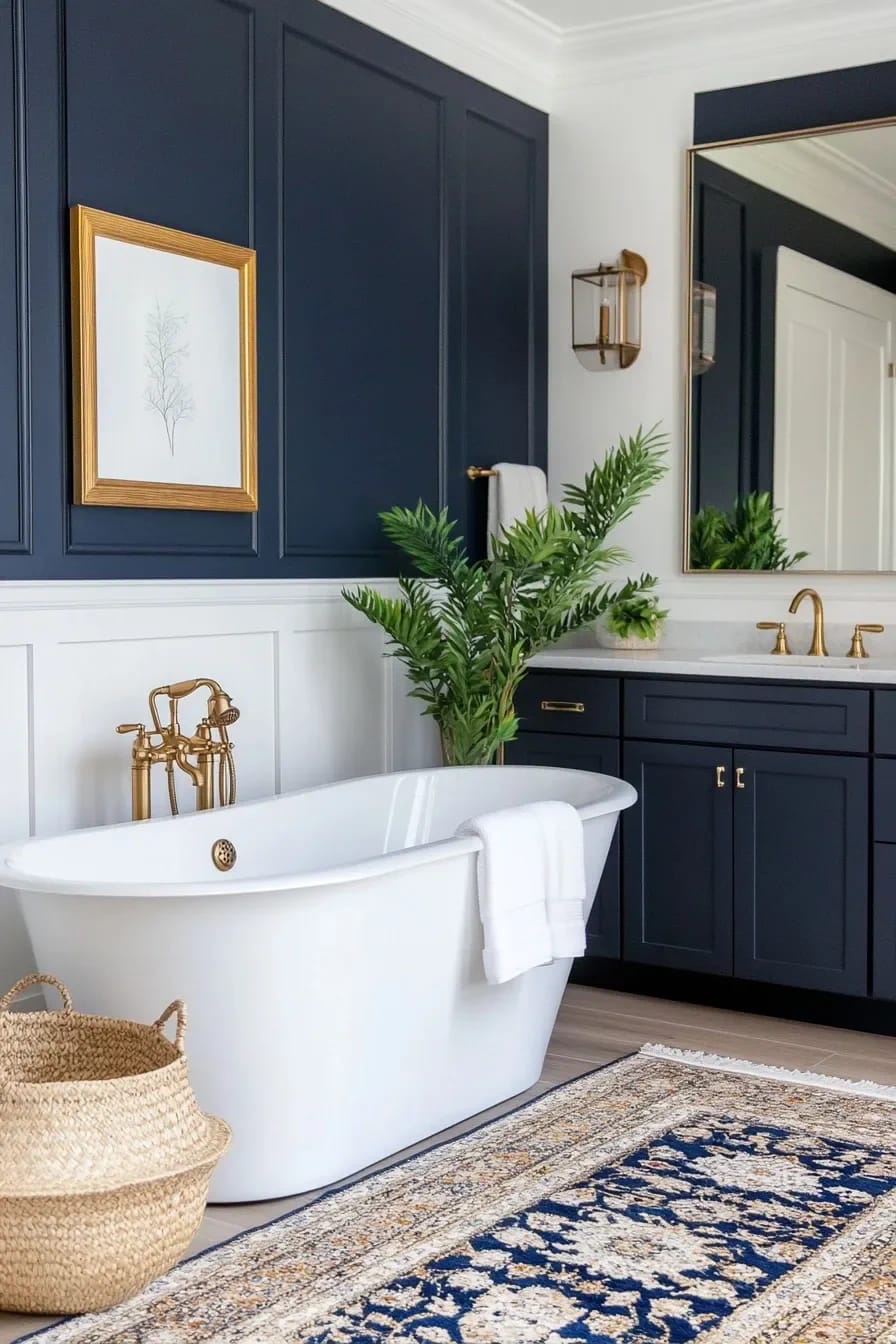
The trade is that unlacquered brass shows water spots and cannot be brought back to uniform without polishing it, which restarts the clock. If that sounds like a chore rather than a feature, buy brushed nickel and stop worrying about it. Chrome against navy is also a defensible call and gets unfairly dismissed; it just reads sharper and more nautical rather than warm, which is a different room, not a worse one.
Do this
- Buy the faucet, the drain, the trap and the towel bar in one finish from one line, since brass tones vary noticeably between manufacturers.
- Let unlacquered brass go through its first ugly stage without intervening. Around weeks three to eight it looks blotchy and wrong.
- If you want gold that stays gold, at least go satin. The reflection is broader and softer against a dark wall.
Avoid
- Mixing an unlacquered faucet with lacquered brass cabinet knobs. One ages, one does not, and within a year they no longer match.
- Gold-tone shower drains and gold-tone toilet flush plates. Too much metal, and both are the pieces you cannot easily swap later.
- Polished brass on a navy vanity in a hard-water area.
Copper reads warmer than brass in a navy bathroom
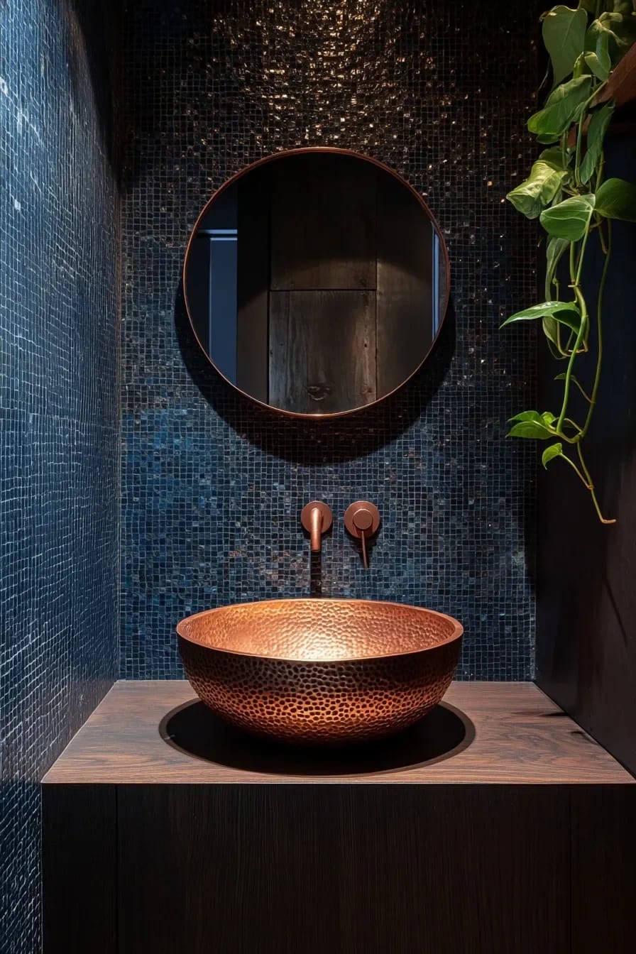
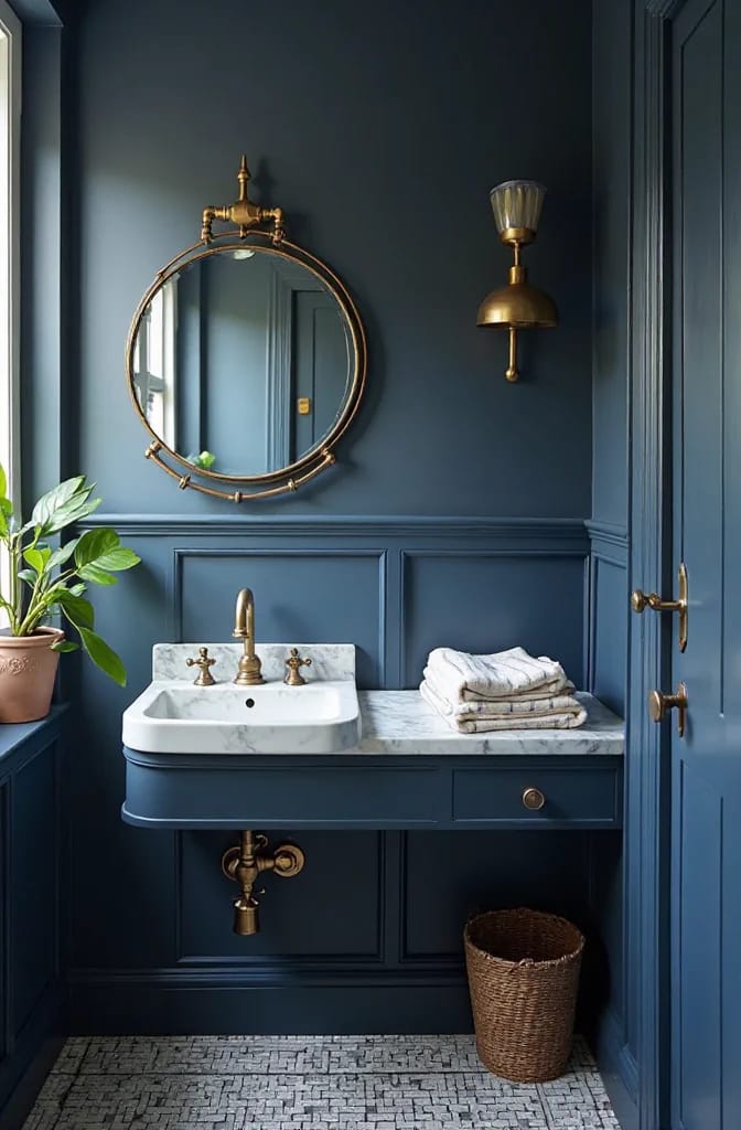
Copper is the underused version of the same idea. It sits further into orange than brass does, which means it fights the blue harder and produces more contrast rather than more harmony. In a narrow bathroom where the navy is doing most of the work, that extra push is often what stops the room feeling monochrome. Hammered copper vessel sinks are the obvious route, though the thin imported ones dent under a dropped bottle; sixteen gauge or heavier is the line worth holding.
Navy below the chair rail, lime plaster above
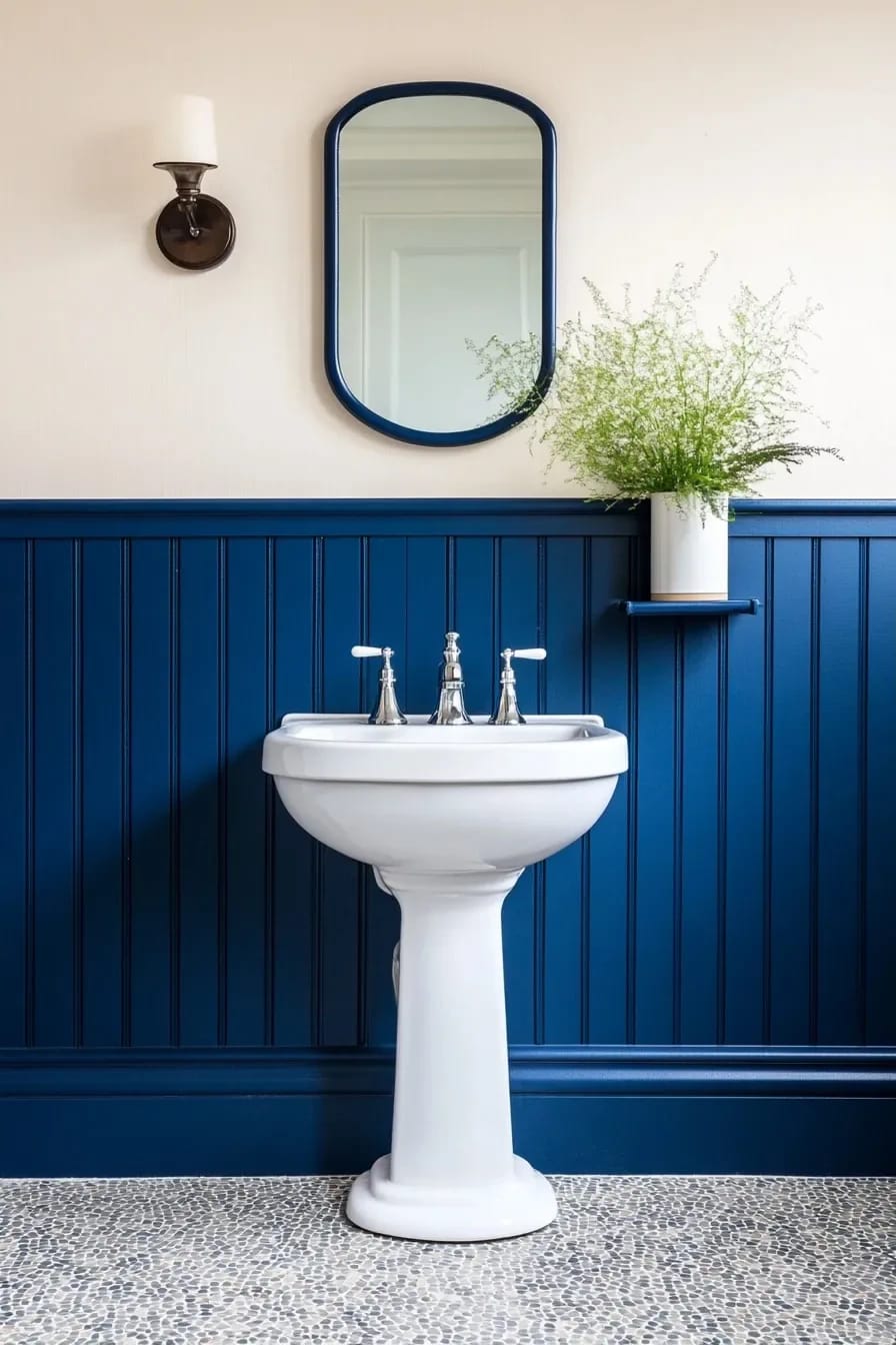
Splitting the wall horizontally gives you navy without giving up the ceiling height, and it puts the dark color exactly where splashes and shoe scuffs actually land. Beadboard is the traditional carrier; flat MDF panels with a square-edge rail read more contemporary and cost less to install. Set the rail at around 36 to 42 inches, higher than the standard 32, because the taller the navy field the less the split reads as a builder detail.
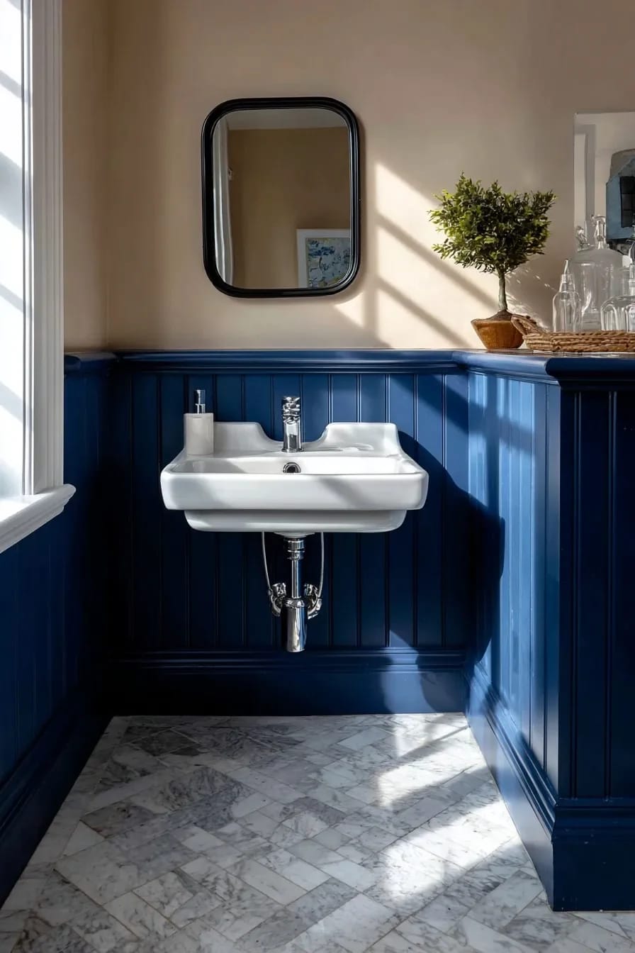
The half-and-half wall lives or dies on the top half. Flat white above navy is fine and slightly boring. Lime plaster or a limewash in a warm off-white gives the upper wall a texture that reads as a material rather than an absence, which is the same discipline that makes a two-tone black and white bathroom work instead of looking like an unfinished paint job.
Navy penny tile floors need dark grout, not white
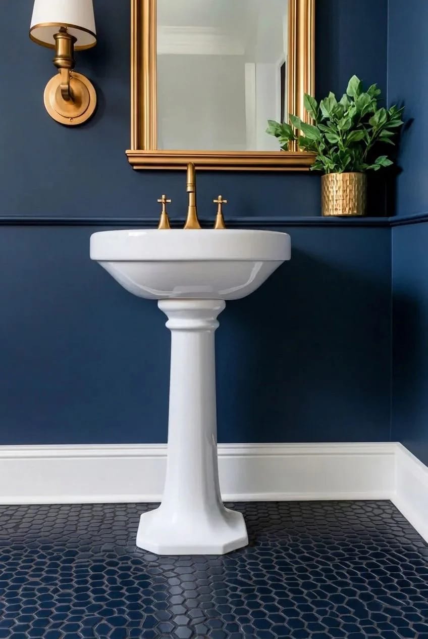
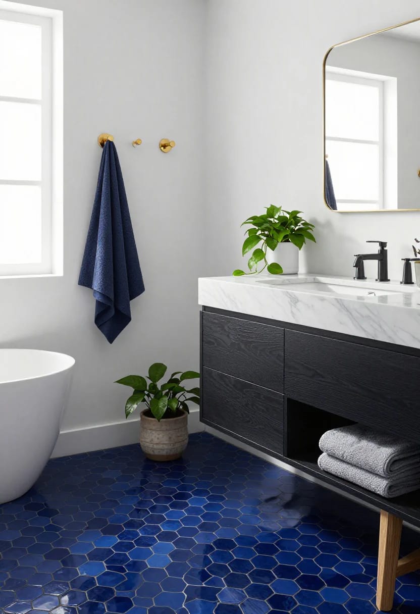
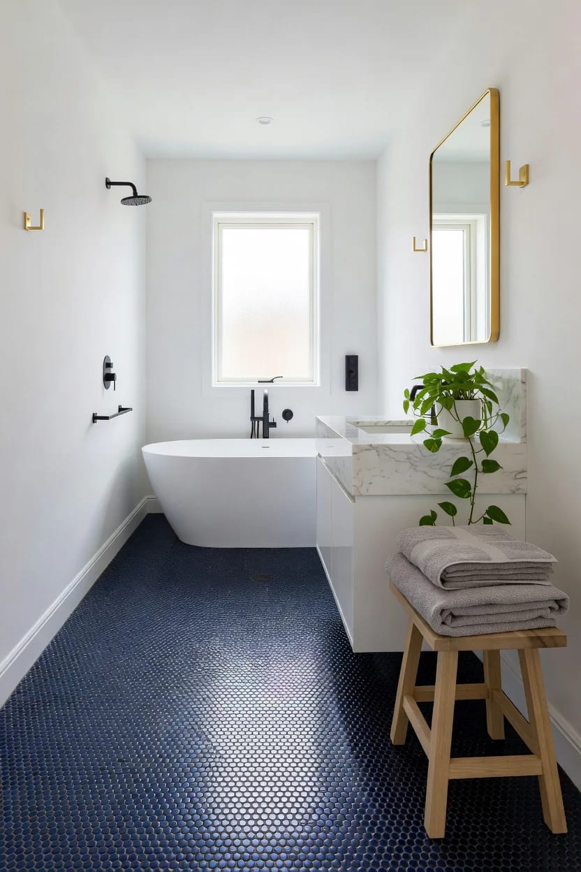
Penny tile has more grout per square foot than almost any other format, which is exactly why it grips underfoot and exactly why white grout is a mistake here. A navy penny floor with white grout does not read as a navy floor. It reads as a white floor with blue dots, and after eighteen months of foot traffic those white lines are grey anyway.
Charcoal or a deep blue-grey grout collapses the pattern into one field of color and hides everything. Use epoxy rather than cement if the floor is in a shower or in front of one, since cement grout in a wet zone needs resealing on a schedule nobody keeps. If I had to cut one idea from this list it would probably be this one, not because it looks bad but because the labor cost of a mosaic floor is genuinely out of proportion to a small room.
 19 Trendy Bathroom Tile Ideas that WOW Formats, layouts and grout decisions across the whole tile category, not just the blue end of it.
Navy wallpaper belongs in the powder room, not the shower bath
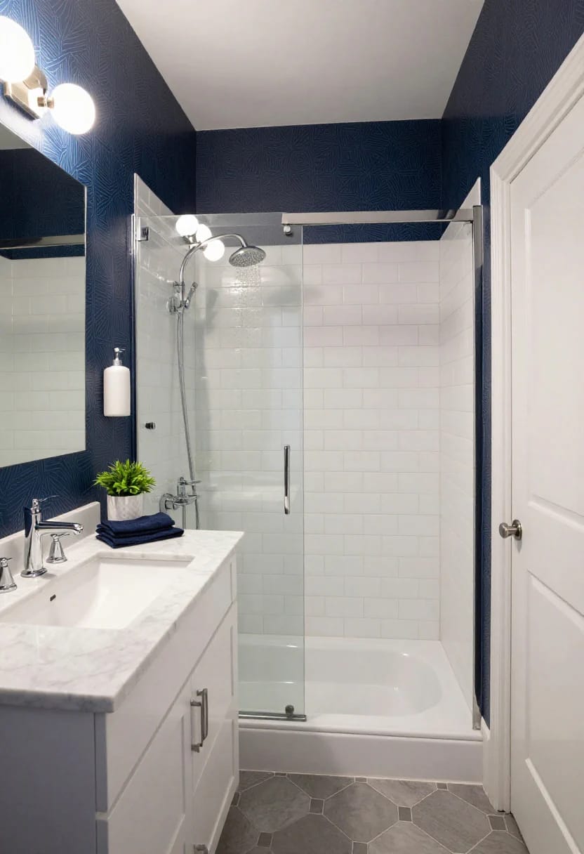
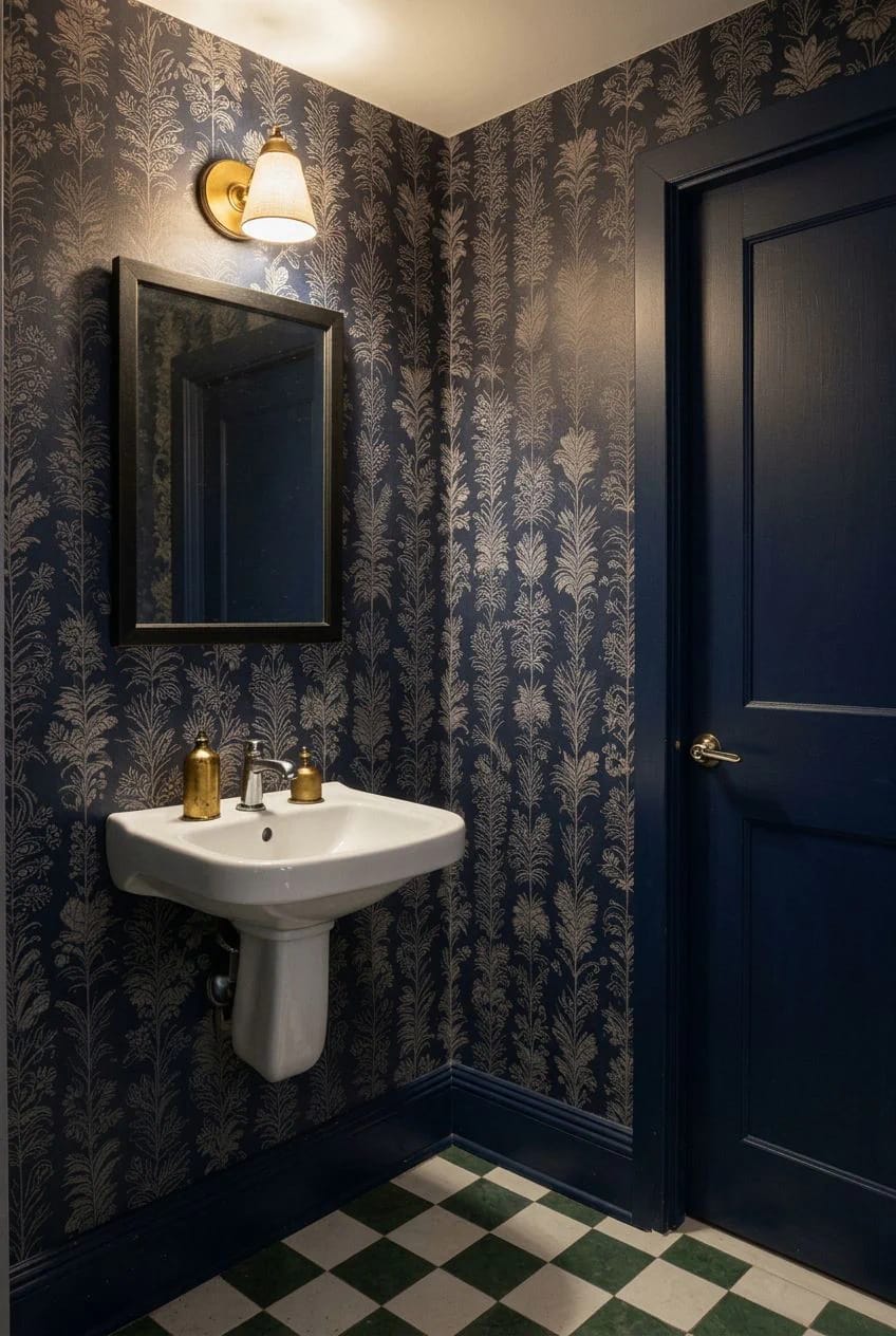
A half bath has no shower, so it has no sustained steam, and that is the only room where dark patterned paper is a low-risk decision. Vinyl-coated papers survive a full bathroom better than uncoated, but "survives" is doing work in that sentence: seams still lift at the top corners above a shower within a few years unless the extraction is genuinely good.
Paint the skirting and architrave the same navy as the paper’s ground rather than white. It stops the pattern looking framed and pinned to the wall. If you want the range of what actually holds up in a wet room, the wider survey of bathroom wallpaper covers the coated and peel-and-stick options in more detail than is worth repeating here.
White oak beats marble on a navy vanity
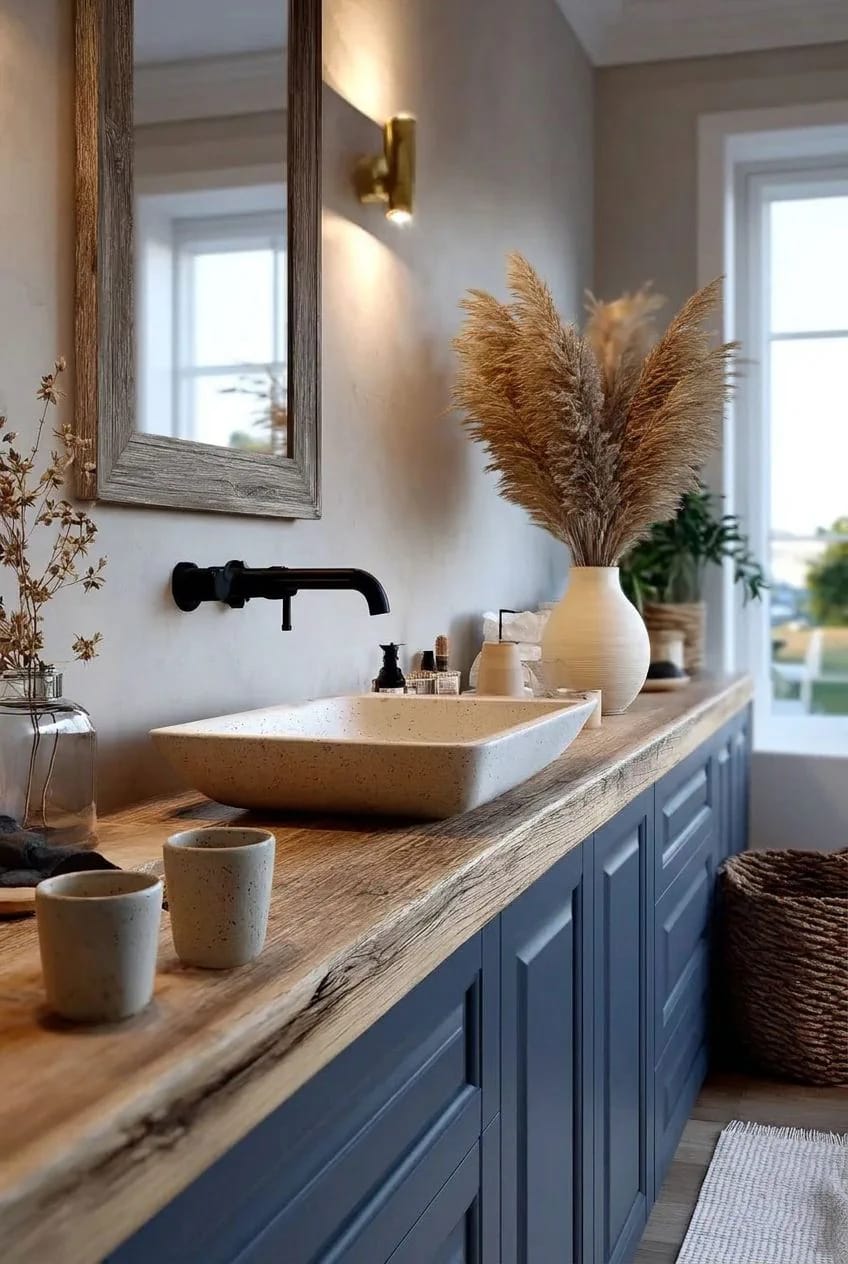
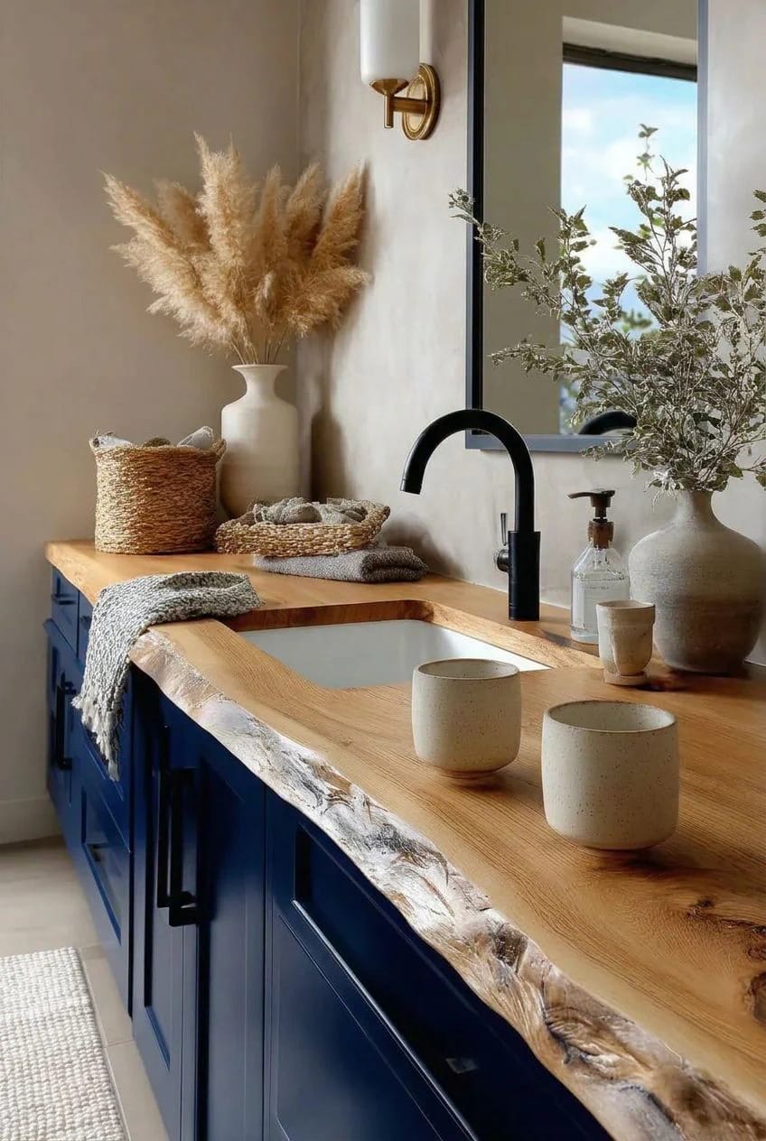
Marble on navy is the default and it is a cold pairing: two hard, cool surfaces with nothing to warm the room. A white oak or walnut counter does the opposite, and open-grain oak in particular gives the eye a texture at exactly the height where you spend the most time looking. Finish it with a hardwax oil rather than polyurethane so you can spot-repair water marks with a rag instead of sanding a whole slab.
That said, wood next to a basin needs a tap that does not drip backward, which rules out most vessel-sink arrangements and a lot of the shorter spouts.
Paint the ceiling navy and leave the walls alone
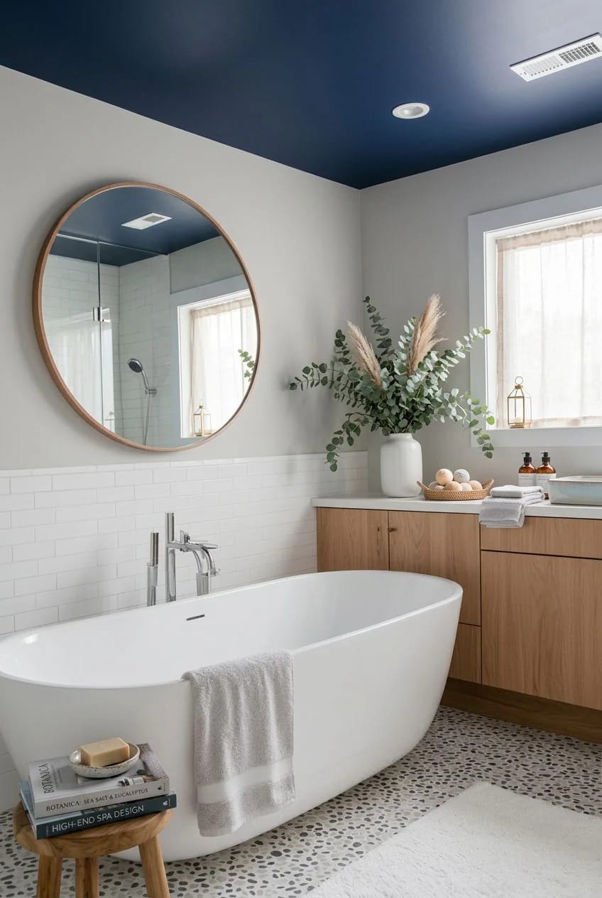
In a bathroom with a decent window, the ceiling is the least-used surface and the cheapest place to put a strong color. A navy ceiling over warm white walls reads deliberate in a way an accent wall never does, and it costs a quart. Flat finish, no cornice, and let the color stop at the wall line rather than dropping down onto a picture rail. It is the same move that carries a navy blue bedroom without darkening the whole room, just in a space small enough that you can do it in an afternoon.
Navy with sage green, not navy with grey
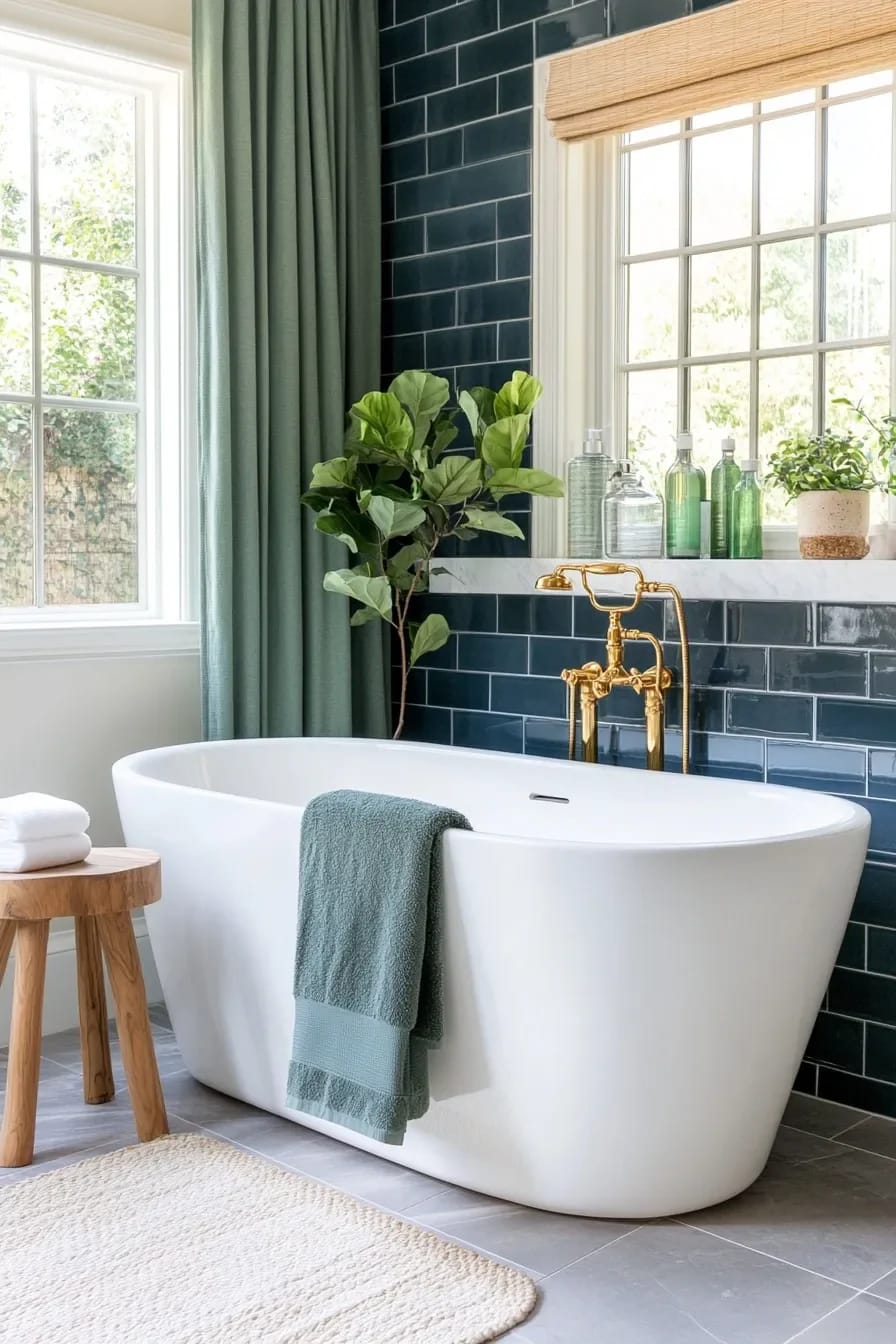
Navy and grey is the pairing that makes a bathroom look like an office. They share too much: both cool, both low chroma, and grey has nothing to offer navy that navy is not already doing. Sage green sits close enough on the wheel to feel related and far enough to register as a second color, and it brings a yellow component that warms the whole scheme. Keep the sage on the grey side rather than the mint side. If you want to see the range before committing, the green bathroom survey covers where the various greens land.
Warm 2700K sconces at eye level, and nothing overhead
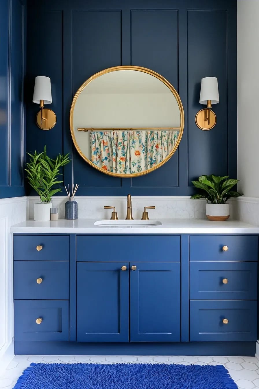
Overhead downlights are what kill dark bathrooms. They throw light down onto the floor and the top of your head, leave the walls unlit, and turn navy into a black surround. Two sconces at roughly 66 inches, flanking the mirror rather than sitting above it, light the face from the sides and light the wall at the same time, which is the only way the blue stays blue after dark.
Specify 2700K and CRI 90 or better. A 4000K bulb will strip the warmth out of navy and out of brass simultaneously, and cheap low-CRI LEDs make dark blue read as a flat grey-purple. Dimmers on the sconces, not on a ceiling fixture you should not be installing.
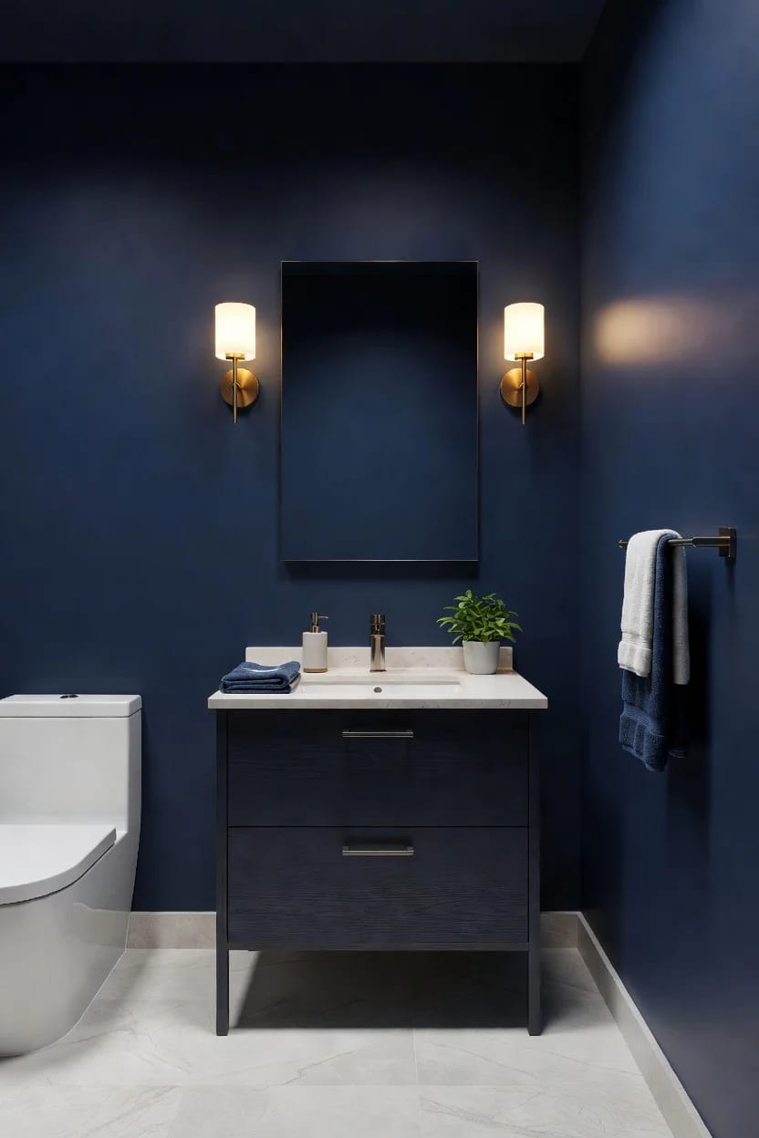
Paint the water closet navy and let the rest of the bathroom stay light
If the primary bathroom has a separate toilet enclosure, paint that one small box navy on every surface, including the ceiling and the inside face of the door, and leave the main room pale. The contrast when the door swings open does more for both rooms than a single scheme applied to the whole floor plan would.
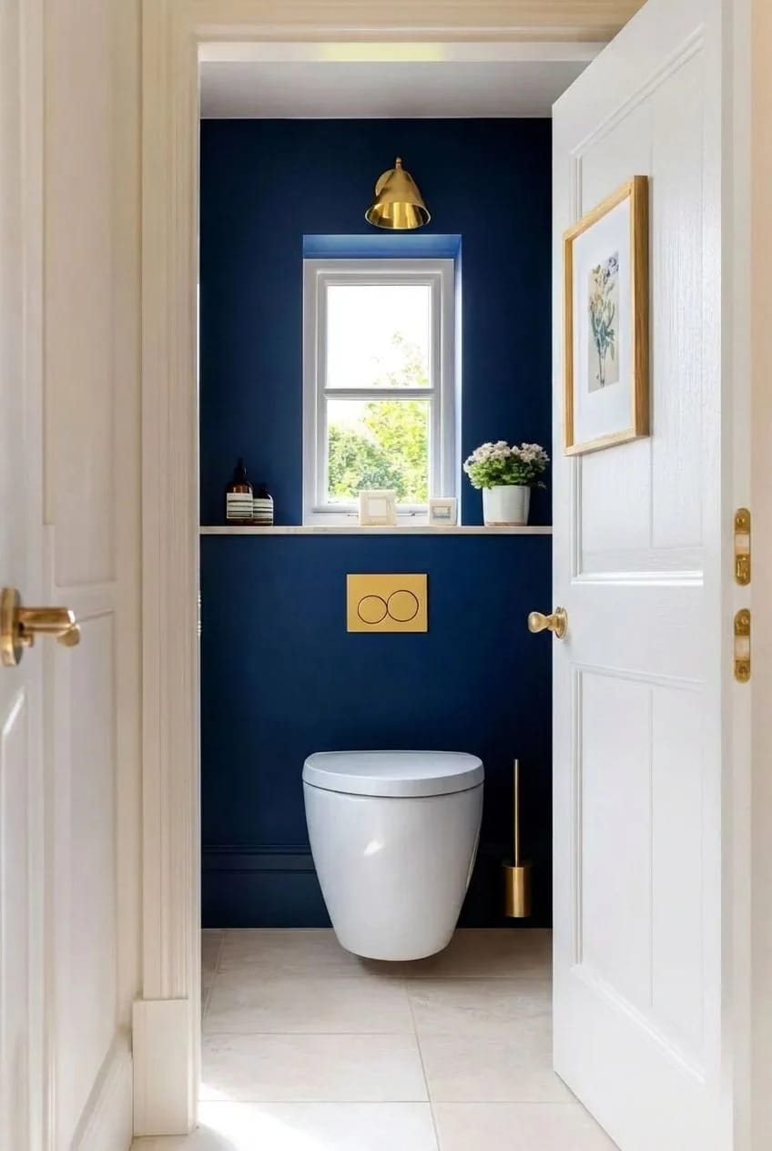
The same logic applies to any half bath off a hallway, which is the one room in the house where nobody spends long enough to get tired of a strong color. Half baths reward this kind of commitment more than any other room precisely because the stakes are so low.
Do the metals last
The order that saves money is paint, then tile, then metals, and people almost always reverse the last two. Buy a peel-and-stick sample of the two navies you are considering, tape them up in the actual room under the actual bulbs, and look at them at night rather than at noon, because the low-light behavior in that table is the whole decision. Then pick the tile against the painted sample. The faucet is the easiest thing in the room to change your mind about and the most expensive thing to change your mind about twice.
Related Posts
- 21 Stunning Navy Blue Bedroom Design Ideas
- 20 Pink Coastal Bathroom Ideas With a Breezy Finish
- Burgundy Bathroom Ideas, Sorted by How Much Nerve You Have
- 21 Best Blue Boho Bedroom Ideas to Inspire You
- 27 Gorgeous Green Bathroom Ideas for a Fresh Look
- 10 Spa-Inspired Coastal Bathroom Ideas That Don’t Look Like a Hotel Lobby