
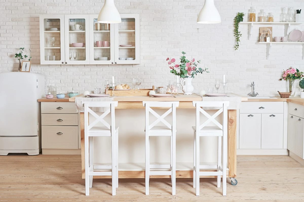
"Timeless" has quietly become the word people reach for when they mean beige and a little afraid. Half the kitchens filed under it are a white Shaker box with a grey island, chosen because nobody at the table could argue with them. That is not the same thing as a kitchen you still like in ten years, and the two come apart fast the moment a detail everyone copied starts to read as a date stamp. The ideas below are the decisions that actually age, ordered roughly from the most permanent (cabinet color, stone, floor) down to the details you can change without a renovation.
A few of them push against current advice on purpose. One makes the case for a saturated cabinet color most timeless-kitchen lists refuse to print, and one tells you to use the year's most photographed detail with a very light hand. Where something costs real money or ages badly, I have said so rather than pretend every option is equal.
1. Glass-front uppers age better than a solid wall of cabinets


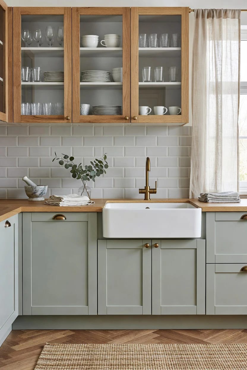
Break the run of solid upper doors and the room reads calmer, not busier. A wall of identical slab fronts is the thing that dates a kitchen fastest, because it reads as one big decision made all at once. Glass and open shelving interrupt that, and both have been in real kitchens for a century.
Glass-front uppers
Use them on one or two cabinets, flanking a window or the range, not across the whole top run. Seeded or old-glass panes hide the fact that most of us do not stack dishes like a catalog; clear glass demands tidy shelves you may not have. For a fuller run of options, our roundup of cabinet configurations from modern to classic shows where glass earns its place and where it just adds fingerprints.
Open shelving, but less of it
One shelf, near the sink or coffee station, in wood or a single slab bracket. The mistake is treating open shelving as a style rather than a spot for the four things you reach for daily. Anything past that becomes a dusting chore you will quietly resent by year two.
2. Skip bright white: greige and putty cabinets read timeless longer
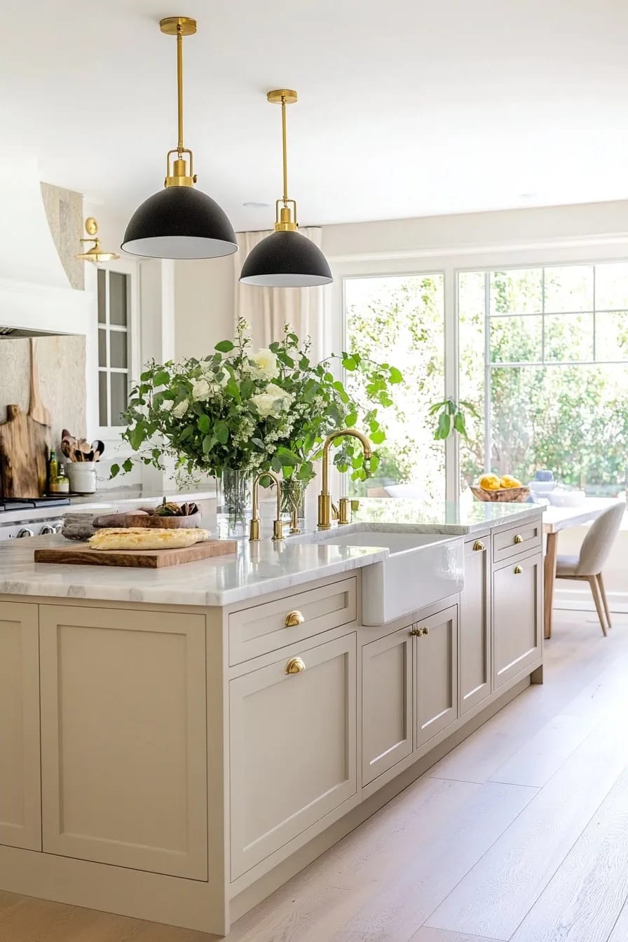
A warm off-white or greige cabinet ages better than a cool bright white, full stop. Stark white kitchens photograph well and then reveal every scuff, and the very coolest whites already look like the 2016 renovation they usually were. Warm putty, mushroom, and greige hold their nerve because they were never trying to be the brightest thing in the room.
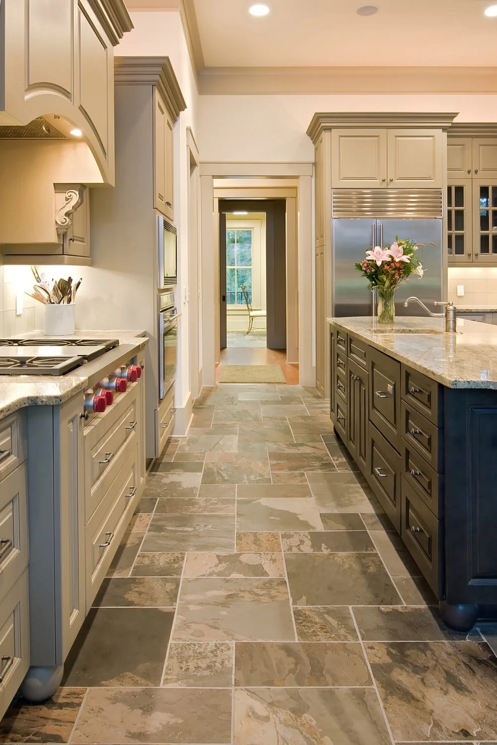
The trap with greige is undertone. In a north-facing room a greige with too much grey goes cold and dingy by mid-afternoon; the same paint in a south-facing kitchen can go slightly pink. Sherwin-Williams Agreeable Gray and Accessible Beige are the two most-painted versions in the country for a reason, but they behave differently by exposure, so this is the one color you order samples of and live with for a week before you commit. Getting a beige that reads as a choice and not builder-grade comes down to the light reflectance number more than the name on the can.
 27 Breathtaking White Kitchen Cabinets: Ideas to Brighten Your Space with Timeless Elegance Twenty-seven white-cabinet kitchens for when you decide the safe classic is still the one you want.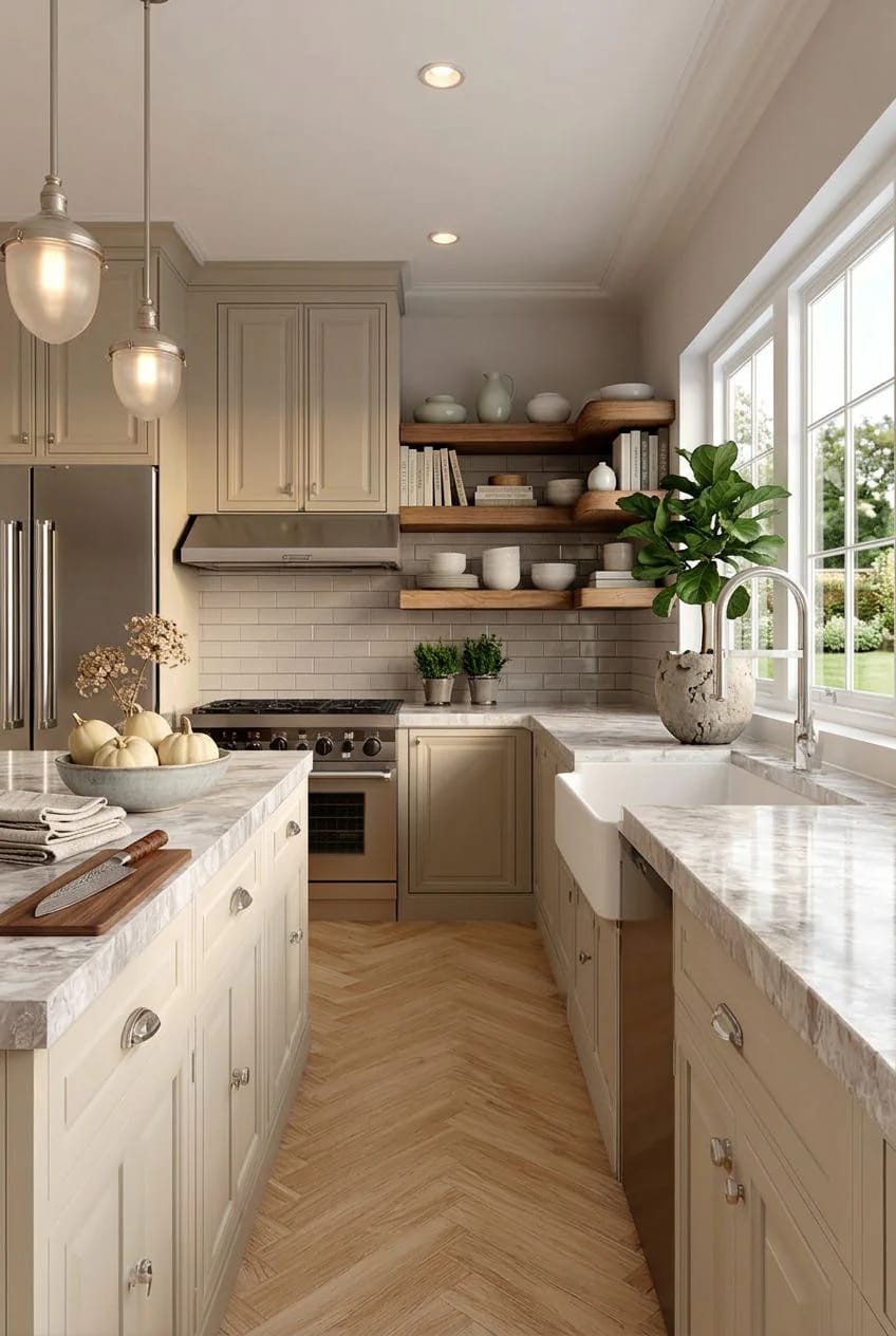
3. Honed marble over polished, and when to swap in quartzite
If you want marble, hone it. The high-polish finish that photographs like glass is also the one that shows every water ring and etch mark within a month of real cooking, and once it etches, the dull spots read as damage against the shine. Honed marble starts matte, so the etching that is coming anyway simply disappears into the surface instead of announcing itself.
Honed reads older than polished
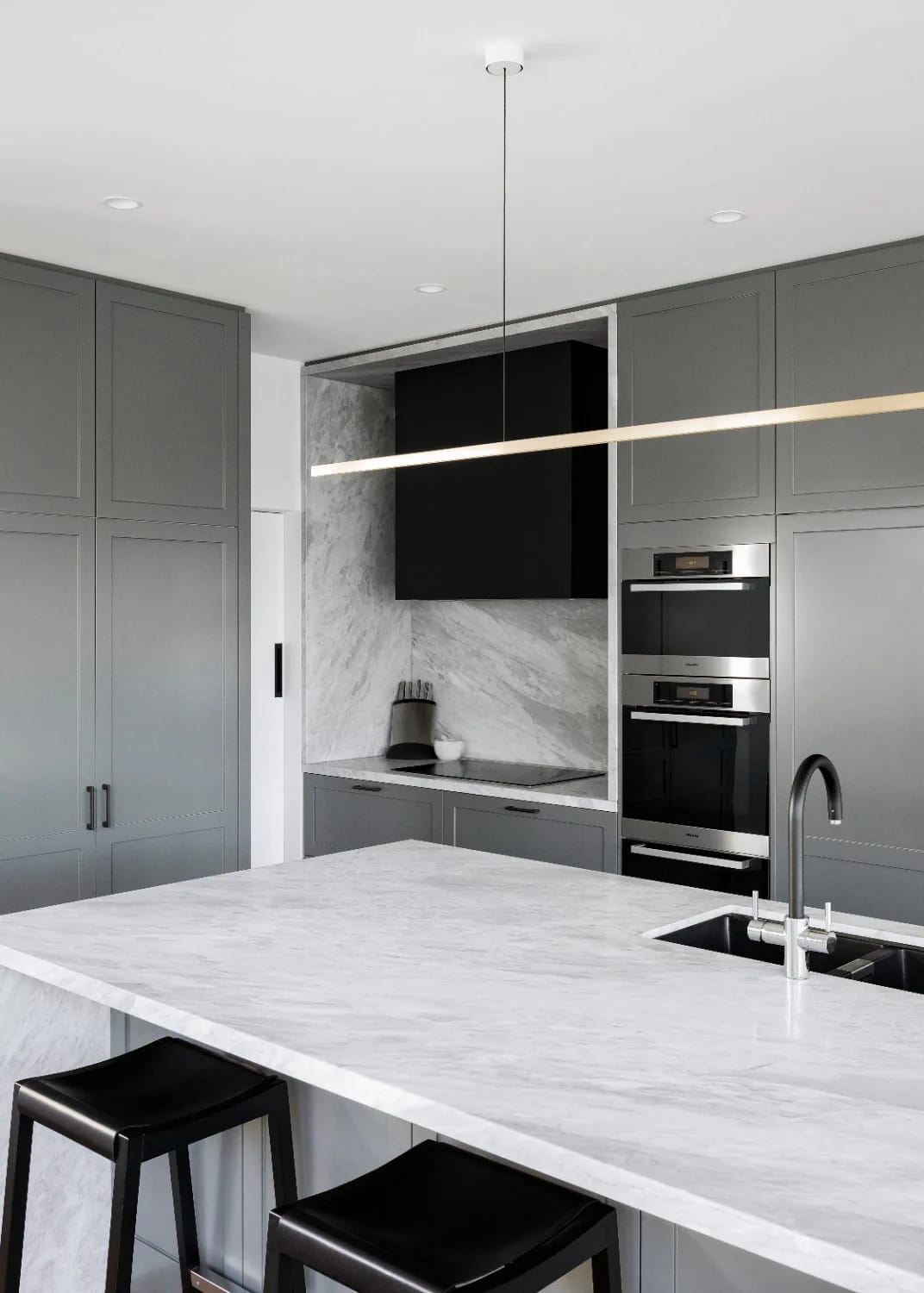
A honed Carrara or Calacatta slab has the soft, chalky quality of stone that has been in a French kitchen for decades. It is the finish that ages toward patina rather than toward regret. The grey veining stays legible without the mirror glare that pins a polished slab to a specific renovation year.

When quartzite beats the marble
If the idea of a stain giving you a small daily heart attack is not romantic to you, buy quartzite instead. A veined slab like Taj Mahal or Mont Blanc gives you the same soft movement and reads as marble across a room, but it does not etch from lemon juice or a spilled glass of wine. It is the honest choice for people who actually cook acidic food, and there is a whole grammar to picking veined quartzite that mimics marble without the maintenance.
4. Unlacquered brass you let go dull
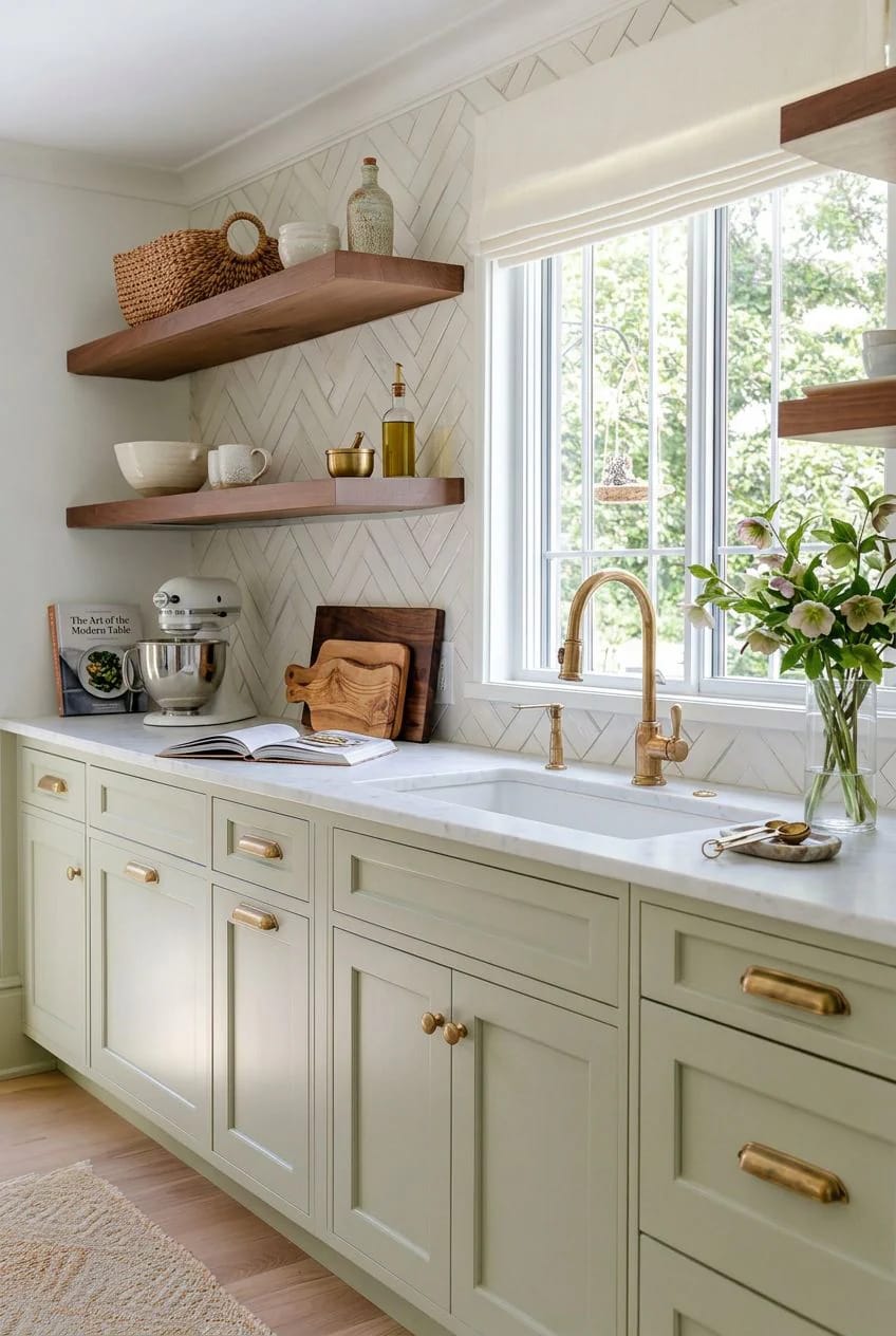
Buy unlacquered brass and stop fighting it. The bright, sealed "polished brass" that stays mirror-shiny forever is the finish that will read as dated, because a permanent gold shine looks like a product. Living brass darkens unevenly where hands touch it, and that patina is the thing that makes a new kitchen look like it has been loved for years rather than installed last Tuesday.
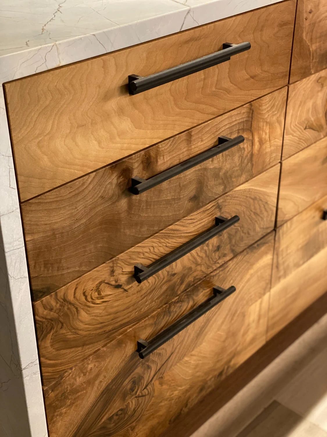
One caution: unlacquered brass and a faucet see water constantly, so on the tap the patina goes green and blotchy faster than most people expect. If a fully aged faucet worries you, put the living brass on the cabinet pulls and knobs, where the darkening is even and handsome, and choose a satin or aged-brass sealed finish for the faucet itself.
5. A white oak island against painted perimeter cabinets
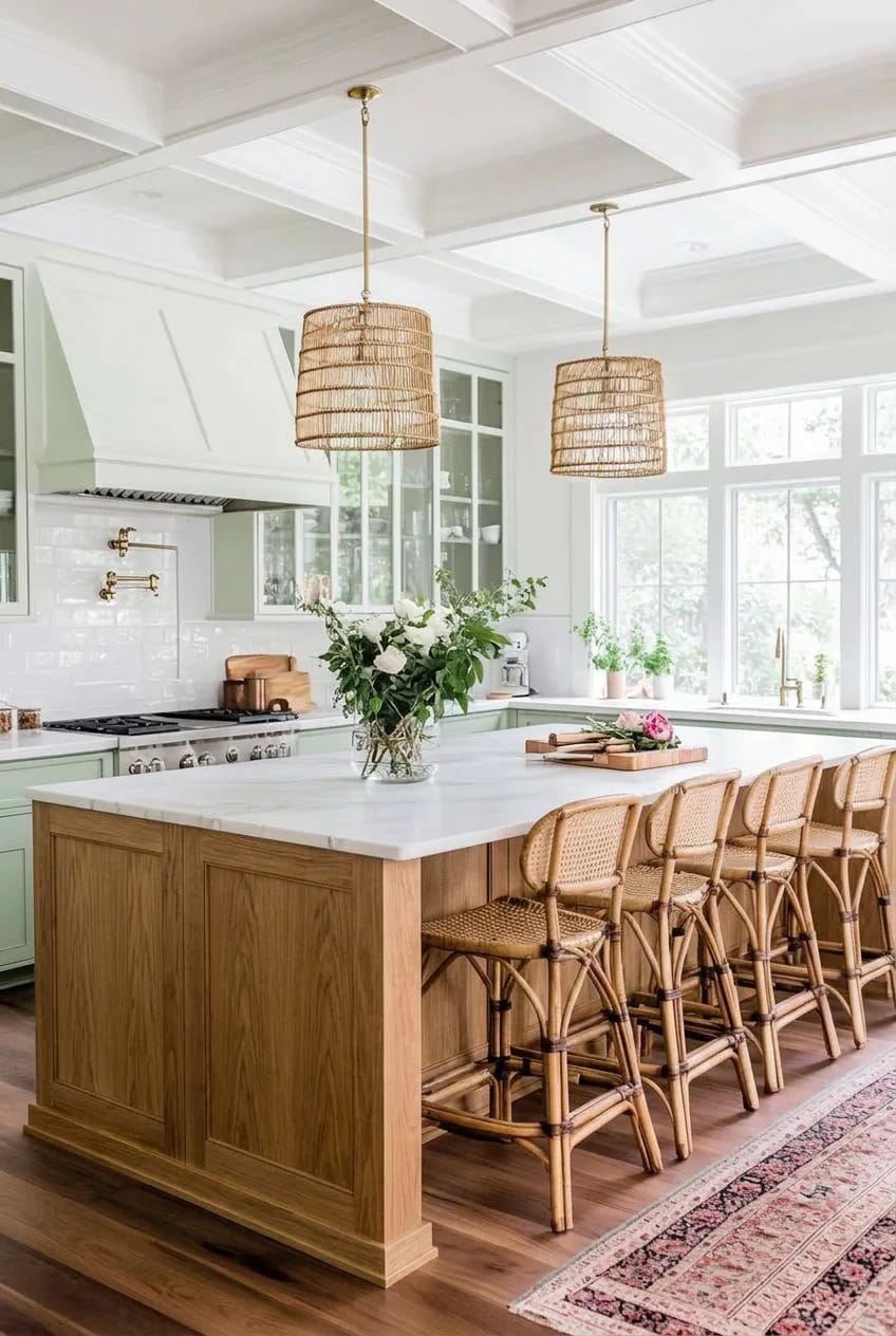
Make the island wood and the perimeter painted, not the other way around. A natural white oak island grounds a painted kitchen and gives the eye a warm, grained centerpiece that a second cabinet color cannot. Two paint colors can read as a trend; wood against paint reads as furniture, which is the whole idea.

Specify rift-and-quartersawn oak for the island if the budget allows, not plainsawn. Rift-and-quartersawn cuts give you the straight, quiet grain that stays calm over decades; plainsawn oak has the cathedral loops that dominated the 1990s and drag that association along with them. The difference is a real line item, and it is the one worth arguing for here.
6. Sage green is the one saturated cabinet color that doesn't date
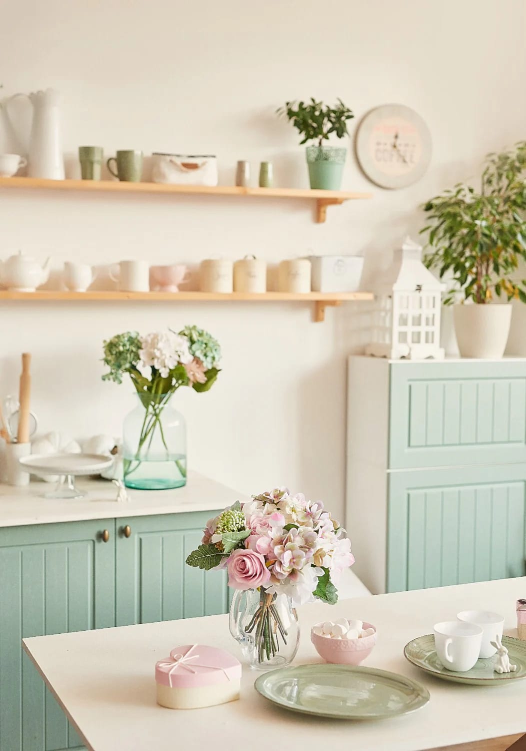
If you want color and you still want timeless, paint the cabinets a muted sage or olive green. Green is the color the eye reads as neutral because it is the color of the outdoors, which is why it survives trend cycles that kill teal and blush within five years. A greyed, earthy sage (nothing minty, nothing electric) has shown up in English and French kitchens for two hundred years and never looked wrong.
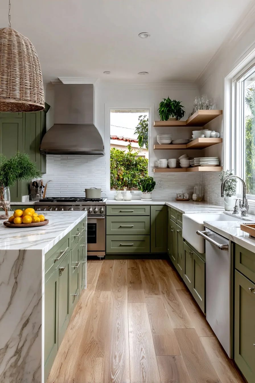
The one that reads Mexican or Mediterranean is a warmer, yellower green; the one that reads English country is greyer and cooler, closer to Farrow & Ball’s Card Room Green or Benjamin Moore’s Saybrook Sage. Pick your undertone deliberately, because they are not interchangeable, and pair sage with warm wood and brass rather than chrome so it lands as heritage instead of institutional. It also plays well in the wider modern farmhouse version of this look.
7. The apron-front fireclay sink earned its cliché
Yes, it is on every farmhouse mood board, and it is still the right call. The apron-front fireclay sink survived the farmhouse boom because the shape genuinely works: the exposed front means you lean into the basin instead of over a strip of counter, which spares your back over a decade of dishes. A cliché that earns its place through function is not really a cliché anymore.
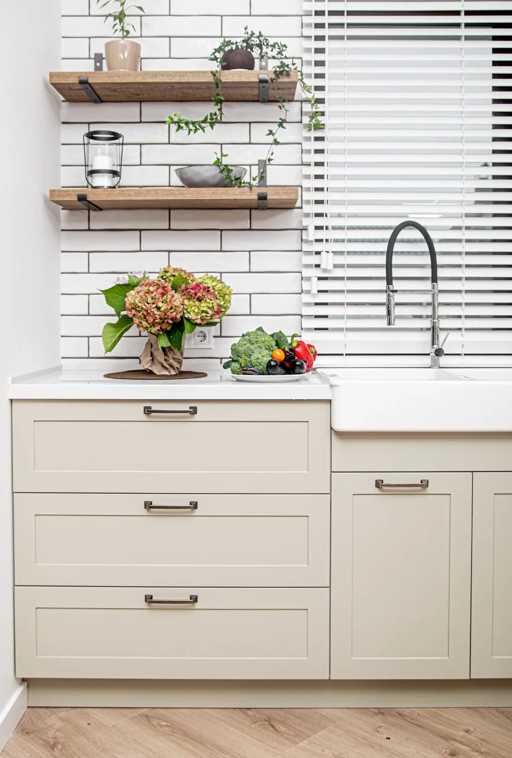
Choose fireclay over cast iron and a smooth apron over a fluted one if you want the quieter version. A 30 to 36 inch fireclay apron sink typically runs $600 to $1,200, and the smooth flat front dates less than the fluted apron that reads as a very specific 2021 to 2023 moment. Plan for the weight: these sinks need extra cabinet support, so it is a decision made with the cabinet maker, not after.

 20 Farmhouse Kitchen Island Designs to Inspire You Twenty islands sorted by the countertop and seating decisions behind them, not by how they photograph.
8. Warm wood plank floors instead of tile or luxury vinyl
Put a warm wood floor underfoot and the kitchen stops reading as a showroom. Tile is cold and grouty, and luxury vinyl is fine until the day it looks exactly like what it is, which arrives sooner than the sales sheet suggests. A real or engineered oak plank in a mid-warm tone is the floor that quietly makes everything above it look more expensive.

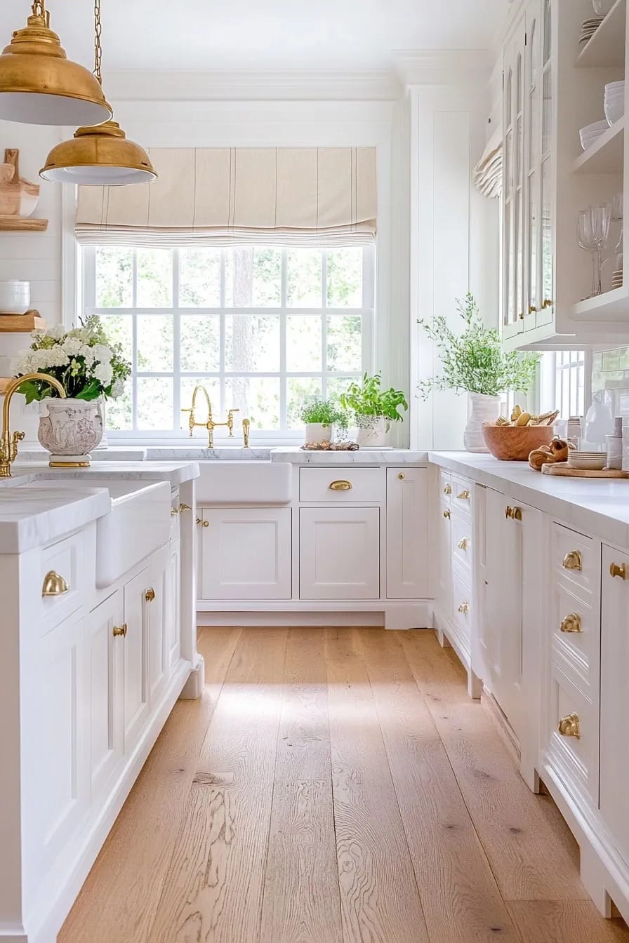

Avoid the two extremes that scream a decade: the orange-gold honey oak of the 90s and the grey-washed plank of the 2010s. Aim for a natural or lightly white-oiled oak in between, matte rather than glossy, so the grain reads without a sheen bouncing the ceiling lights back at you. This warm-wood-and-stone pairing is the backbone of the organic modern kitchens that lean hardest on natural material.
9. Inset shaker doors, if the budget can take them
Inset shaker doors are the most timeless cabinet build there is, and they cost real money, so this one is a genuine budget decision rather than a free tip. Inset means the door sits flush inside the face frame instead of on top of it, which is how furniture was made and why an inset kitchen reads as built rather than assembled. The precision that creates the look also drives the price: inset typically runs roughly 15 to 30 percent more than a comparable overlay build.
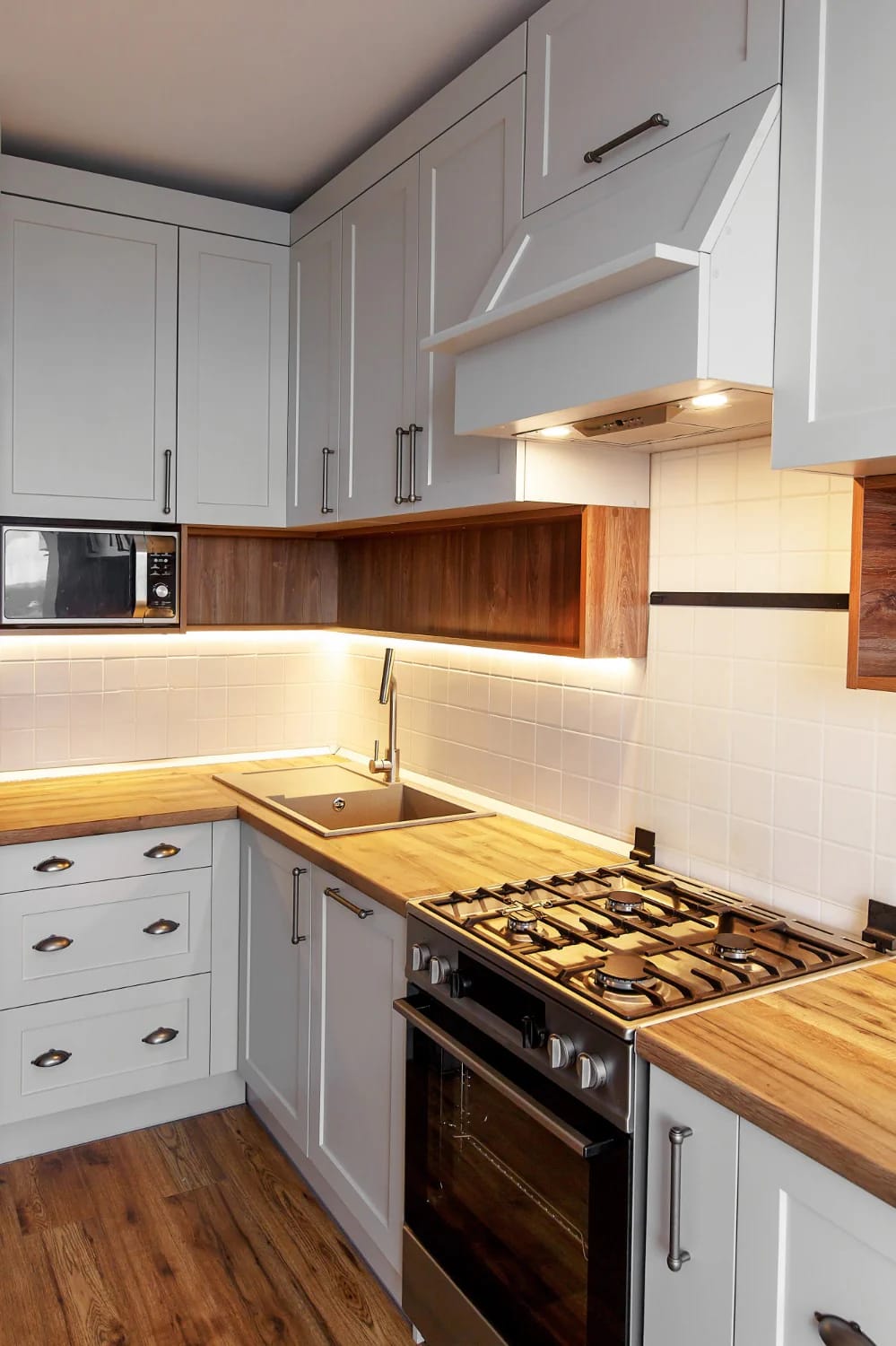
If the budget will not stretch, do not fake it with cheap inset; a well-built full-overlay Shaker in a good paint grade looks far better than a strained inset with sloppy reveals. And know the trade-off going in: inset relies on tight tolerances, so in a humid climate the doors can stick and need a hinge tweak a couple of times a year. That is the cost of the look, not a defect.
10. Layer the kitchen lighting instead of relying on can lights
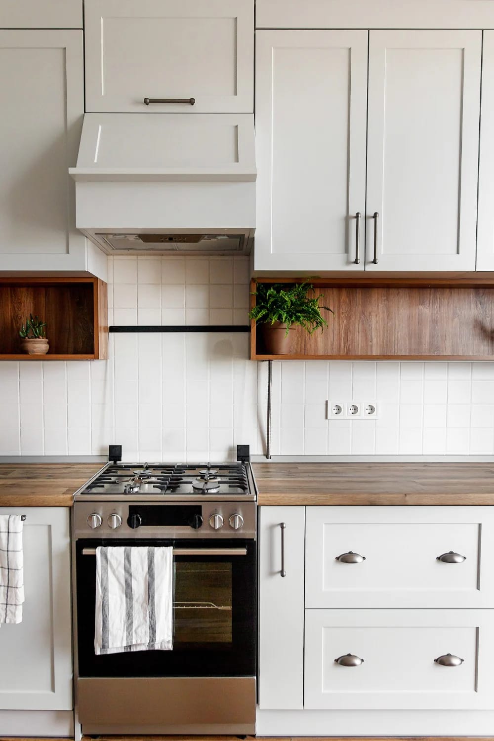
A grid of recessed can lights is the single most common thing that makes a nice kitchen feel flat and rental-grade. Timeless kitchens are lit in layers, so the eye has something to land on at three different heights instead of a wash of ceiling downlight. You need three things doing three jobs.
Pendants over the island
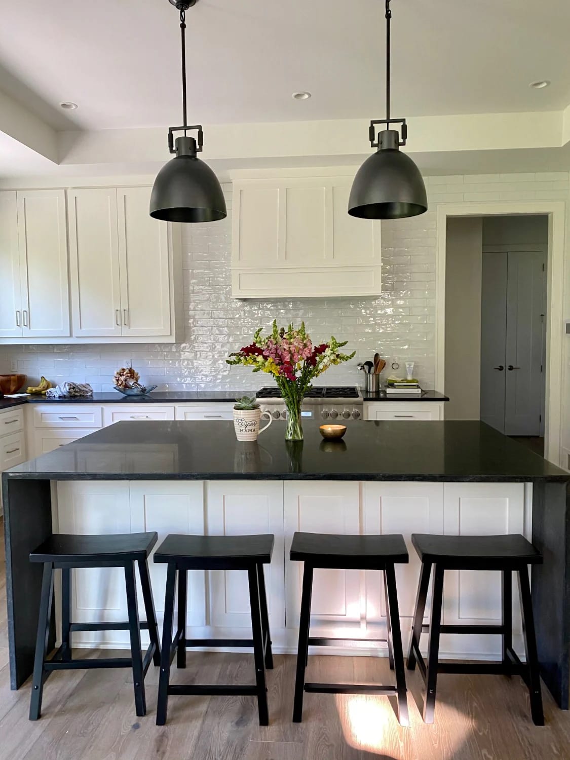
Two pendants or one long linear fixture, hung about 30 to 36 inches above the counter, do the decorative work and set the room's tone. Schoolhouse shades and simple metal domes date the least.

The undercabinet layer you actually cook by
This is the task light nobody photographs and everybody notices when it is missing. Warm LED strips tucked under the wall cabinets light the counter you chop on, kill the shadow your own body casts under a ceiling fixture, and read as quality rather than as a gadget. Put it on its own switch so you can run just this layer late at night.
Picture lights and a dimmer over everything
A small picture light over open shelving or a slim sconce beside the range adds the third layer, the low, warm glow that makes a kitchen feel like a room after dinner rather than a workspace. Put the whole scheme on dimmers. A kitchen that can drop to a soft evening level is doing more for the timeless feeling than any single fixture choice.
11. A plaster range hood instead of a stainless box
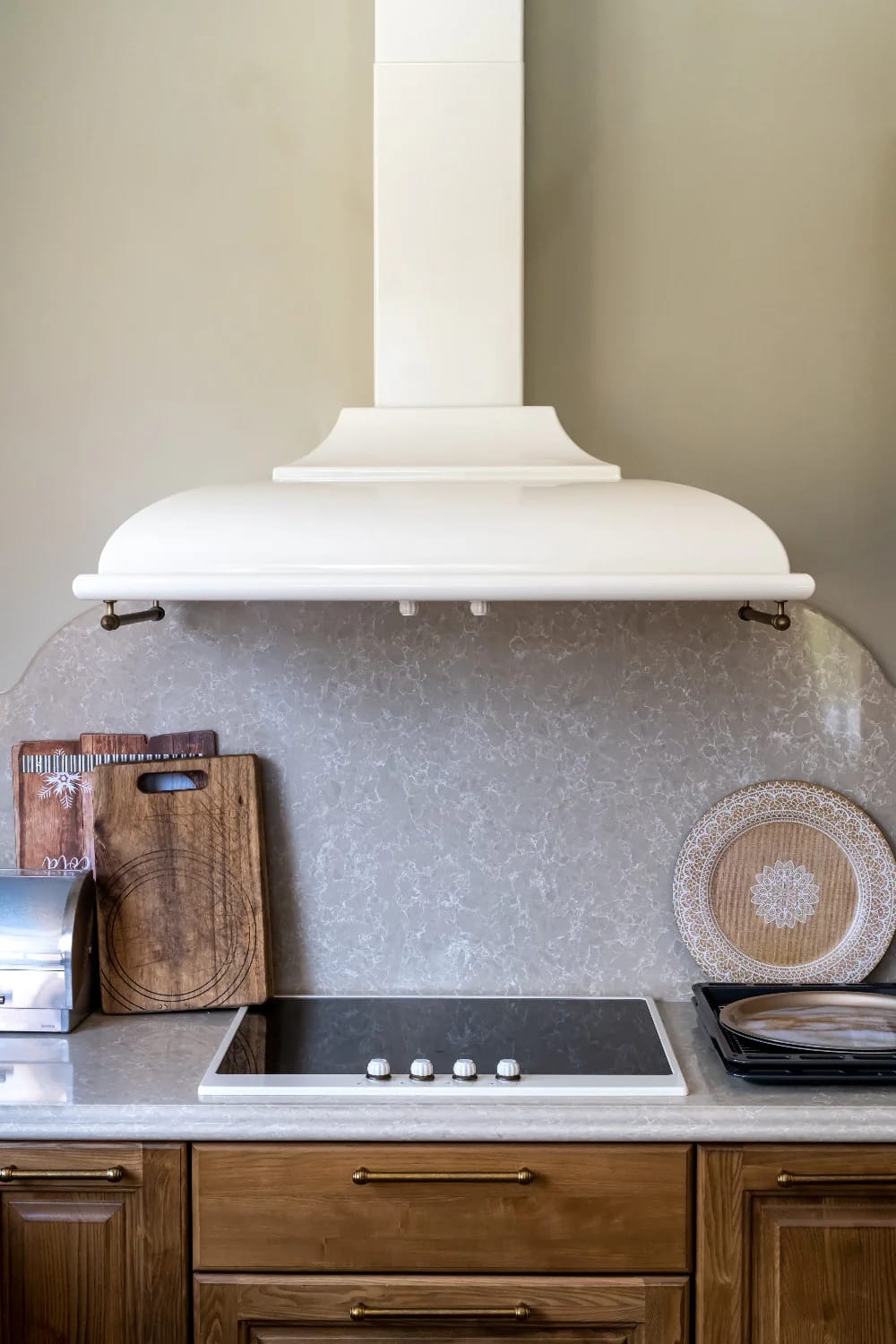
Swap the stainless chimney hood for a plaster or limewash one and the whole wall softens. The big steel box was the default for twenty years, which is exactly why it now reads as the default; a tapered plaster hood built into the wall becomes architecture instead of an appliance. It is the move that makes the range wall look designed rather than equipped.
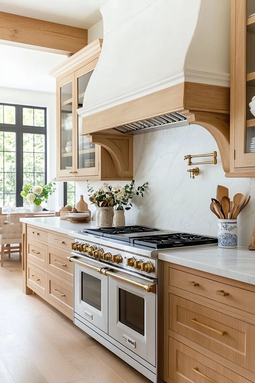
Two practical notes before you fall for the photos. The plaster is a cladding over a real insert, so you still buy a proper vented liner underneath with the CFM your range needs, and skimping there gives you a beautiful hood that does not actually clear smoke. And plaster picks up grease over a gas burner, so a limewash or a wipeable mineral finish beats raw plaster right above the cooktop.

12. Deep navy on the island only, not the whole kitchen
Navy is the safe way to use a dark, dramatic color in a kitchen, provided you keep it to the island. A whole kitchen in deep blue-black is a strong statement that a future buyer, or future you, may tire of; the same navy on the island alone reads as a considered accent against pale perimeter cabinets and stays out of trend-fatigue territory. It anchors the room without committing the whole thing.

Reach for an inky, slightly greyed navy such as Hague Blue or Naval rather than a clean primary blue, which skews nautical fast. Pair it with unlacquered brass and a warm white marble or quartzite top so the dark base reads as depth, not as a color choice you will explain to guests. If you find you want more blue than the island, there is a whole range of blues that hold up on full cabinetry worth seeing first.
13. Reeded and fluted details, used with a very light hand
Fluting is the most photographed kitchen detail right now, which is exactly why you should use almost none of it. A single fluted island base or one reeded glass cabinet front adds craft and texture; fluting on the island, the hood, the bar front, and the pantry doors all at once is how you laminate a 2024 date stamp onto a kitchen you meant to keep for twenty years. The material is old, but the saturation is very of-the-moment.
Fluting everywhere is this cycle’s version of the all-subway-tile kitchen of 2015: correct at the time, unmistakably tagged to it later. Keep reeding to one surface, and keep it in a finish and material that could plausibly have existed decades ago (fluted wood, reeded glass) rather than the trendier fluted plaster or resin, which have no history to fall back on when the moment passes.

The broader test works for any detail you are unsure about: if you can name the exact year a feature belongs to, use it once or skip it, and check which current kitchen looks are already starting to date before you commit budget to any of them.
The order to actually make these decisions in
Do them in order of permanence, not excitement. Cabinet layout, the wood floor, and the stone are the expensive, disruptive choices that everything else hangs on, so settle those first and settle them conservatively: honed stone or quartzite, a warm oak plank, inset or a well-built overlay Shaker in a greige you sampled properly. Colour on the island, the plaster hood, the lighting layers, and the brass are the parts you can push further, because they are also the parts you can change later without gutting the room.
Where I would still hesitate is the sage and the navy. They are the two ideas here most likely to feel dated in fifteen years even done well, because saturated cabinet colour, however heritage the shade, carries more of the moment than a neutral does. If you want the near-certain version, put the colour on the island only and keep the perimeter neutral, and save the braver call for the walls or the runner, where changing your mind costs a weekend instead of a contractor.
Related Posts
- 45 Timeless Kitchen Design Ideas for Everlasting Style
- Modern Kitchen Ideas That Age Well (and the One Already Dating)
- 39 Cutting-Edge Modern Kitchen Design Ideas: Contemporary Style
- 15 Unique Mid Century Modern Kitchen Ideas
- 15 Organic Modern Kitchen Inspiration You’ll Love
- 21 Inspiring Kitchen Cabinet Ideas: From Modern to Classic Designs