
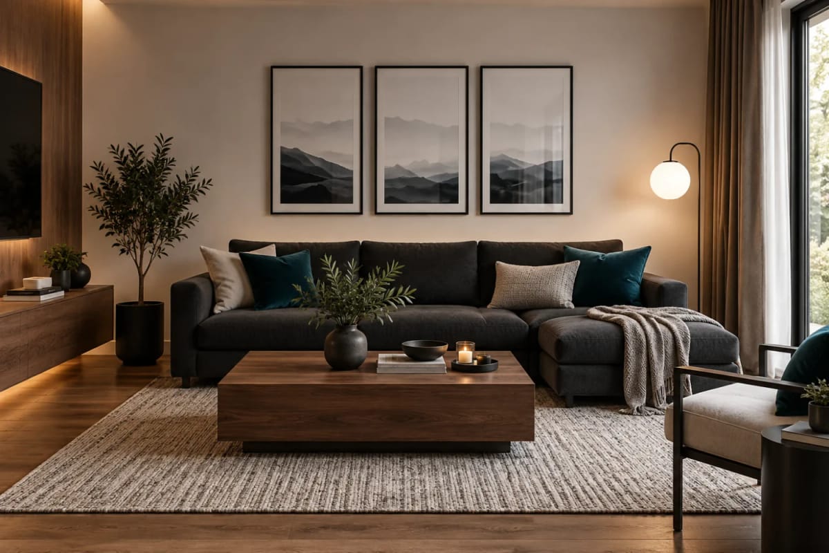
Eight colors, one of them loud, and a rule about how much of it you are allowed to use. That is the system here: a creamy off-white on the walls of every room but one, walnut and oak doing the heavy lifting, and a deep teal that shows up only in pieces small enough to count. Here is the palette, then where each color lands.
The eight colors
LRV is the share of light a color throws back, where white sits near 100, so Plaster Cloud at 71 keeps a small apartment bright and the teal at 2 reads almost black until light hits it. The split is simple: Plaster Cloud and Toasted Sand are wall colors, Stone Gray is the rugs and upholstery, Mushroom Taupe is the deeper wall and the drapes, Aged Oak is the floor, Walnut Bark is the furniture wood, Soft Black is the metal, and Deep Teal is the one accent.
Room by room
Bedroom: teal at the bed
One free sign-up opens every recipe in this guide. Subscribers also get the paint sheet: the closest Benjamin Moore, Sherwin-Williams and Behr near matches to all eight of these palette colors, the surfaces each one suits, and the two codes nearest the hero wall.
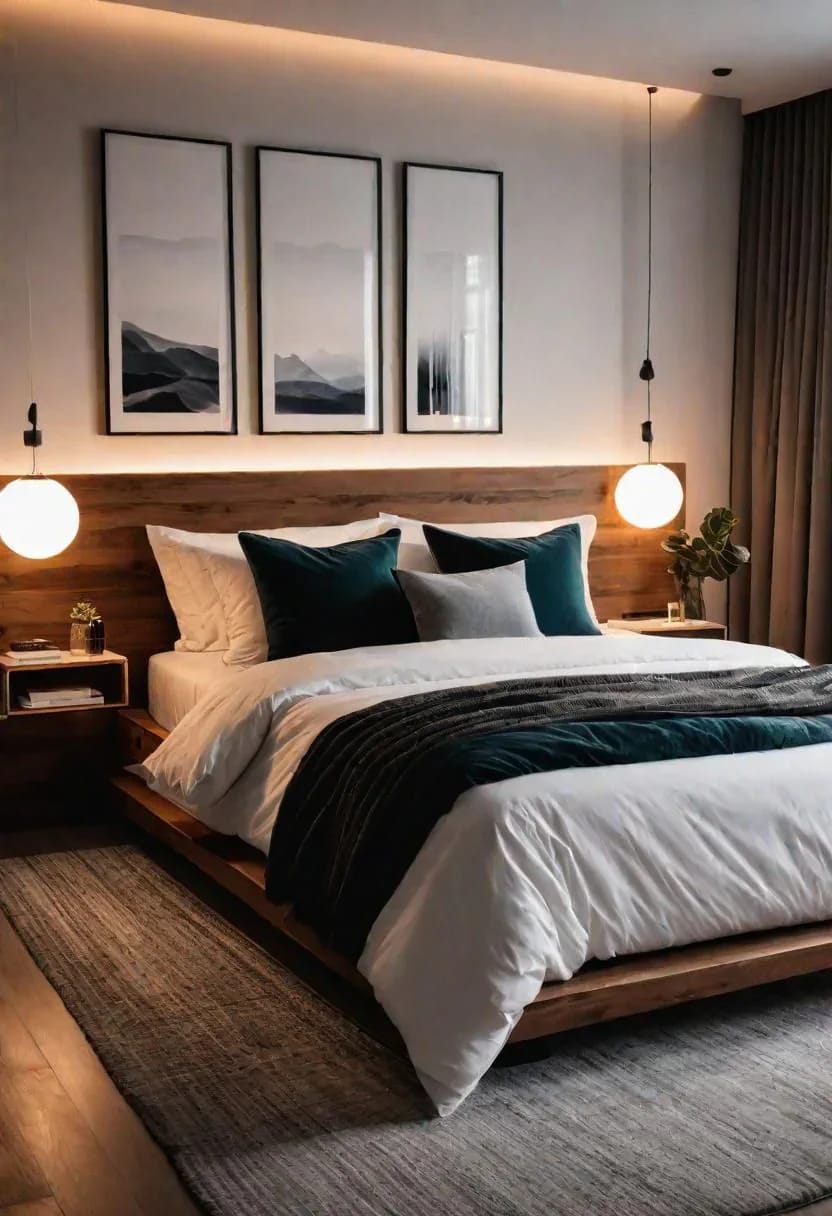
Granted, the teal does very little here, and that is what makes it work: it shows up in the cushions and stops. The weight comes from the walnut instead, in a wide headboard and a low frame cut to the same depth. No teal goes on the wall above the bed, so the walls stay entirely Plaster Cloud.
Two pieces here need no painter: teal velvet cushion covers by MIULEE in an 18 inch square, and a black globe pendant light with a milky glass shade on an adjustable rod.
Bedrooms make a dark accent hardest to get right, and these bedroom schemes keep it in one place, which is the trade this room is making.
Subscribers get the bedroom's own recipe: which of the eight colors goes on the walls, the ceiling and the trim, the sheen that keeps the off-white from going chalky, and where the teal has to stop at night.
Living room, three walnut pieces
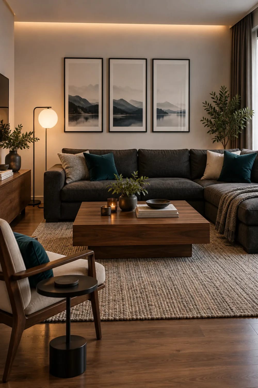
The living room is where the palette stretches out. The sectional is the charcoal, the throw is gray, and the teal turns up twice on the cushions and gets out of the way. Walnut appears three times at the same depth: coffee table, sideboard, armchair frame. Cream walls, a beige rug and a mid-brown floor leave the room one place to go dark, and that is the furniture.
The throw is the only textured thing in the room, so it carries the softness: a gray wool-blend throw with knotted fringe in a 60 by 51 inch size is close to it. For the cushions, velvet cushion covers by DEZENE give the same deep, matte tone.
Moody neutral living rooms live or die on this balance, and the ones that work keep the dark in the largest object, not on the walls.
Subscribers get the living room's recipe: the three surfaces that carry the palette at eye level, the sheen that survives a sofa, and how to repeat the teal twice without making it a theme.
Kitchen: keep the wood, keep the teal in fabric
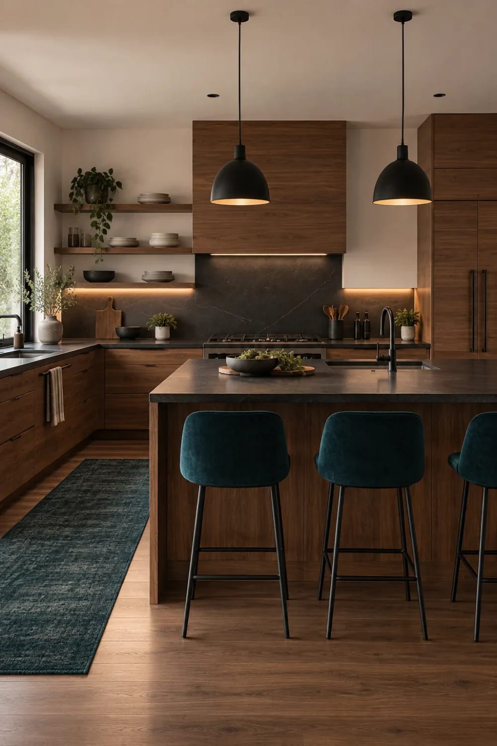
The kitchen carries more color than any other room here and still reads quiet, because every strong surface is a material rather than a paint. The cabinetry and island are Aged Oak, the counter and backsplash a charcoal stone, the black is metal, and the teal is fabric on the runner and the stool seats. The mistake to avoid is painting the cabinetry to match a trend: wood this warm is why the off-white walls do not look cold.
Two pieces from the image are easy to source: a teal low-pile runner rug, at 2 by 6 feet for the strip of floor between the cabinets, and a matte black pull-down faucet, where Delta’s single-handle pull-down in matte black beats the no-name versions.
Neutral kitchens that avoid the builder look get their warmth from the wood, not the wall.
Subscribers get the kitchen recipe: which surfaces stay as wood, which sheen the walls need behind a cooktop, and the one place the teal should not go back.
Bathroom, the warm one
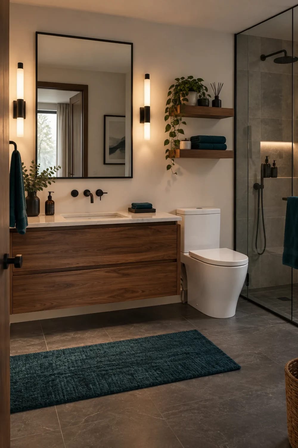
The bathroom is the one room that breaks the wall color. Warm beige walls over a dark gray stone floor give it a softer edge, and the walnut vanity ties it back to the bedroom. The black is heavier here, so the teal works as fabric: towels and the mat. Small rooms do not have to stay pale to feel bigger, and a dark floor under a warm wall makes this one feel finished rather than cramped.
A matte black rainfall shower system with a handheld sprayer copies the fixture from the image, and a Turkish cotton towel set in teal puts the accent where the image puts it.
Before you talk yourself out of the dark floor, this is where a dark color belongs in a small bathroom.
For subscribers, the bathroom recipe names the wall color, the sheen that survives steam, and the one surface to keep a shade darker so the tile does not wash the walls out.
Sheen, and where it shows
Granted, sheen is invisible in a swatch and obvious on a wall. Make flat matte the default for the walls and ceilings, because Plaster Cloud in a higher sheen picks up a shine that turns it faintly yellow after dark. Then step up only where a room needs it: satin on trim and doors so they wipe, satin on the bathroom walls for the steam, a washable matte on the kitchen walls behind the cooktop, and eggshell in the living room, because it is the room that gets touched and the small lift in sheen is worth the trade. Keep the teal in matte wherever it is painted at all; deep teal in gloss shows every roller mark.
Building the same palette in your own rooms
Start with the floor and the biggest piece of furniture, then pick the wall color last. The ratio that holds this look together is roughly seven parts light, two parts wood and one part near-black, with the teal sitting outside the count. If your rooms are smaller, spend the light on walls and ceiling and take the wood darker rather than lighter, because a dark floor needs a pale room around it to read as furniture. If the floor is gray-toned oak rather than warm, go a step warmer on the walls so the palette does not tip cool, and if you cannot change the floor at all, keep the rug and the bedding pale and let the wood be the only dark thing in the room.
Work the quantity out per surface, not per room. A 12 by 14 foot room with 8 foot ceilings has about 416 square feet of wall and another 168 of ceiling. Manufacturers rate a gallon at roughly 350 to 400 square feet per coat, and the low end is the honest one for a strong color, so those two surfaces take about four gallons for two coats before you add trim. Buy it all in one order, because cream is the color that shows a batch mismatch, and where the warmth in a warm room actually comes from is worth reading first: a warm palette dies quietly when the light after dark is cool.
Where this palette goes wrong
Three failures do most of the damage. The teal stops being an accent the moment it covers a wall, and three separate teal pieces in one room is one too many (a set of cushions or towels counts as one). Painting the wood comes second: the walnut is the dark in this scheme, and once it is cream you have a pale room with nothing holding it down. The third is blaming the color for the light: if your cream goes sour at night, the bulbs are the problem, and warm white bulbs at 2700K to 3000K fix more wrong paint than a repaint does.
Before you commit to a gallon
Sample first, and sample twice. Everything here was matched from images, and images flatten the thing that changes a color most: your light, your floor and the hour of the day. Put peel-and-stick samples of the wall color and the teal on two walls in the room you are painting, and look at them in the morning and again under the lamps at night.
Related Posts
- 15 Trendy Moody Neutral Living Room Designs to Inspire
- 25 Stunning Mid-Century Modern Living Room Color Palette to Elevate Your Home
- Neutral Kitchen Ideas That Read Warm, Not Builder-Grade
- Warm Minimalist Kitchen Ideas: Where the Warmth Actually Comes From
- 12 Enchanting Mid-Century Modern Bedroom Color Palettes for Dreamy Interiors
- 10 Off-White Kitchen Ideas That Stay Warm Without Going Yellow