
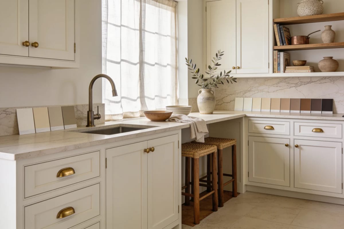
Off-white is the safest cabinet colour in America and the easiest one to get wrong. The gap between a kitchen that reads warm and one that reads grubby usually comes down to three decisions: which off-white, what sits next to it, and what light hits it after dark. Everything below is one of those decisions, from the light reflectance numbers on the back of the fan deck to whether your oak grain will telegraph through the paint.
1. Pick the off-white by its LRV, not by the chip
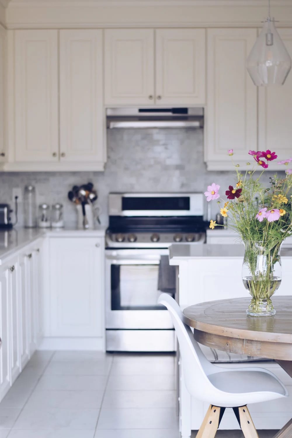
Ask for the light reflectance value before you ask what the colour is called. Benjamin Moore White Dove OC-17 sits at 83.16, Sherwin-Williams Alabaster SW 7008 at 82.2, and Benjamin Moore Swiss Coffee OC-45 at 81.91, all three published by the manufacturers themselves. What those numbers actually tell you is that the three most-specified off-whites in American kitchens land within a point and a quarter of each other. Brightness is not what separates them.
Which is why cross-shopping them on lightness wastes a week. Anything in the low 80s reads as a soft white in a kitchen with one window and holds its shape in a kitchen with three; drop below about 78 and you are into cream proper, which is a fine colour and a different one, and it needs south light or a lot of lamps to stay out of trouble. (The chip is printed on a bright white card and viewed under store fluorescents, which is the single lighting condition your kitchen will never have. Nobody chooses paint well at the paint counter.)
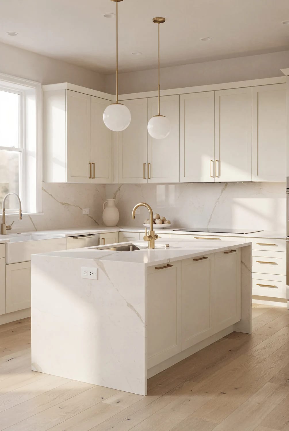
Undertone does all the work here. White Dove carries a grey base under the warmth, so it stays put and does not slide yellow. Alabaster is the creamier of the two and reads slightly beige against a bright white trim. Swiss Coffee is creamier still and has a faint green in its base, which is why it turns up cooler than people expect on a north-facing run of doors.
2. Let the floor undertone choose the off-white, not the countertop
The floor picks the colour. It is the largest uninterrupted surface in the room after the cabinets themselves, and every bit of daylight reaching a cabinet door has bounced off it first, arriving tinted. People sample paint against a granite offcut on the counter and then wonder why the doors look different once the boxes are hung.
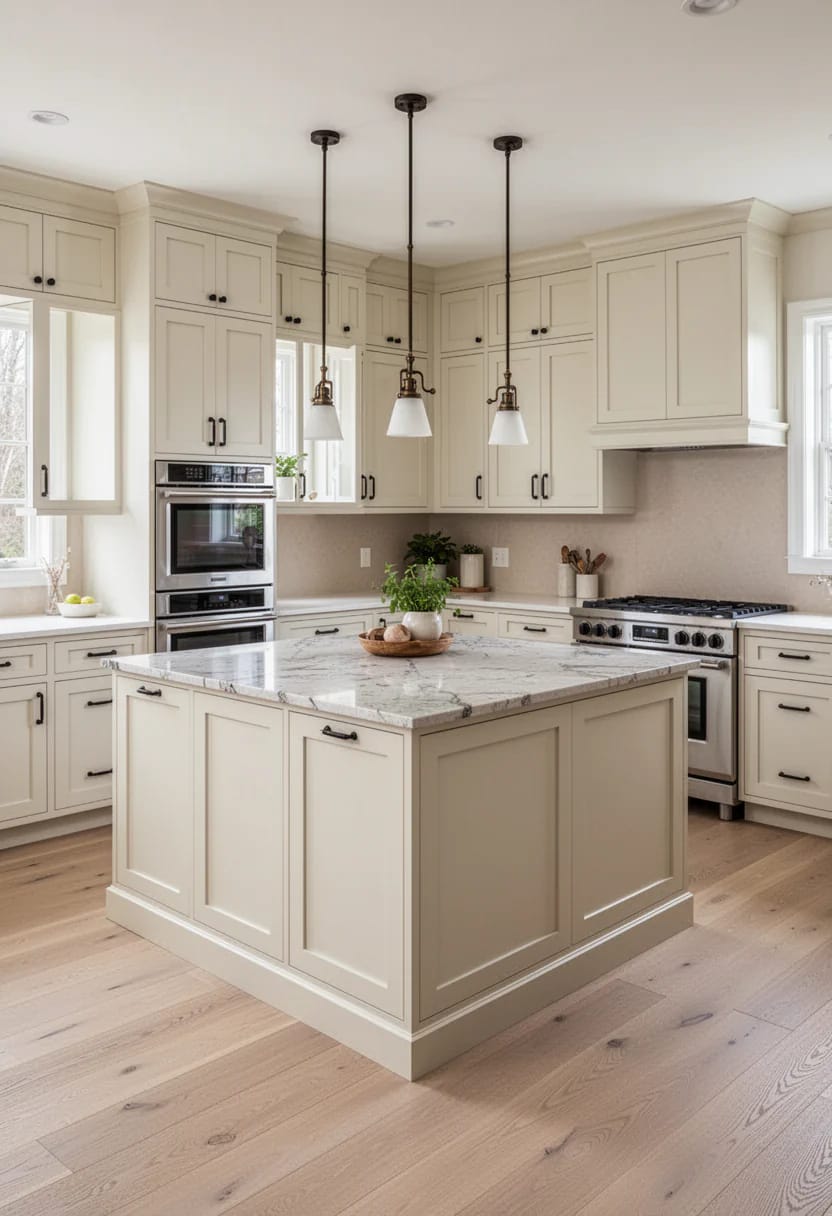
If the floor is red oak, hickory, or anything with orange in it
Go greyer than instinct says. A creamy off-white over a red-oak floor picks up the bounce and lands somewhere near peach, which is the effect people describe as “it went yellow” when the paint did nothing of the kind. White Dove’s grey base absorbs that bounce. The same logic runs through the undertone test applied to beige cabinets, where the margin for error is smaller still.
If the floor is grey-washed oak, porcelain, or LVP
Now you have the opposite problem. Cool bounce strips the warmth out of an off-white and leaves it looking like a dirty white rather than a soft one; here the creamier colours earn their place, and Alabaster or Swiss Coffee will hold their character against a floor that is actively working against them.
3. Plaster the range hood in the same off-white as the cabinets
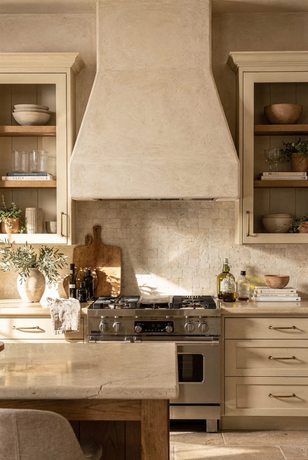
A plastered or painted hood surround in the cabinet colour is the cheapest thing on this list that makes a kitchen look built rather than assembled. A drywall box, a skim coat, and the same paint reads as one continuous mass from counter to ceiling; a stainless chimney hood is the most expensive available way to interrupt a wall you just paid to have finished.
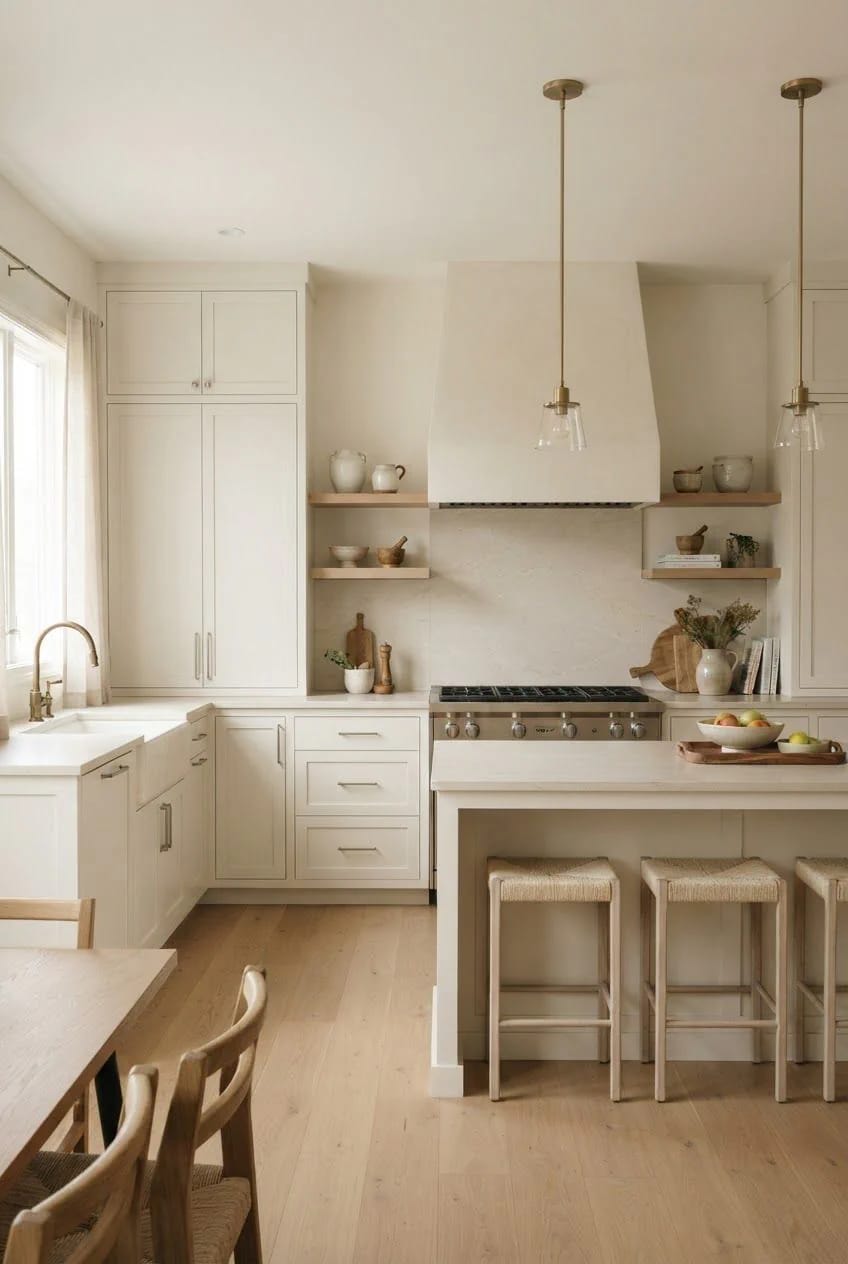
Where this goes wrong is the gap. If your uppers stop short of the ceiling and the hood runs all the way up, the eye reads two different construction decisions on one wall, which is worth resolving before you commit, and it is the same problem people are solving when they ask what to do with the space above the cabinets.
4. Warm veined stone beats bright white quartz on an off-white counter
Put pure white engineered quartz next to off-white cabinets and the cabinets look dirty. The quartz is whiter and brighter than any paint you can buy, so it becomes the reference point in the room and everything softer than it reads as a compromise. This is comparison, not colour, and no amount of repainting fixes it.
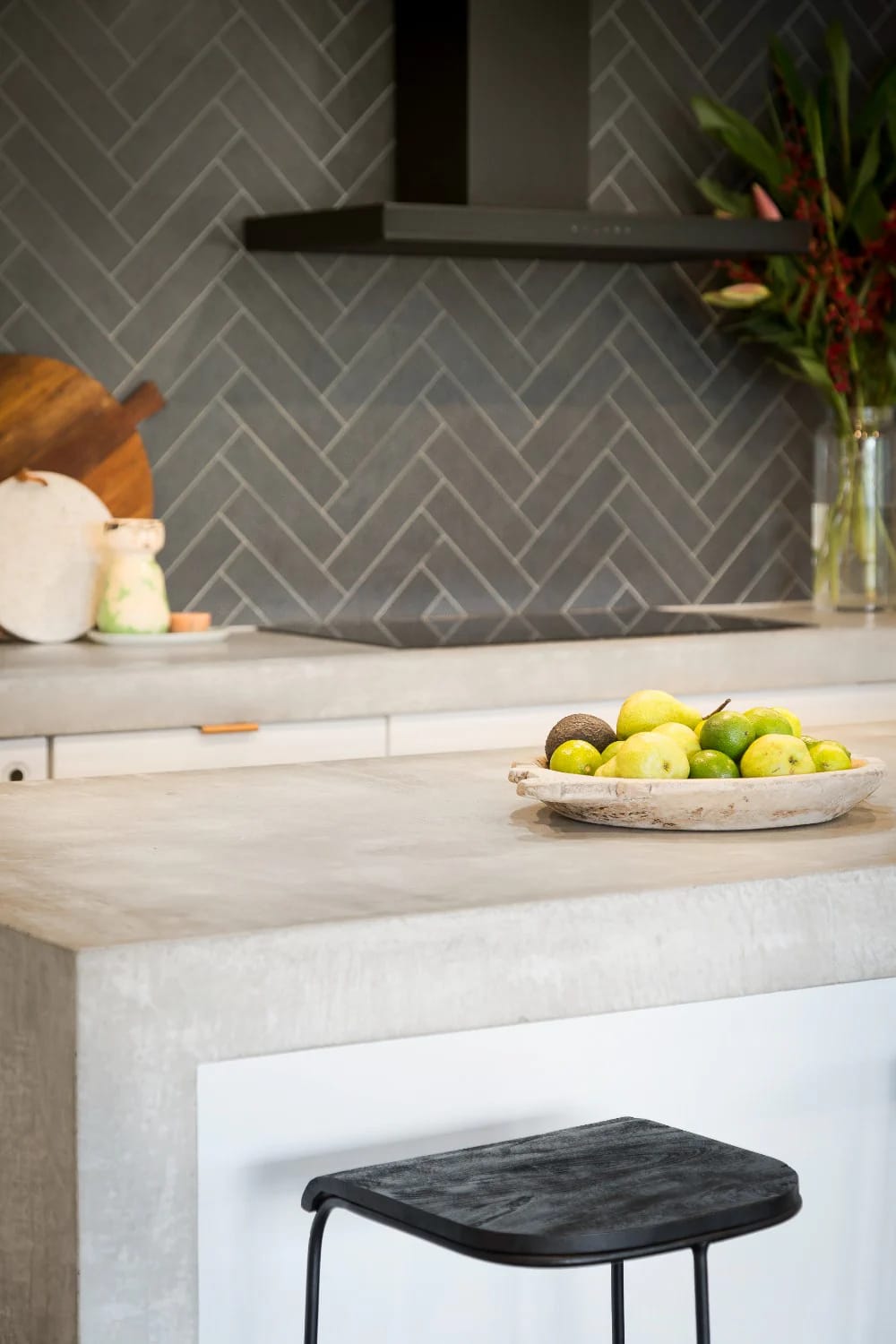
Quartzite in the Taj Mahal and Perla Venata family works because the background is creamy and the veining is soft gold and beige rather than grey.
Honed marble works for the same reason, with the etching caveat everyone already knows about. If you want engineered stone for the maintenance, buy a warm-white slab and look at it outdoors before signing; the Calacatta-look quartz with cool grey veining is the one that fights cream hardest, and it is also the one every showroom leads with.
5. Two-tone: put the second colour on the base cabinets, not the uppers
Bases carry colour, uppers carry light
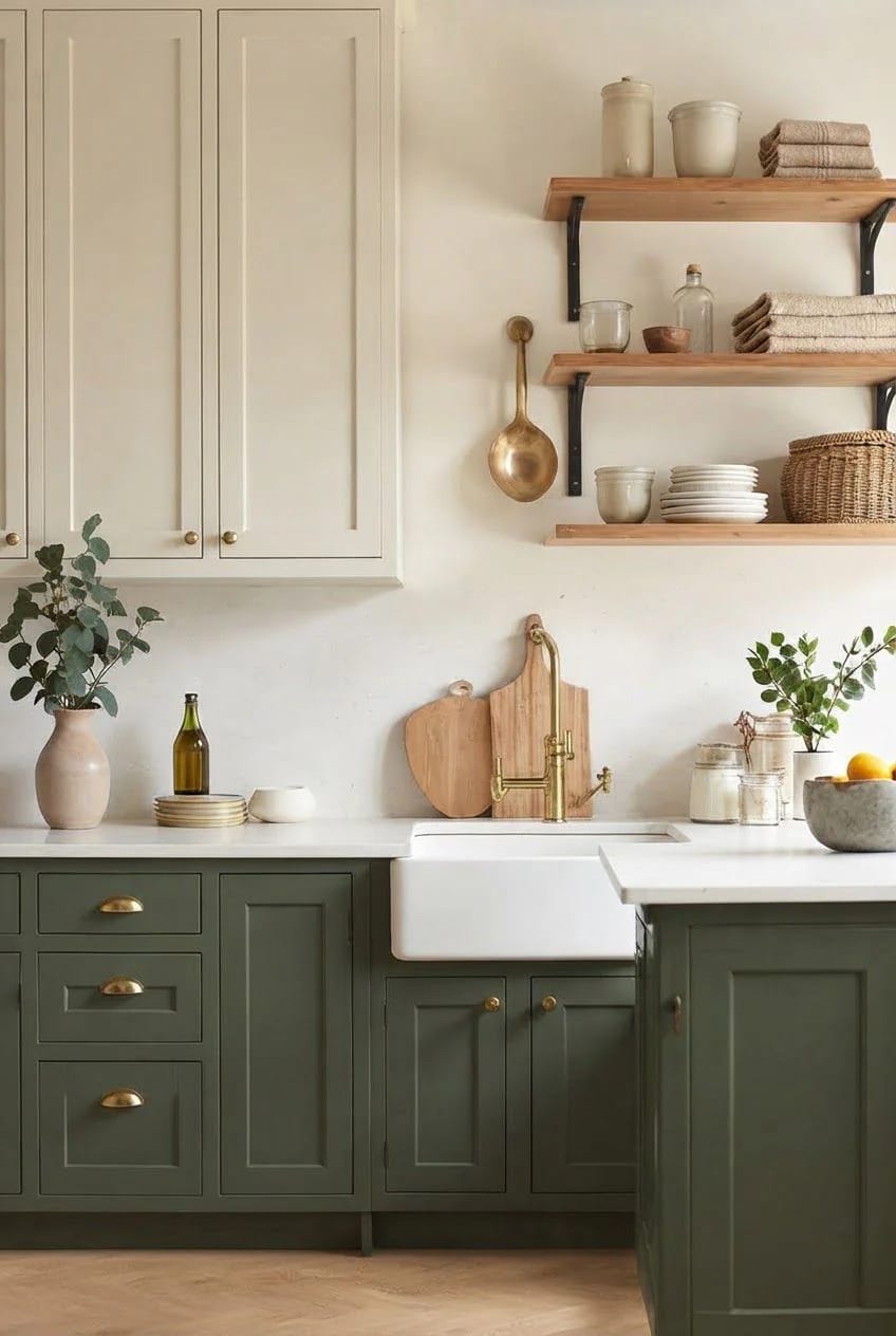
Wood or a deeper colour belongs below the counter. Uppers sit in the darkest band of the room, above eye level and away from the window, so anything you put up there loses light rather than adding interest; bases are at knee height where daylight actually lands, and they take the hit from mopping and dog paws besides.
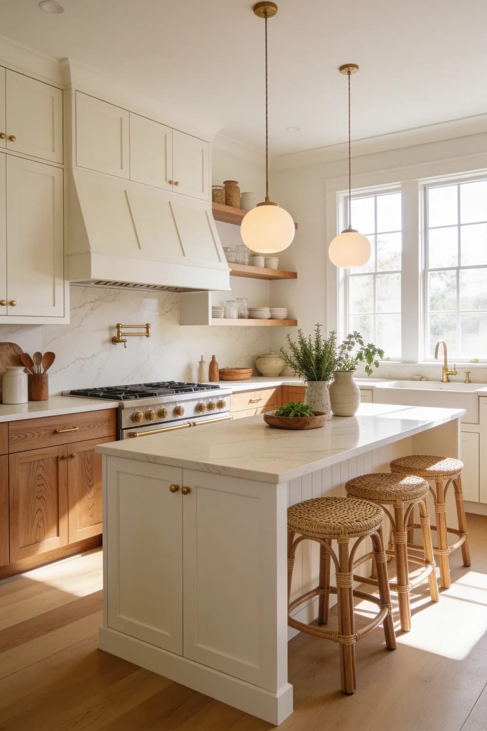
Stain the wood half, do not paint it
If the second tone is wood, let it be wood. A stained white oak base under an off-white upper gives you two materials, which is a different and better proposition than two paint colours pretending to be materials. Granted, this only works if the oak is rift-sawn or quarter-sawn; flat-sawn oak with cathedral grain next to cream cabinetry reads builder-grade no matter what you spend on the stain.
 Neutral Kitchen Ideas That Read Warm, Not Builder-Grade Why the 2016 grey palette swung to oak, cream and brass, and how to place each one.
6. Give the backsplash a second off-white with texture, not a second colour
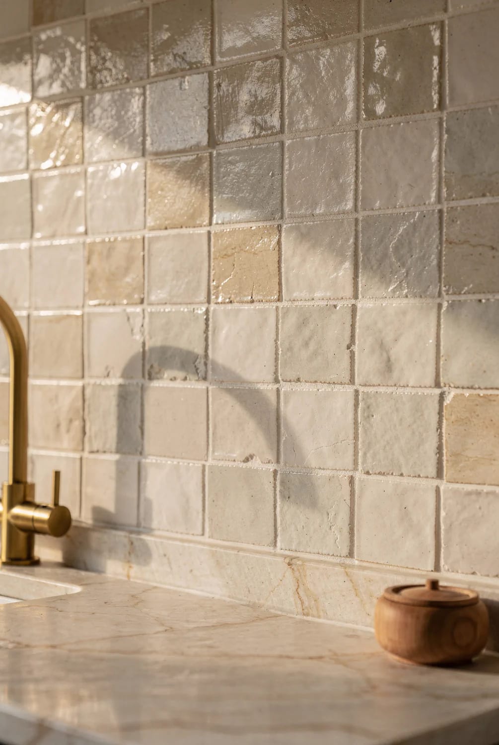
The backsplash should differ from the cabinets in surface, not in hue. Zellige, hand-glazed subway, or a limestone slab in a neighbouring ivory gives the wall movement without introducing a second decision the room has to justify; a contrasting colour up there turns the cabinets into a background, which is not what you bought them for.
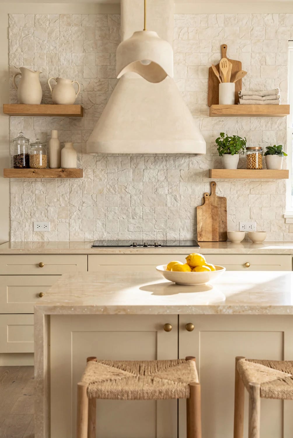
Grout choice does most of the damage or most of the good. Match it to the tile within a shade and the wall reads as one surface; go two shades lighter and you have drawn a white grid over your warm kitchen. There are more contrast-driven approaches worth seeing in the backsplash options that work over white cabinetry, several of which apply directly here.
Standard bright white grout under a cream or ivory tile makes the tile look dirty within a week, and it is the most common regret in off-white kitchens after the paint itself. Ask for an alabaster, bone, or oyster grout and hold the sample stick against the actual tile in your own light before the tiler opens a bag.
7. Run 2700K bulbs at CRI 90, or the off-white kitchen goes grey at night
Buy the bulbs before you buy the paint. An off-white kitchen is a colour that exists only in the light you give it, and 4000K downlights, which is what most builders and most big-box multipacks default to, drain the warmth straight out of cream and leave it looking like unwashed white.
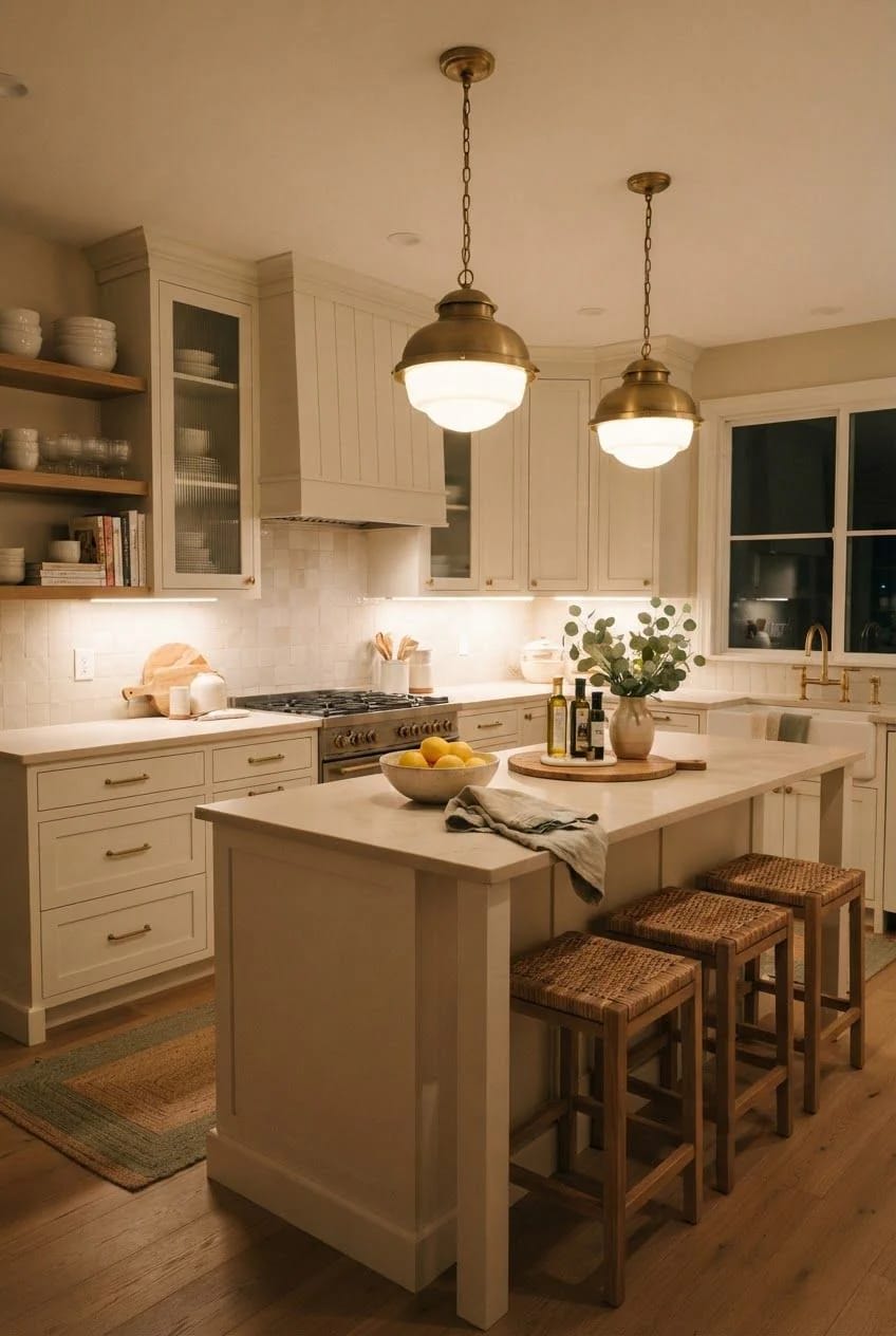
Colour temperature: 2700K throughout, including the recessed cans. Mixing 2700K under the cabinets with 3500K overhead produces two different cabinet colours on one wall.
Colour rendering: CRI 90 or better, with R9 above 50 where the manufacturer publishes it. R9 is the deep red value, and it is what makes warm neutrals look like colours rather than like paper.
Output: roughly 200 to 300 lumens per linear foot of counter, dimmable.
Position: at the front edge of the cabinet bottom, not the back, so the light falls on the counter instead of the backsplash.
A hardwired bar such as this dimmable 2700K under-cabinet light with CRI above 90 hits all four of those without a colour-changing gimmick, and the same failure mode is worked through at more length in why pale kitchens go cold after dark.
8. Use unlacquered brass hardware and let it go dull
Unlacquered brass is the one hardware finish that improves as the kitchen ages. Polished lacquered brass is a coating over metal, and when the coating wears through in the four spots your hands actually touch, it looks like damage; unlacquered brass has no coating to fail, so the same wear reads as use.
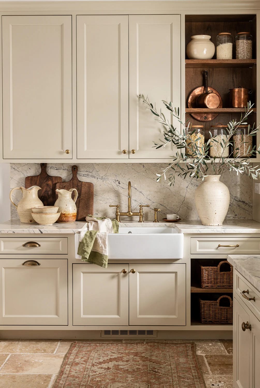
Solid brass with no coating at all, so the patina develops evenly instead of flaking off in patches the way plated hardware does.
Unlacquered solid brass wire drawer pulls, 5 inch centresOne warning about mixing. Unlacquered brass darkens on its own schedule, so within a year your pulls will no longer match a lacquered brass faucet bought at the same time, and the two will read as a mistake rather than a mix. The undertone arithmetic behind that is worked out in detail for unlacquered brass against a coloured cabinet, and it applies just as much to cream.
9. Painting existing oak cabinets off-white: the grain decides everything
Fill the grain, or commit to seeing it
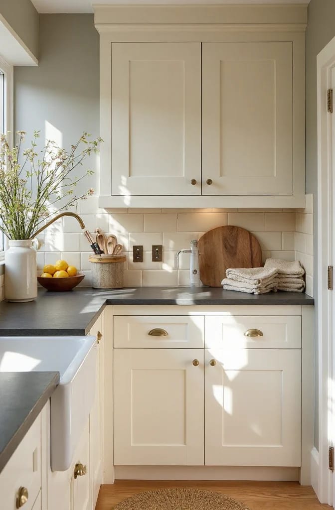
Decide about the grain before you buy a single brush. Oak has open pores that stay visible through two coats of paint, and cream shows them more than white does because the colour is closer to the shadow in the pore. There are two honest positions: fill it and get a sprayed, furniture-like surface, or leave it and accept that your kitchen will read as painted oak, which is a legitimate look and one people pay for in England.
Filling means a product like Aqua Coat water-based white cabinet grain filler, worked across the grain with a plastic spreader, scraped back, sanded at 320 grit, and usually repeated. It is two extra days across a full kitchen and it is the entire difference between the two outcomes above. Skipping it and then being disappointed is the common path.
Sheen is the decision nobody makes on purpose
Satin. Matte on a cabinet door looks correct for about six weeks and then holds every finger mark at the pull and every splash beside the sink, because there is no film to wipe; semi-gloss on cream goes plasticky and shows every ripple in a door that was never dead flat to begin with.
Do this
- Degrease every door with a TSP substitute before sanding, since kitchen grease sits in the grain and no primer bonds through it
- Use a bonding or shellac primer over oak. Tannin bleed through cream shows as brown haloes and it will not cover with more topcoat
- Two thin coats, sprayed or rolled with a microfibre mini-roller, laid off with a brush only in the profiles
- Give it two to three weeks to cure before the doors take real use, even though they are dry to the touch in hours
Avoid
- Wall paint. It is not made for horizontal wear and it will print against the frame
- Rehanging doors the same afternoon
- Matte sheen below counter height
10. Match the appliances to the cabinet colour, not to the hardware
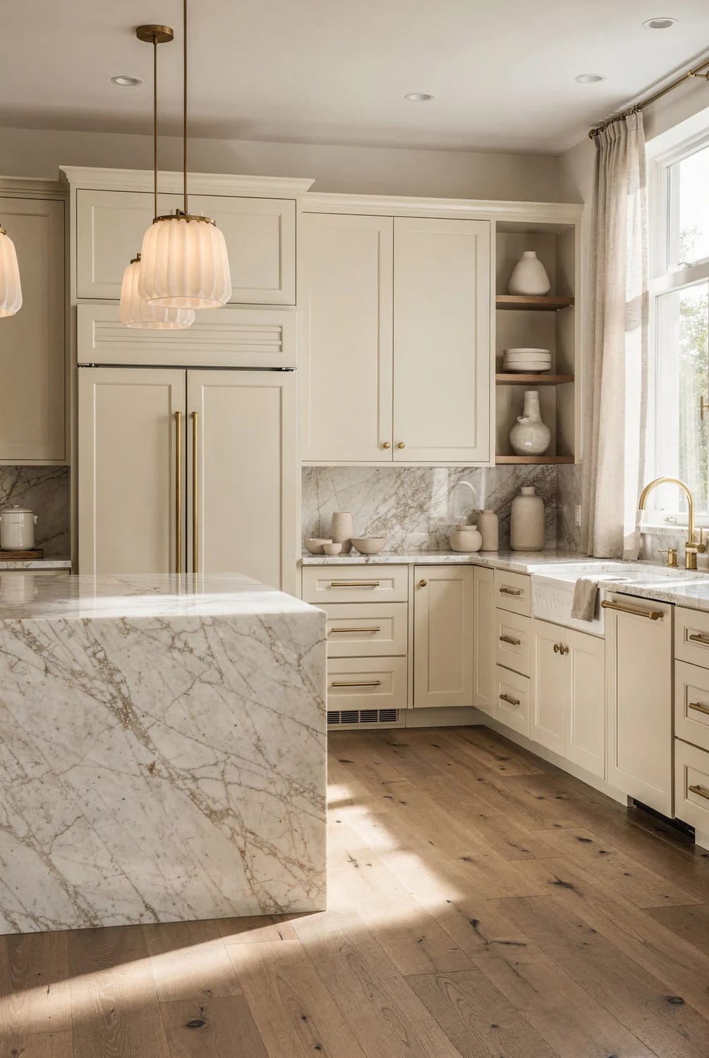
Stainless is the default and it is the weakest choice in a warm kitchen. It is a cool grey with a mirror finish, so it reflects whatever is in front of it, and next to cream it looks like an appliance parked in a room rather than part of one. Panel fronts cost more; matte black costs the same as stainless and does the job better.
| Appliance finish | Next to off-white cabinets | Where it fails |
|---|---|---|
| Panel front, cabinet matched | Disappears into the run; the room reads as cabinetry with a hood | Adds real cost, and the panel colour is locked to the paint forever |
| Matte black | Reads as a deliberate dark object against cream, like a range in an English kitchen | Shows dust and water spots on textured finishes |
| Stainless | Cool grey against warm cream; the cabinets look yellower by comparison | Worst in small kitchens where two stainless fronts sit side by side |
| White or cream enamel range | Sits closest to the cabinet colour and warms the whole wall | Almost never an exact match, and a near-miss is more noticeable than a contrast |
If the budget covers one panel front, spend it on the refrigerator. It is the largest single appliance face in the room, usually taller than the uppers, and hiding it does more for the look of an off-white kitchen than panelling a dishwasher nobody notices.
Order matters more than any single choice here. Pick the floor and the counter first, then paint the samples, because the paint is the only element on the list that adapts to what is already in the room; doing it the other way round is how people end up repainting cabinets they have already hung.
I could not find pricing on plaster hood surrounds that holds up across regions, and the quotes people report vary by a factor of three depending on whether a drywall contractor or a decorative plasterer does the work. Get two quotes before you commit to that one.
Last thing, and it costs nothing: tape your paint samples to the cabinet doors themselves rather than the wall, stand back to where you normally stand at the sink, and look at them again at eight in the evening with the lights you actually own. White Dove at four in the afternoon and White Dove under a 4000K downlight are, for practical purposes, two different colours.
Related Posts
- Light Colored Kitchen Cabinets: 7 Ways to Get Bright Without Going Cold
- Warm Minimalist Kitchen Ideas: Where the Warmth Actually Comes From
- Japandi Kitchen Ideas: 10 Design Decisions That Keep It Warm, Not Clinical
- Neutral Kitchen Ideas That Read Warm, Not Builder-Grade
- 11 Beige Kitchen Ideas That Don’t Read Builder-Grade
- 11 Cozy Neutral Christmas Living Room Decor Ideas That Stay Warm Without the Red and Green