
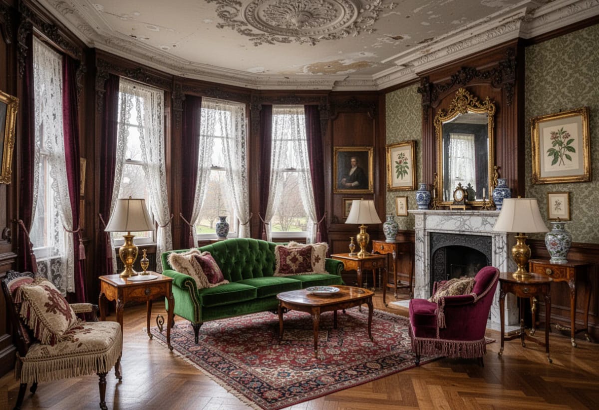
In a lot of Victorian houses the original hall floor is still down there, under a sheet of hardboard somebody nailed over it in the seventies. That is the useful thing to know about Victorian house interiors: most of what makes a room read as Victorian is architecture rather than furniture, and a surprising amount of it survives in the fabric whether or not anyone has looked after it. The nine ideas below are about the decisions that produce the effect, which is to say floor pattern, wall division, woodwork color, and one light doing the work of six.
None of it requires an actual Victorian house. Most of it is paint, pattern and proportion, and it works in a flat-walled 1990s box if you accept that the frieze will be carrying more weight there. The last two sections are the ones where I would break with the period entirely, for reasons that come down to plumbing and to how anybody actually cooks.
The Hall Is Where the House Makes Its Case
1. Put the pattern back on the vestibule floor
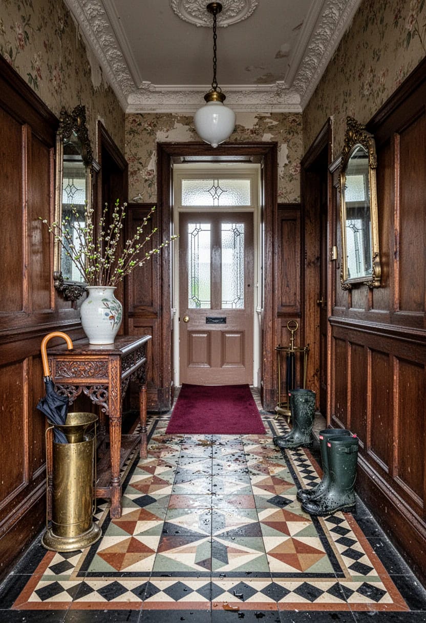
Geometric floor tile is the single strongest period signal in the house, and it is the one most often buried rather than lost. Ochre, black, dull red and cream, laid in a running pattern with a plain border and a dark edge line: that arrangement is doing more work than any piece of furniture you could put in the hall. Craven Dunnill Jackfield still fires reproduction encaustic and geometric tile in Shropshire, and Original Style makes the Victorian floor ranges most UK installers know by name.
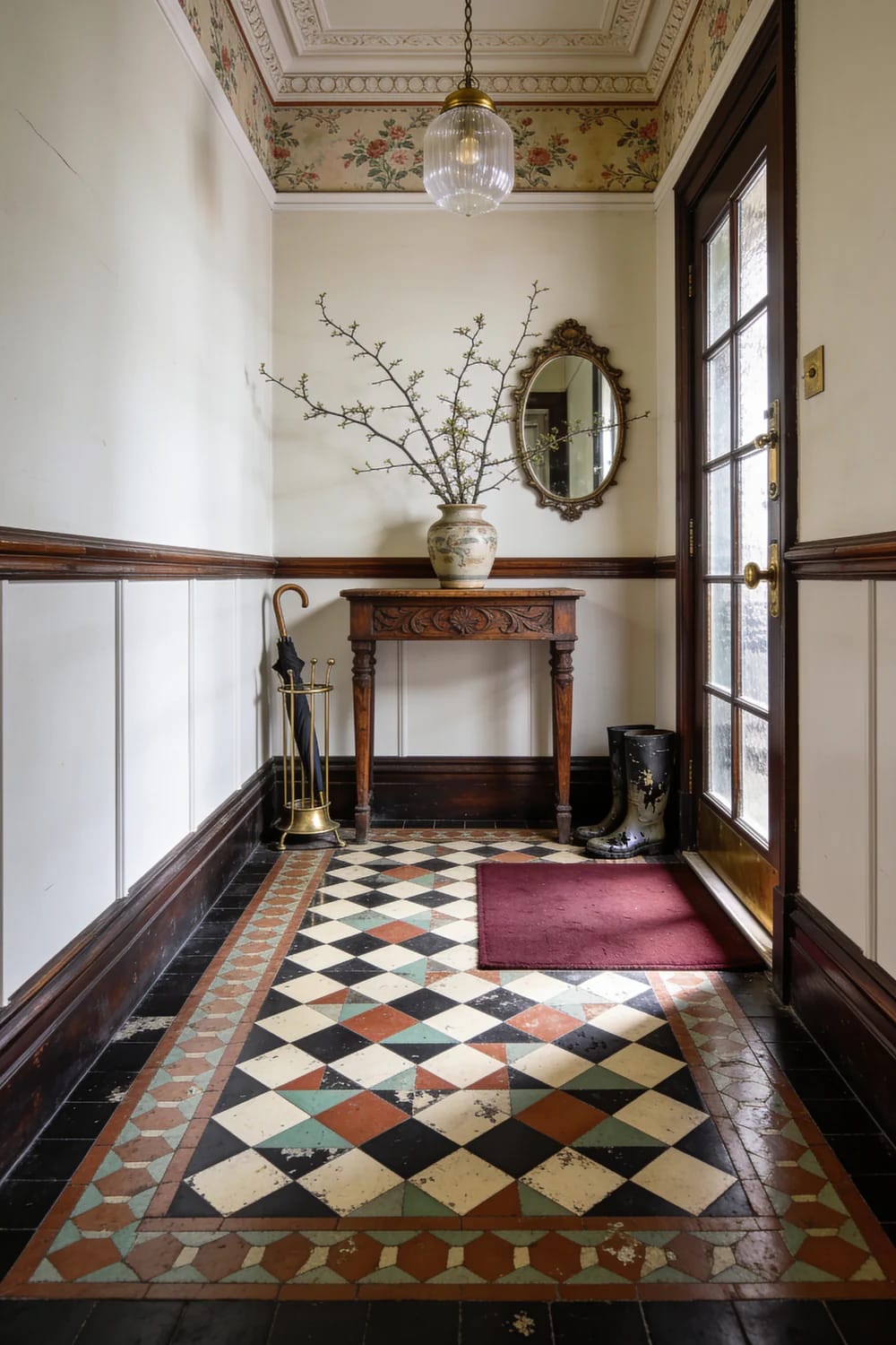
The catch is labor. Setting out a geometric floor is slow, fiddly work with a lot of cut edges, and I could not find a current cost figure I trusted enough to print here; quotes vary too much by region and by how level the sub-floor turns out to be. Lift a corner of whatever is down there before you price anything. If the original survives, cleaning and patching is cheaper than any new floor and it will look better than a new one for the obvious reason.
Renting, or unwilling to commit a five-figure sum to four square meters, is a real position and there is a real answer to it. Vinyl geometric tile in black and white will not fool anyone at close range, but a hall is a place people walk through, and something like this black and white patterned peel-and-stick vinyl floor tile gets the pattern down for the price of a takeaway. Stop it at the arch or the door line. A pattern that runs on into the kitchen loses the thing that made it work, which is that the hall was always treated as a separate, harder-wearing room. The rest of the hall decisions, especially in a narrow one, follow the same logic as the standard problems of a small entrance hall, just with a heavier hand on the floor.
2. Paint the balusters, leave the handrail and newel bare
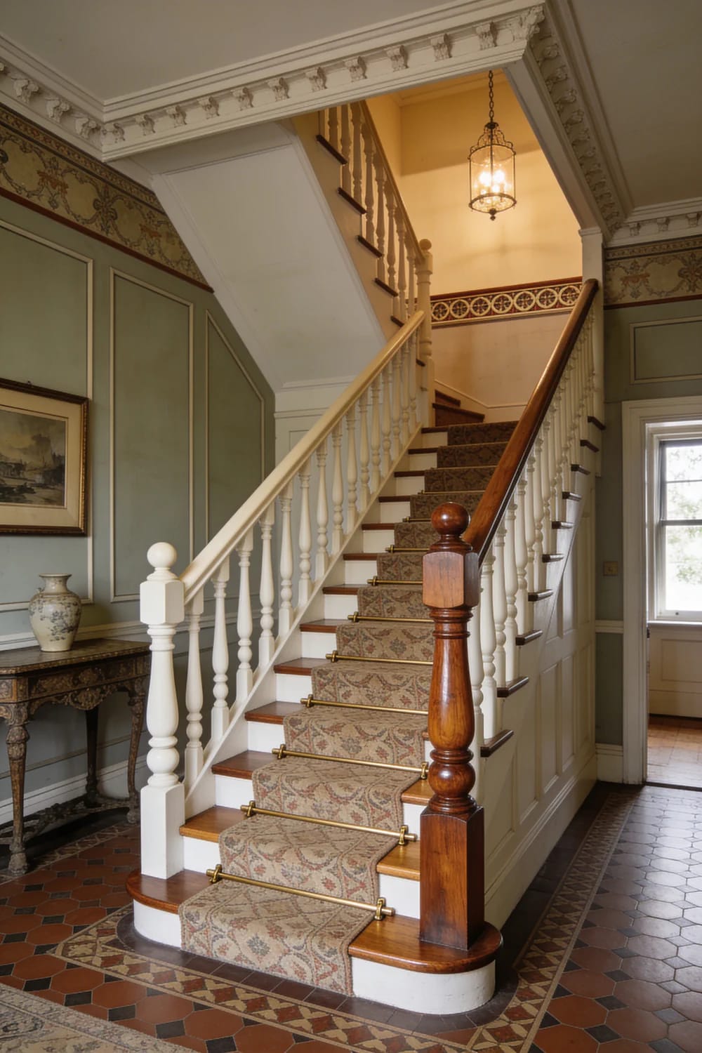
Stripping an entire staircase is punishing, and it is also historically wrong. Victorian builders used cheap softwood for the balusters and painted or grained it, reserving the good timber for the handrail, the newel post and sometimes the string. Copy that division and you save yourself the worst of the work: balusters in a deep color, rail and newel stripped back and oiled, which takes maybe a weekend of scraping rather than a fortnight.
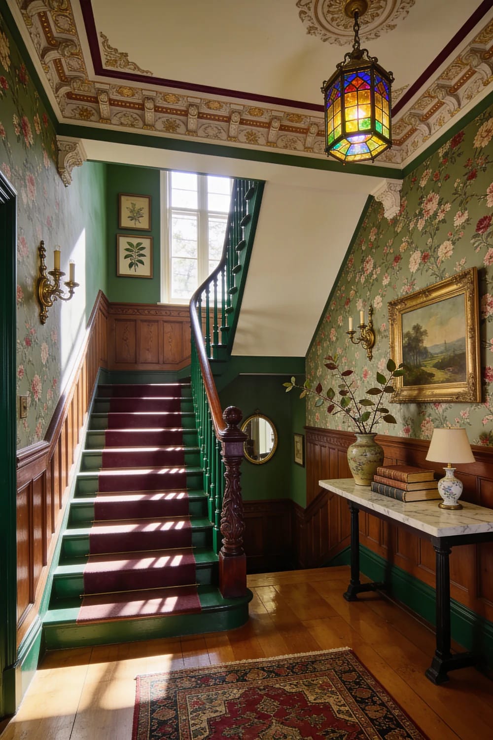
Then the runner. A wool runner laid short of the tread edge, with the stripped timber showing either side, is the arrangement that survives dogs and school shoes; the wool crushes and recovers, the exposed timber takes the scuffs, and neither one has to be perfect. Fix it with antique brass stair rods with finials and brackets rather than gripper alone, because rods let you pull the runner up two inches every few years and even out the wear on the nosings.
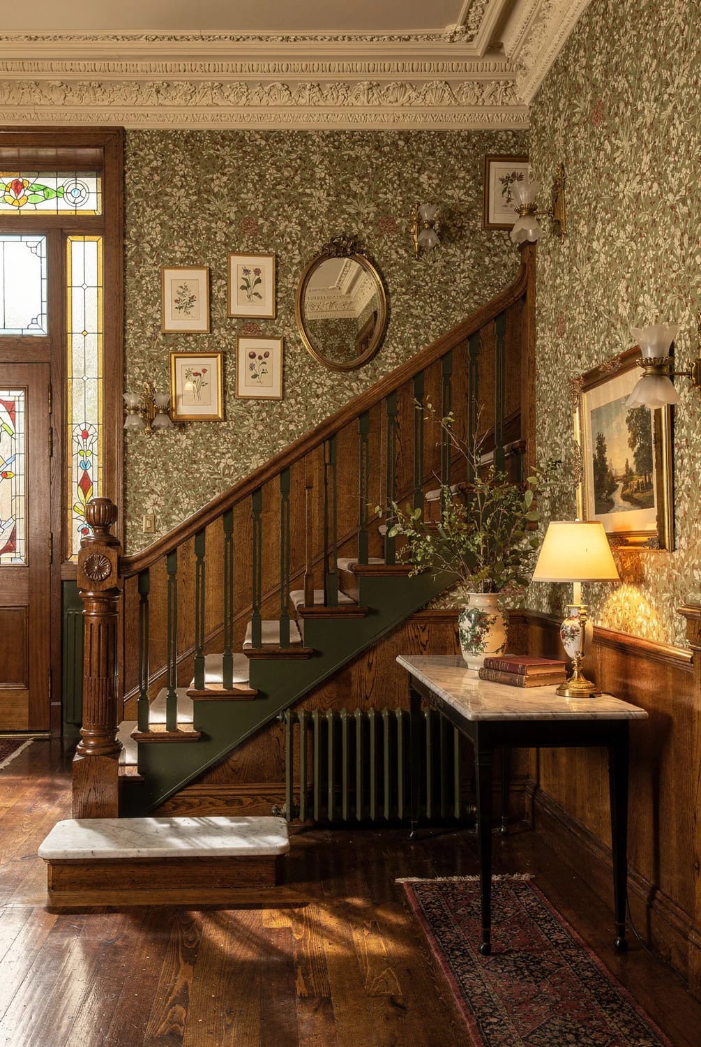
3. One oversized Victorian hall lantern, not a row of downlights
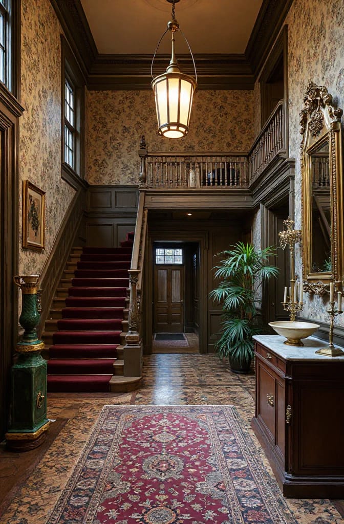
Buy one fixture that is a size too big and hang it low, at roughly seven feet to the base in a standard hall. Gas-era rooms were lit at levels we would now call gloomy, and the whole palette below was designed to be seen under that light; scatter six 3000K downlights across the ceiling and you flatten the cornice, kill the shadow in the plaster, and make the dark colors look like a mistake. Warm lamps, one source, and a wall light near the console if the hall runs long. If the console itself is the next question, the entrance table is worth thinking about separately, since it carries most of the clutter this style cannot absorb.
Color Does More Work Than the Furniture
4. Build the palette on one earth pigment
Pick one earth pigment and let the room hang off it. Yellow ochre, Venetian red, raw umber, verdigris green: these were the affordable, available pigments of the period, and they share a quality modern neutrals do not have, which is that they change through the day instead of sitting flat. Farrow & Ball India Yellow No. 66 and Picture Gallery Red No. 42 are the obvious reference points; Sherwin-Williams keeps Rookwood Dark Red SW 2801 and Roycroft Bottle Green SW 2847 in its historic ranges and they cost a third as much.
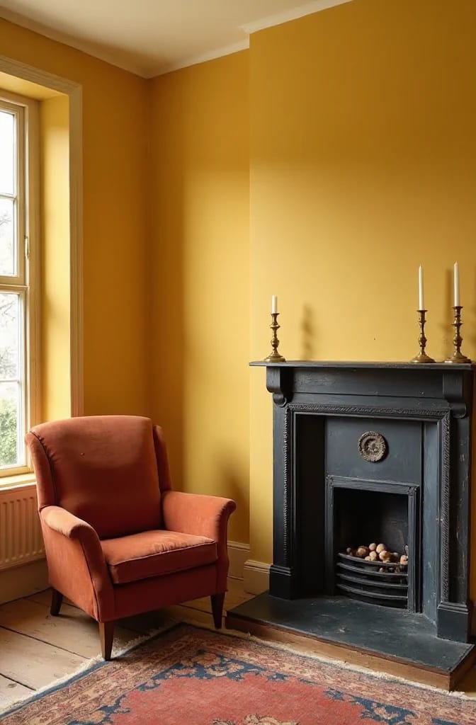
Now the part people skip: the ceiling. Victorian ceilings were distempered in tinted washes, not brilliant white, for the plain reason that brilliant white barely existed; titanium dioxide only went into commercial production around 1916, and the bright ceiling paint we treat as neutral is a twentieth century default applied backwards onto a nineteenth century room. Take the ceiling to a pale version of the wall color, or to a warm stone, and the whole room stops looking like a Victorian house with a modern lid on it.
Restraint on saturation matters more than restraint on color. Period pigments were mixed by hand and faded unevenly, so a wall that reads slightly dusty, slightly greyed, slightly inconsistent across a long run will look right where a flawless factory-mixed color will not. That is the same logic behind the faded, heirloom approach to Victorian Christmas decorating: saturation is what gives away a reproduction, every time.
5. Take the woodwork darker than the walls
Woodwork darker than the wall is the fastest correction available in a Victorian room. Architrave, skirting, doors and picture rail in bottle green or brown-black against a lighter chalky wall gives you the deep frame the plasterwork was designed to sit inside; white trim, which we treat as the safe option, is a mid-century habit that makes the mouldings vanish and leaves the room looking like a rental with fancy skirting.
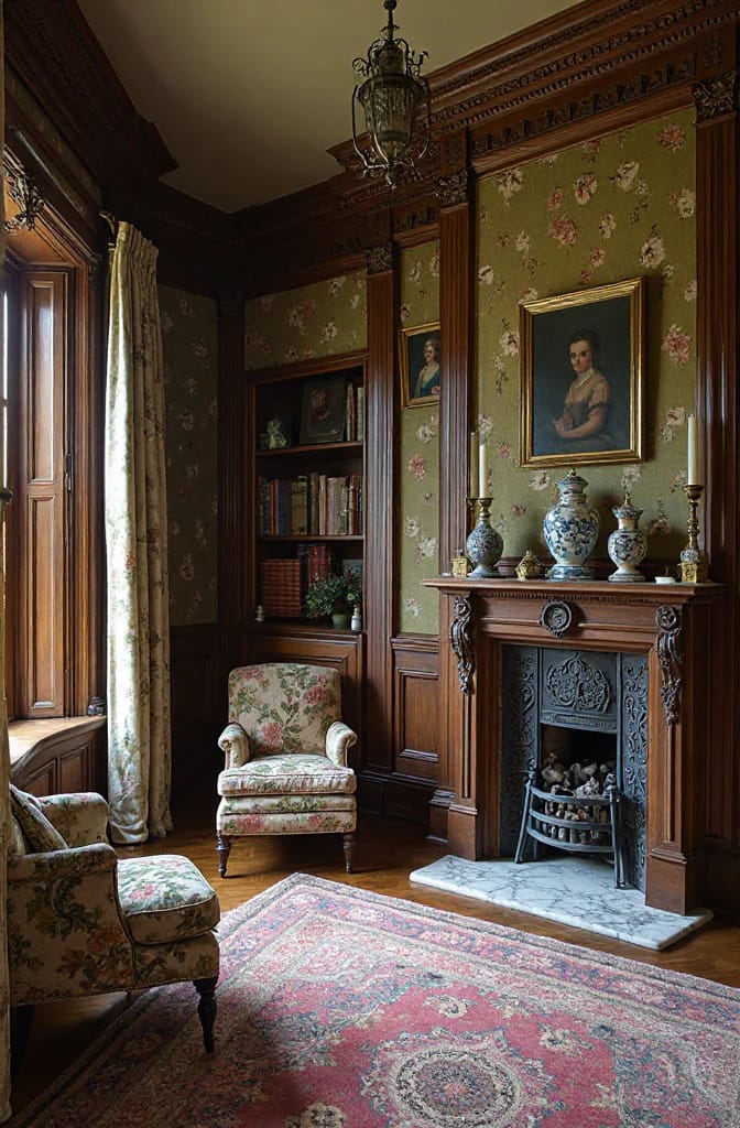
Two practical notes. Use eggshell or satin rather than the full gloss the Victorians used, because modern LED light hits high gloss hard and shows every ripple in a hundred-year-old moulding. And run the same color over the door, the frame and the skirting as one continuous band; picking out the panel mouldings in a second shade is a graining tradition that needs a skilled hand and looks like a craft project without one.
Walls With Something Happening on Them
6. Divide the wall in three, the way the Victorians did
The three-part wall is the structural idea behind almost every period room you have saved a picture of. Dado rail at about waist height, picture rail set roughly a foot to eighteen inches below the ceiling, and the wall treated as three separate bands: a hard-wearing dado below, the field in the middle where pictures hang, a lighter frieze above. It costs two lengths of moulding and a weekend.
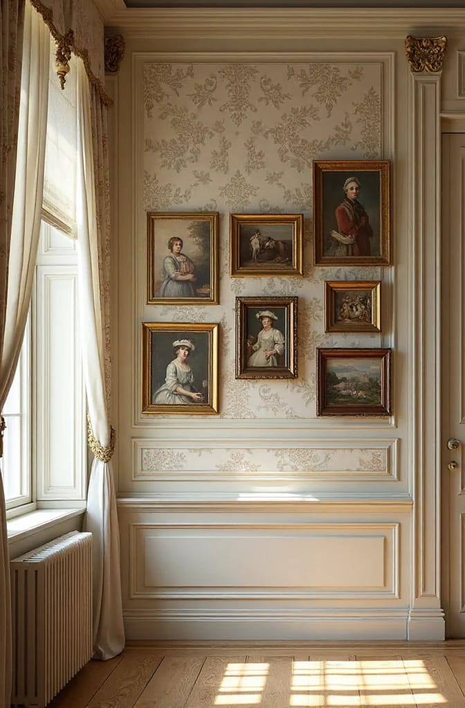
Below the rail is where the embossed papers belong: Lincrusta, patented in 1877, and Anaglypta, which followed in 1887, were both made to be painted and to survive being kicked. Both are still manufactured, both are heavy to hang, and both hide a genuinely bad wall better than lining paper will. Hang pictures from the rail on brass hooks and wire rather than driving fixings into the field, which is also how you keep the plaster intact.
7. Keep the big pattern to one plane
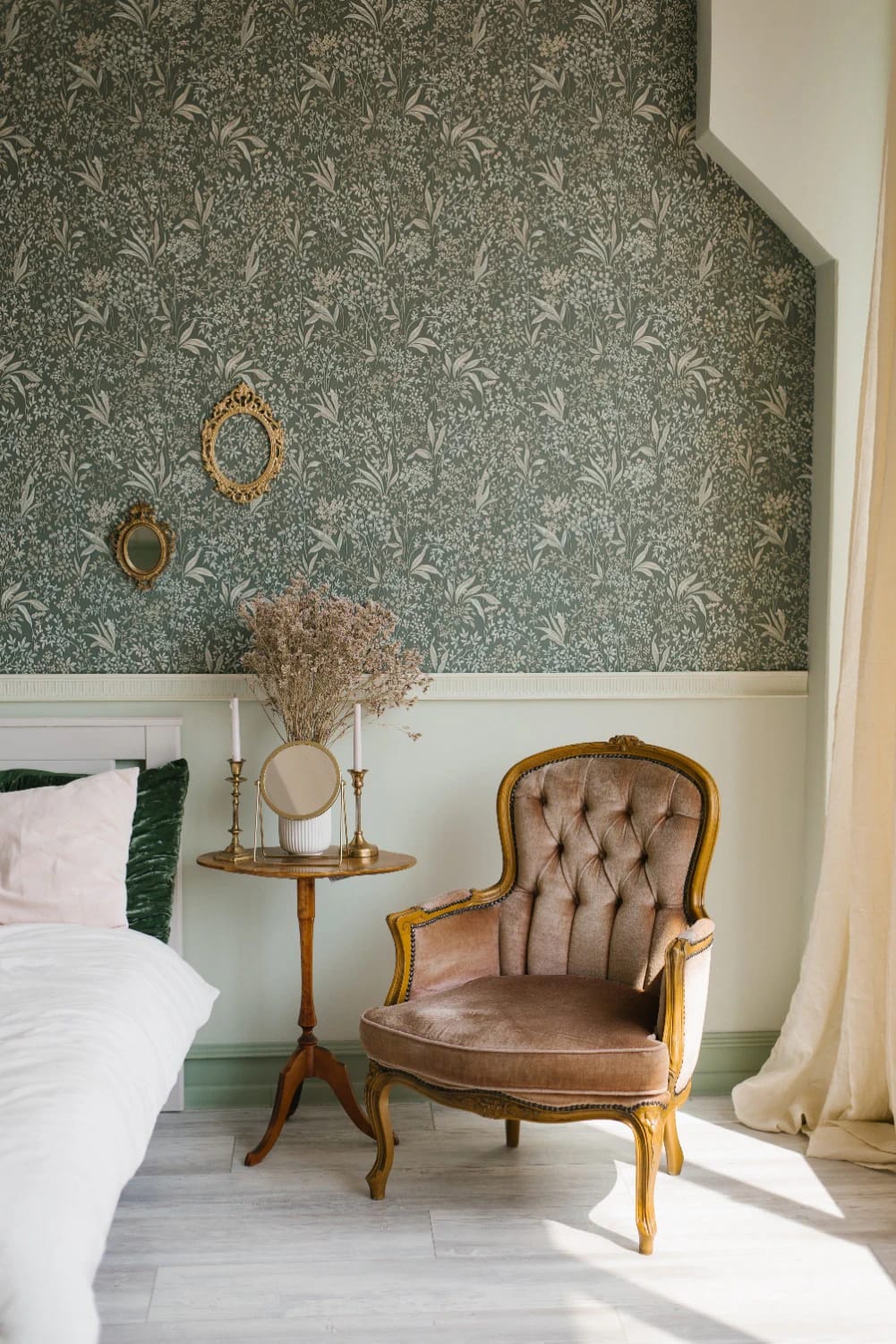
One plane of pattern, everything else quiet. Morris designs are the obvious choice and they are genuinely good, but a room papered on all four walls in Strawberry Thief (registered 1883) reads as a themed hotel room rather than a house; put it on the chimney breast, stop it at the picture rail, and paint the remaining walls in a color pulled from the paper’s background rather than its brightest flower. Morris & Co still sells the originals under Sanderson Design Group, and Graham & Brown holds the license for the more affordable version, including this Graham & Brown William Morris at Home Strawberry Thief wallpaper in soft blue.
Willow Bough from 1887 is the one I would reach for first in a small room, because the repeat is finer and it does not fight furniture the way the bird patterns do. The peel-and-stick copies flooding the marketplace are a different proposition: the color is usually hotter than the original and the repeat is often subtly wrong, which you will notice at a corner. They are fine for a cupboard interior. The same one-plane discipline is what makes a bedroom accent wall work instead of closing the room in.
Two Rooms Where the Period Should Lose
8. A Victorian bathroom with a modern shower hidden behind it
Build the bathroom to look period and plumb it entirely to modern standards, because there is no authentic Victorian bathroom to restore. Full fitted bathrooms arrived late, unevenly, and mostly in wealthy houses; the room you are decorating is usually a converted bedroom or a rear addition, which means you are free to design it. Take the floor tile seriously (small hexagons, or a black and white checkerboard with a border) and let that carry the whole period argument.
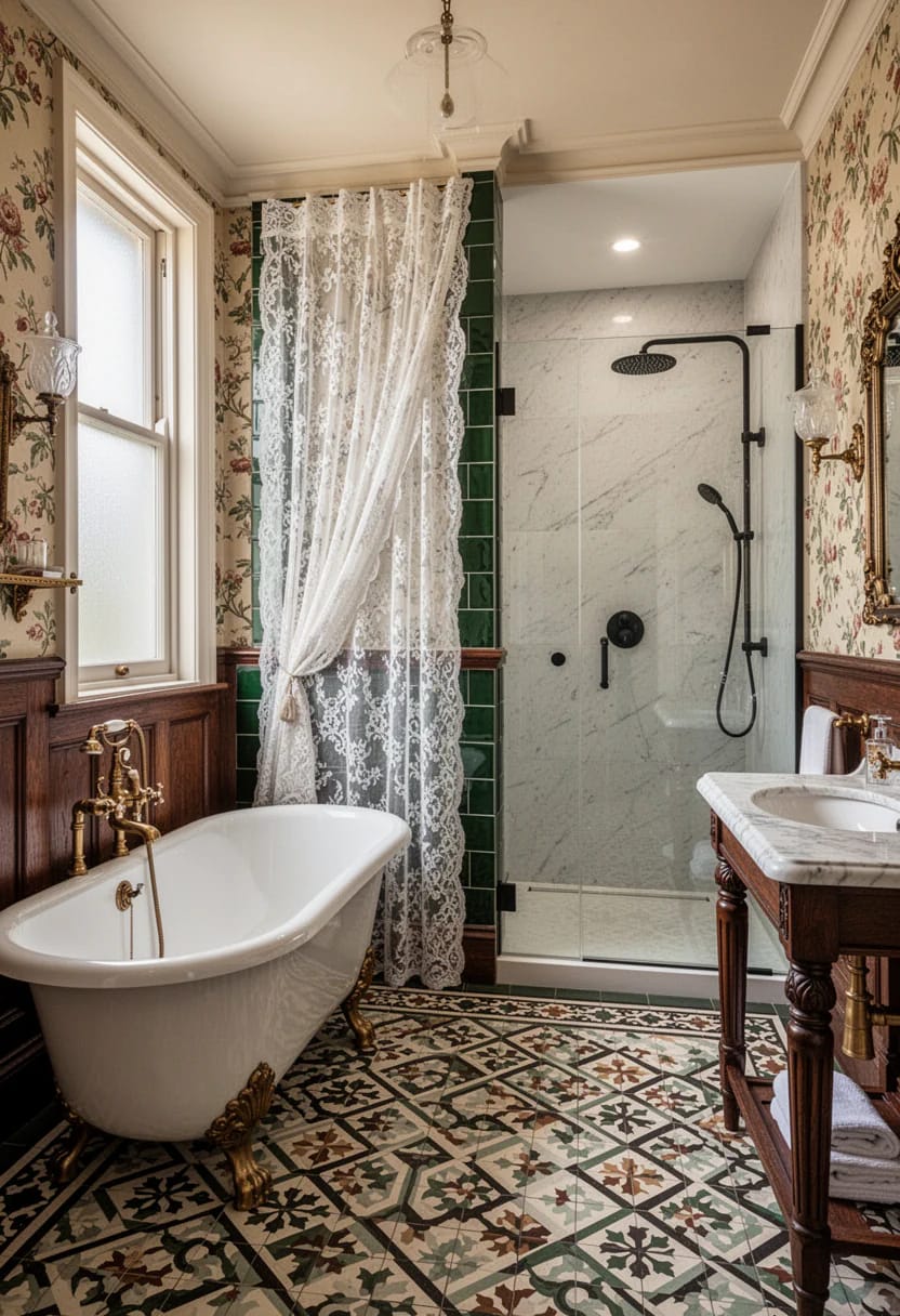
Where I would refuse to play along is the fittings. A high-level cistern with a pull chain looks correct and is a slow, dripping annoyance to live with; exposed nickel pipework stains; and a period-style shower valve without a thermostatic cartridge will scald somebody the moment a tap runs downstairs. Buy a modern thermostatic valve in an unlacquered brass or nickel finish, a plain roll-top bath, and spend the saved money on the floor. Tongue-and-groove painted to shoulder height covers a bad wall and reads period without pretending to be salvage, and the tile options worth comparing matter more here than any single fixture.
 19 Stunning Black and White Bathroom Designs to Inspire You Nineteen ways to handle the monochrome floor and wall combination without it going flat.
9. Stop restoring the kitchen
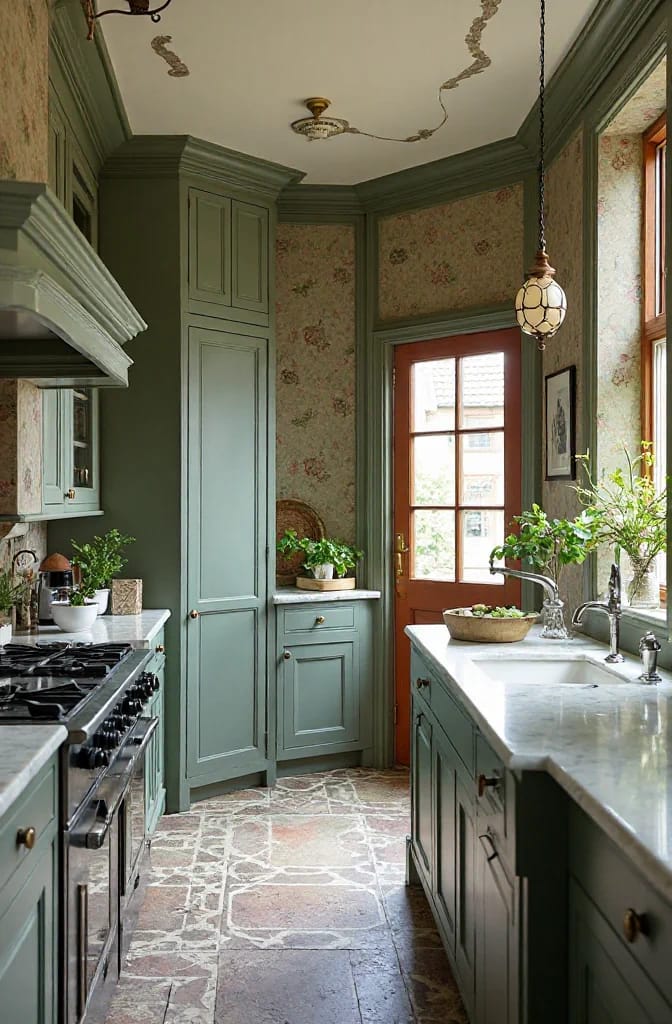
The Victorian kitchen was a service room, and restoring it accurately would give you a cold north-facing space with a scrubbed table, a range that eats fuel, and nowhere to put a dishwasher. Almost every "Victorian kitchen" sold today is an invention: pressed tin panels, applied corbels, a decorative mantel built around an extractor hood. It is a costume, and it dates faster than a plain kitchen does.
Go plain instead. Flat or shaker doors painted in one of the earth colors from the rest of the house, a thick oiled timber worktop, a deep fireclay sink, unlacquered brass handles that will darken unevenly and look better for it. Then add one honest freestanding piece, usually a pine dresser, since an unfitted element is the genuinely period thing about a Victorian kitchen and it does the work that all the applied moulding is trying to fake. Let the stainless range show.
Related Posts
- Vintage Kitchen Design Ideas That Read Period, Not Costume
- French Chateau Ideas That Read Authentic, Not Themed
- Vintage and Victorian Christmas Decorating: 11 Ideas for a Faded, Heirloom Holiday
- Retro 1950s Christmas Decorations That Look Collected, Not Costumed
- Farmhouse Front Porch Christmas Decor Ideas That Read Warm, Not Staged
- Rococo Room Ideas That Skip the Costume Drama